#EB3C27 Color
Your all-in-one color resource. Download hex background images, Adobe swatches (ASE), PDF color sheets, and SVG files. Explore palettes, harmonies, accessibility, conversions, and professional exports — designed for designers, developers, and color perfectionists.
This vibrant, energetic hue is a powerful stimulant, evoking feelings of passion, excitement, and urgency. Its the color of a roaring bonfire, the flush of a determined blush, or the intense intensity of a summer sunset at its peak. This shade commands attention, representing boldness, action, and a readiness to embrace challenges. It creates an atmosphere of dynamism and intensity, perfect for conveying strong emotions or driving a call to action. In design, it can be used to highlight key elements, inject energy into a space, or symbolize courage and vitality. Culturally, it's often linked to strength, life, and the thrill of the moment. Visually matched named color: Fiery Courage.
PANTONE 17-1563 TCX
Choose Color
Selected Color
Recent Colors
Color Details
Similar Ink Alternatives for #EB3C27 color Alternative print inks for reproducing #EB3C27 background image with a similar visual appearance.
Disclaimer: The visually matched ink reference is an independent approximation intended as a guide only. Please be advised that this pantone colors is only intended as a guide, Actual colours will depend on screen calibration variances. The print ink suggestions provided are independent visual approximations and are not affiliated with or endorsed by Pantone LLC. For official color specifications, conversion factors, and comprehensive color system information, please visit Pantone Connect. Official Pantone products can be purchased at pantone.com.
Color Previews for #000000 See how this color looks as a background or as text.
Complete Guide to Your Color Laboratory
Everything you need to know about this professional color toolkit.
Use the Color Picker at the top to select any color. All modules below update instantly.
Workflow: Pick a color → Explore palettes & data → Download what you need (PDF, Image, or Adobe ASE).
Color Details — Your color in all formats: HEX, RGB, RGBA, HSL, HSLA, HSV, CMYK, CIELab, Hunter-Lab, XYZ, Yxy, YUV. One-click copy.
Color Psychology — Emotional impact, cultural meanings, physiological effects, branding applications, and historical significance.
Named Colors — Find official color names (HTML/CSS, Pantone) that match your selection with similarity percentages.
Light & Dark Shades
80-step gradient from black to white. Perfect for button states and component systems.
Tints
Color mixed with white → lighter, pastel variations for backgrounds and disabled states.
Monochromatic — 11 curated tints/shades from one color. Production-ready for design systems.
- Complementary — Opposite on wheel (180°). High contrast.
- Analogous — Neighbors (±30°). Harmonious flow.
- Triadic — Three colors (120° apart). Vibrant, balanced.
- Split-Complementary — Base + two near-complements. Softer contrast.
- Tetradic/Square — Four colors. Complex, maximum variety.
- Neutral — Desaturated versions. Subtle, sophisticated.
15 Professional Variations — Monochromatic, Analogous, Complementary, Warm/Cool/Earth Tones, Pastel, Vibrant, High Contrast, and more.
Color Infusion — 10 palettes showing your color morphing into each major hue. Find bridge colors.
Similar Colors — 60+ colors generated via CIELAB Delta E matching. Unexpected harmonious combinations.
18 Ready-to-Use Gradients — Complementary, Analogous, Triadic, Tint/Shade progressions, and more.
Downloads: PNG (2560×1440), CSS (production-ready code), SVG (scalable vector).
WCAG Contrast Checker — Tests your color against white, black, and custom colors for AA (4.5:1) and AAA (7:1) compliance. Large text thresholds included.
Harmony & Accessibility Guide — Tests against 10 canonical hues. Shows which pairs are both beautiful AND WCAG-compliant for text.
PNG/JPG — High-res images for presentations and mood boards.
PDF — Print-ready reports for clients and teams.
Adobe ASE — Direct import to Photoshop, Illustrator, InDesign, XD.
CSS/SVG — Gradients only. Production-ready code and vectors.
Color Science: Industry-standard conversions (HSL, CIELAB, CMYK, XYZ). WCAG 2.1 luminance formula. Delta E (ΔE76) for perceptual matching.
Direct Links: Share colors via icolorpalette.com/color/ff5733 or icolorpalette.com/color/red
Issues? Refresh the page, wait for rendering, try another browser, or check console (F12) for errors.
Printing Guide for #eb3c27 Background Image
Use PANTONE 17-1563 TCX as a visually matched ink reference when printing this background image.
To print the #eb3c27 background image from our site, consider using PANTONE 17-1563 TCX as a visually matched ink reference.
Download the background image, then provide this reference code to your print vendor to help achieve accurate color reproduction.
The visually matched ink reference for the #eb3c27 background image is PANTONE 17-1563 TCX.
This color is commonly described as Fiery Courage.
This vibrant, energetic hue is a powerful stimulant, evoking feelings of passion, excitement, and urgency. Its the color of a roaring bonfire, the flush of a determined blush, or the intense intensity of a summer sunset at its peak. This shade commands attention, representing boldness, action, and a readiness to embrace challenges. It creates an atmosphere of dynamism and intensity, perfect for conveying strong emotions or driving a call to action. In design, it can be used to highlight key elements, inject energy into a space, or symbolize courage and vitality. Culturally, it's often linked to strength, life, and the thrill of the moment.
We provide PANTONE 17-1563 TCX as a visually matched ink reference to help you reproduce the #eb3c27 background image accurately in professional printing.
This reference code helps print vendors achieve consistent color output across different printing equipment and materials.
After downloading the #eb3c27 background image from our site:
- Include the visually matched ink reference PANTONE 17-1563 TCX in your print order notes
- Inform your print vendor that this is your target color reference
- Request a proof print to verify the Fiery Courage color appearance before full production
The #eb3c27 background image with PANTONE 17-1563 TCX as visually matched ink reference can be used for:
- Posters, banners, and backdrops
- Business cards, brochures, and flyers
- Packaging, labels, and stickers
- Signage and promotional materials
This is an independent visual approximation.
While PANTONE 17-1563 TCX closely matches the #eb3c27 background image color, variations may exist between screen display and printed output.
We recommend requesting a proof print to verify the final appearance.
This vibrant, energetic hue is a powerful stimulant, evoking feelings of passion, excitement, and urgency. Its the color of a roaring bonfire, the flush of a determined blush, or the intense intensity of a summer sunset at its peak. This shade commands attention, representing boldness, action, and a readiness to embrace challenges. It creates an atmosphere of dynamism and intensity, perfect for conveying strong emotions or driving a call to action. In design, it can be used to highlight key elements, inject energy into a space, or symbolize courage and vitality. Culturally, it's often linked to strength, life, and the thrill of the moment.
Understanding these associations helps ensure the #eb3c27 background image aligns with your intended message and brand impact.
Important Information
The visually matched ink reference is an independent approximation intended as a guide only.
Actual printed colors may vary depending on screen calibration, substrate material, ink type, and printing equipment used.
For official color specifications and certified color standards, visit Pantone Connect.
Official color guides and swatch books can be purchased from pantone.com.
Cherry Tomato: An Energetic Red | #EB3C27
Introduction:
Cherry Tomato is a vibrant and energetic red color that catches attention and exudes a sense of excitement and passion.
Historical Significance:
Use in Fashion: Cherry Tomato has been a popular color in fashion, making appearances on runways and in collections. It adds a bold and fiery touch to outfits.
Symbolism and Meaning: Cherry Tomato represents energy, vitality, and warmth. It can evoke feelings of passion, desire, and strength.
In Graphic Design: Cherry Tomato is often used to grab attention and create a visually striking impact in designs. It can signify urgency or draw focus to important elements.
Color Combinations:
Popular Color Combinations: Cherry Tomato pairs well with other bold colors, such as navy blue, turquoise, or sunny yellow. It can also create a striking contrast with neutrals like black or white.
Nature’s Palette:
In Nature: Cherry Tomato can be found in various fruits, such as ripe tomatoes, cherries, or pomegranates. It also appears in vibrant flowers like poppies or tulips.
Artistic Representations:
In Art: Cherry Tomato has been used by artists to convey intensity, passion, or create visual impact. It can be seen in abstract paintings, floral motifs, or expressive portraits.
Movies and Cinematic Landscapes:
In Movies: Cherry Tomato often sets a vibrant and energetic tone in movies. It can be seen in action-packed scenes, passionate love stories, or high-energy musicals.
Products and Commercial Appeal:
Commercial Use: Cherry Tomato is commonly used in branding and advertising to grab attention and create a memorable impression. It can be seen in logos, packaging designs, or promotional materials.
National Symbols and Significance:
National and Cultural Significance: While not specifically tied to any national symbols, Cherry Tomato's vibrant hue is often associated with celebrations, festivals, and joyous occasions in various cultures.
The Psychological and Emotional Impact:
Psychological Influence: Cherry Tomato can evoke strong emotions, ranging from excitement and passion to urgency and determination. It can grab attention and create a sense of high energy.
Conclusion:
Cherry Tomato, with its vibrant and energetic red hue, holds historical significance in fashion and graphic design. Symbolizing passion and energy, it is used to create visual impact and evoke strong emotions. Found in nature's palette, artistic representations, movies, and commercial branding, Cherry Tomato continues to captivate, making it an iconic color choice.
Pantone 17-1563 Tcx Cherry Tomato Color | Hex color Code #eb3c27 Image & Artwork
Download high-quality assets for your projects.

#eb3c27 Color Schemes
Download Color Schemes
#eb3c27 Color Shades
Download Color Shades
Pantone 17-1563 Tcx Cherry Tomato Color | Hex color Code #eb3c27 Solid Color Background
Download Solid Color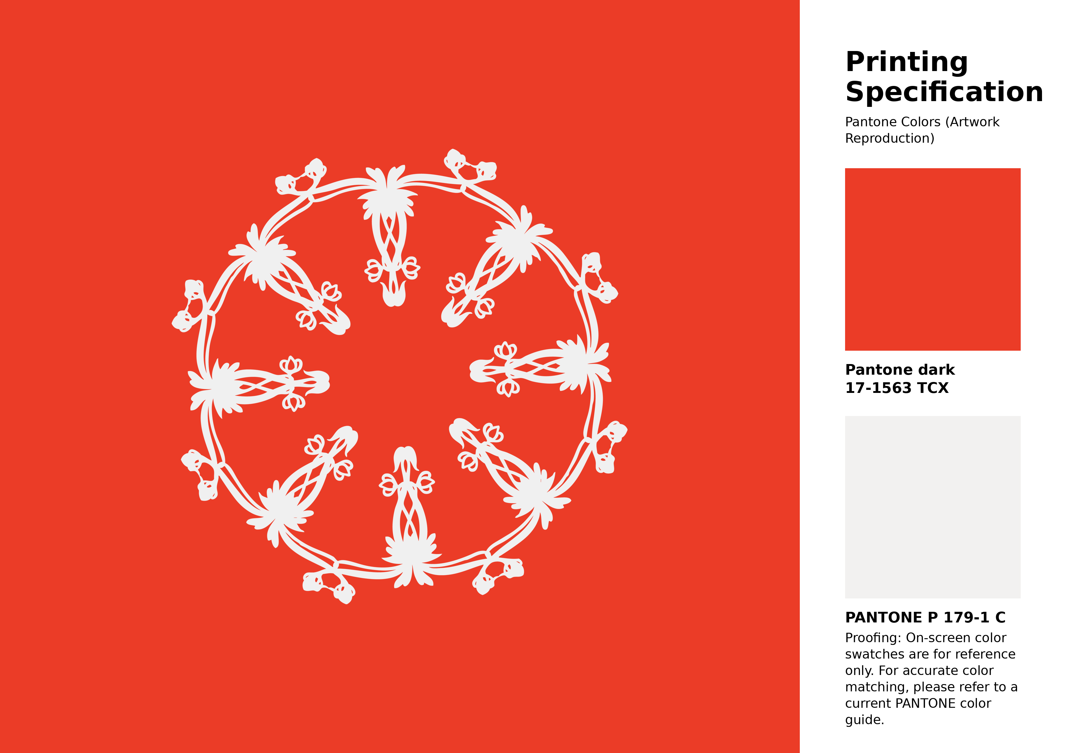
#eb3c27 Pantone 17-1563 Tcx Cherry Tomato Color | Hex color Code #eb3c27 Artwork Image (PNG)
Download Artwork (PNG)#eb3c27 Pantone 17-1563 Tcx Cherry Tomato Color | Hex color Code #eb3c27 Artwork Vector (PDF)
Download Artwork (PDF)#eb3c27 Pantone 17-1563 Tcx Cherry Tomato Color | Hex color Code #eb3c27 Artwork Vector (SVG)
Download Artwork (SVG)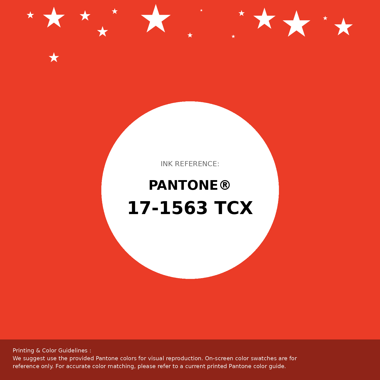
#eb3c27 Pantone 17-1563 Tcx Cherry Tomato Color | Hex color Code #eb3c27 Pantone Swatch Artwork
Download Artwork Swatch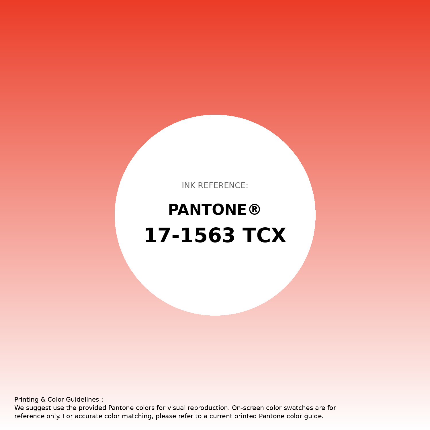
#eb3c27 Pantone 17-1563 Tcx Cherry Tomato Color | Hex color Code #eb3c27 Gradient Artwork (PNG)
Download Gradient (PNG)#eb3c27 Pantone 17-1563 Tcx Cherry Tomato Color | Hex color Code #eb3c27 Gradient Artwork (SVG)
Download Gradient (SVG)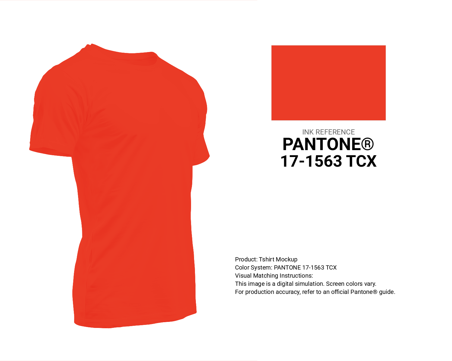
#eb3c27 Pantone 17-1563 Tcx Cherry Tomato Color | Hex color Code #eb3c27 T-Shirt Mockup
Download T-Shirt Mockup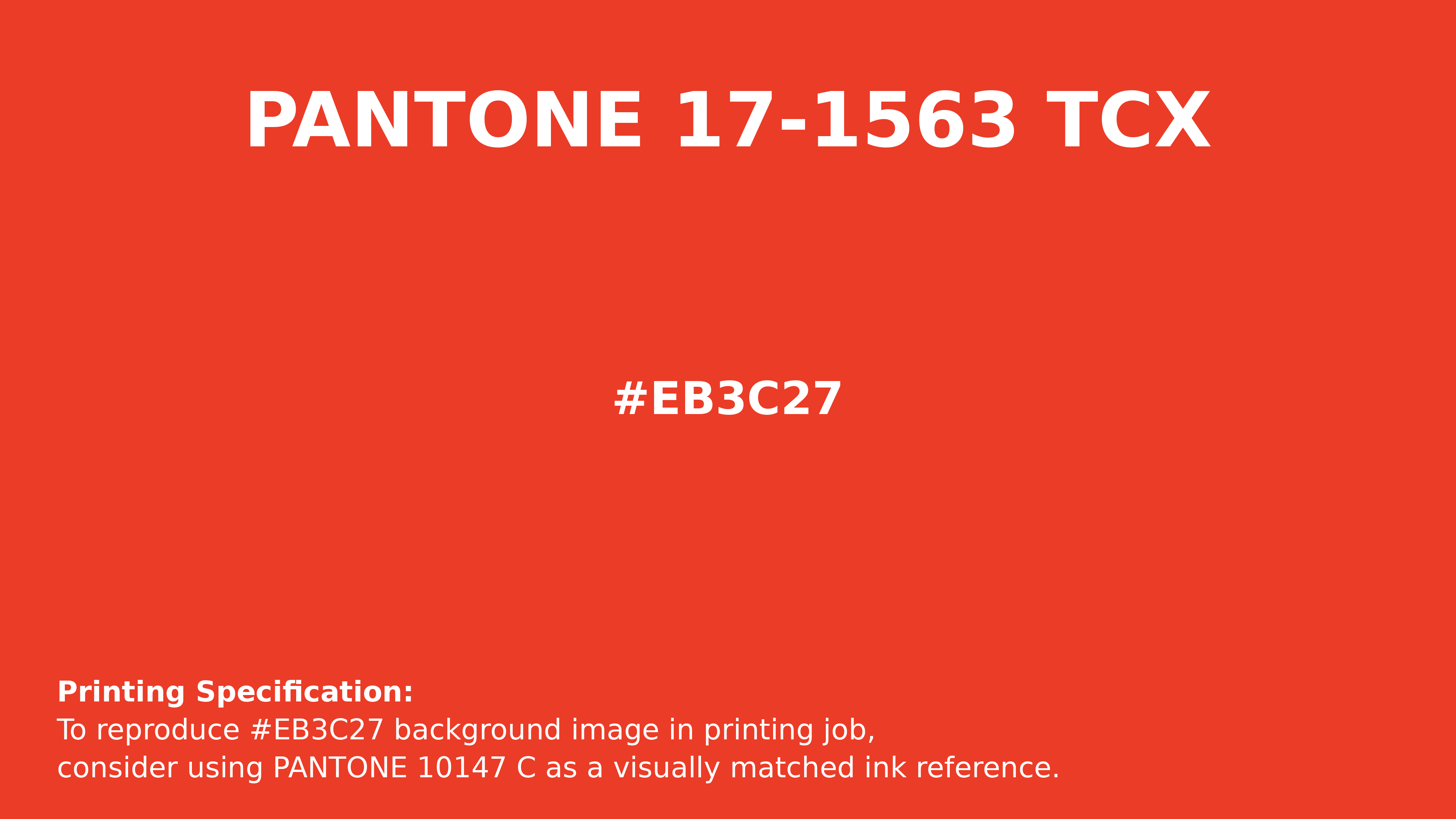
#eb3c27 Pantone 17-1563 Tcx Cherry Tomato Color | Hex color Code #eb3c27 Printing Artwork Pantone Reference
Download Pantone Printing ReferenceRelated Color Palettes
- Burly Wood and Indian Red •
- Burly Wood and OrangeRed •
- Pale Violet Red and Midnight Blue •
- Dark Slate Blue and OrangeRed •
- OrangeRed and Maroon •
- Pale Violet Red and Olive Drab •
- Indian Red and Dark Red •
- Yellow Green and Pale Violet Red •
- Pale Violet Red and Linen •
- Thistle and Pale Violet Red •
- Peru and Dark Red •
- Redwood •
- Indian Red and Cadet Blue •
- Indian Red and Gainsboro •
- Crimson and Red
Color Palette Collection
125 Yellow Color Palettes
125 color palettes with 625 colors.
34 Yellow Color Schemes
34 color palettes with 170 colors.

20 Beige Color Combinations
20 color palettes with 100 colors.

38 Purple Color Schemes
38 color palettes with 190 colors.