#FABBCB Color
Your all-in-one color resource. Download hex background images, Adobe swatches (ASE), PDF color sheets, and SVG files. Explore palettes, harmonies, accessibility, conversions, and professional exports — designed for designers, developers, and color perfectionists.
#FABBCB, a light, warm pink-coral, evokes feelings of gentle warmth and soft optimism. Its pastel quality prevents it from being overwhelming, instead suggesting a delicate, almost shy, vibrancy. It reminds one of a coral reef bathed in shallow sunlight, seashells on a beach, or perhaps a blush on pale skin. The mood is cheerful yet understated, peaceful yet subtly energetic. In design, it would be suitable for spaces meant to be comforting and inviting a bedroom, a nursery, or a cozy reading nook. Its soft nature allows it to be paired with a variety of other colors, from deeper corals and pinks to calming neutrals like creams and greys. There's a sense of innocence and playfulness associated with it, possibly linking to childhood memories or feelings of carefree joy. Visually matched named color: Blushing Coral Reef.
PANTONE 182 C
Choose Color
Selected Color
Recent Colors
Color Details
Similar Ink Alternatives for #FABBCB color Alternative print inks for reproducing #FABBCB background image with a similar visual appearance.
Disclaimer: The visually matched ink reference is an independent approximation intended as a guide only. Please be advised that this pantone colors is only intended as a guide, Actual colours will depend on screen calibration variances. The print ink suggestions provided are independent visual approximations and are not affiliated with or endorsed by Pantone LLC. For official color specifications, conversion factors, and comprehensive color system information, please visit Pantone Connect. Official Pantone products can be purchased at pantone.com.
Color Previews for #000000 See how this color looks as a background or as text.
Complete Guide to Your Color Laboratory
Everything you need to know about this professional color toolkit.
Use the Color Picker at the top to select any color. All modules below update instantly.
Workflow: Pick a color → Explore palettes & data → Download what you need (PDF, Image, or Adobe ASE).
Color Details — Your color in all formats: HEX, RGB, RGBA, HSL, HSLA, HSV, CMYK, CIELab, Hunter-Lab, XYZ, Yxy, YUV. One-click copy.
Color Psychology — Emotional impact, cultural meanings, physiological effects, branding applications, and historical significance.
Named Colors — Find official color names (HTML/CSS, Pantone) that match your selection with similarity percentages.
Light & Dark Shades
80-step gradient from black to white. Perfect for button states and component systems.
Tints
Color mixed with white → lighter, pastel variations for backgrounds and disabled states.
Monochromatic — 11 curated tints/shades from one color. Production-ready for design systems.
- Complementary — Opposite on wheel (180°). High contrast.
- Analogous — Neighbors (±30°). Harmonious flow.
- Triadic — Three colors (120° apart). Vibrant, balanced.
- Split-Complementary — Base + two near-complements. Softer contrast.
- Tetradic/Square — Four colors. Complex, maximum variety.
- Neutral — Desaturated versions. Subtle, sophisticated.
15 Professional Variations — Monochromatic, Analogous, Complementary, Warm/Cool/Earth Tones, Pastel, Vibrant, High Contrast, and more.
Color Infusion — 10 palettes showing your color morphing into each major hue. Find bridge colors.
Similar Colors — 60+ colors generated via CIELAB Delta E matching. Unexpected harmonious combinations.
18 Ready-to-Use Gradients — Complementary, Analogous, Triadic, Tint/Shade progressions, and more.
Downloads: PNG (2560×1440), CSS (production-ready code), SVG (scalable vector).
WCAG Contrast Checker — Tests your color against white, black, and custom colors for AA (4.5:1) and AAA (7:1) compliance. Large text thresholds included.
Harmony & Accessibility Guide — Tests against 10 canonical hues. Shows which pairs are both beautiful AND WCAG-compliant for text.
PNG/JPG — High-res images for presentations and mood boards.
PDF — Print-ready reports for clients and teams.
Adobe ASE — Direct import to Photoshop, Illustrator, InDesign, XD.
CSS/SVG — Gradients only. Production-ready code and vectors.
Color Science: Industry-standard conversions (HSL, CIELAB, CMYK, XYZ). WCAG 2.1 luminance formula. Delta E (ΔE76) for perceptual matching.
Direct Links: Share colors via icolorpalette.com/color/ff5733 or icolorpalette.com/color/red
Issues? Refresh the page, wait for rendering, try another browser, or check console (F12) for errors.
Printing Guide for #fabbcb Background Image
Use PANTONE 182 C as a visually matched ink reference when printing this background image.
To print the #fabbcb background image from our site, consider using PANTONE 182 C as a visually matched ink reference.
Download the background image, then provide this reference code to your print vendor to help achieve accurate color reproduction.
The visually matched ink reference for the #fabbcb background image is PANTONE 182 C.
This color is commonly described as Blushing Coral Reef.
#FABBCB, a light, warm pink-coral, evokes feelings of gentle warmth and soft optimism. Its pastel quality prevents it from being overwhelming, instead suggesting a delicate, almost shy, vibrancy. It reminds one of a coral reef bathed in shallow sunlight, seashells on a beach, or perhaps a blush on pale skin. The mood is cheerful yet understated, peaceful yet subtly energetic. In design, it would be suitable for spaces meant to be comforting and inviting a bedroom, a nursery, or a cozy reading nook. Its soft nature allows it to be paired with a variety of other colors, from deeper corals and pinks to calming neutrals like creams and greys. There's a sense of innocence and playfulness associated with it, possibly linking to childhood memories or feelings of carefree joy.
We provide PANTONE 182 C as a visually matched ink reference to help you reproduce the #fabbcb background image accurately in professional printing.
This reference code helps print vendors achieve consistent color output across different printing equipment and materials.
After downloading the #fabbcb background image from our site:
- Include the visually matched ink reference PANTONE 182 C in your print order notes
- Inform your print vendor that this is your target color reference
- Request a proof print to verify the Blushing Coral Reef color appearance before full production
The #fabbcb background image with PANTONE 182 C as visually matched ink reference can be used for:
- Posters, banners, and backdrops
- Business cards, brochures, and flyers
- Packaging, labels, and stickers
- Signage and promotional materials
This is an independent visual approximation.
While PANTONE 182 C closely matches the #fabbcb background image color, variations may exist between screen display and printed output.
We recommend requesting a proof print to verify the final appearance.
#FABBCB, a light, warm pink-coral, evokes feelings of gentle warmth and soft optimism. Its pastel quality prevents it from being overwhelming, instead suggesting a delicate, almost shy, vibrancy. It reminds one of a coral reef bathed in shallow sunlight, seashells on a beach, or perhaps a blush on pale skin. The mood is cheerful yet understated, peaceful yet subtly energetic. In design, it would be suitable for spaces meant to be comforting and inviting a bedroom, a nursery, or a cozy reading nook. Its soft nature allows it to be paired with a variety of other colors, from deeper corals and pinks to calming neutrals like creams and greys. There's a sense of innocence and playfulness associated with it, possibly linking to childhood memories or feelings of carefree joy.
Understanding these associations helps ensure the #fabbcb background image aligns with your intended message and brand impact.
Important Information
The visually matched ink reference is an independent approximation intended as a guide only.
Actual printed colors may vary depending on screen calibration, substrate material, ink type, and printing equipment used.
For official color specifications and certified color standards, visit Pantone Connect.
Official color guides and swatch books can be purchased from pantone.com.
Pantone 182 C Color: Joyful Raspberry | #FABBCB
Introduction:
Joyful Raspberry, represented by the Pantone 182 C Color (#FABBCB), is a vibrant and energetic color that exudes happiness and excitement. It is a shade of pink that instantly catches attention and adds a cheerful touch to any space or design.
Historical Significance:
Key moments in history: Joyful Raspberry has been prominently used in various cultural celebrations, such as weddings and festivals, to symbolize love, joy, and abundance. It has also been used in advertising campaigns to create a sense of excitement and attraction. The vibrant hue of Joyful Raspberry became popular in the 1980s and has remained a popular choice for creative expressions.
Symbolism and Meaning:
Symbolism and Meaning: Joyful Raspberry is often associated with love, sweetness, and femininity. In various cultures, it represents passion, romance, and tenderness. It is also believed to evoke feelings of joy, energy, and playfulness. The color's vibrant nature makes it an ideal choice for expressing creativity and excitement.
Joyful Raspberry in Fashion:
Joyful Raspberry in Fashion: Joyful Raspberry has a significant impact on styles and trends in the fashion world. It is often used in clothing and accessories to add a pop of color and create a bold fashion statement. Designers often incorporate Joyful Raspberry in their collections to bring a sense of joy and femininity to their designs.
Joyful Raspberry in Graphic Design:
Joyful Raspberry in Graphic Design: Joyful Raspberry holds great significance in design aesthetics and branding. Its vibrant and eye-catching nature makes it a popular choice for logos, advertisements, and marketing materials. The color's playful and energetic vibe instantly grabs attention and conveys a sense of excitement and creativity.
Color Combinations:
Color Combinations: Joyful Raspberry pairs well with a variety of colors, including complementary hues like mint green (#BDF8C2) or coral (#FF7F50). It can also be combined with neutral tones like gray or beige for a sophisticated and elegant look.
Nature’s Palette:
Nature’s Palette: Joyful Raspberry can be found naturally in various flowers like peonies and roses. It also appears in vibrant sunsets and tropical landscapes. The color reflects the vibrancy and beauty of nature, adding a touch of joy to any natural setting.
Artistic Representations:
Artistic Representations: Joyful Raspberry has been used in various forms of art, including paintings and illustrations, to evoke emotions and create visually striking compositions. Its vibrant and energetic nature makes it a popular choice for artists looking to convey joy and playfulness in their artwork.
Movies and Cinematic Landscapes:
Movies and Cinematic Landscapes: Joyful Raspberry is often used in movies or specific scenes to set the tone or mood of a scene. It can be seen in romantic comedies or scenes that aim to evoke feelings of happiness and excitement.
Products and Commercial Appeal:
Products and Commercial Appeal: Joyful Raspberry is widely used by various brands to create visually appealing packaging and branding. It is often associated with products that evoke emotions of joy, playfulness, and femininity, such as cosmetics, confectionery, and clothing.
National Symbols and Significance:
National Symbols and Significance: Joyful Raspberry does not have any specific national or cultural significance tied to it. However, its vibrant and joyful nature resonates with people worldwide, making it a symbol of happiness and positivity.
The Psychological and Emotional Impact:
The Psychological and Emotional Impact: Joyful Raspberry is known to influence emotions and perceptions psychologically. It can evoke feelings of joy, excitement, and happiness. The color's vibrant nature can also create a sense of energy and playfulness, uplifting moods and sparking creativity.
Conclusion:
In conclusion, Joyful Raspberry, represented by the Pantone 182 C Color (#FABBCB), is a vibrant and energetic color that has a rich historical significance. It symbolizes love, joy, and femininity and has a strong impact on various industries such as fashion, graphic design, and branding. With its ability to evoke emotions and create visually striking compositions, it remains a timeless choice for expressing creativity and adding a touch of excitement to any space or design.
Pantone 182 C Color | Hex color Code #fabbcb Image & Artwork
Download high-quality assets for your projects.

#fabbcb Color Schemes
Download Color Schemes
#fabbcb Color Shades
Download Color Shades
Pantone 182 C Color | Hex color Code #fabbcb Solid Color Background
Download Solid Color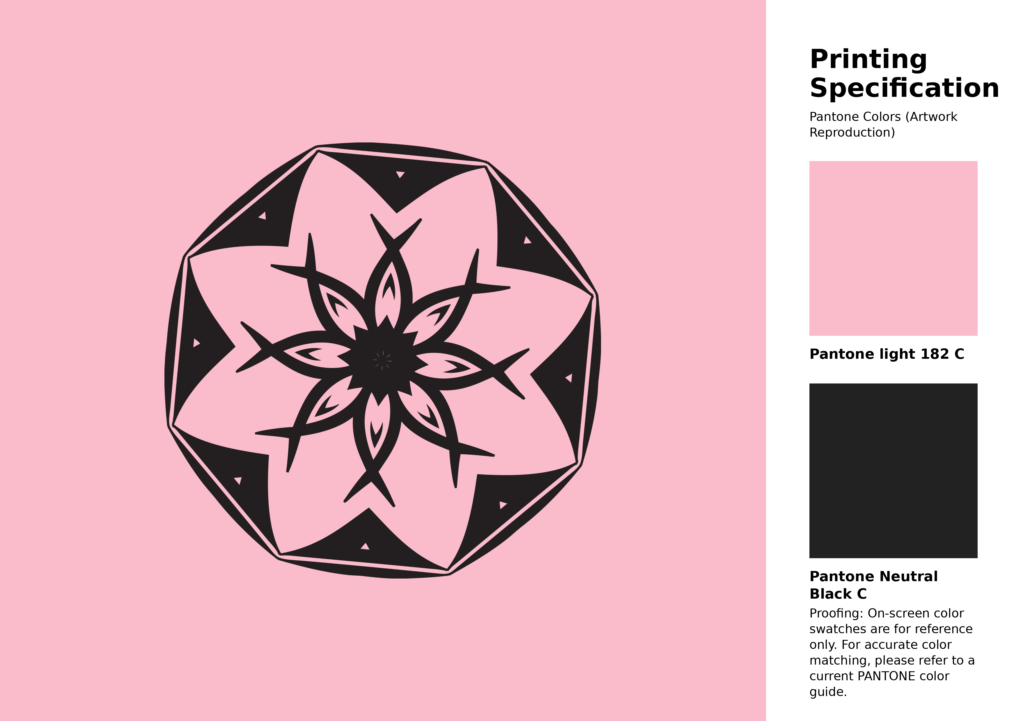
#fabbcb Pantone 182 C Color | Hex color Code #fabbcb Artwork Image (PNG)
Download Artwork (PNG)#fabbcb Pantone 182 C Color | Hex color Code #fabbcb Artwork Vector (PDF)
Download Artwork (PDF)#fabbcb Pantone 182 C Color | Hex color Code #fabbcb Artwork Vector (SVG)
Download Artwork (SVG)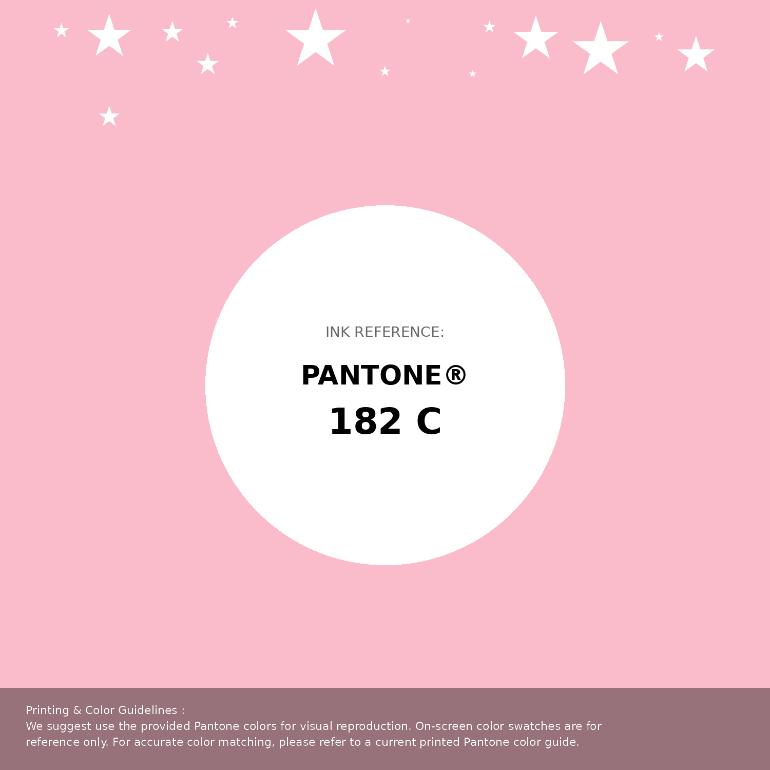
#fabbcb Pantone 182 C Color | Hex color Code #fabbcb Pantone Swatch Artwork
Download Artwork Swatch
#fabbcb Pantone 182 C Color | Hex color Code #fabbcb Gradient Artwork (PNG)
Download Gradient (PNG)#fabbcb Pantone 182 C Color | Hex color Code #fabbcb Gradient Artwork (SVG)
Download Gradient (SVG)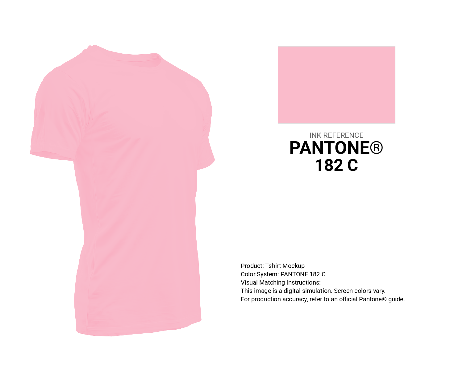
#fabbcb Pantone 182 C Color | Hex color Code #fabbcb T-Shirt Mockup
Download T-Shirt Mockup
#fabbcb Pantone 182 C Color | Hex color Code #fabbcb Printing Artwork Pantone Reference
Download Pantone Printing ReferenceRelated Color Palettes
- Deep Pink and Dim Gray •
- Light Pink and Dark Olive Green •
- Cannon Pink •
- Shocking Pink •
- Careys Pink •
- Light Pink and Indian Red •
- Carnation Pink •
- Brown and Light Pink •
- Rosy Brown and Light Pink •
- Solid Pink •
- Dark Olive Green and Deep Pink •
- Salmon and Light Pink •
- Deep Pink and Midnight Blue •
- Deep Pink and Tomato •
- Deep Pink
Color Palette Collection
65 Red Color Palettes
65 color palettes with 325 colors.

33 Blue Color Schemes
33 color palettes with 165 colors.
ERGO
1 color palettes with 5 colors.

Color palettes for tshirt
12 color palettes with 60 colors.