Bright Pink Color | fe01b1
Your all-in-one color resource. Download hex background images, Adobe swatches (ASE), PDF color sheets, and SVG files. Explore palettes, harmonies, accessibility, conversions, and professional exports — designed for designers, developers, and color perfectionists.
Choose Color
Selected Color
Recent Colors
Color Details
Similar Ink Alternatives for #FE01B1 color Alternative print inks for reproducing #FE01B1 background image with a similar visual appearance.
Disclaimer: The visually matched ink reference is an independent approximation intended as a guide only. Please be advised that this pantone colors is only intended as a guide, Actual colours will depend on screen calibration variances. The print ink suggestions provided are independent visual approximations and are not affiliated with or endorsed by Pantone LLC. For official color specifications, conversion factors, and comprehensive color system information, please visit Pantone Connect. Official Pantone products can be purchased at pantone.com.
Color Previews for #000000 See how this color looks as a background or as text.
Complete Guide to Your Color Laboratory
Everything you need to know about this professional color toolkit.
Use the Color Picker at the top to select any color. All modules below update instantly.
Workflow: Pick a color → Explore palettes & data → Download what you need (PDF, Image, or Adobe ASE).
Color Details — Your color in all formats: HEX, RGB, RGBA, HSL, HSLA, HSV, CMYK, CIELab, Hunter-Lab, XYZ, Yxy, YUV. One-click copy.
Color Psychology — Emotional impact, cultural meanings, physiological effects, branding applications, and historical significance.
Named Colors — Find official color names (HTML/CSS, Pantone) that match your selection with similarity percentages.
Light & Dark Shades
80-step gradient from black to white. Perfect for button states and component systems.
Tints
Color mixed with white → lighter, pastel variations for backgrounds and disabled states.
Monochromatic — 11 curated tints/shades from one color. Production-ready for design systems.
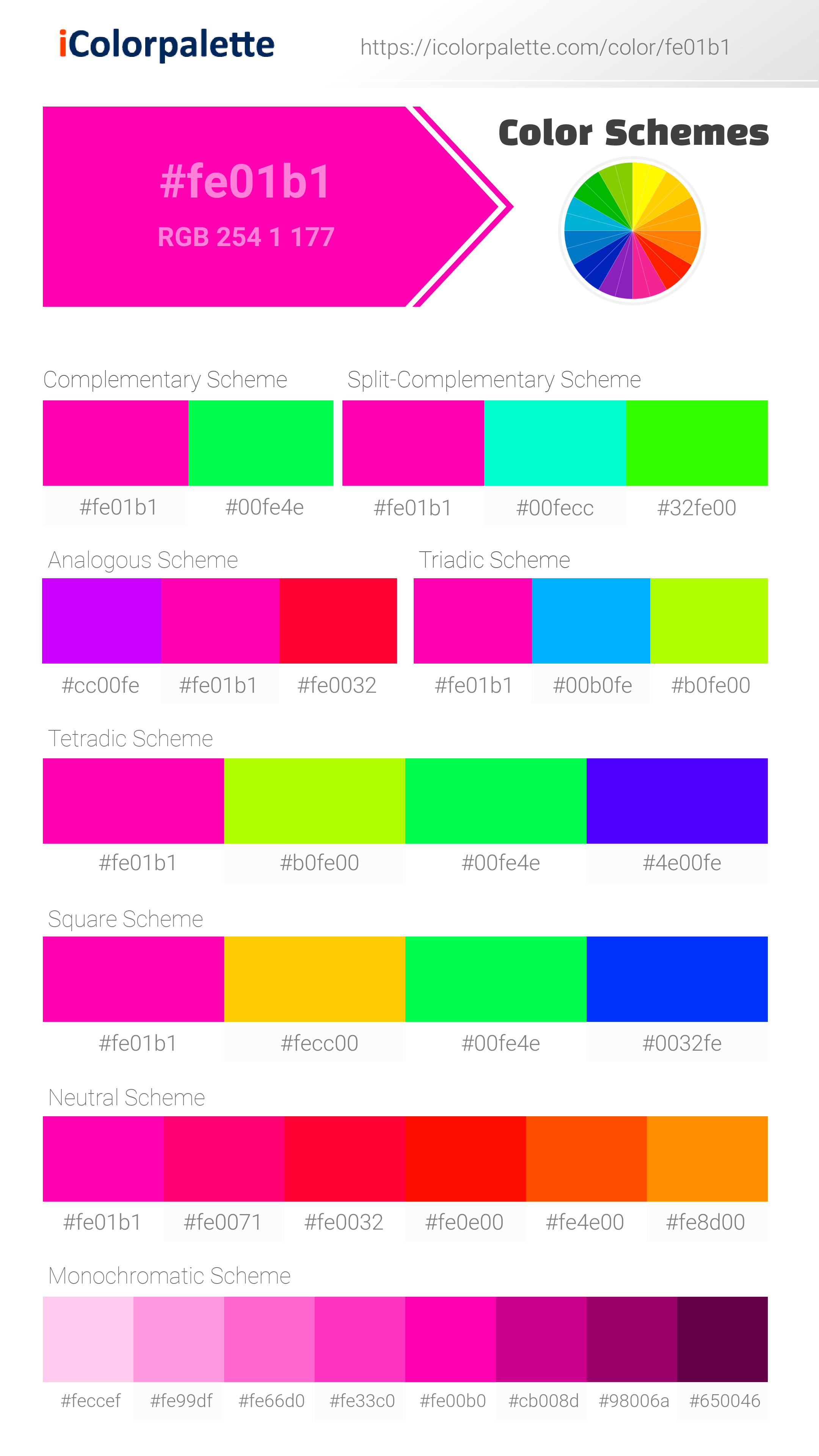
- Complementary — Opposite on wheel (180°). High contrast.
- Analogous — Neighbors (±30°). Harmonious flow.
- Triadic — Three colors (120° apart). Vibrant, balanced.
- Split-Complementary — Base + two near-complements. Softer contrast.
- Tetradic/Square — Four colors. Complex, maximum variety.
- Neutral — Desaturated versions. Subtle, sophisticated.
15 Professional Variations — Monochromatic, Analogous, Complementary, Warm/Cool/Earth Tones, Pastel, Vibrant, High Contrast, and more.
Color Infusion — 10 palettes showing your color morphing into each major hue. Find bridge colors.
Similar Colors — 60+ colors generated via CIELAB Delta E matching. Unexpected harmonious combinations.
18 Ready-to-Use Gradients — Complementary, Analogous, Triadic, Tint/Shade progressions, and more.
Downloads: PNG (2560×1440), CSS (production-ready code), SVG (scalable vector).
WCAG Contrast Checker — Tests your color against white, black, and custom colors for AA (4.5:1) and AAA (7:1) compliance. Large text thresholds included.
Harmony & Accessibility Guide — Tests against 10 canonical hues. Shows which pairs are both beautiful AND WCAG-compliant for text.
PNG/JPG — High-res images for presentations and mood boards.
PDF — Print-ready reports for clients and teams.
Adobe ASE — Direct import to Photoshop, Illustrator, InDesign, XD.
CSS/SVG — Gradients only. Production-ready code and vectors.
Color Science: Industry-standard conversions (HSL, CIELAB, CMYK, XYZ). WCAG 2.1 luminance formula. Delta E (ΔE76) for perceptual matching.
Direct Links: Share colors via icolorpalette.com/color/ff5733 or icolorpalette.com/color/red
Issues? Refresh the page, wait for rendering, try another browser, or check console (F12) for errors.
Bright Pink Color: A Vibrant and Playful Hue | #fe01b1
Introduction:
Bright Pink Color, also known as #fe01b1, is a shade that exudes vibrancy and playfulness. Its energetic appeal captures attention and brings a sense of excitement to any visual composition.
Historical Significance:
Key Moments in History: Throughout history, Bright Pink Color has been utilized prominently in various cultural contexts. From the vibrant fashion trends of the 1980s to the iconic branding of candy companies, this color has left its mark on popular culture and design.
Symbolism and Meaning:
Symbolism: Bright Pink Color typically symbolizes joy, femininity, and creativity. In various cultures, it represents love, compassion, and sensuality. Its bold and captivating nature evokes a sense of optimism and enthusiasm.
Bright Pink Color in Fashion:
Impact on Fashion: Bright Pink Color has played a significant role in shaping fashion trends. It has been embraced by designers to create bold and eye-catching garments that make a statement. The color is often associated with fun, confidence, and femininity, and can be seen in various fashion collections.
Bright Pink Color in Graphic Design:
Design Aesthetics and Visual Impact: In graphic design, Bright Pink Color adds a pop of energy and excitement. It is commonly used to create attention-grabbing visuals and to convey a sense of youthfulness and modernity. Its vibrant and bold nature makes it a popular choice for brands aiming to make a memorable impression.
Color Combinations:
Potential Color Combinations: Bright Pink Color can be paired with various colors to create visually appealing combinations. Some popular options include Bright Pink and Purple, Bright Pink and Gold, Bright Pink and Navy Blue, and Bright Pink and Lime Green.
Nature’s Palette:
Natural Occurrences: While Bright Pink Color is not commonly found in nature, it can be seen in vibrant flowers like orchids and roses. It adds a splash of color to the natural world, creating beautiful and captivating floral displays.
Artistic Representations:
In Art: Bright Pink Color has been used by artists in various forms of art to convey emotions and create visually striking compositions. Its bold and lively qualities allow artists to capture attention and evoke specific feelings in their audiences.
Movies and Cinematic Landscapes:
Setting the Tone: Bright Pink Color often sets the tone or mood in movies and cinematic landscapes. It is frequently used in romantic comedies or scenes that aim to convey a sense of joy, whimsy, or youthful energy. Its striking presence adds visual depth and enhances the overall cinematic experience.
Products and Commercial Appeal:
Popular Products and Brands: Bright Pink Color is often associated with popular products and brands that aim to capture attention and stand out. From cosmetics to children's toys, this color is used to create a strong visual impact and appeal to consumers, particularly those seeking vibrant and energetic choices.
National Symbols and Significance:
Cultural Significance: While Bright Pink Color may not have specific national symbolisms tied to it, it often represents femininity and youthfulness in many cultures. It is embraced as a symbol of celebration, joy, and individuality.
The Psychological and Emotional Impact:
Influence on Emotions and Perceptions: Bright Pink Color influences emotions and perceptions psychologically. It can evoke feelings of happiness, excitement, and optimism. This color is often associated with warmth, love, and passion, creating a positive and energetic atmosphere.
Conclusion:
In summary, Bright Pink Color, with its vibrant and playful nature, has left an indelible mark on various aspects of our lives. From fashion to design, this color brings energy and a sense of joy. Its historical significance, timeless appeal, and psychological impact make it a cherished hue that continues to captivate and inspire.
Bright Pink Color | Hex fe01b1 Image & Artwork
Download high-quality assets for your projects.
#fe01b1 Color Schemes
Download Color Schemes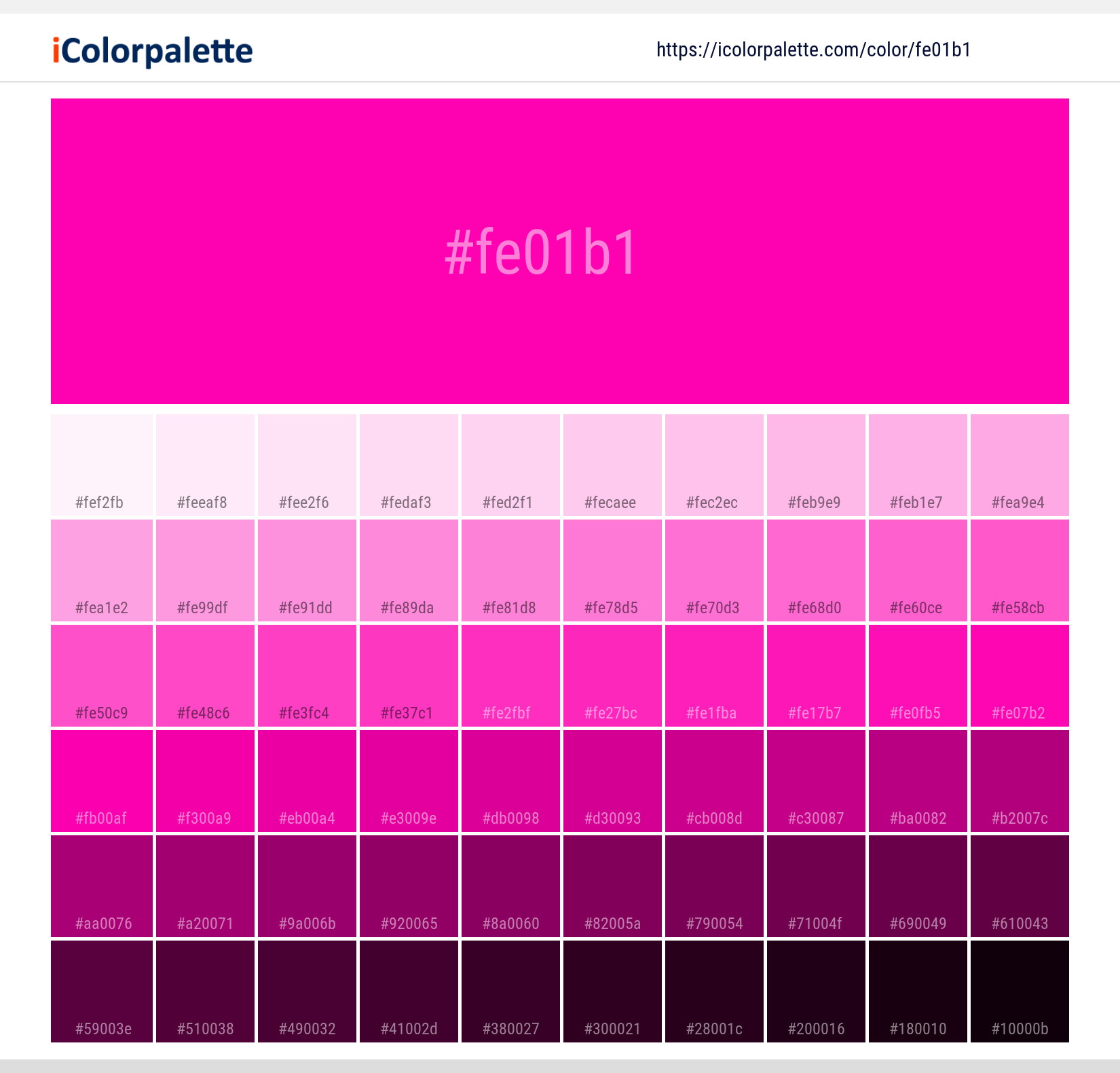
#fe01b1 Color Shades
Download Color Shades
Bright Pink Color | Hex fe01b1 Solid Color Background
Download Solid Color
Bright Pink - #fe01b1 Color Name
Download Color NameRelated Color Palettes
- Red Color Palettes • Green Color Palettes • Purple Color Palettes • Pink Color Palettes • Orange Color Palettes • Blue Color Palettes • Yellow Color Palettes • Brown Color Palettes • Gray Color Palettes • Beige Color Palettes • Turquoise Color Palettes
Color Palette Collection

46 Indigo Color Palettes
46 color palettes with 230 colors.

29 Pink Color Palettes for your next design project
29 color palettes with 145 colors.

50 Color Palettes inspired by Sky
50 color palettes with 250 colors.

50 Green Color Palettes
50 color palettes with 250 colors.