Pale Turquoise Color | afeeee
Your all-in-one color resource. Download hex background images, Adobe swatches (ASE), PDF color sheets, and SVG files. Explore palettes, harmonies, accessibility, conversions, and professional exports — designed for designers, developers, and color perfectionists.
Choose Color
Selected Color
Recent Colors
Color Details
Similar Ink Alternatives for #AFEEEE color Alternative print inks for reproducing #AFEEEE background image with a similar visual appearance.
Disclaimer: The visually matched ink reference is an independent approximation intended as a guide only. Please be advised that this pantone colors is only intended as a guide, Actual colours will depend on screen calibration variances. The print ink suggestions provided are independent visual approximations and are not affiliated with or endorsed by Pantone LLC. For official color specifications, conversion factors, and comprehensive color system information, please visit Pantone Connect. Official Pantone products can be purchased at pantone.com.
Color Previews for #000000 See how this color looks as a background or as text.
Complete Guide to Your Color Laboratory
Everything you need to know about this professional color toolkit.
Use the Color Picker at the top to select any color. All modules below update instantly.
Workflow: Pick a color → Explore palettes & data → Download what you need (PDF, Image, or Adobe ASE).
Color Details — Your color in all formats: HEX, RGB, RGBA, HSL, HSLA, HSV, CMYK, CIELab, Hunter-Lab, XYZ, Yxy, YUV. One-click copy.
Color Psychology — Emotional impact, cultural meanings, physiological effects, branding applications, and historical significance.
Named Colors — Find official color names (HTML/CSS, Pantone) that match your selection with similarity percentages.
Light & Dark Shades
80-step gradient from black to white. Perfect for button states and component systems.
Tints
Color mixed with white → lighter, pastel variations for backgrounds and disabled states.
Monochromatic — 11 curated tints/shades from one color. Production-ready for design systems.
- Complementary — Opposite on wheel (180°). High contrast.
- Analogous — Neighbors (±30°). Harmonious flow.
- Triadic — Three colors (120° apart). Vibrant, balanced.
- Split-Complementary — Base + two near-complements. Softer contrast.
- Tetradic/Square — Four colors. Complex, maximum variety.
- Neutral — Desaturated versions. Subtle, sophisticated.
15 Professional Variations — Monochromatic, Analogous, Complementary, Warm/Cool/Earth Tones, Pastel, Vibrant, High Contrast, and more.
Color Infusion — 10 palettes showing your color morphing into each major hue. Find bridge colors.
Similar Colors — 60+ colors generated via CIELAB Delta E matching. Unexpected harmonious combinations.
18 Ready-to-Use Gradients — Complementary, Analogous, Triadic, Tint/Shade progressions, and more.
Downloads: PNG (2560×1440), CSS (production-ready code), SVG (scalable vector).
WCAG Contrast Checker — Tests your color against white, black, and custom colors for AA (4.5:1) and AAA (7:1) compliance. Large text thresholds included.
Harmony & Accessibility Guide — Tests against 10 canonical hues. Shows which pairs are both beautiful AND WCAG-compliant for text.
PNG/JPG — High-res images for presentations and mood boards.
PDF — Print-ready reports for clients and teams.
Adobe ASE — Direct import to Photoshop, Illustrator, InDesign, XD.
CSS/SVG — Gradients only. Production-ready code and vectors.
Color Science: Industry-standard conversions (HSL, CIELAB, CMYK, XYZ). WCAG 2.1 luminance formula. Delta E (ΔE76) for perceptual matching.
Direct Links: Share colors via icolorpalette.com/color/ff5733 or icolorpalette.com/color/red
Issues? Refresh the page, wait for rendering, try another browser, or check console (F12) for errors.
PaleTurquoise: A Calming and Serene Color | #AFEEEE
Introduction:
PaleTurquoise is a light and delicate color that exudes a sense of calmness and serenity. With its soothing and tranquil qualities, this color brings a refreshing and peaceful atmosphere to any surrounding.
Historical Significance:
PaleTurquoise has been used throughout history in various notable moments. For instance, it was prominently featured in ancient Egyptian artwork, symbolizing water and fertility. During the Renaissance period, this color was often used in religious paintings to depict heavenly realms and divine presence.
Symbolism and Meaning:
PaleTurquoise typically symbolizes tranquility, purity, and emotional balance. In many cultures, it is associated with healing and spiritual growth. This color is also believed to promote clear communication and inspire creativity.
PaleTurquoise in Fashion:
PaleTurquoise has a significant impact on fashion styles and trends. It is often used in spring and summer collections to create a fresh and vibrant look. This color can be found in dresses, blouses, and accessories, adding a touch of elegance and sophistication to any outfit.
PaleTurquoise in Graphic Design:
PaleTurquoise plays a significant role in design aesthetics and branding. Its soft and calming nature makes it a popular choice for creating a clean and modern look. This color is often used in logos, websites, and promotional materials to evoke a sense of trust and reliability.
Color Combinations:
PaleTurquoise pairs well with various colors, enhancing their beauty and creating harmonious combinations. Some examples include PaleTurquoise and white for a clean and fresh look, PaleTurquoise and coral for a vibrant and energetic combination, and PaleTurquoise and silver for a sophisticated and elegant blend.
Nature’s Palette:
PaleTurquoise can be found in nature in the form of turquoise gemstones, tropical waters, and delicate flowers like forget-me-nots. It blends harmoniously with other colors in natural landscapes, creating a tranquil and serene atmosphere.
Artistic Representations:
PaleTurquoise has been used by artists in various forms of art, including paintings, ceramics, and sculptures. Its calming and serene qualities make it a popular choice for creating tranquil and introspective artwork.
Movies and Cinematic Landscapes:
In movies, PaleTurquoise is often used to set a serene and dreamy tone. It can be seen in cinematic landscapes depicting peaceful beach scenes or calming natural environments.
Products and Commercial Appeal:
Many products and brands utilize PaleTurquoise in their branding to convey a sense of calmness and purity. It can be found in cosmetics, home decor, and wellness products, creating an aesthetic that promotes relaxation and well-being.
National Symbols and Significance:
PaleTurquoise holds cultural significance in various countries. In some cultures, it is associated with spirituality and is used in traditional rituals and ceremonies.
The Psychological and Emotional Impact:
PaleTurquoise has a positive psychological impact, promoting feelings of peace, harmony, and emotional balance. It can help reduce stress and anxiety, creating a sense of overall well-being.
Conclusion:
In conclusion, PaleTurquoise is a color that brings a sense of calmness, purity, and tranquility. Its historical significance, timeless appeal, and positive impact on our emotions make it a popular choice in various aspects of life, from fashion and design to art and nature.
Pale Turquoise Color | Hex afeeee Image & Artwork
Download high-quality assets for your projects.

#afeeee Color Schemes
Download Color Schemes
#afeeee Color Shades
Download Color Shades
Pale Turquoise Color | Hex afeeee Solid Color Background
Download Solid Color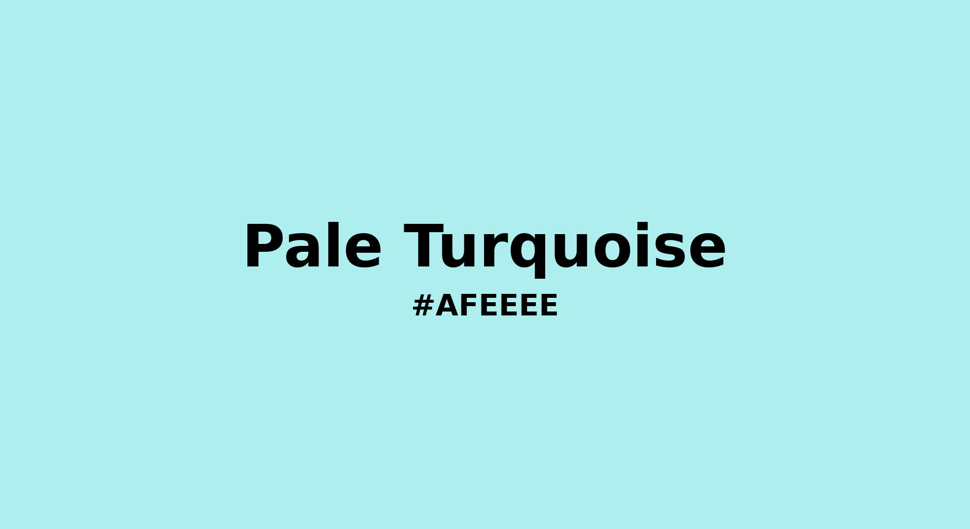
Pale Turquoise - #afeeee Color Name
Download Color NameRelated Color Palettes
- Slate Gray and Beige •
- Beige and Cadet Blue •
- Beige and Olive Drab •
- Olive Drab and Beige •
- Beige and Light Steel Blue •
- Beige and Steel Blue •
- Black and Beige •
- Wheat and Beige •
- Light GoldenrodYellow and Beige •
- Beige and Salmon •
- Linen and Beige •
- Beige and Khaki •
- Light Slate Gray and Beige •
- Peru and Beige •
- Beige and Crimson
Color Palette Collection
ADC Website Accents
1 color palettes with 5 colors.

786 Popular Color Palettes
786 color palettes with 3930 colors.

100 Rose Flower Nature Color Palettes
100 color palettes with 500 colors.

Purple ideas
10 color palettes with 50 colors.