#BDB0D0 Color
Your all-in-one color resource. Download hex background images, Adobe swatches (ASE), PDF color sheets, and SVG files. Explore palettes, harmonies, accessibility, conversions, and professional exports — designed for designers, developers, and color perfectionists.
#BDB0D0 presents a muted, sophisticated palette, reminiscent of a cloudy twilight sky or the delicate petals of a lilac bush fading into the late afternoon light. The color evokes a sense of calm introspection, a quiet elegance, and perhaps a touch of wistful nostalgia. It lacks the vibrancy of stronger hues, suggesting a subdued, contemplative mood. It reminds one of soft, slightly dusty textures, like aged velvet or a time-worn tapestry. In design, this color would work well in spaces intended for relaxation or contemplation, such as a reading nook or a quiet meditation room. Its understated elegance would also suit sophisticated branding or packaging, suggesting refinement and a touch of classic beauty. It lacks strong cultural or symbolic connotations, allowing it to blend subtly into various design contexts. Visually matched named color: Silvered Lilac.
PANTONE 14-3812 TCX
Choose Color
Selected Color
Recent Colors
Color Details
Similar Ink Alternatives for #BDB0D0 color Alternative print inks for reproducing #BDB0D0 background image with a similar visual appearance.
Disclaimer: The visually matched ink reference is an independent approximation intended as a guide only. Please be advised that this pantone colors is only intended as a guide, Actual colours will depend on screen calibration variances. The print ink suggestions provided are independent visual approximations and are not affiliated with or endorsed by Pantone LLC. For official color specifications, conversion factors, and comprehensive color system information, please visit Pantone Connect. Official Pantone products can be purchased at pantone.com.
Color Previews for #000000 See how this color looks as a background or as text.
Complete Guide to Your Color Laboratory
Everything you need to know about this professional color toolkit.
Use the Color Picker at the top to select any color. All modules below update instantly.
Workflow: Pick a color → Explore palettes & data → Download what you need (PDF, Image, or Adobe ASE).
Color Details — Your color in all formats: HEX, RGB, RGBA, HSL, HSLA, HSV, CMYK, CIELab, Hunter-Lab, XYZ, Yxy, YUV. One-click copy.
Color Psychology — Emotional impact, cultural meanings, physiological effects, branding applications, and historical significance.
Named Colors — Find official color names (HTML/CSS, Pantone) that match your selection with similarity percentages.
Light & Dark Shades
80-step gradient from black to white. Perfect for button states and component systems.
Tints
Color mixed with white → lighter, pastel variations for backgrounds and disabled states.
Monochromatic — 11 curated tints/shades from one color. Production-ready for design systems.
- Complementary — Opposite on wheel (180°). High contrast.
- Analogous — Neighbors (±30°). Harmonious flow.
- Triadic — Three colors (120° apart). Vibrant, balanced.
- Split-Complementary — Base + two near-complements. Softer contrast.
- Tetradic/Square — Four colors. Complex, maximum variety.
- Neutral — Desaturated versions. Subtle, sophisticated.
15 Professional Variations — Monochromatic, Analogous, Complementary, Warm/Cool/Earth Tones, Pastel, Vibrant, High Contrast, and more.
Color Infusion — 10 palettes showing your color morphing into each major hue. Find bridge colors.
Similar Colors — 60+ colors generated via CIELAB Delta E matching. Unexpected harmonious combinations.
18 Ready-to-Use Gradients — Complementary, Analogous, Triadic, Tint/Shade progressions, and more.
Downloads: PNG (2560×1440), CSS (production-ready code), SVG (scalable vector).
WCAG Contrast Checker — Tests your color against white, black, and custom colors for AA (4.5:1) and AAA (7:1) compliance. Large text thresholds included.
Harmony & Accessibility Guide — Tests against 10 canonical hues. Shows which pairs are both beautiful AND WCAG-compliant for text.
PNG/JPG — High-res images for presentations and mood boards.
PDF — Print-ready reports for clients and teams.
Adobe ASE — Direct import to Photoshop, Illustrator, InDesign, XD.
CSS/SVG — Gradients only. Production-ready code and vectors.
Color Science: Industry-standard conversions (HSL, CIELAB, CMYK, XYZ). WCAG 2.1 luminance formula. Delta E (ΔE76) for perceptual matching.
Direct Links: Share colors via icolorpalette.com/color/ff5733 or icolorpalette.com/color/red
Issues? Refresh the page, wait for rendering, try another browser, or check console (F12) for errors.
Printing Guide for #bdb0d0 Background Image
Use PANTONE 14-3812 TCX as a visually matched ink reference when printing this background image.
To print the #bdb0d0 background image from our site, consider using PANTONE 14-3812 TCX as a visually matched ink reference.
Download the background image, then provide this reference code to your print vendor to help achieve accurate color reproduction.
The visually matched ink reference for the #bdb0d0 background image is PANTONE 14-3812 TCX.
This color is commonly described as Silvered Lilac.
#BDB0D0 presents a muted, sophisticated palette, reminiscent of a cloudy twilight sky or the delicate petals of a lilac bush fading into the late afternoon light. The color evokes a sense of calm introspection, a quiet elegance, and perhaps a touch of wistful nostalgia. It lacks the vibrancy of stronger hues, suggesting a subdued, contemplative mood. It reminds one of soft, slightly dusty textures, like aged velvet or a time-worn tapestry. In design, this color would work well in spaces intended for relaxation or contemplation, such as a reading nook or a quiet meditation room. Its understated elegance would also suit sophisticated branding or packaging, suggesting refinement and a touch of classic beauty. It lacks strong cultural or symbolic connotations, allowing it to blend subtly into various design contexts.
We provide PANTONE 14-3812 TCX as a visually matched ink reference to help you reproduce the #bdb0d0 background image accurately in professional printing.
This reference code helps print vendors achieve consistent color output across different printing equipment and materials.
After downloading the #bdb0d0 background image from our site:
- Include the visually matched ink reference PANTONE 14-3812 TCX in your print order notes
- Inform your print vendor that this is your target color reference
- Request a proof print to verify the Silvered Lilac color appearance before full production
The #bdb0d0 background image with PANTONE 14-3812 TCX as visually matched ink reference can be used for:
- Posters, banners, and backdrops
- Business cards, brochures, and flyers
- Packaging, labels, and stickers
- Signage and promotional materials
This is an independent visual approximation.
While PANTONE 14-3812 TCX closely matches the #bdb0d0 background image color, variations may exist between screen display and printed output.
We recommend requesting a proof print to verify the final appearance.
#BDB0D0 presents a muted, sophisticated palette, reminiscent of a cloudy twilight sky or the delicate petals of a lilac bush fading into the late afternoon light. The color evokes a sense of calm introspection, a quiet elegance, and perhaps a touch of wistful nostalgia. It lacks the vibrancy of stronger hues, suggesting a subdued, contemplative mood. It reminds one of soft, slightly dusty textures, like aged velvet or a time-worn tapestry. In design, this color would work well in spaces intended for relaxation or contemplation, such as a reading nook or a quiet meditation room. Its understated elegance would also suit sophisticated branding or packaging, suggesting refinement and a touch of classic beauty. It lacks strong cultural or symbolic connotations, allowing it to blend subtly into various design contexts.
Understanding these associations helps ensure the #bdb0d0 background image aligns with your intended message and brand impact.
Important Information
The visually matched ink reference is an independent approximation intended as a guide only.
Actual printed colors may vary depending on screen calibration, substrate material, ink type, and printing equipment used.
For official color specifications and certified color standards, visit Pantone Connect.
Official color guides and swatch books can be purchased from pantone.com.
Pastel Lilac Color: A Subtle Shade of Purple | #BDB0D0
Introduction:
Pastel Lilac is a delicate shade of purple that exudes a sense of serenity and tranquility. It is a soft and soothing color often associated with femininity and elegance.
Historical Significance:
A Popular Color in Rococo Art: Pastel Lilac was prominently used in Rococo art during the 18th century. It was often seen in delicate floral motifs and elegant interior designs, reflecting the opulence and refinement of the period.
Symbolism and Meaning:
Elegance and Grace: Pastel Lilac symbolizes elegance, grace, and sophistication. It is often associated with femininity and romanticism. In some cultures, it represents purity and innocence.
Pastel Lilac in Fashion:
A Popular Spring Color: Pastel Lilac is a popular color in the fashion world, especially during the spring season. It is often used in dresses, blouses, and accessories to create a feminine and fresh look.
Pastel Lilac in Graphic Design:
Soothing and Harmonious: Pastel Lilac is widely used in graphic design to create a calming and harmonious visual experience. It can evoke a sense of tranquility and balance, making it perfect for designs related to wellness and relaxation.
Color Combinations:
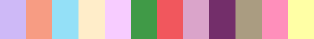
Perfect Combinations: Pastel Lilac pairs well with other pastel shades, such as blush pink, mint green, and baby blue. It also works beautifully with neutrals like gray and beige.
Nature’s Palette:
A Hint of Lilac in Flowers: Lilac flowers, with their delicate and fragrant blooms, naturally exhibit shades of pastel lilac. They add a touch of elegance and beauty to gardens and landscapes.
Artistic Representations:
Pastel Lilac in Impressionist Paintings: Pastel Lilac has been featured in various Impressionist paintings, where it is used to depict soft and dreamy scenes. It adds a sense of romanticism and tranquility to the artwork.
Movies and Cinematic Landscapes:
A Subtle Touch in Cinematography: Pastel Lilac is often used in movies to create a dreamy and ethereal atmosphere. It can be seen in scenes depicting fantasy worlds or romantic moments.
Products and Commercial Appeal:
Feminine and Elegant Branding: Pastel Lilac is often used in branding for products aimed at a female audience. It represents femininity, elegance, and sophistication, making it popular in cosmetics, fashion, and interior design industries.
National Symbols and Significance:
Lilac as a Symbol of Youth: In some cultures, the lilac flower is considered a symbol of youth and renewal. It represents the freshness and vitality of young age.
The Psychological and Emotional Impact:
Calming and Soothing: Pastel Lilac has a calming effect on the mind and can promote relaxation and stress relief. It is often used in therapeutic settings to create a peaceful environment.
Conclusion:
Pastel Lilac is a timeless color that represents elegance, femininity, and tranquility. It has a rich historical significance, being prominently used in Rococo art. From fashion to graphic design, this delicate shade of purple has a wide range of applications. Its calming and soothing nature makes it a popular choice for creating a serene atmosphere. Whether in nature or art, pastel lilac adds a touch of beauty and grace.
Pantone 14-3812 Tcx Pastel Lilac Color | Hex color Code #bdb0d0 Image & Artwork
Download high-quality assets for your projects.

#bdb0d0 Color Schemes
Download Color Schemes
#bdb0d0 Color Shades
Download Color Shades
Pantone 14-3812 Tcx Pastel Lilac Color | Hex color Code #bdb0d0 Solid Color Background
Download Solid Color
#bdb0d0 Pantone 14-3812 Tcx Pastel Lilac Color | Hex color Code #bdb0d0 Artwork Image (PNG)
Download Artwork (PNG)#bdb0d0 Pantone 14-3812 Tcx Pastel Lilac Color | Hex color Code #bdb0d0 Artwork Vector (PDF)
Download Artwork (PDF)#bdb0d0 Pantone 14-3812 Tcx Pastel Lilac Color | Hex color Code #bdb0d0 Artwork Vector (SVG)
Download Artwork (SVG)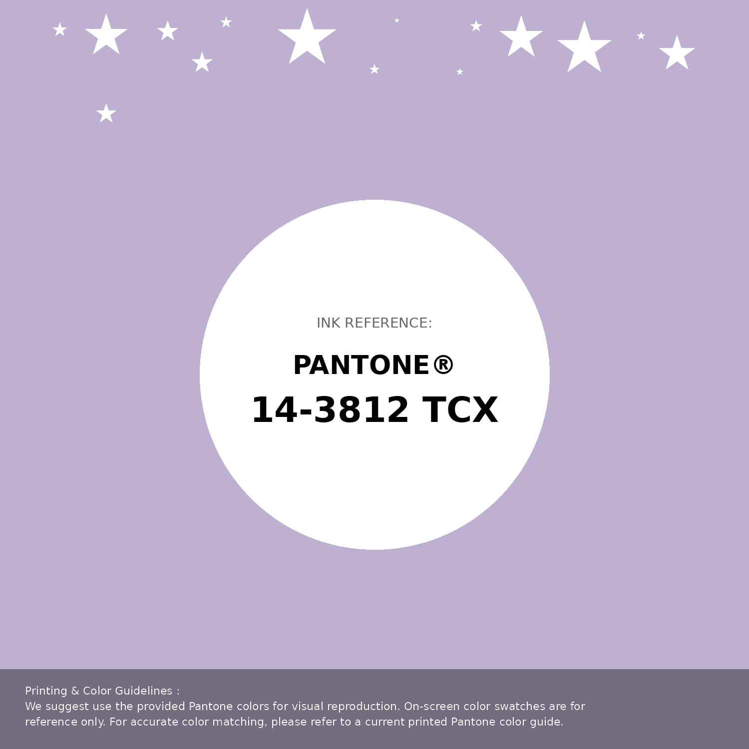
#bdb0d0 Pantone 14-3812 Tcx Pastel Lilac Color | Hex color Code #bdb0d0 Pantone Swatch Artwork
Download Artwork Swatch
#bdb0d0 Pantone 14-3812 Tcx Pastel Lilac Color | Hex color Code #bdb0d0 Gradient Artwork (PNG)
Download Gradient (PNG)#bdb0d0 Pantone 14-3812 Tcx Pastel Lilac Color | Hex color Code #bdb0d0 Gradient Artwork (SVG)
Download Gradient (SVG)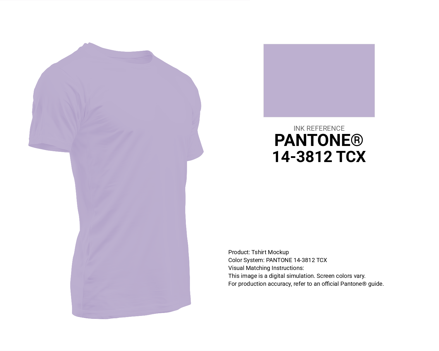
#bdb0d0 Pantone 14-3812 Tcx Pastel Lilac Color | Hex color Code #bdb0d0 T-Shirt Mockup
Download T-Shirt Mockup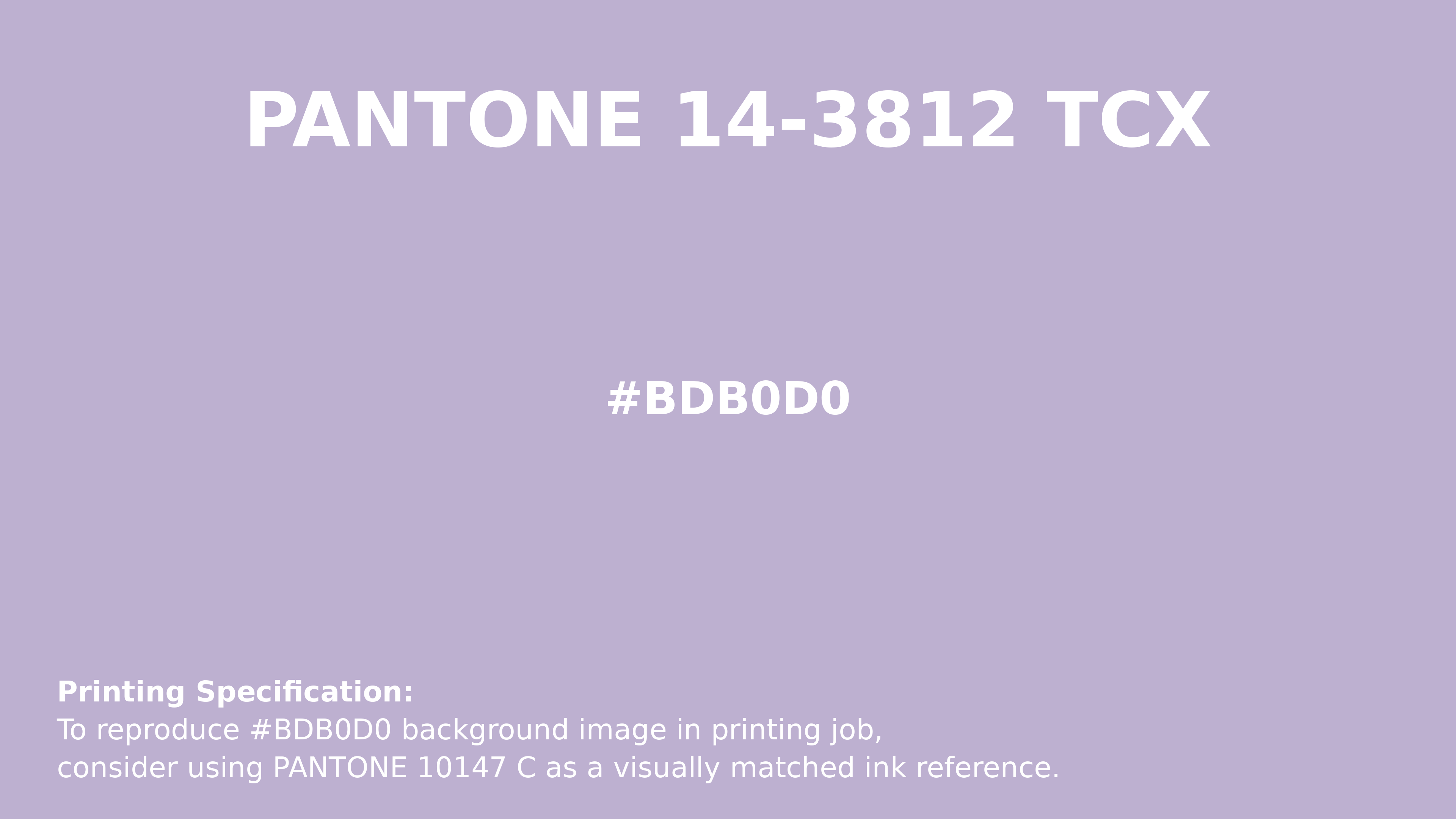
#bdb0d0 Pantone 14-3812 Tcx Pastel Lilac Color | Hex color Code #bdb0d0 Printing Artwork Pantone Reference
Download Pantone Printing Reference
Pastel Lilac - #bdb0d0 Color Name
Download Color NameRelated Color Palettes
- Light Pink and Rosy Brown •
- Rosy Brown and Deep Pink •
- Crimson and Hot Pink •
- Deep Pink and Dark Sea Green •
- Deep Pink and Black •
- Light Pink and Dark Olive Green •
- Dark Sea Green and Hot Pink •
- Tomato and Deep Pink •
- Hot Pink and Hot Pink •
- pink peacock •
- Trendy Pink •
- Your Pink •
- Tan and Deep Pink •
- Deep Pink and Dark Slate Blue •
- Salmon and Light Pink
Color Palette Collection

50 Color Palettes inspired by Sky
50 color palettes with 250 colors.

The Color of Calm: 18 Blue Palettes to Enhance Your Design
18 color palettes with 90 colors.

Light Blue Palettes to Enhance Your Design
13 color palettes with 65 colors.
Light color Palettes
9 color palettes with 45 colors.