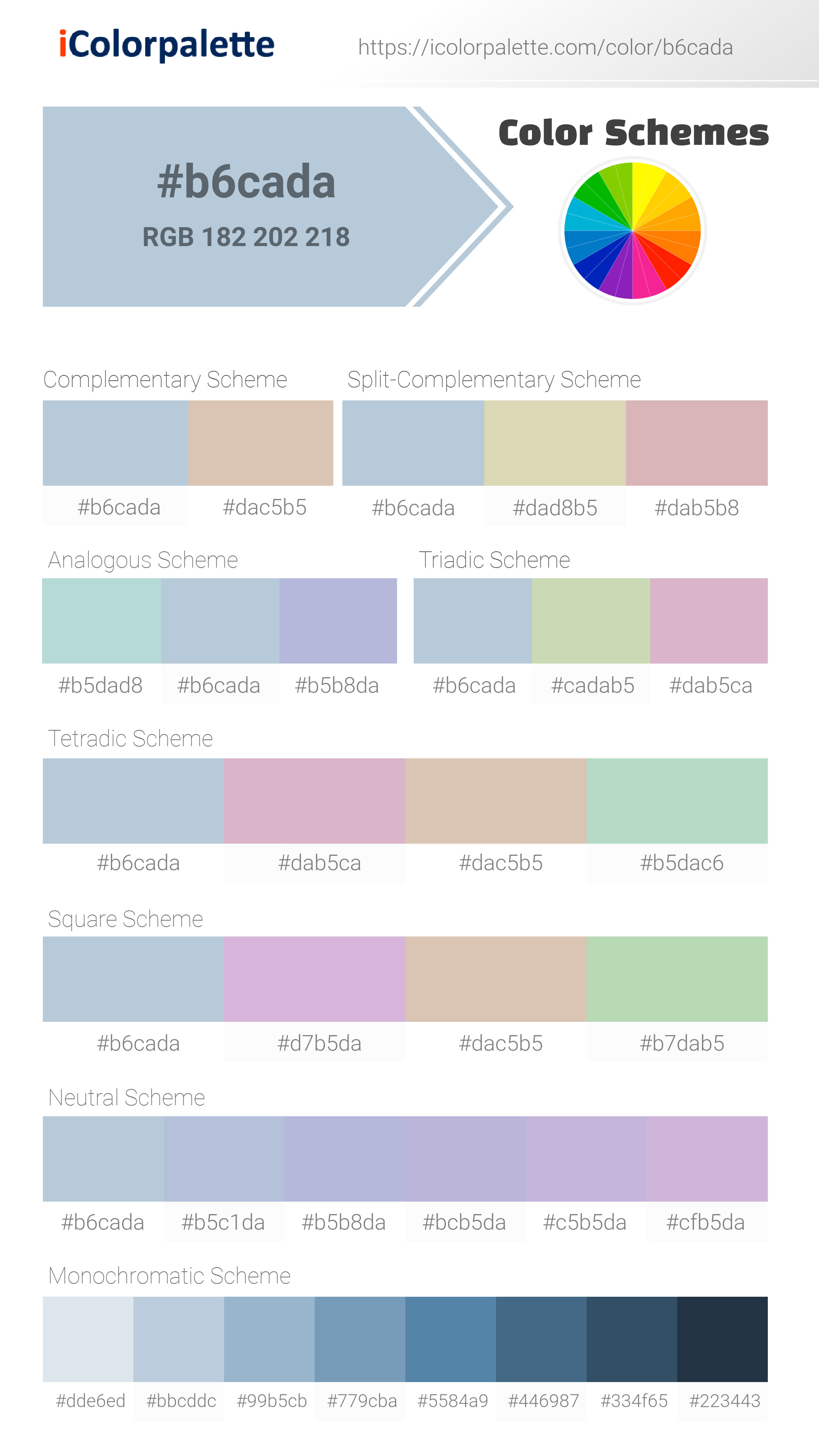
#B6CADA Color
Your all-in-one color resource. Download hex background images, Adobe swatches (ASE), PDF color sheets, and SVG files. Explore palettes, harmonies, accessibility, conversions, and professional exports — designed for designers, developers, and color perfectionists.
#B6CADA is a soft, muted blue-green, like the color of the ocean on a cloudy day. It evokes feelings of tranquility, peace, and a sense of spaciousness. It can suggest trust, stability, and communication. This color is often used in design to create a calm, inviting atmosphere, and is often associated with cleanliness and professionalism. It is reminiscent of the coast, promoting a sense of freedom and clarity. Visually matched named color: Coastal Calm.
PANTONE 13-4308 TPX
Choose Color
Selected Color
Recent Colors
Color Details
Similar Ink Alternatives for #B6CADA color Alternative print inks for reproducing #B6CADA background image with a similar visual appearance.
Disclaimer: The visually matched ink reference is an independent approximation intended as a guide only. Please be advised that this pantone colors is only intended as a guide, Actual colours will depend on screen calibration variances. The print ink suggestions provided are independent visual approximations and are not affiliated with or endorsed by Pantone LLC. For official color specifications, conversion factors, and comprehensive color system information, please visit Pantone Connect. Official Pantone products can be purchased at pantone.com.
Color Previews for #000000 See how this color looks as a background or as text.
Complete Guide to Your Color Laboratory
Everything you need to know about this professional color toolkit.
Use the Color Picker at the top to select any color. All modules below update instantly.
Workflow: Pick a color → Explore palettes & data → Download what you need (PDF, Image, or Adobe ASE).
Color Details — Your color in all formats: HEX, RGB, RGBA, HSL, HSLA, HSV, CMYK, CIELab, Hunter-Lab, XYZ, Yxy, YUV. One-click copy.
Color Psychology — Emotional impact, cultural meanings, physiological effects, branding applications, and historical significance.
Named Colors — Find official color names (HTML/CSS, Pantone) that match your selection with similarity percentages.
Light & Dark Shades
80-step gradient from black to white. Perfect for button states and component systems.
Tints
Color mixed with white → lighter, pastel variations for backgrounds and disabled states.
Monochromatic — 11 curated tints/shades from one color. Production-ready for design systems.
- Complementary — Opposite on wheel (180°). High contrast.
- Analogous — Neighbors (±30°). Harmonious flow.
- Triadic — Three colors (120° apart). Vibrant, balanced.
- Split-Complementary — Base + two near-complements. Softer contrast.
- Tetradic/Square — Four colors. Complex, maximum variety.
- Neutral — Desaturated versions. Subtle, sophisticated.
15 Professional Variations — Monochromatic, Analogous, Complementary, Warm/Cool/Earth Tones, Pastel, Vibrant, High Contrast, and more.
Color Infusion — 10 palettes showing your color morphing into each major hue. Find bridge colors.
Similar Colors — 60+ colors generated via CIELAB Delta E matching. Unexpected harmonious combinations.
18 Ready-to-Use Gradients — Complementary, Analogous, Triadic, Tint/Shade progressions, and more.
Downloads: PNG (2560×1440), CSS (production-ready code), SVG (scalable vector).
WCAG Contrast Checker — Tests your color against white, black, and custom colors for AA (4.5:1) and AAA (7:1) compliance. Large text thresholds included.
Harmony & Accessibility Guide — Tests against 10 canonical hues. Shows which pairs are both beautiful AND WCAG-compliant for text.
PNG/JPG — High-res images for presentations and mood boards.
PDF — Print-ready reports for clients and teams.
Adobe ASE — Direct import to Photoshop, Illustrator, InDesign, XD.
CSS/SVG — Gradients only. Production-ready code and vectors.
Color Science: Industry-standard conversions (HSL, CIELAB, CMYK, XYZ). WCAG 2.1 luminance formula. Delta E (ΔE76) for perceptual matching.
Direct Links: Share colors via icolorpalette.com/color/ff5733 or icolorpalette.com/color/red
Issues? Refresh the page, wait for rendering, try another browser, or check console (F12) for errors.
Printing Guide for #b6cada Background Image
Use PANTONE 13-4308 TPX as a visually matched ink reference when printing this background image.
To print the #b6cada background image from our site, consider using PANTONE 13-4308 TPX as a visually matched ink reference.
Download the background image, then provide this reference code to your print vendor to help achieve accurate color reproduction.
The visually matched ink reference for the #b6cada background image is PANTONE 13-4308 TPX.
This color is commonly described as Coastal Calm.
#B6CADA is a soft, muted blue-green, like the color of the ocean on a cloudy day. It evokes feelings of tranquility, peace, and a sense of spaciousness. It can suggest trust, stability, and communication. This color is often used in design to create a calm, inviting atmosphere, and is often associated with cleanliness and professionalism. It is reminiscent of the coast, promoting a sense of freedom and clarity.
We provide PANTONE 13-4308 TPX as a visually matched ink reference to help you reproduce the #b6cada background image accurately in professional printing.
This reference code helps print vendors achieve consistent color output across different printing equipment and materials.
After downloading the #b6cada background image from our site:
- Include the visually matched ink reference PANTONE 13-4308 TPX in your print order notes
- Inform your print vendor that this is your target color reference
- Request a proof print to verify the Coastal Calm color appearance before full production
The #b6cada background image with PANTONE 13-4308 TPX as visually matched ink reference can be used for:
- Posters, banners, and backdrops
- Business cards, brochures, and flyers
- Packaging, labels, and stickers
- Signage and promotional materials
This is an independent visual approximation.
While PANTONE 13-4308 TPX closely matches the #b6cada background image color, variations may exist between screen display and printed output.
We recommend requesting a proof print to verify the final appearance.
#B6CADA is a soft, muted blue-green, like the color of the ocean on a cloudy day. It evokes feelings of tranquility, peace, and a sense of spaciousness. It can suggest trust, stability, and communication. This color is often used in design to create a calm, inviting atmosphere, and is often associated with cleanliness and professionalism. It is reminiscent of the coast, promoting a sense of freedom and clarity.
Understanding these associations helps ensure the #b6cada background image aligns with your intended message and brand impact.
Important Information
The visually matched ink reference is an independent approximation intended as a guide only.
Actual printed colors may vary depending on screen calibration, substrate material, ink type, and printing equipment used.
For official color specifications and certified color standards, visit Pantone Connect.
Official color guides and swatch books can be purchased from pantone.com.
Pantone 13-4308 TPX Baby Blue Color: Assign Creative Related Color Title | #B6CADA
Introduction:
Baby Blue Color is a soft, pastel shade that resembles the color of a clear sky on a sunny day. It exudes a sense of calmness, tranquility, and innocence. Its light and airy nature make it a popular choice for various applications, including fashion, graphic design, and interior design.
Historical Significance:
Key moments in history where Baby Blue Color was prominently used or played a significant role: Baby Blue Color gained popularity in the 1950s during the post-war era. It was often used in baby clothing, nursery decorations, and advertisements, symbolizing purity, innocence, and the arrival of a new generation. In the 1960s, Baby Blue Color became associated with the mod fashion trend, representing youthfulness and a break from traditional norms. It has since remained a timeless and beloved color choice in various fields.
Symbolism and Meaning:
What Baby Blue Color typically symbolizes in various cultures or contexts: Baby Blue Color is often associated with baby boys and is commonly used in baby showers, birth announcements, and nurseries. It symbolizes innocence, purity, and new beginnings. In some cultures, it is also associated with peacefulness and tranquility.
Baby Blue Color in Fashion:
How Baby Blue Color impacts styles and trends in the fashion world: Baby Blue Color is often used in spring and summer collections, bringing a fresh and light vibe to outfits. It is commonly seen in dresses, shirts, and accessories. Its pastel hue adds a touch of femininity and elegance to fashion designs.
Baby Blue Color in Graphic Design:
Significance of Baby Blue Color in design aesthetics, branding, and visual impact: Baby Blue Color is often used in various design projects to evoke feelings of calmness, serenity, and trust. It is commonly used in branding for baby-related products, healthcare companies, and spa businesses. In graphic design, it can be used as a background color or to highlight certain elements.
Color Combinations:
Potential color combinations that go well with Baby Blue Color: Baby Blue Color pairs well with soft pastel shades, such as pale pink, mint green, and lavender. It also complements neutrals like white, cream, and light gray.
Nature’s Palette:
Natural occurrences of Baby Blue Color: Baby Blue Color can be found in various natural elements, such as blue skies, clear ocean waters, and certain flower petals. It is also seen in some species of birds, butterflies, and fish.
Artistic Representations:
How Baby Blue Color has been used in various forms of art over time: Baby Blue Color has been a popular choice among artists, especially in abstract and contemporary art. It is often used to create a sense of lightness and tranquility in paintings, sculptures, and installations.
Movies and Cinematic Landscapes:
Movies or scenes where Baby Blue Color sets the tone or mood: Baby Blue Color is often used in dreamy and nostalgic movie scenes. It creates a sense of innocence, nostalgia, and romance. Examples include "La La Land" and "The Notebook," where Baby Blue Color plays a significant role in creating a whimsical atmosphere.
Products and Commercial Appeal:
Popular products or brands associated with Baby Blue Color: Baby Blue Color is commonly used in baby products, such as clothing, toys, and nursery furniture. It is also often seen in beauty and skincare products, conveying a sense of purity and gentleness. Some popular brands known for their use of Baby Blue Color include Tiffany & Co., which uses it in their iconic packaging, and Johnson's Baby, known for their Baby Blue Color branding.
National Symbols and Significance:
Any national or cultural significance tied to Baby Blue Color: Baby Blue Color is not generally associated with specific national symbols. However, it is often used in flags, sports team logos, and other national emblems to represent peace, harmony, and unity.
The Psychological and Emotional Impact:
How Baby Blue Color influences emotions or perceptions psychologically: Baby Blue Color is known to have a calming and soothing effect on the mind. It can induce feelings of relaxation, peace, and tranquility. It is often used in therapeutic environments to create a sense of serenity.
Conclusion:
Baby Blue Color, also known as Pantone 13-4308 TPX, holds a significant place in various fields and industries. Its historical relevance, timeless appeal, and associations with innocence and tranquility make it a beloved choice for fashion, graphic design, and other creative endeavors.
Pantone 13-4308 Tpx Baby Blue Color | Hex color Code #b6cada Image & Artwork
Download high-quality assets for your projects.
#b6cada Color Schemes
Download Color Schemes
#b6cada Color Shades
Download Color Shades
Pantone 13-4308 Tpx Baby Blue Color | Hex color Code #b6cada Solid Color Background
Download Solid Color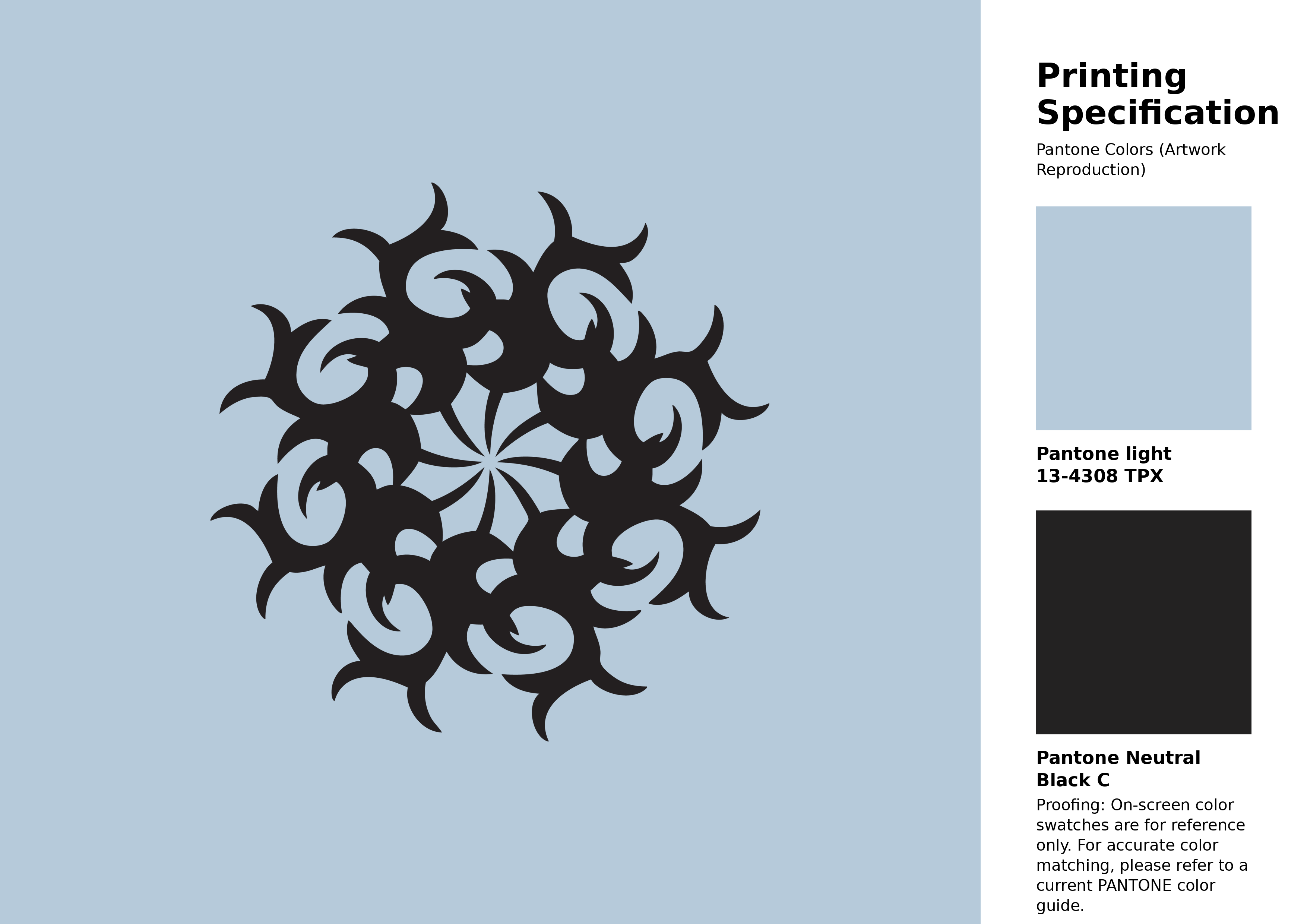
#b6cada Pantone 13-4308 Tpx Baby Blue Color | Hex color Code #b6cada Artwork Image (PNG)
Download Artwork (PNG)#b6cada Pantone 13-4308 Tpx Baby Blue Color | Hex color Code #b6cada Artwork Vector (PDF)
Download Artwork (PDF)#b6cada Pantone 13-4308 Tpx Baby Blue Color | Hex color Code #b6cada Artwork Vector (SVG)
Download Artwork (SVG)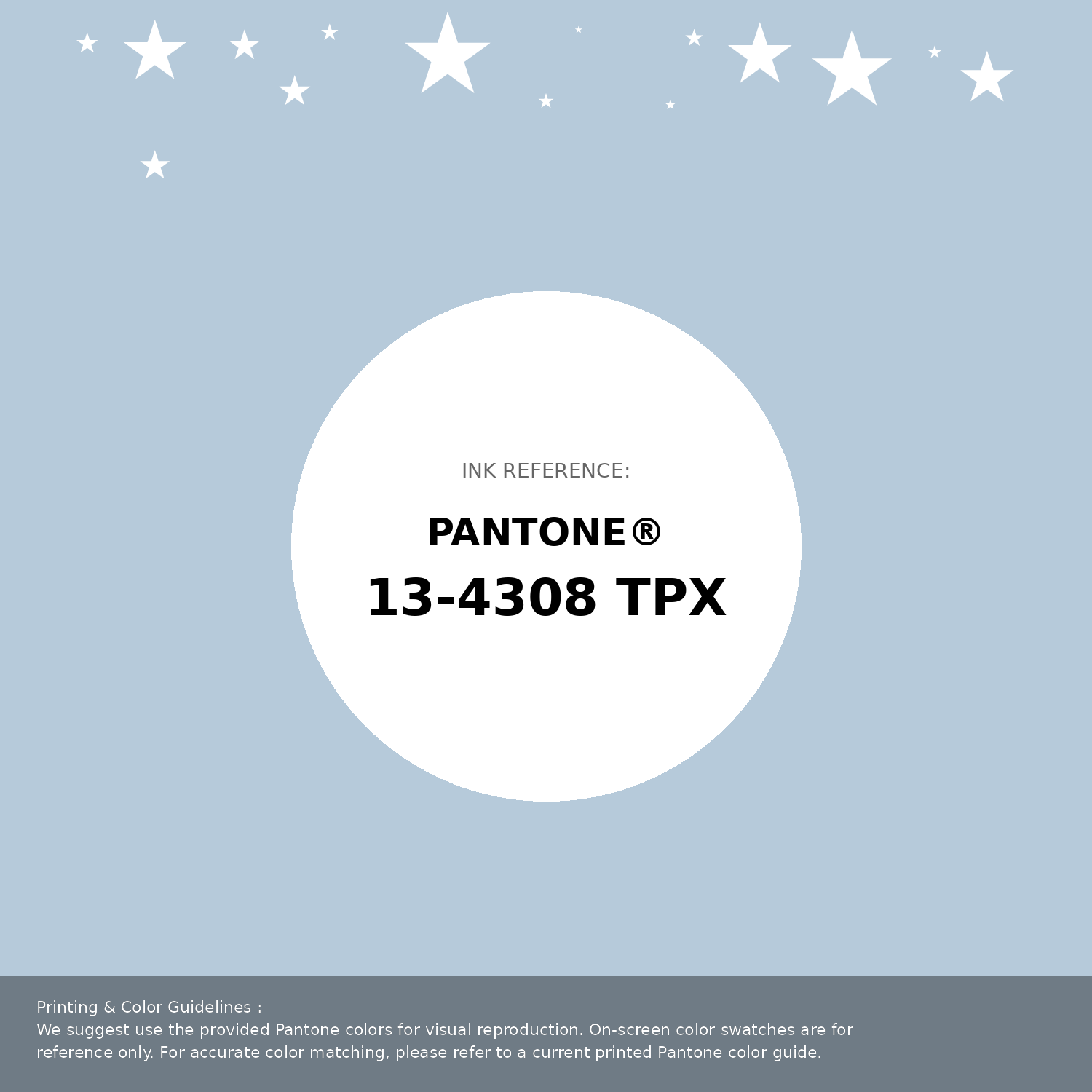
#b6cada Pantone 13-4308 Tpx Baby Blue Color | Hex color Code #b6cada Pantone Swatch Artwork
Download Artwork Swatch
#b6cada Pantone 13-4308 Tpx Baby Blue Color | Hex color Code #b6cada Gradient Artwork (PNG)
Download Gradient (PNG)#b6cada Pantone 13-4308 Tpx Baby Blue Color | Hex color Code #b6cada Gradient Artwork (SVG)
Download Gradient (SVG)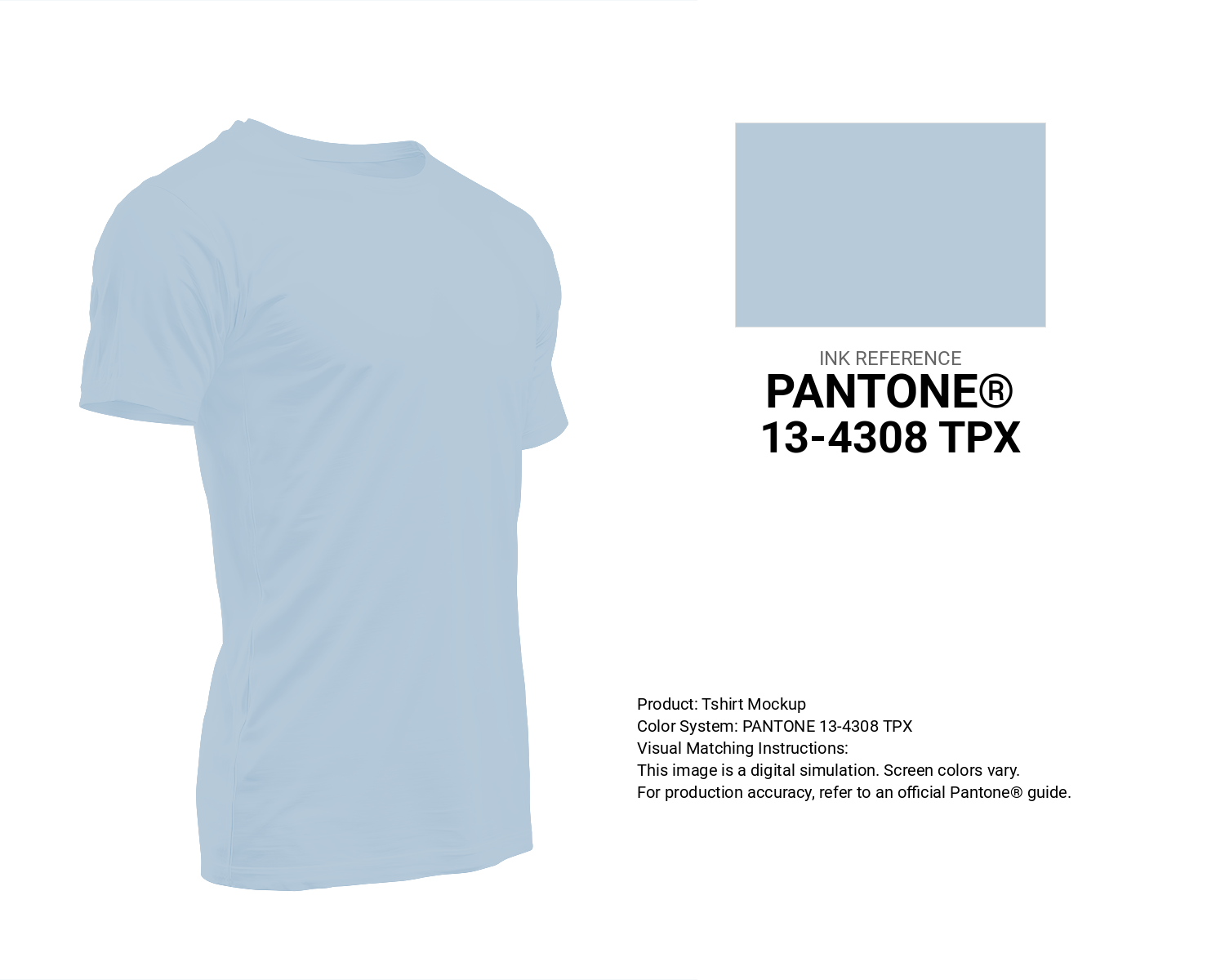
#b6cada Pantone 13-4308 Tpx Baby Blue Color | Hex color Code #b6cada T-Shirt Mockup
Download T-Shirt Mockup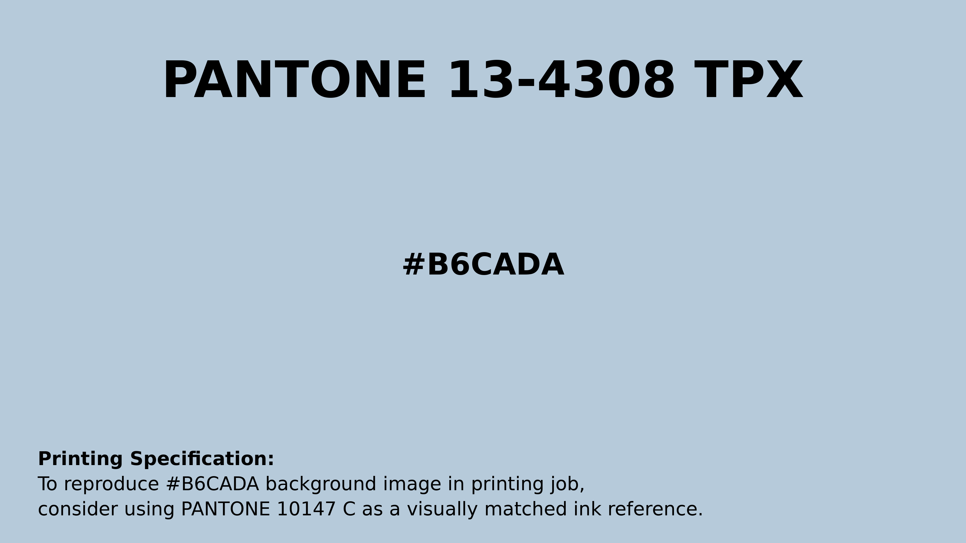
#b6cada Pantone 13-4308 Tpx Baby Blue Color | Hex color Code #b6cada Printing Artwork Pantone Reference
Download Pantone Printing ReferenceRelated Color Palettes
- Pink Flare •
- Deep Pink and Dark Slate Blue •
- Brown and Light Pink •
- Careys Pink •
- Medium Violet Red and Hot Pink •
- Hot Pink and Deep Pink •
- Dark Sea Green and Deep Pink •
- Deep Pink and Sandy Brown •
- Trendy Pink •
- Dawn Pink •
- Pink •
- Sea Pink •
- Brown and Hot Pink •
- Pink Lace •
- Pale Violet Red and Light Pink
Color Palette Collection

50 Red color palettes
50 color palettes with 250 colors.
Burnt orange
25 color palettes with 125 colors.

Child Theme Colors
5 color palettes with 25 colors.
Forest Theme colors
15 color palettes with 75 colors.