#9FC131 Color
Your all-in-one color resource. Download hex background images, Adobe swatches (ASE), PDF color sheets, and SVG files. Explore palettes, harmonies, accessibility, conversions, and professional exports — designed for designers, developers, and color perfectionists.
#9FC131 is a vibrant, yet calming, yellowish-green. Its emotional impact is one of optimism, freshness, and new beginnings, reminiscent of a lush spring meadow bathed in sunlight. The color evokes feelings of growth, vitality, and hope. It reminds one of blooming flowers, young leaves unfurling, and the warmth of the sun on a spring day. The mood it creates is cheerful and invigorating, yet peaceful and balanced. In design, it could be used to create a space that feels both energetic and relaxing, perhaps in a living room or a child's playroom. Culturally, green is often associated with nature, growth, and renewal across many cultures, making #9FC131 particularly versatile and broadly appealing. Visually matched named color: Spring Meadow.
PANTONE 14-0452 TCX
Choose Color
Selected Color
Recent Colors
Color Details
Similar Ink Alternatives for #9FC131 color Alternative print inks for reproducing #9FC131 background image with a similar visual appearance.
Disclaimer: The visually matched ink reference is an independent approximation intended as a guide only. Please be advised that this pantone colors is only intended as a guide, Actual colours will depend on screen calibration variances. The print ink suggestions provided are independent visual approximations and are not affiliated with or endorsed by Pantone LLC. For official color specifications, conversion factors, and comprehensive color system information, please visit Pantone Connect. Official Pantone products can be purchased at pantone.com.
Color Previews for #000000 See how this color looks as a background or as text.
Complete Guide to Your Color Laboratory
Everything you need to know about this professional color toolkit.
Use the Color Picker at the top to select any color. All modules below update instantly.
Workflow: Pick a color → Explore palettes & data → Download what you need (PDF, Image, or Adobe ASE).
Color Details — Your color in all formats: HEX, RGB, RGBA, HSL, HSLA, HSV, CMYK, CIELab, Hunter-Lab, XYZ, Yxy, YUV. One-click copy.
Color Psychology — Emotional impact, cultural meanings, physiological effects, branding applications, and historical significance.
Named Colors — Find official color names (HTML/CSS, Pantone) that match your selection with similarity percentages.
Light & Dark Shades
80-step gradient from black to white. Perfect for button states and component systems.
Tints
Color mixed with white → lighter, pastel variations for backgrounds and disabled states.
Monochromatic — 11 curated tints/shades from one color. Production-ready for design systems.
- Complementary — Opposite on wheel (180°). High contrast.
- Analogous — Neighbors (±30°). Harmonious flow.
- Triadic — Three colors (120° apart). Vibrant, balanced.
- Split-Complementary — Base + two near-complements. Softer contrast.
- Tetradic/Square — Four colors. Complex, maximum variety.
- Neutral — Desaturated versions. Subtle, sophisticated.
15 Professional Variations — Monochromatic, Analogous, Complementary, Warm/Cool/Earth Tones, Pastel, Vibrant, High Contrast, and more.
Color Infusion — 10 palettes showing your color morphing into each major hue. Find bridge colors.
Similar Colors — 60+ colors generated via CIELAB Delta E matching. Unexpected harmonious combinations.
18 Ready-to-Use Gradients — Complementary, Analogous, Triadic, Tint/Shade progressions, and more.
Downloads: PNG (2560×1440), CSS (production-ready code), SVG (scalable vector).
WCAG Contrast Checker — Tests your color against white, black, and custom colors for AA (4.5:1) and AAA (7:1) compliance. Large text thresholds included.
Harmony & Accessibility Guide — Tests against 10 canonical hues. Shows which pairs are both beautiful AND WCAG-compliant for text.
PNG/JPG — High-res images for presentations and mood boards.
PDF — Print-ready reports for clients and teams.
Adobe ASE — Direct import to Photoshop, Illustrator, InDesign, XD.
CSS/SVG — Gradients only. Production-ready code and vectors.
Color Science: Industry-standard conversions (HSL, CIELAB, CMYK, XYZ). WCAG 2.1 luminance formula. Delta E (ΔE76) for perceptual matching.
Direct Links: Share colors via icolorpalette.com/color/ff5733 or icolorpalette.com/color/red
Issues? Refresh the page, wait for rendering, try another browser, or check console (F12) for errors.
Printing Guide for #9fc131 Background Image
Use PANTONE 14-0452 TCX as a visually matched ink reference when printing this background image.
To print the #9fc131 background image from our site, consider using PANTONE 14-0452 TCX as a visually matched ink reference.
Download the background image, then provide this reference code to your print vendor to help achieve accurate color reproduction.
The visually matched ink reference for the #9fc131 background image is PANTONE 14-0452 TCX.
This color is commonly described as Spring Meadow.
#9FC131 is a vibrant, yet calming, yellowish-green. Its emotional impact is one of optimism, freshness, and new beginnings, reminiscent of a lush spring meadow bathed in sunlight. The color evokes feelings of growth, vitality, and hope. It reminds one of blooming flowers, young leaves unfurling, and the warmth of the sun on a spring day. The mood it creates is cheerful and invigorating, yet peaceful and balanced. In design, it could be used to create a space that feels both energetic and relaxing, perhaps in a living room or a child's playroom. Culturally, green is often associated with nature, growth, and renewal across many cultures, making #9FC131 particularly versatile and broadly appealing.
We provide PANTONE 14-0452 TCX as a visually matched ink reference to help you reproduce the #9fc131 background image accurately in professional printing.
This reference code helps print vendors achieve consistent color output across different printing equipment and materials.
After downloading the #9fc131 background image from our site:
- Include the visually matched ink reference PANTONE 14-0452 TCX in your print order notes
- Inform your print vendor that this is your target color reference
- Request a proof print to verify the Spring Meadow color appearance before full production
The #9fc131 background image with PANTONE 14-0452 TCX as visually matched ink reference can be used for:
- Posters, banners, and backdrops
- Business cards, brochures, and flyers
- Packaging, labels, and stickers
- Signage and promotional materials
This is an independent visual approximation.
While PANTONE 14-0452 TCX closely matches the #9fc131 background image color, variations may exist between screen display and printed output.
We recommend requesting a proof print to verify the final appearance.
#9FC131 is a vibrant, yet calming, yellowish-green. Its emotional impact is one of optimism, freshness, and new beginnings, reminiscent of a lush spring meadow bathed in sunlight. The color evokes feelings of growth, vitality, and hope. It reminds one of blooming flowers, young leaves unfurling, and the warmth of the sun on a spring day. The mood it creates is cheerful and invigorating, yet peaceful and balanced. In design, it could be used to create a space that feels both energetic and relaxing, perhaps in a living room or a child's playroom. Culturally, green is often associated with nature, growth, and renewal across many cultures, making #9FC131 particularly versatile and broadly appealing.
Understanding these associations helps ensure the #9fc131 background image aligns with your intended message and brand impact.
Important Information
The visually matched ink reference is an independent approximation intended as a guide only.
Actual printed colors may vary depending on screen calibration, substrate material, ink type, and printing equipment used.
For official color specifications and certified color standards, visit Pantone Connect.
Official color guides and swatch books can be purchased from pantone.com.
Lime Green Color: Vibrant and Energizing | #9FC131
Introduction:
Lime Green Color is a bright and vibrant shade that exudes energy and positivity. Its essence lies in its zesty and refreshing visual appeal, making it a popular choice in various contexts.
Historical Significance:
Early Usage: Lime Green Color gained prominence in the 1960s, primarily associated with the psychedelic movement and the vibrant counterculture of the time. Its use in clothing, art, and music reflected the spirit of rebellion and experimentation.
Contemporary Influence: In recent years, Lime Green Color has made a comeback as a popular choice in fashion and design. Its association with environmental consciousness and freshness has contributed to its continued relevance.
Symbolism and Meaning:
Refreshing and Rejuvenating: Lime Green Color symbolizes freshness, growth, and renewal. It is often associated with nature and the regenerative qualities of plants and foliage. In color psychology, Lime Green Color is believed to have a balancing and calming effect on emotions.
Positive Energy: Lime Green Color is also linked to feelings of vitality, optimism, and enthusiasm. Its vibrant hue can uplift moods and create a sense of joy and excitement.
Environmental Awareness: Lime Green Color is commonly associated with environmental and ecological movements, representing sustainability and eco-friendly practices. It is often used to promote initiatives related to conservation and a greener future.
Lime Green Color in Fashion:
Lime Green Color has become a prominent trendsetter in the fashion industry. Its bold and vibrant nature allows it to make a statement in clothing and accessories. Lime Green Color is often used to create eye-catching looks and is particularly popular in activewear and streetwear.
Lime Green Color in Graphic Design:
Lime Green Color plays a significant role in graphic design and branding. Its vibrant and energetic qualities are utilized to grab attention and create a memorable visual impact. Lime Green Color is often employed in designs related to technology, health, and eco-friendly products.
Color Combinations:
Harmonious Combinations: Lime Green Color pairs well with colors such as white, gray, and black, creating a crisp and modern look. It also works harmoniously with shades of blue, creating a refreshing and tranquil combination.
Contrasting Combinations: To create a vibrant and dynamic look, Lime Green Color can be paired with complementary colors such as purple or pink. This combination creates a bold and eye-catching contrast.
Nature’s Palette:
Natural Vibrancy: Lime Green Color can be found in various elements of nature, including vibrant leaves, luscious fruits like limes and kiwis, and certain species of birds and insects. It represents the lushness and vitality of the natural world.
Artistic Representations:
Throughout art history, Lime Green Color has been used to evoke different moods and atmospheres. It has been used by artists to represent growth, renewal, and the lushness of the natural world. From Impressionist landscapes to abstract paintings, Lime Green Color adds a vibrant touch to artistic creations.
Movies and Cinematic Landscapes:
Energetic Aesthetics: Lime Green Color is often used in films and cinematic landscapes to create an energetic and engaging visual experience. It can be seen in scenes that depict vitality, excitement, and the vibrant nature of urban environments.
Products and Commercial Appeal:
Lime Green Color is a popular choice for various products and brands. Its association with freshness, vibrancy, and environmental consciousness makes it appealing to consumers. From sports equipment to household items, Lime Green Color can attract attention and convey a sense of modernity and vitality.
National Symbols and Significance:
National Celebrations: Lime Green Color is often associated with celebrations and festivals in different cultures. In some countries, it represents joy, renewal, and luck. It may be used in traditional costumes, decorations, and flag designs to symbolize national pride and unity.
The Psychological and Emotional Impact:
Lime Green Color has a range of psychological and emotional impacts. It is known to evoke feelings of freshness, energy, and optimism. Lime Green Color can uplift moods, promote creativity, and create a sense of balance and harmony.
Conclusion:
Lime Green Color, with its vibrant and energizing qualities, has a rich historical significance and a timeless appeal. Its association with growth, vitality, and environmental consciousness makes it a versatile and impactful choice in various industries. Whether in fashion, graphic design, or cultural celebrations, Lime Green Color continues to captivate and inspire.
Pantone 14-0452 Tcx Lime Green Color | Hex color Code #9fc131 Image & Artwork
Download high-quality assets for your projects.

#9fc131 Color Schemes
Download Color Schemes
#9fc131 Color Shades
Download Color Shades
Pantone 14-0452 Tcx Lime Green Color | Hex color Code #9fc131 Solid Color Background
Download Solid Color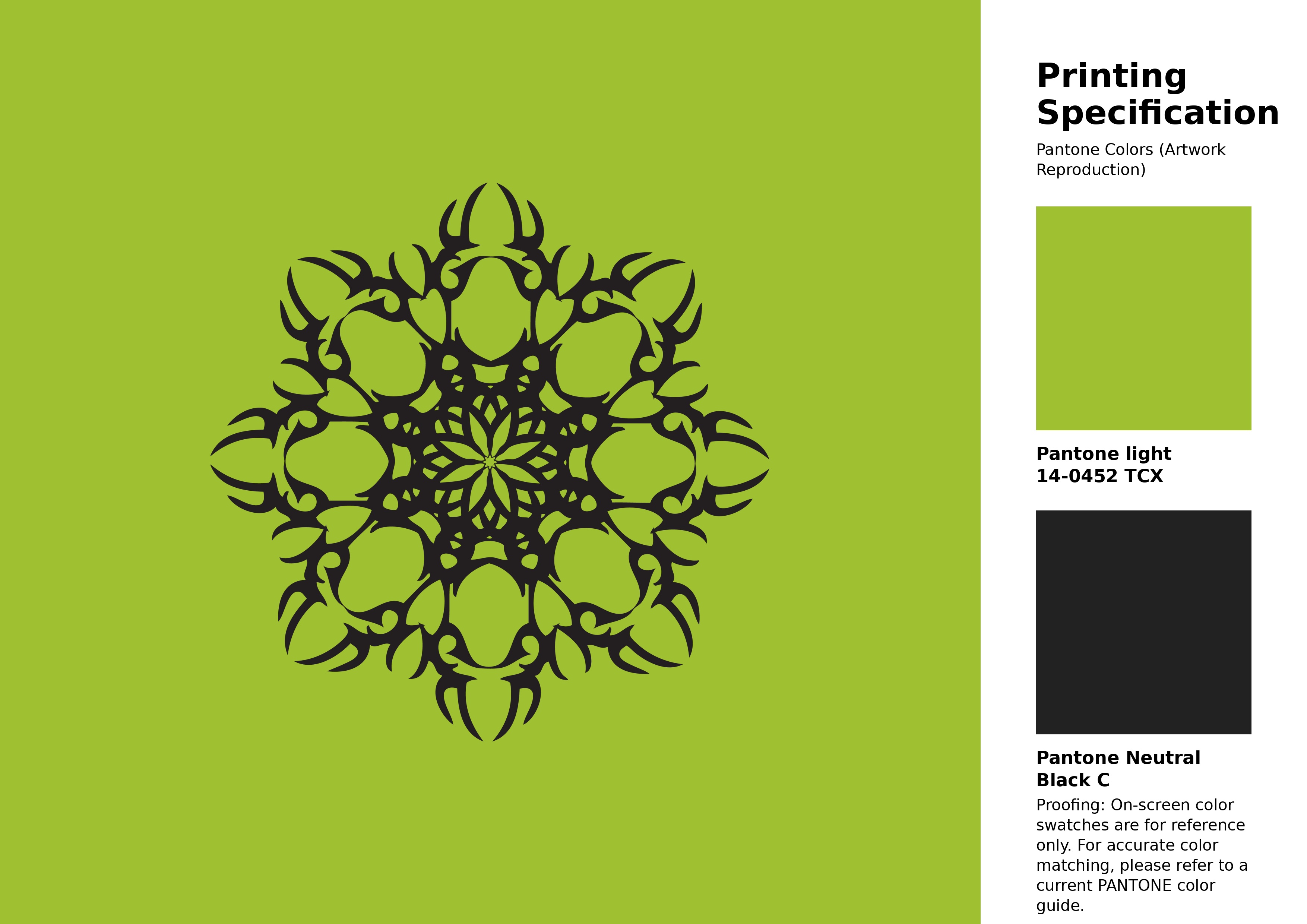
#9fc131 Pantone 14-0452 Tcx Lime Green Color | Hex color Code #9fc131 Artwork Image (PNG)
Download Artwork (PNG)#9fc131 Pantone 14-0452 Tcx Lime Green Color | Hex color Code #9fc131 Artwork Vector (PDF)
Download Artwork (PDF)#9fc131 Pantone 14-0452 Tcx Lime Green Color | Hex color Code #9fc131 Artwork Vector (SVG)
Download Artwork (SVG)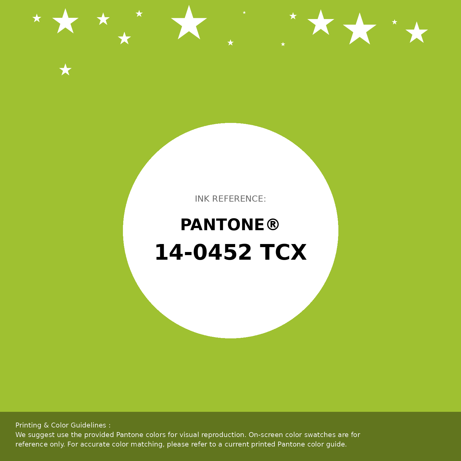
#9fc131 Pantone 14-0452 Tcx Lime Green Color | Hex color Code #9fc131 Pantone Swatch Artwork
Download Artwork Swatch
#9fc131 Pantone 14-0452 Tcx Lime Green Color | Hex color Code #9fc131 Gradient Artwork (PNG)
Download Gradient (PNG)#9fc131 Pantone 14-0452 Tcx Lime Green Color | Hex color Code #9fc131 Gradient Artwork (SVG)
Download Gradient (SVG)
#9fc131 Pantone 14-0452 Tcx Lime Green Color | Hex color Code #9fc131 T-Shirt Mockup
Download T-Shirt Mockup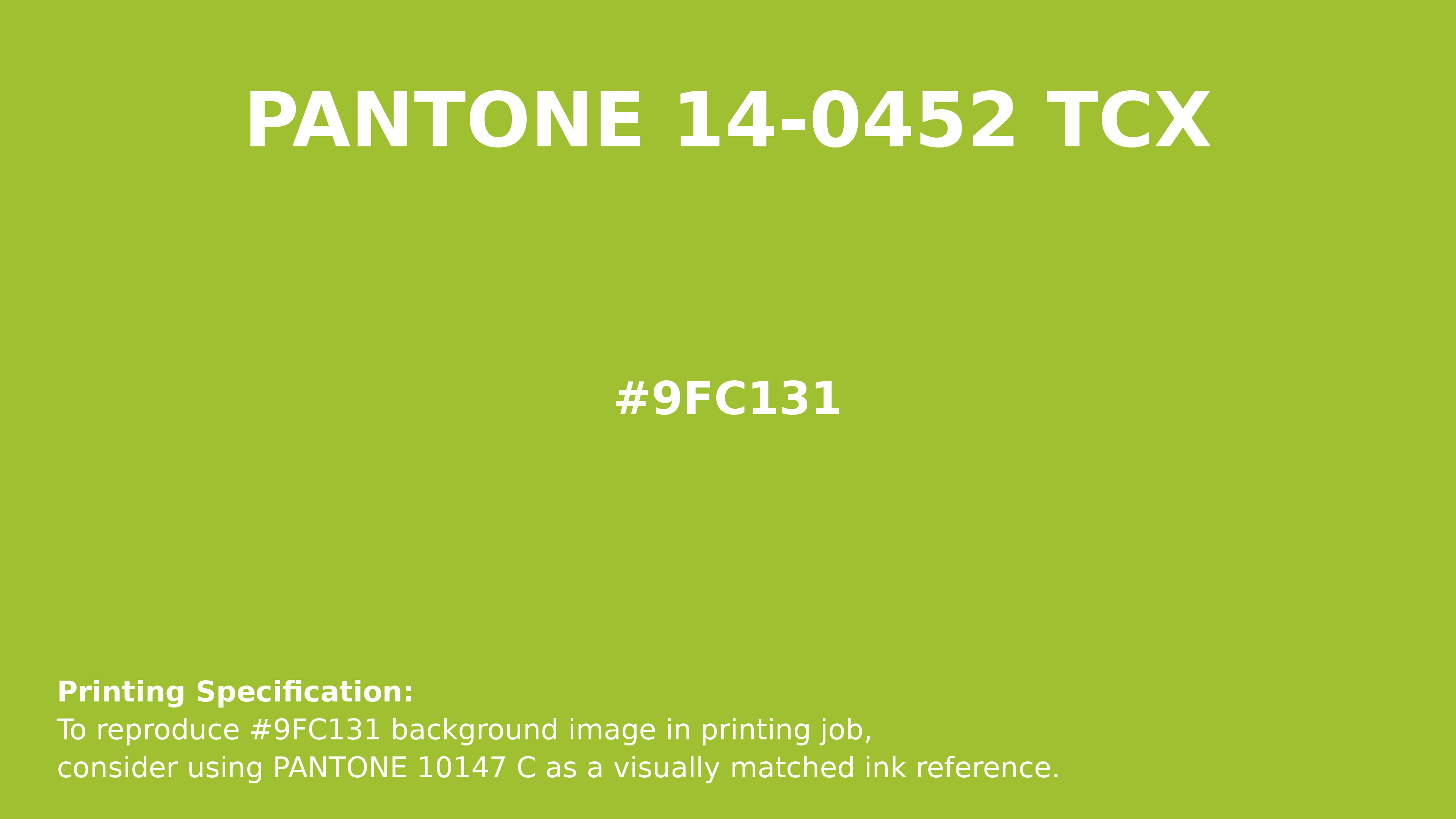
#9fc131 Pantone 14-0452 Tcx Lime Green Color | Hex color Code #9fc131 Printing Artwork Pantone Reference
Download Pantone Printing ReferenceRelated Color Palettes
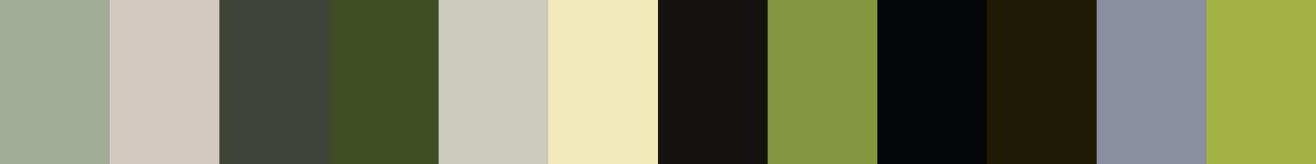
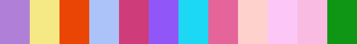
- Indian Red and Light Gray •
- Gray and Forest Green •
- Slate Gray and Light Slate Gray •
- Light Slate Gray and Olive •
- Cornflower Blue and Gray •
- Dark Slate Blue and Light Slate Gray •
- Dark Green and Dark Gray •
- French Gray •
- Dark Salmon and Slate Gray •
- Burly Wood and Light Slate Gray •
- Chocolate and Light Slate Gray •
- Light Slate Gray and Pale Violet Red •
- Yellow Green and Dark Slate Gray •
- Dark Slate Gray and Teal •
- Medium Aquamarine and Slate Gray
Color Palette Collection

265 Color Palettes
265 color palettes with 1325 colors.
Chardonnay
1 color palettes with 5 colors.
Forest Theme colors
15 color palettes with 75 colors.
ERGO
1 color palettes with 5 colors.