#7DA1BF Color
Your all-in-one color resource. Download hex background images, Adobe swatches (ASE), PDF color sheets, and SVG files. Explore palettes, harmonies, accessibility, conversions, and professional exports — designed for designers, developers, and color perfectionists.
This cool, crisp blue (#7DA1BF) conjures images of icy landscapes and the tranquility of a winter's day. It gives a feeling of clarity, serenity, and a touch of distance, suggesting a sense of isolation. It is associated with intelligence, trust, and efficiency. Design applications include backgrounds and design elements aiming to inspire focus and calm. It is best used in designs where a sense of objectivity is needed. Visually matched named color: Arctic Stillness.
PANTONE 16-4120 TPX
Choose Color
Selected Color
Recent Colors
Color Details
Similar Ink Alternatives for #7DA1BF color Alternative print inks for reproducing #7DA1BF background image with a similar visual appearance.
Disclaimer: The visually matched ink reference is an independent approximation intended as a guide only. Please be advised that this pantone colors is only intended as a guide, Actual colours will depend on screen calibration variances. The print ink suggestions provided are independent visual approximations and are not affiliated with or endorsed by Pantone LLC. For official color specifications, conversion factors, and comprehensive color system information, please visit Pantone Connect. Official Pantone products can be purchased at pantone.com.
Color Previews for #000000 See how this color looks as a background or as text.
Complete Guide to Your Color Laboratory
Everything you need to know about this professional color toolkit.
Use the Color Picker at the top to select any color. All modules below update instantly.
Workflow: Pick a color → Explore palettes & data → Download what you need (PDF, Image, or Adobe ASE).
Color Details — Your color in all formats: HEX, RGB, RGBA, HSL, HSLA, HSV, CMYK, CIELab, Hunter-Lab, XYZ, Yxy, YUV. One-click copy.
Color Psychology — Emotional impact, cultural meanings, physiological effects, branding applications, and historical significance.
Named Colors — Find official color names (HTML/CSS, Pantone) that match your selection with similarity percentages.
Light & Dark Shades
80-step gradient from black to white. Perfect for button states and component systems.
Tints
Color mixed with white → lighter, pastel variations for backgrounds and disabled states.
Monochromatic — 11 curated tints/shades from one color. Production-ready for design systems.
- Complementary — Opposite on wheel (180°). High contrast.
- Analogous — Neighbors (±30°). Harmonious flow.
- Triadic — Three colors (120° apart). Vibrant, balanced.
- Split-Complementary — Base + two near-complements. Softer contrast.
- Tetradic/Square — Four colors. Complex, maximum variety.
- Neutral — Desaturated versions. Subtle, sophisticated.
15 Professional Variations — Monochromatic, Analogous, Complementary, Warm/Cool/Earth Tones, Pastel, Vibrant, High Contrast, and more.
Color Infusion — 10 palettes showing your color morphing into each major hue. Find bridge colors.
Similar Colors — 60+ colors generated via CIELAB Delta E matching. Unexpected harmonious combinations.
18 Ready-to-Use Gradients — Complementary, Analogous, Triadic, Tint/Shade progressions, and more.
Downloads: PNG (2560×1440), CSS (production-ready code), SVG (scalable vector).
WCAG Contrast Checker — Tests your color against white, black, and custom colors for AA (4.5:1) and AAA (7:1) compliance. Large text thresholds included.
Harmony & Accessibility Guide — Tests against 10 canonical hues. Shows which pairs are both beautiful AND WCAG-compliant for text.
PNG/JPG — High-res images for presentations and mood boards.
PDF — Print-ready reports for clients and teams.
Adobe ASE — Direct import to Photoshop, Illustrator, InDesign, XD.
CSS/SVG — Gradients only. Production-ready code and vectors.
Color Science: Industry-standard conversions (HSL, CIELAB, CMYK, XYZ). WCAG 2.1 luminance formula. Delta E (ΔE76) for perceptual matching.
Direct Links: Share colors via icolorpalette.com/color/ff5733 or icolorpalette.com/color/red
Issues? Refresh the page, wait for rendering, try another browser, or check console (F12) for errors.
Printing Guide for #7da1bf Background Image
Use PANTONE 16-4120 TPX as a visually matched ink reference when printing this background image.
To print the #7da1bf background image from our site, consider using PANTONE 16-4120 TPX as a visually matched ink reference.
Download the background image, then provide this reference code to your print vendor to help achieve accurate color reproduction.
The visually matched ink reference for the #7da1bf background image is PANTONE 16-4120 TPX.
This color is commonly described as Arctic Stillness.
This cool, crisp blue (#7DA1BF) conjures images of icy landscapes and the tranquility of a winter's day. It gives a feeling of clarity, serenity, and a touch of distance, suggesting a sense of isolation. It is associated with intelligence, trust, and efficiency. Design applications include backgrounds and design elements aiming to inspire focus and calm. It is best used in designs where a sense of objectivity is needed.
We provide PANTONE 16-4120 TPX as a visually matched ink reference to help you reproduce the #7da1bf background image accurately in professional printing.
This reference code helps print vendors achieve consistent color output across different printing equipment and materials.
After downloading the #7da1bf background image from our site:
- Include the visually matched ink reference PANTONE 16-4120 TPX in your print order notes
- Inform your print vendor that this is your target color reference
- Request a proof print to verify the Arctic Stillness color appearance before full production
The #7da1bf background image with PANTONE 16-4120 TPX as visually matched ink reference can be used for:
- Posters, banners, and backdrops
- Business cards, brochures, and flyers
- Packaging, labels, and stickers
- Signage and promotional materials
This is an independent visual approximation.
While PANTONE 16-4120 TPX closely matches the #7da1bf background image color, variations may exist between screen display and printed output.
We recommend requesting a proof print to verify the final appearance.
This cool, crisp blue (#7DA1BF) conjures images of icy landscapes and the tranquility of a winter's day. It gives a feeling of clarity, serenity, and a touch of distance, suggesting a sense of isolation. It is associated with intelligence, trust, and efficiency. Design applications include backgrounds and design elements aiming to inspire focus and calm. It is best used in designs where a sense of objectivity is needed.
Understanding these associations helps ensure the #7da1bf background image aligns with your intended message and brand impact.
Important Information
The visually matched ink reference is an independent approximation intended as a guide only.
Actual printed colors may vary depending on screen calibration, substrate material, ink type, and printing equipment used.
For official color specifications and certified color standards, visit Pantone Connect.
Official color guides and swatch books can be purchased from pantone.com.
Pantone 16-4120 Tpx Dusk Blue Color: An Elegant and Serene Shade | #7DA1BF
Introduction:
Dusk Blue is a color that exudes a sense of tranquility and calmness. It is a serene, sophisticated shade that adds a touch of elegance to any space or design.
Historical Significance:
Key moments in history: Dusk Blue has been prominently used in classic art pieces and has been a popular choice for interior design during the mid-20th century. It symbolized a sense of refinement and elegance during that era.
Other historical uses: Dusk Blue was often used in traditional Japanese art to depict tranquility and peace.
Symbolism and Meaning:
Symbolism: Dusk Blue is commonly associated with calmness, serenity, and stability. It represents a peaceful and harmonious state of mind.
Meaning in different cultures: In Chinese culture, Dusk Blue is often associated with immortality and divine beauty. In Western culture, it symbolizes trust, loyalty, and reliability.
Dusk Blue in Fashion:
Influence on fashion trends: Dusk Blue is a versatile color that can be found in various fashion collections. It is often used in formal attire to convey a sense of elegance and sophistication.
Fashion designers' perspective: Many renowned fashion designers incorporate Dusk Blue into their collections due to its calming and soothing effect on the viewers and wearers.
Dusk Blue in Graphic Design:
Significance in design aesthetics: Dusk Blue is often utilized in graphic design to evoke a sense of tranquility and elegance. It complements various other colors and can be used as a base color or a subtle accent.
Branding and visual impact: Many brands use Dusk Blue in their logos and branding materials to convey trustworthiness and reliability to their target audience.
Color Combinations:
Potential color combinations:
- Dusk Blue and White
- Dusk Blue and Silver
- Dusk Blue and Pale Pink
- Dusk Blue and Gray
(This list is not exhaustive, and there are many other color combinations that work well with Dusk Blue.)
Nature’s Palette:
Natural occurrences: Dusk Blue can be found in the vibrant blue petals of certain flowering plants, like the Himalayan Blue Poppy. It can also be observed in the tranquil blue color of serene seascapes and skies during dusk.
Artistic Representations:
Usage in art: Dusk Blue has been utilized by artists to convey a sense of tranquility and elegance in their artwork. It adds depth and visual interest to paintings, sculptures, and other forms of artistic expression.
Movies and Cinematic Landscapes:
Movies and scenes: Dusk Blue is often used in cinematic landscapes to create a serene and contemplative atmosphere. It sets the tone for introspective and emotional moments in films.
Products and Commercial Appeal:
Popular products and brands: Many home decor brands, fashion labels, and cosmetic companies use Dusk Blue in their products and branding. It appeals to customers who seek a sense of tranquility and sophistication in their purchases.
National Symbols and Significance:
Cultural significance: Dusk Blue is not specifically associated with any national symbols, but it has a universal appeal and is appreciated across different cultures for its calming and serene qualities.
The Psychological and Emotional Impact:
Influence on emotions and perceptions: Dusk Blue has a soothing effect on the mind and can help reduce stress and anxiety. It promotes a sense of calmness and relaxation.
Conclusion:
Dusk Blue is a timeless color that brings elegance and serenity to any design or space. Its historical significance, symbolism, and calming impact make it a cherished choice in fashion, graphic design, and various artistic expressions. Nature's palette embraces this color, and its commercial appeal is evident in various products and brands. Dusk Blue holds a universal appeal and has a profound psychological and emotional impact, making it a versatile and timeless color choice.
Pantone 16-4120 Tpx Dusk Blue Color | Hex color Code #7da1bf Image & Artwork
Download high-quality assets for your projects.

#7da1bf Color Schemes
Download Color Schemes
#7da1bf Color Shades
Download Color Shades
Pantone 16-4120 Tpx Dusk Blue Color | Hex color Code #7da1bf Solid Color Background
Download Solid Color
#7da1bf Pantone 16-4120 Tpx Dusk Blue Color | Hex color Code #7da1bf Artwork Image (PNG)
Download Artwork (PNG)#7da1bf Pantone 16-4120 Tpx Dusk Blue Color | Hex color Code #7da1bf Artwork Vector (PDF)
Download Artwork (PDF)#7da1bf Pantone 16-4120 Tpx Dusk Blue Color | Hex color Code #7da1bf Artwork Vector (SVG)
Download Artwork (SVG)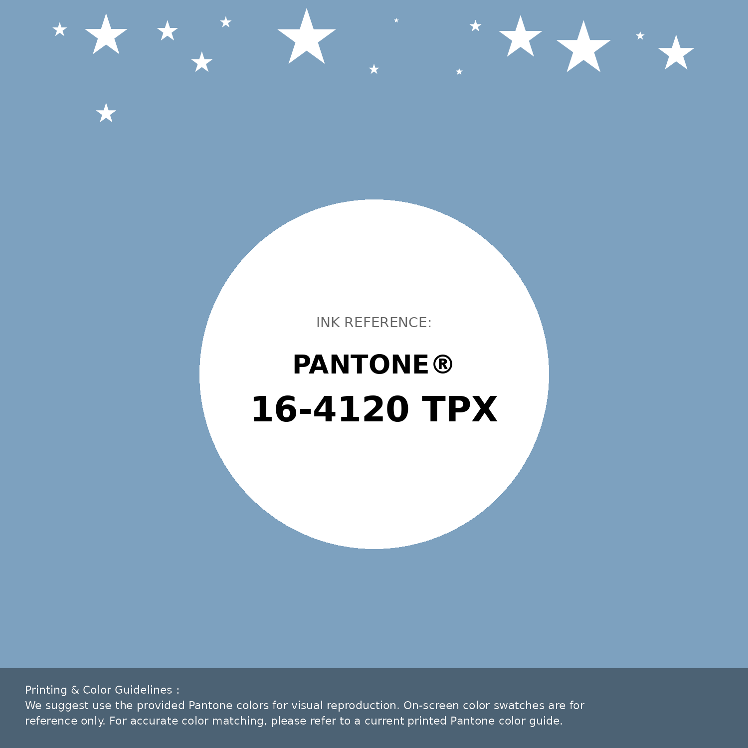
#7da1bf Pantone 16-4120 Tpx Dusk Blue Color | Hex color Code #7da1bf Pantone Swatch Artwork
Download Artwork Swatch
#7da1bf Pantone 16-4120 Tpx Dusk Blue Color | Hex color Code #7da1bf Gradient Artwork (PNG)
Download Gradient (PNG)#7da1bf Pantone 16-4120 Tpx Dusk Blue Color | Hex color Code #7da1bf Gradient Artwork (SVG)
Download Gradient (SVG)
#7da1bf Pantone 16-4120 Tpx Dusk Blue Color | Hex color Code #7da1bf T-Shirt Mockup
Download T-Shirt Mockup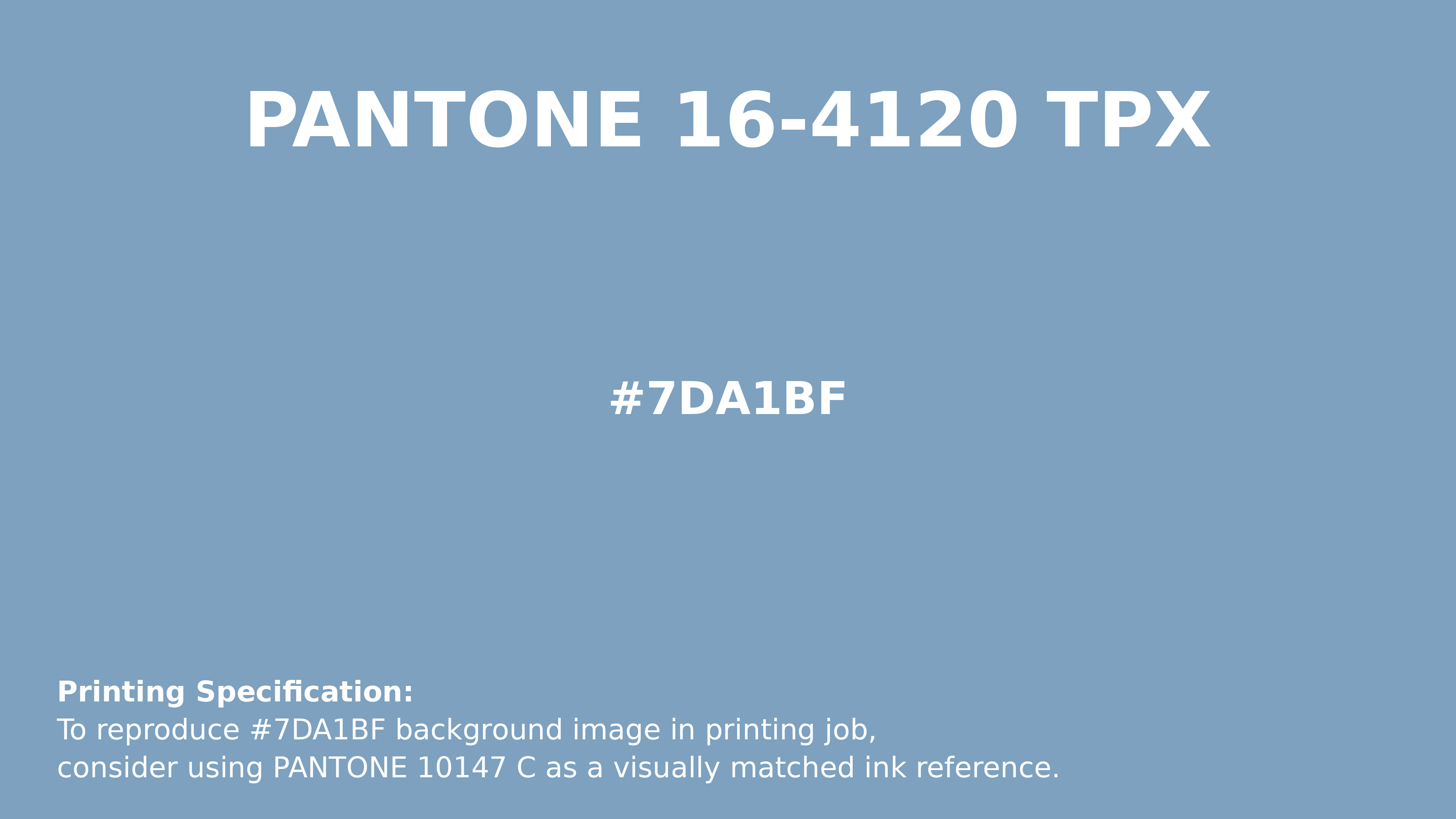
#7da1bf Pantone 16-4120 Tpx Dusk Blue Color | Hex color Code #7da1bf Printing Artwork Pantone Reference
Download Pantone Printing ReferenceRelated Color Palettes
- Lavender Purple •
- Light Steel Blue and Medium Purple •
- Rosy Brown and Medium Purple •
- Medium Purple and Rosy Brown •
- Medium Purple and Dark Olive Green •
- Light Slate Gray and Medium Purple •
- Medium Purple and Dark Sea Green •
- Slate Gray and Medium Purple •
- Medium Purple and Dark Khaki •
- Medium Purple and Olive Drab •
- Dark Slate Blue and Medium Purple •
- Medium Purple and Slate Gray •
- Purple and Purple •
- Jacksons Purple •
- Slate Blue and Medium Purple
Color Palette Collection

31 Royal Blue Color Palette
31 color palettes with 155 colors.
34 Yellow Color Schemes
34 color palettes with 170 colors.

89 Blue Color Palettes
89 color palettes with 445 colors.

24 Summer Color Palettes
24 color palettes with 120 colors.