#7BAFD4 Color
Your all-in-one color resource. Download hex background images, Adobe swatches (ASE), PDF color sheets, and SVG files. Explore palettes, harmonies, accessibility, conversions, and professional exports — designed for designers, developers, and color perfectionists.
This soft, light blue-gray evokes a sense of calm and quiet contemplation. It's reminiscent of a twilight sky over a tranquil lake, or the gentle hues of a spring morning. The color feels both serene and slightly mysterious, hinting at peace and introspection. It creates a soothing and calming atmosphere, perfect for bedrooms or meditation spaces. In design, this color can be used to create a sense of spaciousness and quiet elegance, often associated with a sense of refined simplicity and a connection to nature. There's a subtle coolness to it, without being overly stark or cold. Visually matched named color: Azure Serenity.
PANTONE 542 C
Choose Color
Selected Color
Recent Colors
Color Details
Similar Ink Alternatives for #7BAFD4 color Alternative print inks for reproducing #7BAFD4 background image with a similar visual appearance.
Disclaimer: The visually matched ink reference is an independent approximation intended as a guide only. Please be advised that this pantone colors is only intended as a guide, Actual colours will depend on screen calibration variances. The print ink suggestions provided are independent visual approximations and are not affiliated with or endorsed by Pantone LLC. For official color specifications, conversion factors, and comprehensive color system information, please visit Pantone Connect. Official Pantone products can be purchased at pantone.com.
Color Previews for #000000 See how this color looks as a background or as text.
Complete Guide to Your Color Laboratory
Everything you need to know about this professional color toolkit.
Use the Color Picker at the top to select any color. All modules below update instantly.
Workflow: Pick a color → Explore palettes & data → Download what you need (PDF, Image, or Adobe ASE).
Color Details — Your color in all formats: HEX, RGB, RGBA, HSL, HSLA, HSV, CMYK, CIELab, Hunter-Lab, XYZ, Yxy, YUV. One-click copy.
Color Psychology — Emotional impact, cultural meanings, physiological effects, branding applications, and historical significance.
Named Colors — Find official color names (HTML/CSS, Pantone) that match your selection with similarity percentages.
Light & Dark Shades
80-step gradient from black to white. Perfect for button states and component systems.
Tints
Color mixed with white → lighter, pastel variations for backgrounds and disabled states.
Monochromatic — 11 curated tints/shades from one color. Production-ready for design systems.
- Complementary — Opposite on wheel (180°). High contrast.
- Analogous — Neighbors (±30°). Harmonious flow.
- Triadic — Three colors (120° apart). Vibrant, balanced.
- Split-Complementary — Base + two near-complements. Softer contrast.
- Tetradic/Square — Four colors. Complex, maximum variety.
- Neutral — Desaturated versions. Subtle, sophisticated.
15 Professional Variations — Monochromatic, Analogous, Complementary, Warm/Cool/Earth Tones, Pastel, Vibrant, High Contrast, and more.
Color Infusion — 10 palettes showing your color morphing into each major hue. Find bridge colors.
Similar Colors — 60+ colors generated via CIELAB Delta E matching. Unexpected harmonious combinations.
18 Ready-to-Use Gradients — Complementary, Analogous, Triadic, Tint/Shade progressions, and more.
Downloads: PNG (2560×1440), CSS (production-ready code), SVG (scalable vector).
WCAG Contrast Checker — Tests your color against white, black, and custom colors for AA (4.5:1) and AAA (7:1) compliance. Large text thresholds included.
Harmony & Accessibility Guide — Tests against 10 canonical hues. Shows which pairs are both beautiful AND WCAG-compliant for text.
PNG/JPG — High-res images for presentations and mood boards.
PDF — Print-ready reports for clients and teams.
Adobe ASE — Direct import to Photoshop, Illustrator, InDesign, XD.
CSS/SVG — Gradients only. Production-ready code and vectors.
Color Science: Industry-standard conversions (HSL, CIELAB, CMYK, XYZ). WCAG 2.1 luminance formula. Delta E (ΔE76) for perceptual matching.
Direct Links: Share colors via icolorpalette.com/color/ff5733 or icolorpalette.com/color/red
Issues? Refresh the page, wait for rendering, try another browser, or check console (F12) for errors.
Printing Guide for #7bafd4 Background Image
Use PANTONE 542 C as a visually matched ink reference when printing this background image.
To print the #7bafd4 background image from our site, consider using PANTONE 542 C as a visually matched ink reference.
Download the background image, then provide this reference code to your print vendor to help achieve accurate color reproduction.
The visually matched ink reference for the #7bafd4 background image is PANTONE 542 C.
This color is commonly described as Azure Serenity.
This soft, light blue-gray evokes a sense of calm and quiet contemplation. It's reminiscent of a twilight sky over a tranquil lake, or the gentle hues of a spring morning. The color feels both serene and slightly mysterious, hinting at peace and introspection. It creates a soothing and calming atmosphere, perfect for bedrooms or meditation spaces. In design, this color can be used to create a sense of spaciousness and quiet elegance, often associated with a sense of refined simplicity and a connection to nature. There's a subtle coolness to it, without being overly stark or cold.
We provide PANTONE 542 C as a visually matched ink reference to help you reproduce the #7bafd4 background image accurately in professional printing.
This reference code helps print vendors achieve consistent color output across different printing equipment and materials.
After downloading the #7bafd4 background image from our site:
- Include the visually matched ink reference PANTONE 542 C in your print order notes
- Inform your print vendor that this is your target color reference
- Request a proof print to verify the Azure Serenity color appearance before full production
The #7bafd4 background image with PANTONE 542 C as visually matched ink reference can be used for:
- Posters, banners, and backdrops
- Business cards, brochures, and flyers
- Packaging, labels, and stickers
- Signage and promotional materials
This is an independent visual approximation.
While PANTONE 542 C closely matches the #7bafd4 background image color, variations may exist between screen display and printed output.
We recommend requesting a proof print to verify the final appearance.
This soft, light blue-gray evokes a sense of calm and quiet contemplation. It's reminiscent of a twilight sky over a tranquil lake, or the gentle hues of a spring morning. The color feels both serene and slightly mysterious, hinting at peace and introspection. It creates a soothing and calming atmosphere, perfect for bedrooms or meditation spaces. In design, this color can be used to create a sense of spaciousness and quiet elegance, often associated with a sense of refined simplicity and a connection to nature. There's a subtle coolness to it, without being overly stark or cold.
Understanding these associations helps ensure the #7bafd4 background image aligns with your intended message and brand impact.
Important Information
The visually matched ink reference is an independent approximation intended as a guide only.
Actual printed colors may vary depending on screen calibration, substrate material, ink type, and printing equipment used.
For official color specifications and certified color standards, visit Pantone Connect.
Official color guides and swatch books can be purchased from pantone.com.
Pantone 542 C Color: Tranquil Waters | #7BAFD4
Introduction:
Tranquil Waters is a beautiful shade of blue that exudes a sense of calmness and serenity. Its soothing and peaceful nature makes it a popular choice for creating a serene atmosphere.
Historical Significance:
Key moments in history: Tranquil Waters has been used prominently in various historical artworks, such as Renaissance paintings and Baroque architecture. It has also been associated with the ocean and maritime exploration throughout history.
Symbolism and Meaning:
Symbolism: Tranquil Waters is often associated with tranquility, peace, and stability. It can also symbolize trust, loyalty, and calmness. In many cultures, blue is considered a color of wisdom and spiritual enlightenment.
Tranquil Waters in Fashion:
Fashion impact: Tranquil Waters is a popular color in the fashion industry, especially for spring and summer collections. It is often used in clothing and accessories to create a refreshing and calming effect.
Tranquil Waters in Graphic Design:
Design significance: Tranquil Waters is widely used in graphic design to convey a sense of calmness and tranquility. It is often used in branding, websites, and advertisements to create a visually appealing and soothing experience.
Color Combinations:
Potential color combinations: Tranquil Waters pairs well with shades of white, cream, gray, and pastel colors. It also complements vibrant colors like coral and yellow, creating a harmonious and balanced palette.
Nature’s Palette:
Natural occurrences: Tranquil Waters can be seen in nature, particularly in bodies of water like lakes, oceans, and rivers. It is also found in various flowers, such as blue hydrangeas and forget-me-nots.
Artistic Representations:
Artistic usage: Tranquil Waters has been used by artists across different mediums to depict calm and serene scenes. It is often used in landscape paintings, abstract art, and watercolor compositions.
Movies and Cinematic Landscapes:
Movie and scene examples: Tranquil Waters is often used in movies to create a serene and peaceful atmosphere. It is commonly seen in scenes depicting beaches, tropical islands, and underwater landscapes.
Products and Commercial Appeal:
Products and brands: Tranquil Waters is frequently used in the branding of products related to wellness, relaxation, and lifestyle. It is often seen in spa products, skincare brands, and home decor items.
National Symbols and Significance:
National significance: Tranquil Waters is used as a national color in some countries, symbolizing peace, stability, and unity. It is often incorporated in national flags and emblems.
The Psychological and Emotional Impact:
Psychological impact: Tranquil Waters can have a calming and relaxing effect on the mind and emotions. It has been shown to reduce stress and anxiety, promoting a sense of tranquility and balance.
Conclusion:
Tranquil Waters, Pantone 542 C Color, is a hue that represents tranquility, peace, and stability. Its historical significance, symbolic meaning, and influence in various fields such as fashion, graphic design, and art make it a timeless and versatile color choice.
Pantone 542 C Color | Hex color Code #7bafd4 Image & Artwork
Download high-quality assets for your projects.

#7bafd4 Color Schemes
Download Color Schemes
#7bafd4 Color Shades
Download Color Shades
Pantone 542 C Color | Hex color Code #7bafd4 Solid Color Background
Download Solid Color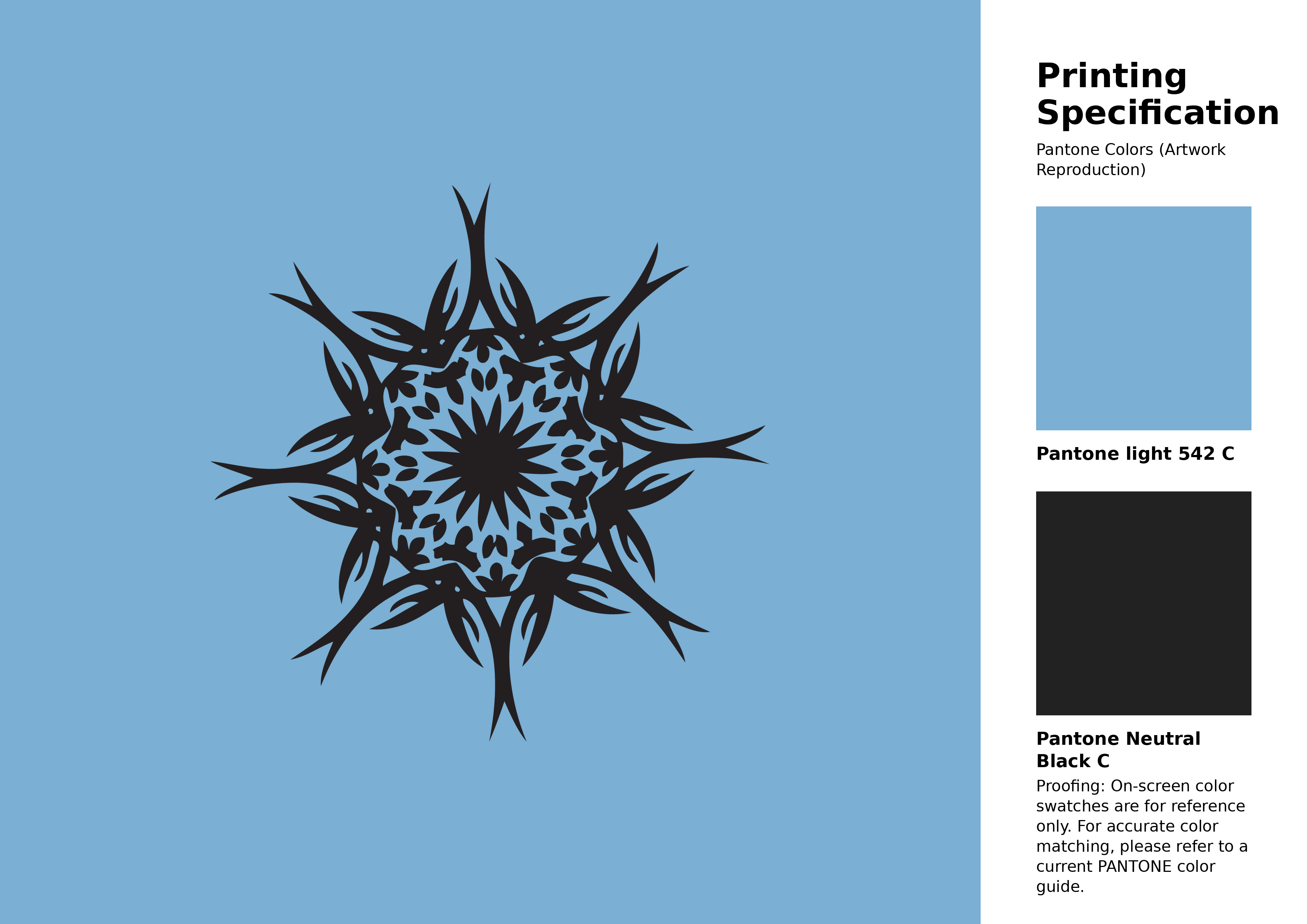
#7bafd4 Pantone 542 C Color | Hex color Code #7bafd4 Artwork Image (PNG)
Download Artwork (PNG)#7bafd4 Pantone 542 C Color | Hex color Code #7bafd4 Artwork Vector (PDF)
Download Artwork (PDF)#7bafd4 Pantone 542 C Color | Hex color Code #7bafd4 Artwork Vector (SVG)
Download Artwork (SVG)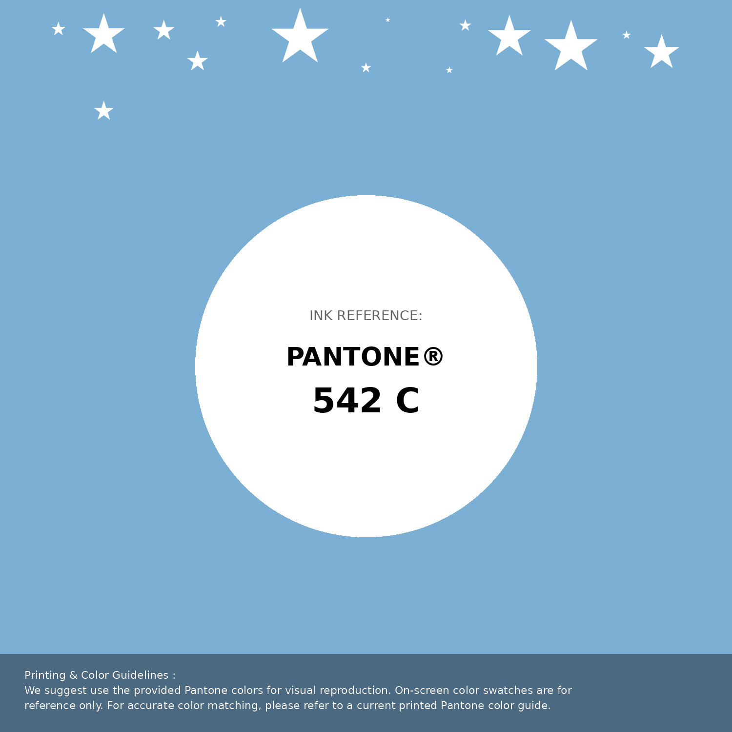
#7bafd4 Pantone 542 C Color | Hex color Code #7bafd4 Pantone Swatch Artwork
Download Artwork Swatch
#7bafd4 Pantone 542 C Color | Hex color Code #7bafd4 Gradient Artwork (PNG)
Download Gradient (PNG)#7bafd4 Pantone 542 C Color | Hex color Code #7bafd4 Gradient Artwork (SVG)
Download Gradient (SVG)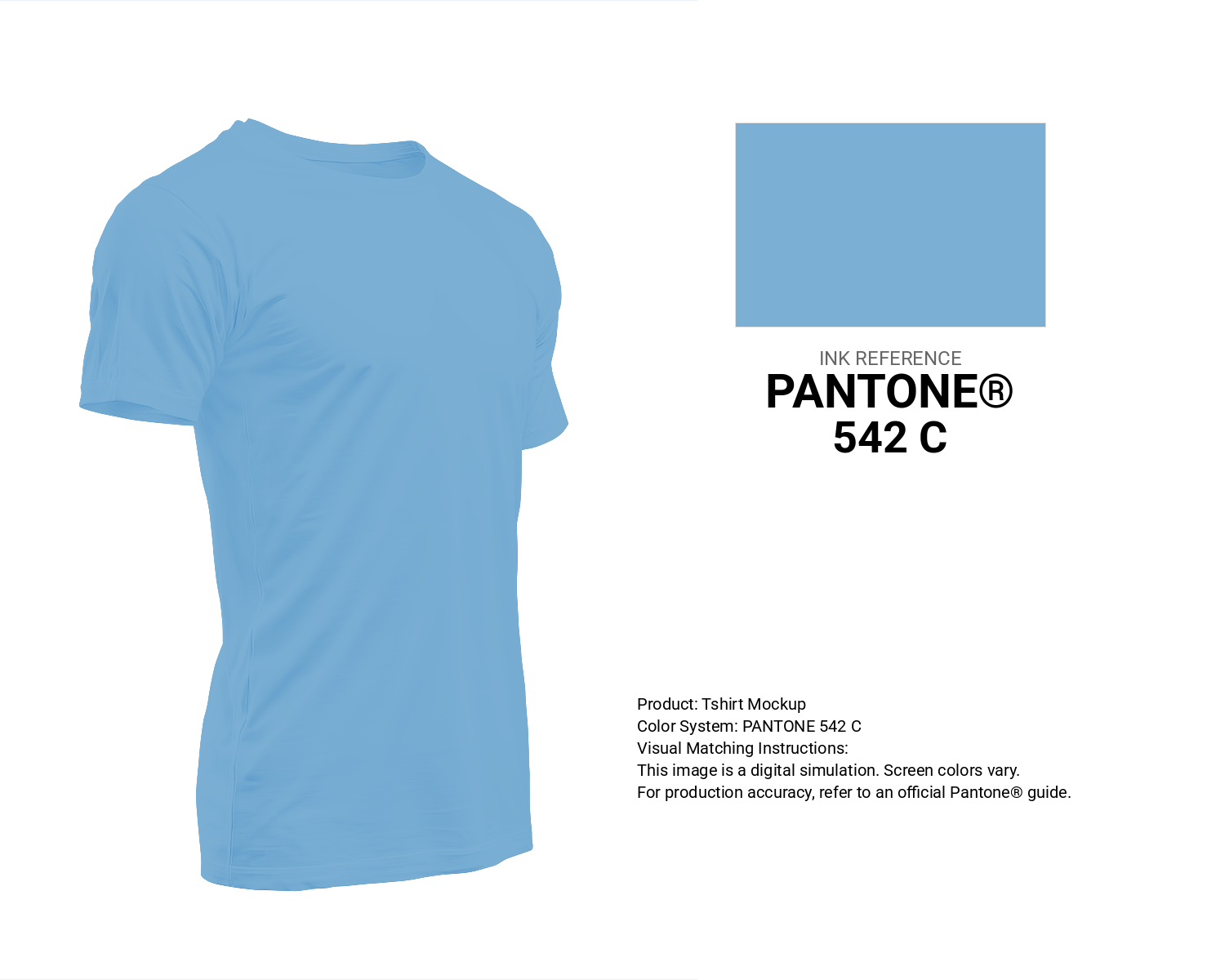
#7bafd4 Pantone 542 C Color | Hex color Code #7bafd4 T-Shirt Mockup
Download T-Shirt Mockup
#7bafd4 Pantone 542 C Color | Hex color Code #7bafd4 Printing Artwork Pantone Reference
Download Pantone Printing ReferenceRelated Color Palettes
- Jacksons Purple •
- Purple and Maroon •
- Medium Purple and Gray •
- Dark Khaki and Medium Purple •
- Light Steel Blue and Medium Purple •
- Medium Purple and Dark Sea Green •
- Dark Slate Gray and Medium Purple •
- Medium Purple and Slate Gray •
- Purple and Medium Violet Red •
- Medium Purple and SkyBlue •
- Purple Mountain's Majesty •
- Medium Purple and Dark Slate Blue •
- Medium Purple and Dark Khaki •
- Medium Purple and Dark Orchid •
- Purple
Color Palette Collection

Orange Palette Collection
10 color palettes with 50 colors.
15 Skin Tone Color Palettes
15 color palettes with 75 colors.
ERGO
1 color palettes with 5 colors.
Purple ideas
12 color palettes with 60 colors.