#3E4827 Color
Your all-in-one color resource. Download hex background images, Adobe swatches (ASE), PDF color sheets, and SVG files. Explore palettes, harmonies, accessibility, conversions, and professional exports — designed for designers, developers, and color perfectionists.
#3E4827 evokes a feeling of quiet strength and earthy grounding. The muted greens and browns suggest a twilight hour in a forest, the sun dipping below the horizon, casting long shadows. It's reminiscent of damp soil, mossy stones, and the undergrowth of a woodland. The color imparts a sense of stability, resilience, and connection to nature. It's not overtly cheerful, but rather contemplative and introspective, creating a mood of calm seriousness. In design, it would work well in spaces intended for reflection or concentration, perhaps in a study or meditation room. It suggests natural materials and handcrafted objects, conveying a sense of authenticity and timelessness. The color lacks overt symbolic meaning across cultures, but its earth tones generally relate to stability and growth. Visually matched named color: Earthen Twilight.
PANTONE 5743 C
Choose Color
Selected Color
Recent Colors
Color Details
Similar Ink Alternatives for #3E4827 color Alternative print inks for reproducing #3E4827 background image with a similar visual appearance.
Disclaimer: The visually matched ink reference is an independent approximation intended as a guide only. Please be advised that this pantone colors is only intended as a guide, Actual colours will depend on screen calibration variances. The print ink suggestions provided are independent visual approximations and are not affiliated with or endorsed by Pantone LLC. For official color specifications, conversion factors, and comprehensive color system information, please visit Pantone Connect. Official Pantone products can be purchased at pantone.com.
Color Previews for #000000 See how this color looks as a background or as text.
Complete Guide to Your Color Laboratory
Everything you need to know about this professional color toolkit.
Use the Color Picker at the top to select any color. All modules below update instantly.
Workflow: Pick a color → Explore palettes & data → Download what you need (PDF, Image, or Adobe ASE).
Color Details — Your color in all formats: HEX, RGB, RGBA, HSL, HSLA, HSV, CMYK, CIELab, Hunter-Lab, XYZ, Yxy, YUV. One-click copy.
Color Psychology — Emotional impact, cultural meanings, physiological effects, branding applications, and historical significance.
Named Colors — Find official color names (HTML/CSS, Pantone) that match your selection with similarity percentages.
Light & Dark Shades
80-step gradient from black to white. Perfect for button states and component systems.
Tints
Color mixed with white → lighter, pastel variations for backgrounds and disabled states.
Monochromatic — 11 curated tints/shades from one color. Production-ready for design systems.
- Complementary — Opposite on wheel (180°). High contrast.
- Analogous — Neighbors (±30°). Harmonious flow.
- Triadic — Three colors (120° apart). Vibrant, balanced.
- Split-Complementary — Base + two near-complements. Softer contrast.
- Tetradic/Square — Four colors. Complex, maximum variety.
- Neutral — Desaturated versions. Subtle, sophisticated.
15 Professional Variations — Monochromatic, Analogous, Complementary, Warm/Cool/Earth Tones, Pastel, Vibrant, High Contrast, and more.
Color Infusion — 10 palettes showing your color morphing into each major hue. Find bridge colors.
Similar Colors — 60+ colors generated via CIELAB Delta E matching. Unexpected harmonious combinations.
18 Ready-to-Use Gradients — Complementary, Analogous, Triadic, Tint/Shade progressions, and more.
Downloads: PNG (2560×1440), CSS (production-ready code), SVG (scalable vector).
WCAG Contrast Checker — Tests your color against white, black, and custom colors for AA (4.5:1) and AAA (7:1) compliance. Large text thresholds included.
Harmony & Accessibility Guide — Tests against 10 canonical hues. Shows which pairs are both beautiful AND WCAG-compliant for text.
PNG/JPG — High-res images for presentations and mood boards.
PDF — Print-ready reports for clients and teams.
Adobe ASE — Direct import to Photoshop, Illustrator, InDesign, XD.
CSS/SVG — Gradients only. Production-ready code and vectors.
Color Science: Industry-standard conversions (HSL, CIELAB, CMYK, XYZ). WCAG 2.1 luminance formula. Delta E (ΔE76) for perceptual matching.
Direct Links: Share colors via icolorpalette.com/color/ff5733 or icolorpalette.com/color/red
Issues? Refresh the page, wait for rendering, try another browser, or check console (F12) for errors.
Printing Guide for #3e4827 Background Image
Use PANTONE 5743 C as a visually matched ink reference when printing this background image.
To print the #3e4827 background image from our site, consider using PANTONE 5743 C as a visually matched ink reference.
Download the background image, then provide this reference code to your print vendor to help achieve accurate color reproduction.
The visually matched ink reference for the #3e4827 background image is PANTONE 5743 C.
This color is commonly described as Earthen Twilight.
#3E4827 evokes a feeling of quiet strength and earthy grounding. The muted greens and browns suggest a twilight hour in a forest, the sun dipping below the horizon, casting long shadows. It's reminiscent of damp soil, mossy stones, and the undergrowth of a woodland. The color imparts a sense of stability, resilience, and connection to nature. It's not overtly cheerful, but rather contemplative and introspective, creating a mood of calm seriousness. In design, it would work well in spaces intended for reflection or concentration, perhaps in a study or meditation room. It suggests natural materials and handcrafted objects, conveying a sense of authenticity and timelessness. The color lacks overt symbolic meaning across cultures, but its earth tones generally relate to stability and growth.
We provide PANTONE 5743 C as a visually matched ink reference to help you reproduce the #3e4827 background image accurately in professional printing.
This reference code helps print vendors achieve consistent color output across different printing equipment and materials.
After downloading the #3e4827 background image from our site:
- Include the visually matched ink reference PANTONE 5743 C in your print order notes
- Inform your print vendor that this is your target color reference
- Request a proof print to verify the Earthen Twilight color appearance before full production
The #3e4827 background image with PANTONE 5743 C as visually matched ink reference can be used for:
- Posters, banners, and backdrops
- Business cards, brochures, and flyers
- Packaging, labels, and stickers
- Signage and promotional materials
This is an independent visual approximation.
While PANTONE 5743 C closely matches the #3e4827 background image color, variations may exist between screen display and printed output.
We recommend requesting a proof print to verify the final appearance.
#3E4827 evokes a feeling of quiet strength and earthy grounding. The muted greens and browns suggest a twilight hour in a forest, the sun dipping below the horizon, casting long shadows. It's reminiscent of damp soil, mossy stones, and the undergrowth of a woodland. The color imparts a sense of stability, resilience, and connection to nature. It's not overtly cheerful, but rather contemplative and introspective, creating a mood of calm seriousness. In design, it would work well in spaces intended for reflection or concentration, perhaps in a study or meditation room. It suggests natural materials and handcrafted objects, conveying a sense of authenticity and timelessness. The color lacks overt symbolic meaning across cultures, but its earth tones generally relate to stability and growth.
Understanding these associations helps ensure the #3e4827 background image aligns with your intended message and brand impact.
Important Information
The visually matched ink reference is an independent approximation intended as a guide only.
Actual printed colors may vary depending on screen calibration, substrate material, ink type, and printing equipment used.
For official color specifications and certified color standards, visit Pantone Connect.
Official color guides and swatch books can be purchased from pantone.com.
Pantone 5743 C Color: Earth Green | #3E4827
Introduction:
Earth Green (#3E4827) is a deep color that exudes a sense of tranquility and connection to nature. Its rich and earthy tones make it a popular choice in various artistic and design fields.
Historical Significance:
Key moments in history: Earth Green has been prominently used in ancient art and architecture, symbolizing abundance, growth, and fertility. It was commonly found in traditional paintings and decorative elements of civilizations throughout history.
Symbolism and Meaning:
Symbolism and Meaning: Earth Green typically symbolizes harmony, balance, and renewal. In various cultures, it is associated with the natural world, representing growth, vitality, and healing.
Earth Green in Fashion:
Impact on styles and trends: Earth Green has made its mark in the fashion industry, appearing in collections inspired by nature and sustainability. It adds a touch of elegance and sophistication to outfits, particularly when combined with neutral tones or vibrant accents.
Earth Green in Graphic Design:
Significance in design aesthetics: Earth Green is often used in design aesthetics to evoke a sense of eco-friendliness, growth, and organic appeal. It is commonly seen in branding for environmentally conscious companies and in designs that aim to create a connection with nature.
Color Combinations:
Potential color combinations:
- Earth Green (#3E4827) paired with Warm Grey (#999A97)
- Earth Green (#3E4827) combined with Soft Peach (#FFDAB9)
- Earth Green (#3E4827) alongside Deep Aqua (#00CED1)
Nature’s Palette:
Natural occurrences: Earth Green is commonly found in lush forests, moss-covered rocks, and leafy vegetation. It can be seen in various flora and fauna, such as ferns, emerald gemstones, and certain types of snakes.
Artistic Representations:
Usage in art forms: Earth Green has been a popular choice among artists for centuries. It has been used in landscape paintings, abstract art, and even in traditional art forms like ceramics and pottery.
Movies and Cinematic Landscapes:
Movies and scenes: Earth Green is often used in movies to create a calming and natural ambiance. It can be seen in scenes depicting forests, gardens, and landscapes that emphasize the beauty of nature.
Products and Commercial Appeal:
Popular products and brands: Earth Green is often used by brands focused on sustainability, natural beauty products, and outdoor gear companies. It represents their commitment to environmental awareness and connection to the outdoors.
National Symbols and Significance:
Cultural significance: In some cultures, Earth Green is associated with national symbols related to agriculture, fertility, and prosperity. It represents the importance of the land and its resources.
The Psychological and Emotional Impact:
Influence on emotions and perceptions: Earth Green has a calming effect on the mind, promoting feelings of balance, tranquility, and rejuvenation. It can evoke a sense of connection to nature and the need for sustainability.
Conclusion:
Earth Green (#3E4827) is a color that has stood the test of time. With its historical significance, symbolism, and association with nature, it continues to be inspiring in various creative fields. Its deep and earthy tones evoke a sense of tranquility and connection, making it a timeless choice for designs and artistic expressions.
Pantone 5743 C Color | Hex color Code #3e4827 Image & Artwork
Download high-quality assets for your projects.

#3e4827 Color Schemes
Download Color Schemes
#3e4827 Color Shades
Download Color Shades
Pantone 5743 C Color | Hex color Code #3e4827 Solid Color Background
Download Solid Color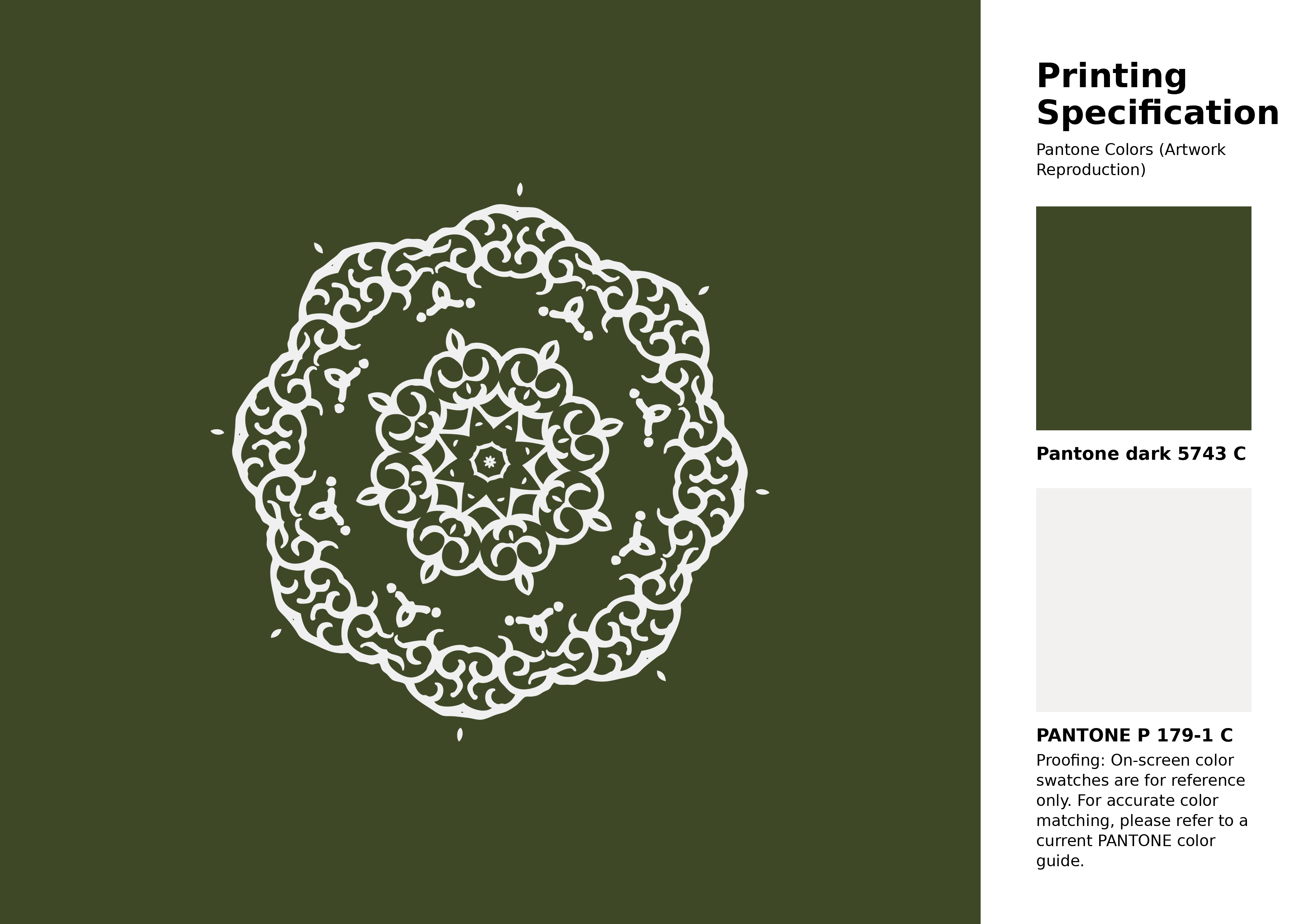
#3e4827 Pantone 5743 C Color | Hex color Code #3e4827 Artwork Image (PNG)
Download Artwork (PNG)#3e4827 Pantone 5743 C Color | Hex color Code #3e4827 Artwork Vector (PDF)
Download Artwork (PDF)#3e4827 Pantone 5743 C Color | Hex color Code #3e4827 Artwork Vector (SVG)
Download Artwork (SVG)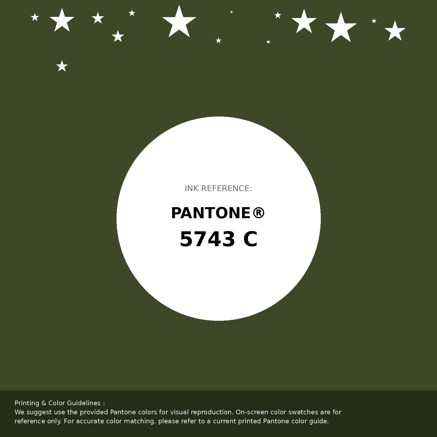
#3e4827 Pantone 5743 C Color | Hex color Code #3e4827 Pantone Swatch Artwork
Download Artwork Swatch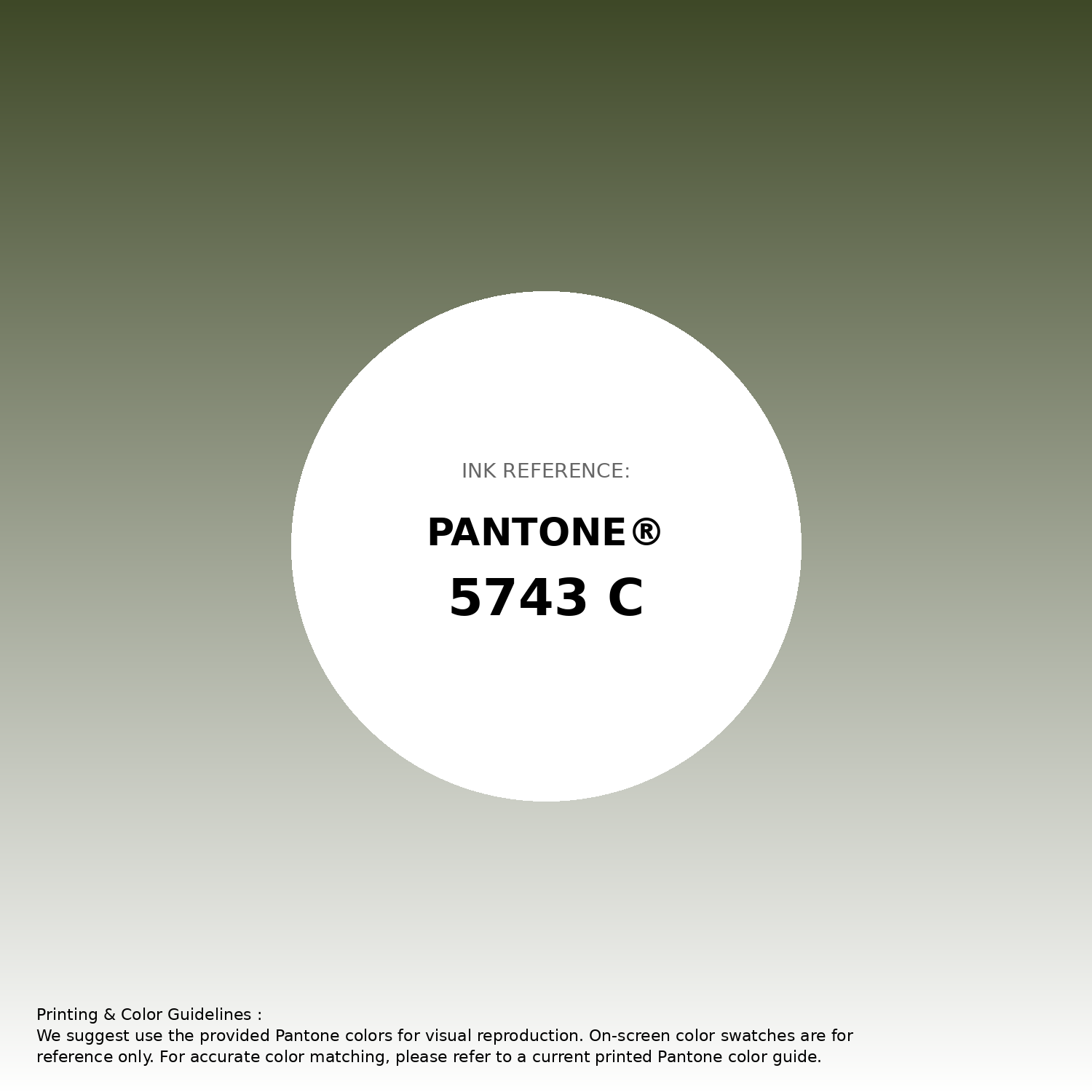
#3e4827 Pantone 5743 C Color | Hex color Code #3e4827 Gradient Artwork (PNG)
Download Gradient (PNG)#3e4827 Pantone 5743 C Color | Hex color Code #3e4827 Gradient Artwork (SVG)
Download Gradient (SVG)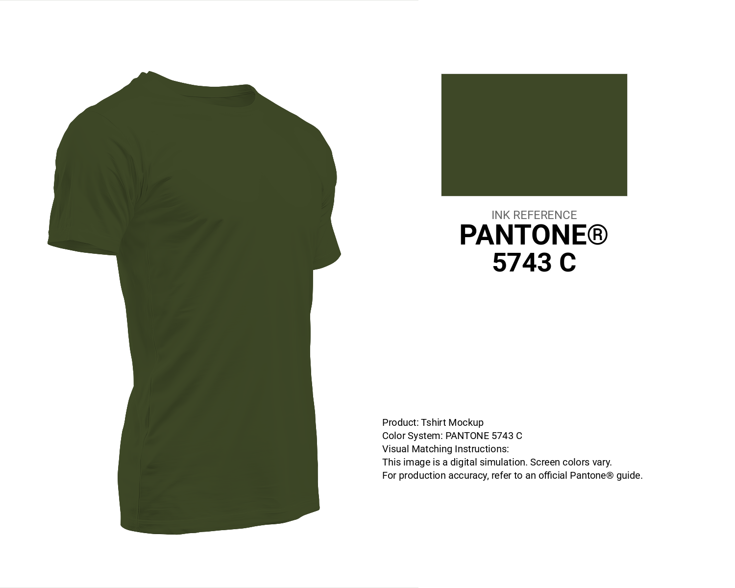
#3e4827 Pantone 5743 C Color | Hex color Code #3e4827 T-Shirt Mockup
Download T-Shirt Mockup
#3e4827 Pantone 5743 C Color | Hex color Code #3e4827 Printing Artwork Pantone Reference
Download Pantone Printing ReferenceRelated Color Palettes
- Dark Gray and Dark Khaki •
- Dark Gray and Tan •
- Gray and Dark Gray •
- Plum and Dark Gray •
- Dark Gray and Slate Gray •
- Crimson and Dark Gray •
- Dark Gray and Crimson •
- Dark Green and Dark Gray •
- Light Slate Gray and Dark Gray •
- Pale Goldenrod and Dark Gray •
- Dark Gray and Light Steel Blue •
- Gainsboro and Dark Gray •
- Peru and Dark Gray •
- Pale Violet Red and Dark Gray •
- Forest Green and Dark Gray
Color Palette Collection

744 Color Palettes
744 color palettes with 3720 colors.

30 Pink Color Combinations
30 color palettes with 150 colors.

80 Pastel Light color Palettes
80 color palettes with 400 colors.

52 Orange Color Palettes
52 color palettes with 260 colors.