#009639 Color
Your all-in-one color resource. Download hex background images, Adobe swatches (ASE), PDF color sheets, and SVG files. Explore palettes, harmonies, accessibility, conversions, and professional exports — designed for designers, developers, and color perfectionists.
This vibrant shade of green, with its deep richness, evokes feelings of growth, vitality, and renewal. It brings to mind lush forests, springtime meadows, and the vibrant energy of new beginnings. The color suggests a sense of hope, optimism, and natural abundance. It creates a cheerful and refreshing atmosphere, perfect for spaces where creativity and productivity are encouraged. In design, it can be used to highlight nature-inspired themes or create a sense of calm energy. The color might symbolize growth, prosperity, and environmental awareness in certain contexts. Visually matched named color: Emerald Bloom.
PANTONE 355 C
Choose Color
Selected Color
Recent Colors
Color Details
Similar Ink Alternatives for #009639 color Alternative print inks for reproducing #009639 background image with a similar visual appearance.
Disclaimer: The visually matched ink reference is an independent approximation intended as a guide only. Please be advised that this pantone colors is only intended as a guide, Actual colours will depend on screen calibration variances. The print ink suggestions provided are independent visual approximations and are not affiliated with or endorsed by Pantone LLC. For official color specifications, conversion factors, and comprehensive color system information, please visit Pantone Connect. Official Pantone products can be purchased at pantone.com.
Color Previews for #000000 See how this color looks as a background or as text.
Complete Guide to Your Color Laboratory
Everything you need to know about this professional color toolkit.
Use the Color Picker at the top to select any color. All modules below update instantly.
Workflow: Pick a color → Explore palettes & data → Download what you need (PDF, Image, or Adobe ASE).
Color Details — Your color in all formats: HEX, RGB, RGBA, HSL, HSLA, HSV, CMYK, CIELab, Hunter-Lab, XYZ, Yxy, YUV. One-click copy.
Color Psychology — Emotional impact, cultural meanings, physiological effects, branding applications, and historical significance.
Named Colors — Find official color names (HTML/CSS, Pantone) that match your selection with similarity percentages.
Light & Dark Shades
80-step gradient from black to white. Perfect for button states and component systems.
Tints
Color mixed with white → lighter, pastel variations for backgrounds and disabled states.
Monochromatic — 11 curated tints/shades from one color. Production-ready for design systems.
- Complementary — Opposite on wheel (180°). High contrast.
- Analogous — Neighbors (±30°). Harmonious flow.
- Triadic — Three colors (120° apart). Vibrant, balanced.
- Split-Complementary — Base + two near-complements. Softer contrast.
- Tetradic/Square — Four colors. Complex, maximum variety.
- Neutral — Desaturated versions. Subtle, sophisticated.
15 Professional Variations — Monochromatic, Analogous, Complementary, Warm/Cool/Earth Tones, Pastel, Vibrant, High Contrast, and more.
Color Infusion — 10 palettes showing your color morphing into each major hue. Find bridge colors.
Similar Colors — 60+ colors generated via CIELAB Delta E matching. Unexpected harmonious combinations.
18 Ready-to-Use Gradients — Complementary, Analogous, Triadic, Tint/Shade progressions, and more.
Downloads: PNG (2560×1440), CSS (production-ready code), SVG (scalable vector).
WCAG Contrast Checker — Tests your color against white, black, and custom colors for AA (4.5:1) and AAA (7:1) compliance. Large text thresholds included.
Harmony & Accessibility Guide — Tests against 10 canonical hues. Shows which pairs are both beautiful AND WCAG-compliant for text.
PNG/JPG — High-res images for presentations and mood boards.
PDF — Print-ready reports for clients and teams.
Adobe ASE — Direct import to Photoshop, Illustrator, InDesign, XD.
CSS/SVG — Gradients only. Production-ready code and vectors.
Color Science: Industry-standard conversions (HSL, CIELAB, CMYK, XYZ). WCAG 2.1 luminance formula. Delta E (ΔE76) for perceptual matching.
Direct Links: Share colors via icolorpalette.com/color/ff5733 or icolorpalette.com/color/red
Issues? Refresh the page, wait for rendering, try another browser, or check console (F12) for errors.
Printing Guide for #009639 Background Image
Use PANTONE 355 C as a visually matched ink reference when printing this background image.
To print the #009639 background image from our site, consider using PANTONE 355 C as a visually matched ink reference.
Download the background image, then provide this reference code to your print vendor to help achieve accurate color reproduction.
The visually matched ink reference for the #009639 background image is PANTONE 355 C.
This color is commonly described as Emerald Bloom.
This vibrant shade of green, with its deep richness, evokes feelings of growth, vitality, and renewal. It brings to mind lush forests, springtime meadows, and the vibrant energy of new beginnings. The color suggests a sense of hope, optimism, and natural abundance. It creates a cheerful and refreshing atmosphere, perfect for spaces where creativity and productivity are encouraged. In design, it can be used to highlight nature-inspired themes or create a sense of calm energy. The color might symbolize growth, prosperity, and environmental awareness in certain contexts.
We provide PANTONE 355 C as a visually matched ink reference to help you reproduce the #009639 background image accurately in professional printing.
This reference code helps print vendors achieve consistent color output across different printing equipment and materials.
After downloading the #009639 background image from our site:
- Include the visually matched ink reference PANTONE 355 C in your print order notes
- Inform your print vendor that this is your target color reference
- Request a proof print to verify the Emerald Bloom color appearance before full production
The #009639 background image with PANTONE 355 C as visually matched ink reference can be used for:
- Posters, banners, and backdrops
- Business cards, brochures, and flyers
- Packaging, labels, and stickers
- Signage and promotional materials
This is an independent visual approximation.
While PANTONE 355 C closely matches the #009639 background image color, variations may exist between screen display and printed output.
We recommend requesting a proof print to verify the final appearance.
This vibrant shade of green, with its deep richness, evokes feelings of growth, vitality, and renewal. It brings to mind lush forests, springtime meadows, and the vibrant energy of new beginnings. The color suggests a sense of hope, optimism, and natural abundance. It creates a cheerful and refreshing atmosphere, perfect for spaces where creativity and productivity are encouraged. In design, it can be used to highlight nature-inspired themes or create a sense of calm energy. The color might symbolize growth, prosperity, and environmental awareness in certain contexts.
Understanding these associations helps ensure the #009639 background image aligns with your intended message and brand impact.
Important Information
The visually matched ink reference is an independent approximation intended as a guide only.
Actual printed colors may vary depending on screen calibration, substrate material, ink type, and printing equipment used.
For official color specifications and certified color standards, visit Pantone Connect.
Official color guides and swatch books can be purchased from pantone.com.
Pantone 355 C Color: Vibrant Green | #009639
Introduction:
Vibrant Green is a rich, energetic color that exudes vitality and freshness. Its vibrant hue and connection to nature make it visually appealing and uplifting.
Historical Significance:
Key moments in history where Vibrant Green was prominently used or played a significant role include the environmental movement in the 1960s and the association with St. Patrick's Day celebrations.
Symbolism and Meaning:
Vibrant Green typically symbolizes growth, renewal, and harmony. It is often associated with luck, balance, and the natural world.
Vibrant Green in Fashion:
Vibrant Green has a strong presence in fashion, particularly in spring and summer collections. It adds a refreshing pop of color to outfits and can be seen in various clothing items, accessories, and cosmetics.
Vibrant Green in Graphic Design:
Vibrant Green is often used in graphic design to create a sense of energy, freshness, and environmental awareness. It is commonly utilized in branding, logos, and advertisements.
Color Combinations:
Potential color combinations with Vibrant Green include white for a crisp and clean look, yellow for a vibrant and sunny feel, and navy blue for a bold and contrasting combination.
Nature’s Palette:
Vibrant Green can be found in various natural occurrences such as lush forests, vibrant foliage, and certain flowers like green leaves, grass, and moss.
Artistic Representations:
Vibrant Green has been used by artists throughout history to depict nature, vitality, and fertility. It can be seen in landscape paintings, botanical illustrations, and abstract art.
Movies and Cinematic Landscapes:
There are several movies and cinematic scenes where Vibrant Green sets the tone or mood, such as "The Great Gatsby" with its vibrant parties and lush green landscapes.
Products and Commercial Appeal:
Many popular products and brands use Vibrant Green in their branding to convey freshness, eco-friendliness, and healthiness. Examples include organic food brands, outdoor gear, and environmentally conscious companies.
National Symbols and Significance:
Vibrant Green is often associated with national symbols such as the Irish flag, which prominently features a vibrant green color, representing Ireland's lush landscapes and heritage.
The Psychological and Emotional Impact:
Vibrant Green has a positive psychological impact as it is associated with feelings of growth, balance, and harmony. It can evoke a sense of rejuvenation and optimism.
Conclusion:
Vibrant Green is a color that brings a sense of energy, renewal, and positivity. Its historical significance, symbolism, and presence in various fields make it a timeless and impactful color.
Pantone 355 C Color | Hex color Code #009639 Image & Artwork
Download high-quality assets for your projects.

#009639 Color Schemes
Download Color Schemes
#009639 Color Shades
Download Color Shades
Pantone 355 C Color | Hex color Code #009639 Solid Color Background
Download Solid Color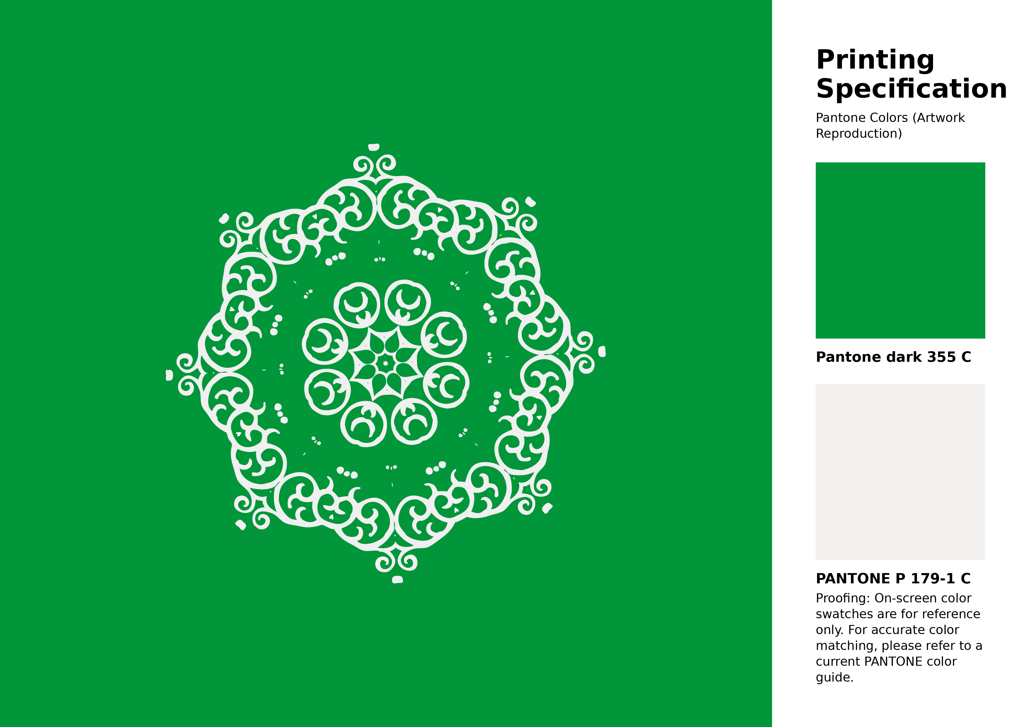
#009639 Pantone 355 C Color | Hex color Code #009639 Artwork Image (PNG)
Download Artwork (PNG)#009639 Pantone 355 C Color | Hex color Code #009639 Artwork Vector (PDF)
Download Artwork (PDF)#009639 Pantone 355 C Color | Hex color Code #009639 Artwork Vector (SVG)
Download Artwork (SVG)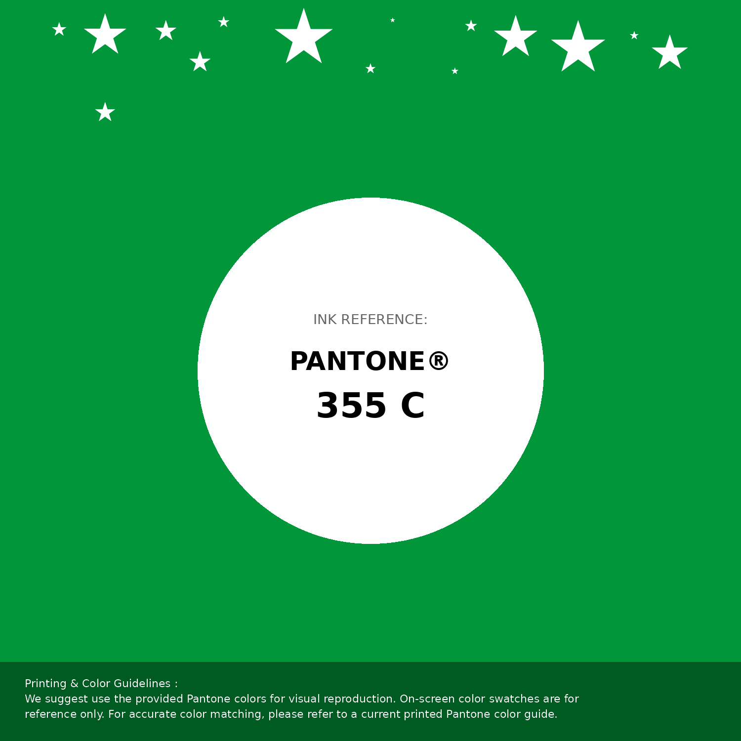
#009639 Pantone 355 C Color | Hex color Code #009639 Pantone Swatch Artwork
Download Artwork Swatch
#009639 Pantone 355 C Color | Hex color Code #009639 Gradient Artwork (PNG)
Download Gradient (PNG)#009639 Pantone 355 C Color | Hex color Code #009639 Gradient Artwork (SVG)
Download Gradient (SVG)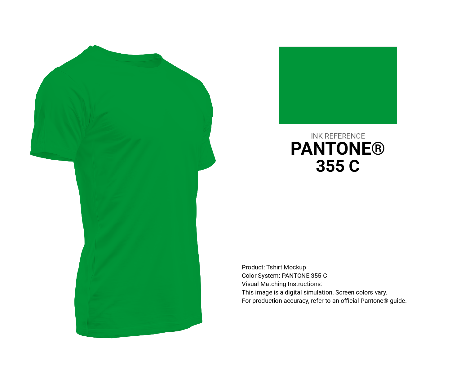
#009639 Pantone 355 C Color | Hex color Code #009639 T-Shirt Mockup
Download T-Shirt Mockup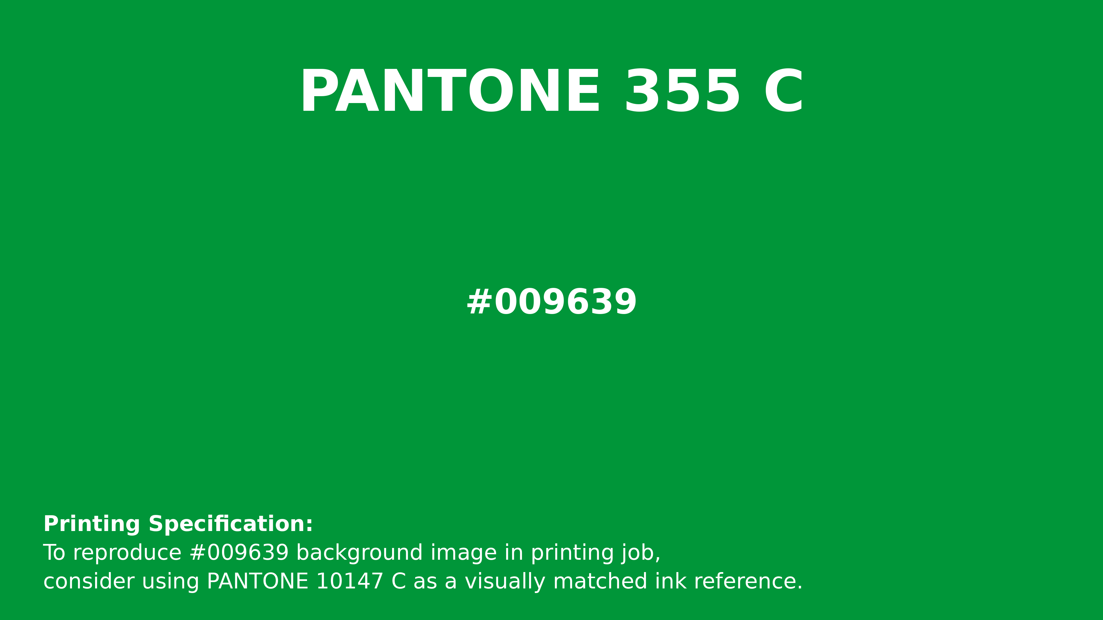
#009639 Pantone 355 C Color | Hex color Code #009639 Printing Artwork Pantone Reference
Download Pantone Printing ReferenceRelated Color Palettes
- Dark Gray and Chocolate •
- Dark Gray and Wheat •
- Dark Gray and Indian Red •
- Cadet Blue and Dark Gray •
- Beige and Dark Gray •
- Dark Gray and Dark Khaki •
- Dark Gray and Dark Slate Blue •
- Dark Gray and Pale Goldenrod •
- Indian Red and Dark Gray •
- Goldenrod and Dark Gray •
- Rosy Brown and Dark Gray •
- Dark Gray and Dark Slate Gray •
- Brown and Dark Gray •
- Dark Gray and White •
- Light Slate Gray and Dark Gray
Color Palette Collection

30 Pink Color Combinations
30 color palettes with 150 colors.
65 Red Color Palettes
65 color palettes with 325 colors.

Pink Colors
8 color palettes with 40 colors.
46 Flower Inspired Color Schemes
46 color palettes with 230 colors.