#F8F7F2 Color
Your all-in-one color resource. Download hex background images, Adobe swatches (ASE), PDF color sheets, and SVG files. Explore palettes, harmonies, accessibility, conversions, and professional exports — designed for designers, developers, and color perfectionists.
This very light, off-white shade evokes feelings of purity, serenity, and subtle elegance. It's reminiscent of aged parchment, delicate silk, or the soft glow of candlelight. The color creates a calming and peaceful atmosphere, promoting a sense of quiet contemplation and understated sophistication. It suggests cleanliness, simplicity, and a gentle warmth without being overly stimulating. In design, it can be used to create a spacious and airy feel, providing a neutral backdrop that allows other colors and textures to stand out. It is often associated with classic and timeless aesthetics and can be used to convey a sense of luxury and refinement. Visually matched named color: Whispered Ivory.
PANTONE P 1-1 C
Choose Color
Selected Color
Recent Colors
Color Details
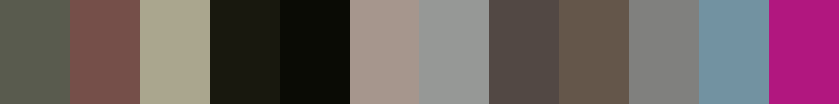
Similar Ink Alternatives for #F8F7F2 color Alternative print inks for reproducing #F8F7F2 background image with a similar visual appearance.
Disclaimer: The visually matched ink reference is an independent approximation intended as a guide only. Please be advised that this pantone colors is only intended as a guide, Actual colours will depend on screen calibration variances. The print ink suggestions provided are independent visual approximations and are not affiliated with or endorsed by Pantone LLC. For official color specifications, conversion factors, and comprehensive color system information, please visit Pantone Connect. Official Pantone products can be purchased at pantone.com.
Color Previews for #000000 See how this color looks as a background or as text.
Complete Guide to Your Color Laboratory
Everything you need to know about this professional color toolkit.
Use the Color Picker at the top to select any color. All modules below update instantly.
Workflow: Pick a color → Explore palettes & data → Download what you need (PDF, Image, or Adobe ASE).
Color Details — Your color in all formats: HEX, RGB, RGBA, HSL, HSLA, HSV, CMYK, CIELab, Hunter-Lab, XYZ, Yxy, YUV. One-click copy.
Color Psychology — Emotional impact, cultural meanings, physiological effects, branding applications, and historical significance.
Named Colors — Find official color names (HTML/CSS, Pantone) that match your selection with similarity percentages.
Light & Dark Shades
80-step gradient from black to white. Perfect for button states and component systems.
Tints
Color mixed with white → lighter, pastel variations for backgrounds and disabled states.
Monochromatic — 11 curated tints/shades from one color. Production-ready for design systems.
- Complementary — Opposite on wheel (180°). High contrast.
- Analogous — Neighbors (±30°). Harmonious flow.
- Triadic — Three colors (120° apart). Vibrant, balanced.
- Split-Complementary — Base + two near-complements. Softer contrast.
- Tetradic/Square — Four colors. Complex, maximum variety.
- Neutral — Desaturated versions. Subtle, sophisticated.
15 Professional Variations — Monochromatic, Analogous, Complementary, Warm/Cool/Earth Tones, Pastel, Vibrant, High Contrast, and more.
Color Infusion — 10 palettes showing your color morphing into each major hue. Find bridge colors.
Similar Colors — 60+ colors generated via CIELAB Delta E matching. Unexpected harmonious combinations.
18 Ready-to-Use Gradients — Complementary, Analogous, Triadic, Tint/Shade progressions, and more.
Downloads: PNG (2560×1440), CSS (production-ready code), SVG (scalable vector).
WCAG Contrast Checker — Tests your color against white, black, and custom colors for AA (4.5:1) and AAA (7:1) compliance. Large text thresholds included.
Harmony & Accessibility Guide — Tests against 10 canonical hues. Shows which pairs are both beautiful AND WCAG-compliant for text.
PNG/JPG — High-res images for presentations and mood boards.
PDF — Print-ready reports for clients and teams.
Adobe ASE — Direct import to Photoshop, Illustrator, InDesign, XD.
CSS/SVG — Gradients only. Production-ready code and vectors.
Color Science: Industry-standard conversions (HSL, CIELAB, CMYK, XYZ). WCAG 2.1 luminance formula. Delta E (ΔE76) for perceptual matching.
Direct Links: Share colors via icolorpalette.com/color/ff5733 or icolorpalette.com/color/red
Issues? Refresh the page, wait for rendering, try another browser, or check console (F12) for errors.
Printing Guide for #f8f7f2 Background Image
Use PANTONE P 1-1 C as a visually matched ink reference when printing this background image.
To print the #f8f7f2 background image from our site, consider using PANTONE P 1-1 C as a visually matched ink reference.
Download the background image, then provide this reference code to your print vendor to help achieve accurate color reproduction.
The visually matched ink reference for the #f8f7f2 background image is PANTONE P 1-1 C.
This color is commonly described as Whispered Ivory.
This very light, off-white shade evokes feelings of purity, serenity, and subtle elegance. It's reminiscent of aged parchment, delicate silk, or the soft glow of candlelight. The color creates a calming and peaceful atmosphere, promoting a sense of quiet contemplation and understated sophistication. It suggests cleanliness, simplicity, and a gentle warmth without being overly stimulating. In design, it can be used to create a spacious and airy feel, providing a neutral backdrop that allows other colors and textures to stand out. It is often associated with classic and timeless aesthetics and can be used to convey a sense of luxury and refinement.
We provide PANTONE P 1-1 C as a visually matched ink reference to help you reproduce the #f8f7f2 background image accurately in professional printing.
This reference code helps print vendors achieve consistent color output across different printing equipment and materials.
After downloading the #f8f7f2 background image from our site:
- Include the visually matched ink reference PANTONE P 1-1 C in your print order notes
- Inform your print vendor that this is your target color reference
- Request a proof print to verify the Whispered Ivory color appearance before full production
The #f8f7f2 background image with PANTONE P 1-1 C as visually matched ink reference can be used for:
- Posters, banners, and backdrops
- Business cards, brochures, and flyers
- Packaging, labels, and stickers
- Signage and promotional materials
This is an independent visual approximation.
While PANTONE P 1-1 C closely matches the #f8f7f2 background image color, variations may exist between screen display and printed output.
We recommend requesting a proof print to verify the final appearance.
This very light, off-white shade evokes feelings of purity, serenity, and subtle elegance. It's reminiscent of aged parchment, delicate silk, or the soft glow of candlelight. The color creates a calming and peaceful atmosphere, promoting a sense of quiet contemplation and understated sophistication. It suggests cleanliness, simplicity, and a gentle warmth without being overly stimulating. In design, it can be used to create a spacious and airy feel, providing a neutral backdrop that allows other colors and textures to stand out. It is often associated with classic and timeless aesthetics and can be used to convey a sense of luxury and refinement.
Understanding these associations helps ensure the #f8f7f2 background image aligns with your intended message and brand impact.
Important Information
The visually matched ink reference is an independent approximation intended as a guide only.
Actual printed colors may vary depending on screen calibration, substrate material, ink type, and printing equipment used.
For official color specifications and certified color standards, visit Pantone Connect.
Official color guides and swatch books can be purchased from pantone.com.
Pantone P 1-1 C Color: Subtle Cream | #F8F7F2
Introduction:
Subtle Cream, also known as Pantone P 1-1 C, is a delicate and soft color with hints of creaminess. It exudes a calming and soothing aura, and its visual appeal lies in its gentle and understated nature.
Historical Significance:
Early Appearances: Subtle Cream has been used in historical paintings, depicting natural landscapes and serene scenes. It was often used to evoke a sense of tranquility and harmony.
Artistic Movements: During the Renaissance period, Subtle Cream was frequently employed by artists to portray the ethereal quality of angelic figures and to create a sense of luminosity in their artworks.
In Interior Design: In the early 20th century, Subtle Cream became a popular choice for interiors, especially in luxurious and elegant settings. It exuded a sense of sophistication and refinement.
Symbolism and Meaning:
Calming and Serenity: Subtle Cream symbolizes tranquility, peace, and serenity. It is often associated with a sense of calmness and relaxation.
Sophistication and Elegance: This color also represents sophistication, refinement, and elegance. It conveys a sense of understated luxury and timeless style.
Subtle Cream in Fashion:
Elegance and Class: In the fashion world, Subtle Cream is often used to create elegant and classy looks. It can be seen in formal wear, evening gowns, and wedding dresses.
Neutral Base: Subtle Cream serves as a versatile neutral base that complements a wide range of colors and patterns. It provides a subtle backdrop for bolder accents.
Subtle Cream in Graphic Design:
Minimalistic Aesthetic: Subtle Cream is often used in graphic design to create a clean and minimalist aesthetic. It enhances the readability and visual appeal of text and images.
Branding and Identity: Subtle Cream can be found in many brand logos and visual identities. It communicates a sense of reliability, professionalism, and timelessness.
Color Combinations:
Subtle Cream and Dusty Rose: This combination creates a soft and romantic atmosphere, often seen in wedding designs and feminine aesthetics.
Subtle Cream and Sage Green: These colors evoke a natural and organic feel, associated with eco-friendly products and nature-themed designs.
Nature’s Palette:
Flora and Fauna: Subtle Cream can be found in the delicate petals of flowers like magnolias and fragrant lilies, as well as the soft fur of certain animals like Arctic foxes and bunny rabbits.
Artistic Representations:
The Play of Light: Artists often use Subtle Cream to depict the subtle play of light and shadow, creating a sense of depth and dimension in their artworks.
Movies and Cinematic Landscapes:
Dreamy and Romantic: Subtle Cream is often featured in movies and cinematic landscapes to evoke a dreamy and romantic atmosphere. It adds a soft and ethereal touch to the visuals.
Products and Commercial Appeal:
Luxury and Opulence: Many luxury brands incorporate Subtle Cream in their product designs and packaging to convey a sense of luxury and opulence.
National Symbols and Significance:
Cultural Harmony: In some cultures, Subtle Cream is associated with cultural harmony and unity. It represents the peaceful coexistence of various cultural traditions.
The Psychological and Emotional Impact:
Relaxation and Tranquility: Subtle Cream has a calming effect on the mind and can help reduce stress and anxiety. It promotes a sense of relaxation and tranquility.
Conclusion:
Overall, Subtle Cream, also known as Pantone P 1-1 C, embodies a gentle and calming presence. Its historical significance, symbolic meanings, and various applications in fashion, design, and art make it a timeless and versatile color.
Pantone P 1-1 C Color | Hex color Code #f8f7f2 Image & Artwork
Download high-quality assets for your projects.

#f8f7f2 Color Schemes
Download Color Schemes
#f8f7f2 Color Shades
Download Color Shades
Pantone P 1-1 C Color | Hex color Code #f8f7f2 Solid Color Background
Download Solid Color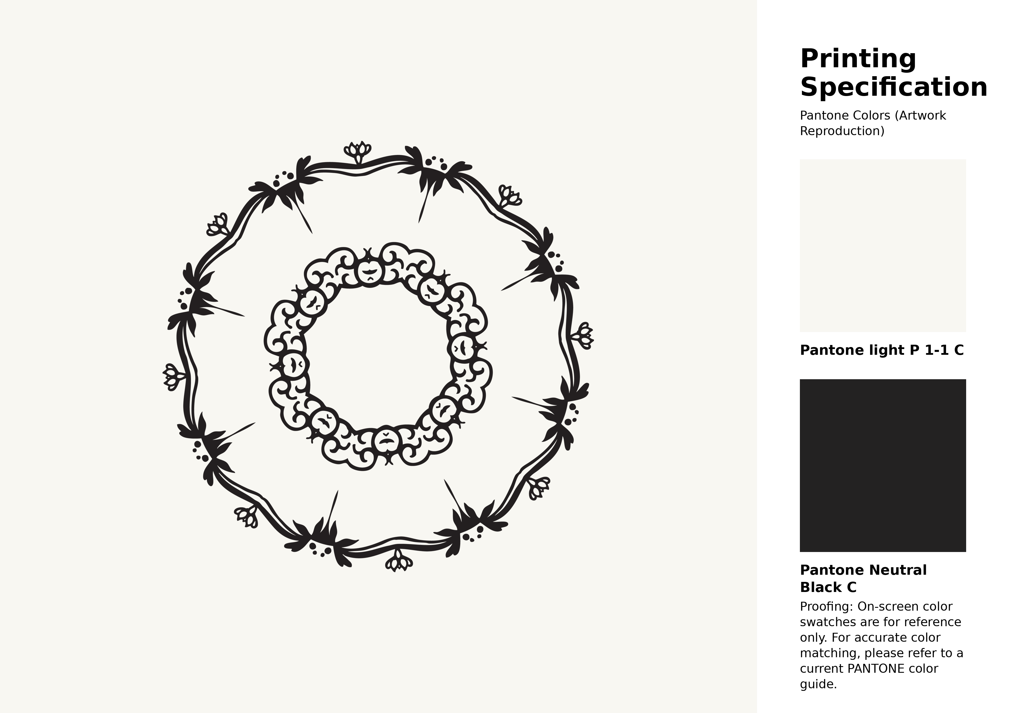
#f8f7f2 Pantone P 1-1 C Color | Hex color Code #f8f7f2 Artwork Image (PNG)
Download Artwork (PNG)#f8f7f2 Pantone P 1-1 C Color | Hex color Code #f8f7f2 Artwork Vector (PDF)
Download Artwork (PDF)#f8f7f2 Pantone P 1-1 C Color | Hex color Code #f8f7f2 Artwork Vector (SVG)
Download Artwork (SVG)
#f8f7f2 Pantone P 1-1 C Color | Hex color Code #f8f7f2 Pantone Swatch Artwork
Download Artwork Swatch
#f8f7f2 Pantone P 1-1 C Color | Hex color Code #f8f7f2 Gradient Artwork (PNG)
Download Gradient (PNG)#f8f7f2 Pantone P 1-1 C Color | Hex color Code #f8f7f2 Gradient Artwork (SVG)
Download Gradient (SVG)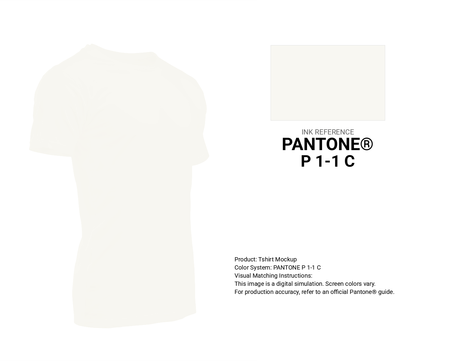
#f8f7f2 Pantone P 1-1 C Color | Hex color Code #f8f7f2 T-Shirt Mockup
Download T-Shirt Mockup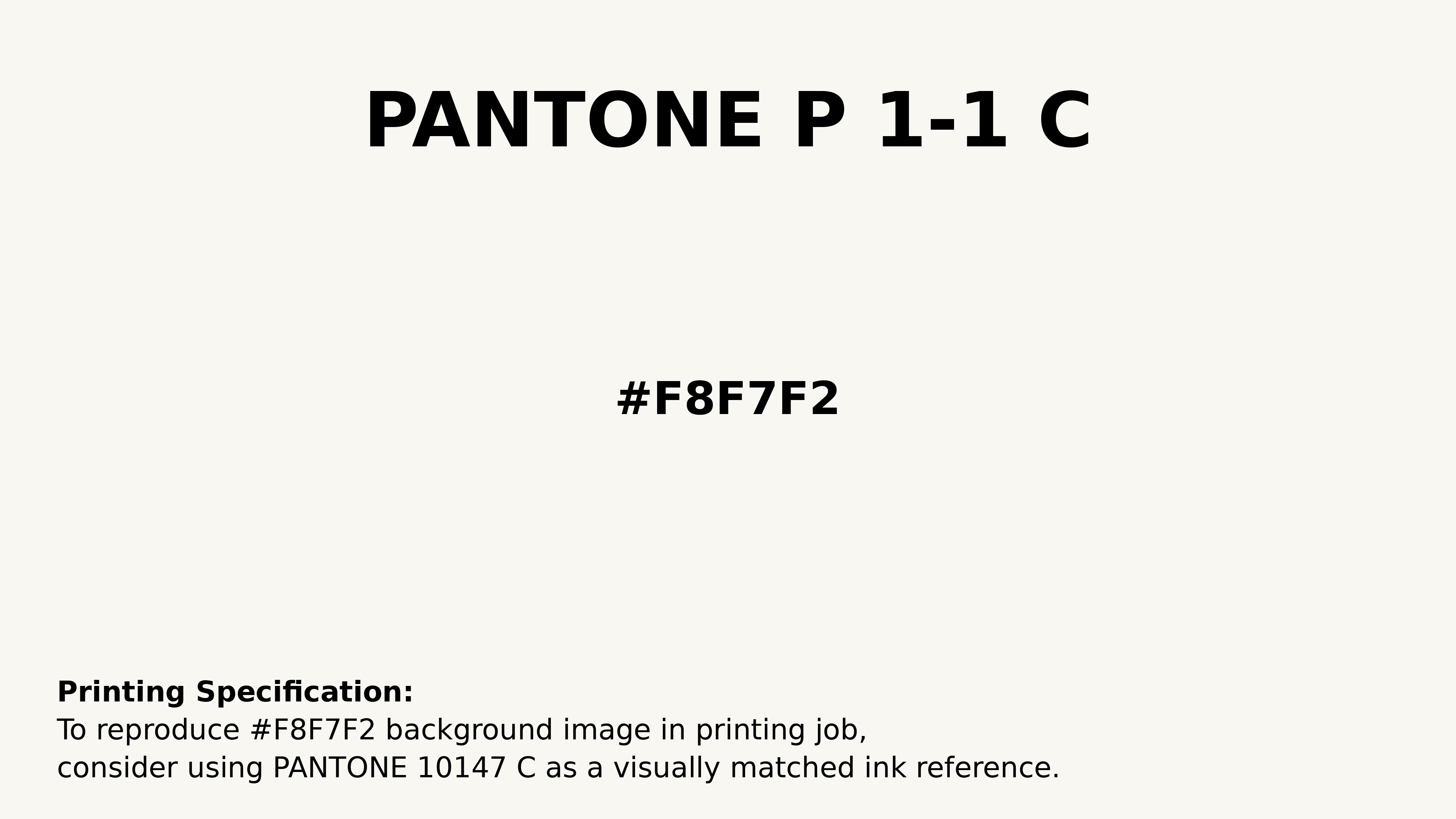
#f8f7f2 Pantone P 1-1 C Color | Hex color Code #f8f7f2 Printing Artwork Pantone Reference
Download Pantone Printing ReferenceRelated Color Palettes
- Antique White and Dark Olive Green •
- Navajo White and Dim Gray •
- Rosy Brown and White Smoke •
- Burly Wood and Navajo White •
- Navajo White and Salmon •
- Dark Khaki and Antique White •
- Antique White and Peru •
- Light Steel Blue and Navajo White •
- Gainsboro and White •
- Coral and Navajo White •
- Barley White •
- Navajo White •
- Navajo White and Maroon •
- Navajo White and Dark Sea Green •
- White Smoke
Color Palette Collection
My color palette 1
863 color palettes with 4315 colors.

35 Light Blue Color Palette
35 color palettes with 175 colors.

36 Orange shades Color Palette Collection
36 color palettes with 180 colors.
My Red Color Palettes
20 color palettes with 100 colors.