#ECB3CB Color
Your all-in-one color resource. Download hex background images, Adobe swatches (ASE), PDF color sheets, and SVG files. Explore palettes, harmonies, accessibility, conversions, and professional exports — designed for designers, developers, and color perfectionists.
This gentle, rosy hue conjures the soft light of early morning, where the sky blushes with the promise of a new day. It evokes feelings of tenderness, comfort, and delicate beauty, reminiscent of rose petals, spring blossoms, and the warmth of a loving embrace. The color creates a mood of serenity and optimism, whispering of quiet moments and gentle beginnings. In design, it lends itself well to spaces intended for relaxation and nurturing, such as bedrooms, nurseries, or spa retreats. It subtly suggests femininity, romance, and a connection to nature's gentle cycles. The color can also be associated with the idea of self-love and inner peace, representing a sense of calm and acceptance. Its a color that invites a sense of well-being and a feeling of being cherished. Visually matched named color: Blushing Dawn.
PANTONE 203 C
Choose Color
Selected Color
Recent Colors
Color Details
Similar Ink Alternatives for #ECB3CB color Alternative print inks for reproducing #ECB3CB background image with a similar visual appearance.
Disclaimer: The visually matched ink reference is an independent approximation intended as a guide only. Please be advised that this pantone colors is only intended as a guide, Actual colours will depend on screen calibration variances. The print ink suggestions provided are independent visual approximations and are not affiliated with or endorsed by Pantone LLC. For official color specifications, conversion factors, and comprehensive color system information, please visit Pantone Connect. Official Pantone products can be purchased at pantone.com.
Color Previews for #000000 See how this color looks as a background or as text.
Complete Guide to Your Color Laboratory
Everything you need to know about this professional color toolkit.
Use the Color Picker at the top to select any color. All modules below update instantly.
Workflow: Pick a color → Explore palettes & data → Download what you need (PDF, Image, or Adobe ASE).
Color Details — Your color in all formats: HEX, RGB, RGBA, HSL, HSLA, HSV, CMYK, CIELab, Hunter-Lab, XYZ, Yxy, YUV. One-click copy.
Color Psychology — Emotional impact, cultural meanings, physiological effects, branding applications, and historical significance.
Named Colors — Find official color names (HTML/CSS, Pantone) that match your selection with similarity percentages.
Light & Dark Shades
80-step gradient from black to white. Perfect for button states and component systems.
Tints
Color mixed with white → lighter, pastel variations for backgrounds and disabled states.
Monochromatic — 11 curated tints/shades from one color. Production-ready for design systems.
- Complementary — Opposite on wheel (180°). High contrast.
- Analogous — Neighbors (±30°). Harmonious flow.
- Triadic — Three colors (120° apart). Vibrant, balanced.
- Split-Complementary — Base + two near-complements. Softer contrast.
- Tetradic/Square — Four colors. Complex, maximum variety.
- Neutral — Desaturated versions. Subtle, sophisticated.
15 Professional Variations — Monochromatic, Analogous, Complementary, Warm/Cool/Earth Tones, Pastel, Vibrant, High Contrast, and more.
Color Infusion — 10 palettes showing your color morphing into each major hue. Find bridge colors.
Similar Colors — 60+ colors generated via CIELAB Delta E matching. Unexpected harmonious combinations.
18 Ready-to-Use Gradients — Complementary, Analogous, Triadic, Tint/Shade progressions, and more.
Downloads: PNG (2560×1440), CSS (production-ready code), SVG (scalable vector).
WCAG Contrast Checker — Tests your color against white, black, and custom colors for AA (4.5:1) and AAA (7:1) compliance. Large text thresholds included.
Harmony & Accessibility Guide — Tests against 10 canonical hues. Shows which pairs are both beautiful AND WCAG-compliant for text.
PNG/JPG — High-res images for presentations and mood boards.
PDF — Print-ready reports for clients and teams.
Adobe ASE — Direct import to Photoshop, Illustrator, InDesign, XD.
CSS/SVG — Gradients only. Production-ready code and vectors.
Color Science: Industry-standard conversions (HSL, CIELAB, CMYK, XYZ). WCAG 2.1 luminance formula. Delta E (ΔE76) for perceptual matching.
Direct Links: Share colors via icolorpalette.com/color/ff5733 or icolorpalette.com/color/red
Issues? Refresh the page, wait for rendering, try another browser, or check console (F12) for errors.
Printing Guide for #ecb3cb Background Image
Use PANTONE 203 C as a visually matched ink reference when printing this background image.
To print the #ecb3cb background image from our site, consider using PANTONE 203 C as a visually matched ink reference.
Download the background image, then provide this reference code to your print vendor to help achieve accurate color reproduction.
The visually matched ink reference for the #ecb3cb background image is PANTONE 203 C.
This color is commonly described as Blushing Dawn.
This gentle, rosy hue conjures the soft light of early morning, where the sky blushes with the promise of a new day. It evokes feelings of tenderness, comfort, and delicate beauty, reminiscent of rose petals, spring blossoms, and the warmth of a loving embrace. The color creates a mood of serenity and optimism, whispering of quiet moments and gentle beginnings. In design, it lends itself well to spaces intended for relaxation and nurturing, such as bedrooms, nurseries, or spa retreats. It subtly suggests femininity, romance, and a connection to nature's gentle cycles. The color can also be associated with the idea of self-love and inner peace, representing a sense of calm and acceptance. Its a color that invites a sense of well-being and a feeling of being cherished.
We provide PANTONE 203 C as a visually matched ink reference to help you reproduce the #ecb3cb background image accurately in professional printing.
This reference code helps print vendors achieve consistent color output across different printing equipment and materials.
After downloading the #ecb3cb background image from our site:
- Include the visually matched ink reference PANTONE 203 C in your print order notes
- Inform your print vendor that this is your target color reference
- Request a proof print to verify the Blushing Dawn color appearance before full production
The #ecb3cb background image with PANTONE 203 C as visually matched ink reference can be used for:
- Posters, banners, and backdrops
- Business cards, brochures, and flyers
- Packaging, labels, and stickers
- Signage and promotional materials
This is an independent visual approximation.
While PANTONE 203 C closely matches the #ecb3cb background image color, variations may exist between screen display and printed output.
We recommend requesting a proof print to verify the final appearance.
This gentle, rosy hue conjures the soft light of early morning, where the sky blushes with the promise of a new day. It evokes feelings of tenderness, comfort, and delicate beauty, reminiscent of rose petals, spring blossoms, and the warmth of a loving embrace. The color creates a mood of serenity and optimism, whispering of quiet moments and gentle beginnings. In design, it lends itself well to spaces intended for relaxation and nurturing, such as bedrooms, nurseries, or spa retreats. It subtly suggests femininity, romance, and a connection to nature's gentle cycles. The color can also be associated with the idea of self-love and inner peace, representing a sense of calm and acceptance. Its a color that invites a sense of well-being and a feeling of being cherished.
Understanding these associations helps ensure the #ecb3cb background image aligns with your intended message and brand impact.
Important Information
The visually matched ink reference is an independent approximation intended as a guide only.
Actual printed colors may vary depending on screen calibration, substrate material, ink type, and printing equipment used.
For official color specifications and certified color standards, visit Pantone Connect.
Official color guides and swatch books can be purchased from pantone.com.
Pantone 203 C Color: Creative Coral | #ECB3CB
Introduction:
Creative Coral is a vibrant shade of pinkish-orange that radiates energy and positivity. It combines the warmth of coral with a touch of creativity, making it an exciting color choice for various purposes.
Historical Significance:
Key moments in history where Creative Coral was prominently used or played a significant role: Creative Coral gained popularity in the 1950s as a trendy color for interior decor, particularly in mid-century modern designs. It became a symbol of modernity and sophistication during that era. In recent years, Creative Coral has been embraced by the fashion industry, appearing on runways and becoming a symbol of boldness and individuality.
Symbolism and Meaning:
What Creative Coral typically symbolizes: Creative Coral symbolizes energy, enthusiasm, and a zest for life. It represents passion, creativity, and adventure. In some cultures, coral is associated with good fortune and protection against evil spirits.
Creative Coral in Fashion:
How Creative Coral impacts styles and trends in the fashion world: Creative Coral has been a popular choice in fashion, particularly during the spring and summer seasons. It adds a vibrant and playful touch to outfits and is often used in statement pieces or accessories. Designers often incorporate Creative Coral into their collections to evoke a sense of joy and excitement.
Creative Coral in Graphic Design:
Significance of Creative Coral in design aesthetics, branding, and visual impact: Creative Coral is a popular choice in graphic design because it creates a strong visual impact. It can be used to grab attention and evoke positive emotions. In branding, Creative Coral is often associated with creativity, innovation, and a youthful spirit, making it suitable for companies targeting a younger audience.
Color Combinations:
Potential color combinations with Creative Coral: Creative Coral pairs well with complementary colors such as turquoise and teal. It also looks great with neutral colors like beige or gray. Other color combinations to consider include Creative Coral with shades of yellow, peach, or lavender.
Nature’s Palette:
Natural occurrences of Creative Coral: Creative Coral can be found in various natural elements such as coral reefs, certain flowers (such as peonies and tropical hibiscus), and vibrant sunsets. It adds a vibrant and eye-catching element to the natural world.
Artistic Representations:
How Creative Coral has been used in various forms of art over time: Creative Coral has been used in paintings, sculptures, and textile art to add vibrancy and create a focal point. It can evoke a sense of energy and passion in artistic expressions, whether in abstract or representational styles.
Movies and Cinematic Landscapes:
Movies or scenes where Creative Coral sets the tone or mood: Creative Coral is often used in movies to convey a sense of excitement, joy, or playfulness. It can be seen in scenes depicting parties, celebrations, or romantic moments.
Products and Commercial Appeal:
Popular products or brands associated with Creative Coral: Creative Coral is commonly used in beauty products, home decor, and fashion brands. It is often chosen by brands that want to convey a sense of creativity, boldness, and trendiness. Some well-known brands that have incorporated Creative Coral in their branding include Sephora, Kate Spade, and Benefit Cosmetics.
National Symbols and Significance:
Any national or cultural significance tied to Creative Coral: Creative Coral does not have any specific national or cultural significance. However, it can be associated with the culture of joy and creativity that transcends boundaries and is universally appreciated.
The Psychological and Emotional Impact:
How Creative Coral influences emotions or perceptions psychologically: Creative Coral is known to evoke feelings of happiness, warmth, and enthusiasm. It can energize and uplift moods, making it an excellent choice for creating positive and engaging environments. The color's vibrant nature can also stimulate creativity and inspire innovative thinking.
Conclusion:
Creative Coral, with its vibrant and energetic nature, holds historical significance as a symbol of modernity and sophistication. Its warm tones evoke feelings of positivity and adventure. From fashion to graphic design, Creative Coral adds a touch of creativity and captivates the senses. Its use in movies, art, and commercial branding further highlights its universal appeal. Overall, Creative Coral is a color that brings joy, inspiration, and a fresh perspective to various aspects of life.
Pantone 203 C Color | Hex color Code #ecb3cb Image & Artwork
Download high-quality assets for your projects.

#ecb3cb Color Schemes
Download Color Schemes
#ecb3cb Color Shades
Download Color Shades
Pantone 203 C Color | Hex color Code #ecb3cb Solid Color Background
Download Solid Color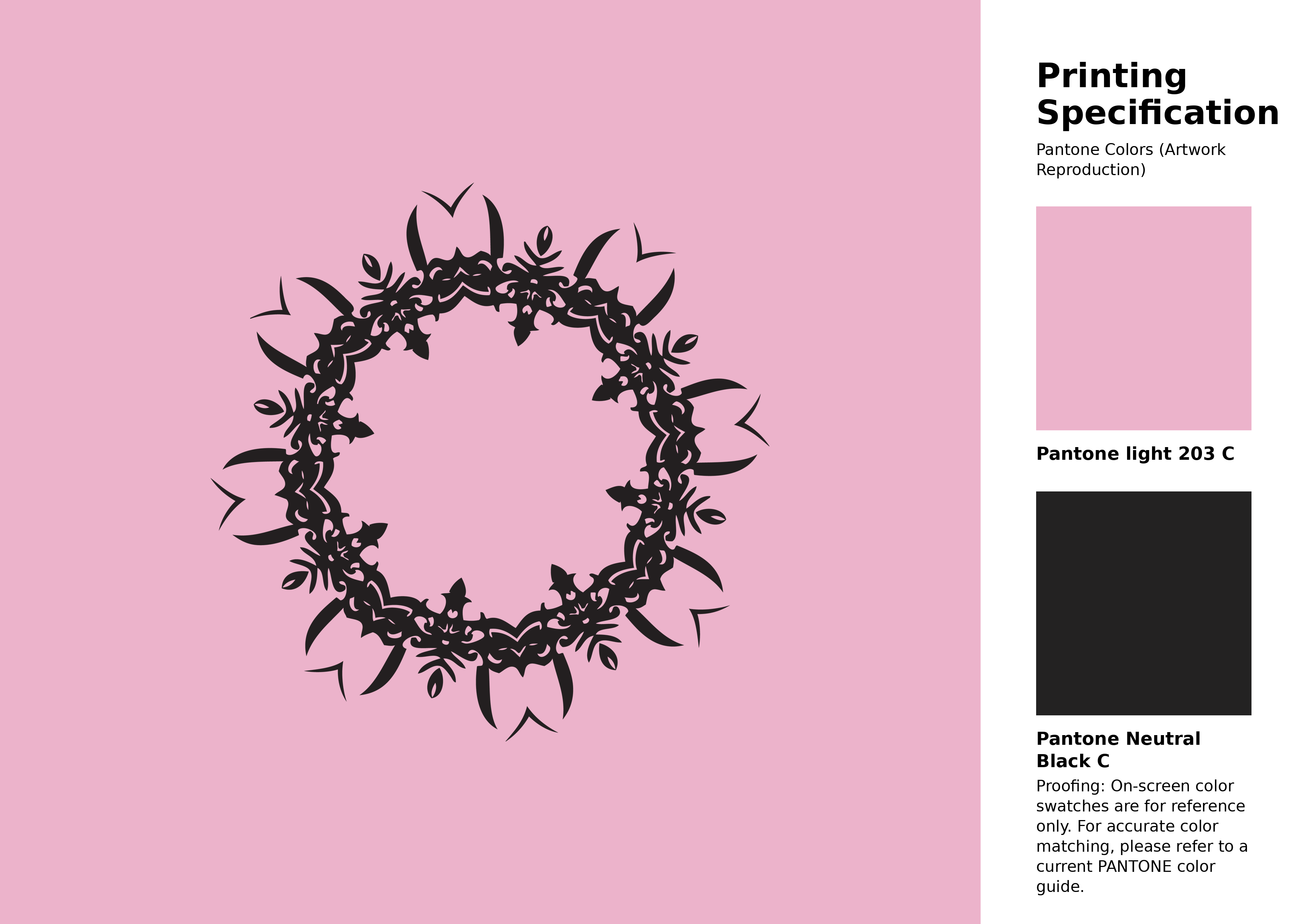
#ecb3cb Pantone 203 C Color | Hex color Code #ecb3cb Artwork Image (PNG)
Download Artwork (PNG)#ecb3cb Pantone 203 C Color | Hex color Code #ecb3cb Artwork Vector (PDF)
Download Artwork (PDF)#ecb3cb Pantone 203 C Color | Hex color Code #ecb3cb Artwork Vector (SVG)
Download Artwork (SVG)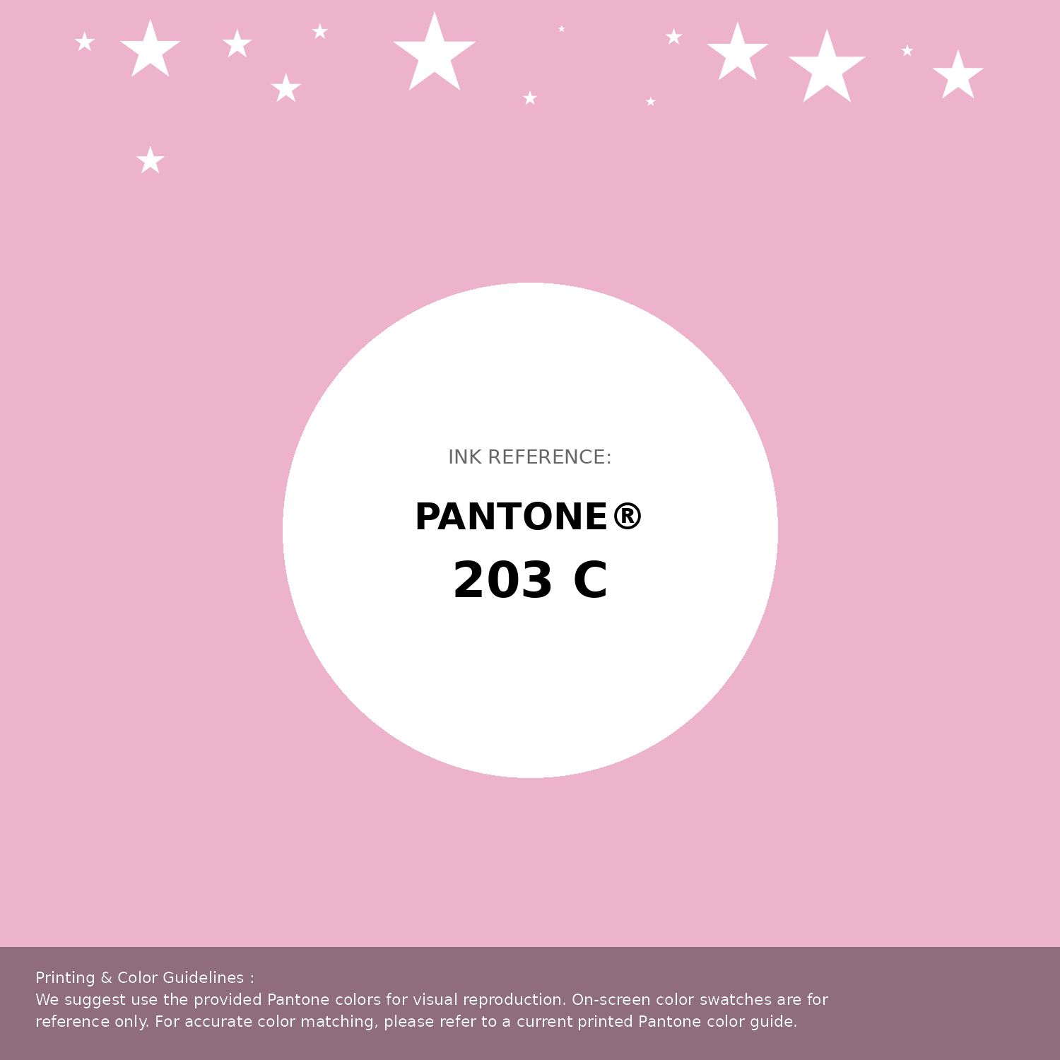
#ecb3cb Pantone 203 C Color | Hex color Code #ecb3cb Pantone Swatch Artwork
Download Artwork Swatch
#ecb3cb Pantone 203 C Color | Hex color Code #ecb3cb Gradient Artwork (PNG)
Download Gradient (PNG)#ecb3cb Pantone 203 C Color | Hex color Code #ecb3cb Gradient Artwork (SVG)
Download Gradient (SVG)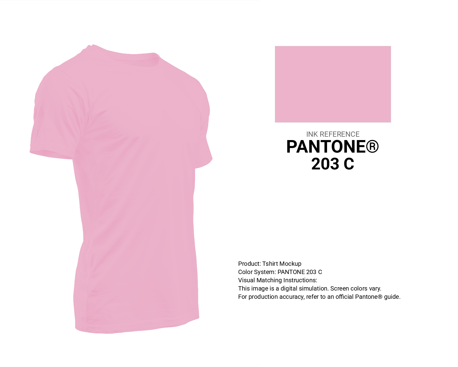
#ecb3cb Pantone 203 C Color | Hex color Code #ecb3cb T-Shirt Mockup
Download T-Shirt Mockup
#ecb3cb Pantone 203 C Color | Hex color Code #ecb3cb Printing Artwork Pantone Reference
Download Pantone Printing ReferenceRelated Color Palettes
- Light Pink and Dim Gray •
- Brown and Deep Pink •
- Light Pink and Dark Slate Gray •
- Pale Violet Red and Light Pink •
- Light Pink and Rosy Brown •
- Light Pink and Light Coral •
- Dark Slate Gray and Deep Pink •
- Brown and Hot Pink •
- Solid Pink •
- Hot Pink and Crimson •
- Mountbatten Pink •
- Light Pink and Dark Olive Green •
- Fuchsia Pink •
- Wheat and Light Pink •
- Light Coral and Light Pink
Color Palette Collection

25 Sunset Color Schemes
25 color palettes with 125 colors.

30+ Purple Color Palettes
31 color palettes with 155 colors.

16 Brown Color Palettes
16 color palettes with 80 colors.

The Color of Calm: 18 Blue Palettes to Enhance Your Design
18 color palettes with 90 colors.