Crimson Color | dc143c
Your all-in-one color resource. Download hex background images, Adobe swatches (ASE), PDF color sheets, and SVG files. Explore palettes, harmonies, accessibility, conversions, and professional exports — designed for designers, developers, and color perfectionists.
Choose Color
Selected Color
Recent Colors
Color Details
Similar Ink Alternatives for #DC143C color Alternative print inks for reproducing #DC143C background image with a similar visual appearance.
Disclaimer: The visually matched ink reference is an independent approximation intended as a guide only. Please be advised that this pantone colors is only intended as a guide, Actual colours will depend on screen calibration variances. The print ink suggestions provided are independent visual approximations and are not affiliated with or endorsed by Pantone LLC. For official color specifications, conversion factors, and comprehensive color system information, please visit Pantone Connect. Official Pantone products can be purchased at pantone.com.
Color Previews for #000000 See how this color looks as a background or as text.
Complete Guide to Your Color Laboratory
Everything you need to know about this professional color toolkit.
Use the Color Picker at the top to select any color. All modules below update instantly.
Workflow: Pick a color → Explore palettes & data → Download what you need (PDF, Image, or Adobe ASE).
Color Details — Your color in all formats: HEX, RGB, RGBA, HSL, HSLA, HSV, CMYK, CIELab, Hunter-Lab, XYZ, Yxy, YUV. One-click copy.
Color Psychology — Emotional impact, cultural meanings, physiological effects, branding applications, and historical significance.
Named Colors — Find official color names (HTML/CSS, Pantone) that match your selection with similarity percentages.
Light & Dark Shades
80-step gradient from black to white. Perfect for button states and component systems.
Tints
Color mixed with white → lighter, pastel variations for backgrounds and disabled states.
Monochromatic — 11 curated tints/shades from one color. Production-ready for design systems.
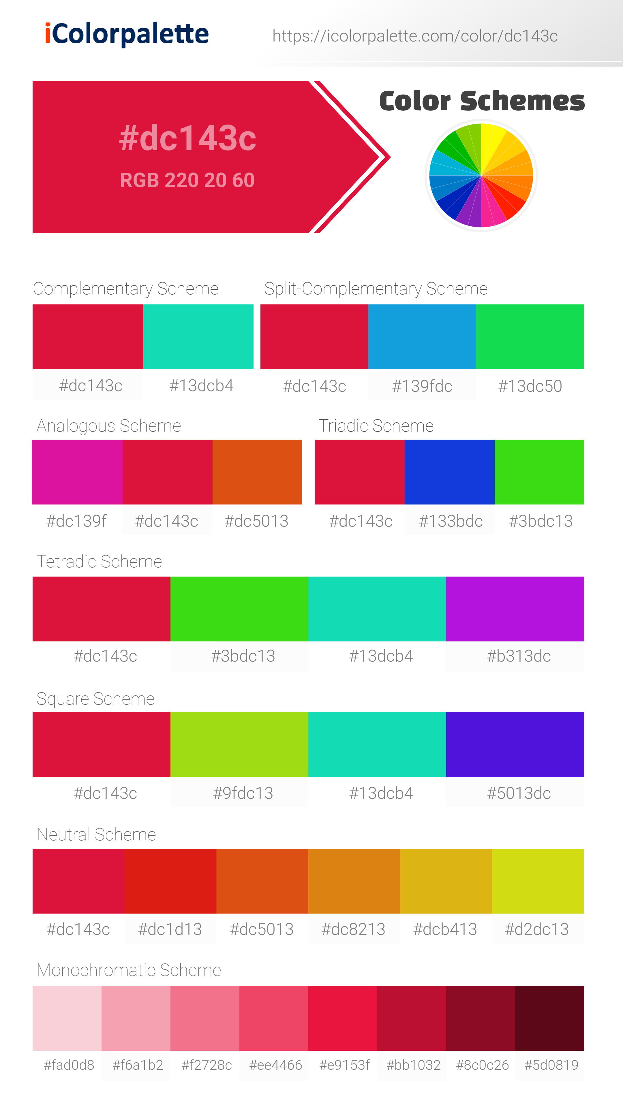
- Complementary — Opposite on wheel (180°). High contrast.
- Analogous — Neighbors (±30°). Harmonious flow.
- Triadic — Three colors (120° apart). Vibrant, balanced.
- Split-Complementary — Base + two near-complements. Softer contrast.
- Tetradic/Square — Four colors. Complex, maximum variety.
- Neutral — Desaturated versions. Subtle, sophisticated.
15 Professional Variations — Monochromatic, Analogous, Complementary, Warm/Cool/Earth Tones, Pastel, Vibrant, High Contrast, and more.
Color Infusion — 10 palettes showing your color morphing into each major hue. Find bridge colors.
Similar Colors — 60+ colors generated via CIELAB Delta E matching. Unexpected harmonious combinations.
18 Ready-to-Use Gradients — Complementary, Analogous, Triadic, Tint/Shade progressions, and more.
Downloads: PNG (2560×1440), CSS (production-ready code), SVG (scalable vector).
WCAG Contrast Checker — Tests your color against white, black, and custom colors for AA (4.5:1) and AAA (7:1) compliance. Large text thresholds included.
Harmony & Accessibility Guide — Tests against 10 canonical hues. Shows which pairs are both beautiful AND WCAG-compliant for text.
PNG/JPG — High-res images for presentations and mood boards.
PDF — Print-ready reports for clients and teams.
Adobe ASE — Direct import to Photoshop, Illustrator, InDesign, XD.
CSS/SVG — Gradients only. Production-ready code and vectors.
Color Science: Industry-standard conversions (HSL, CIELAB, CMYK, XYZ). WCAG 2.1 luminance formula. Delta E (ΔE76) for perceptual matching.
Direct Links: Share colors via icolorpalette.com/color/ff5733 or icolorpalette.com/color/red
Issues? Refresh the page, wait for rendering, try another browser, or check console (F12) for errors.
Crimson: A Bold and Passionate Color | #DC143C
Introduction:
Crimson is a deep red color that exudes power and intensity. With its rich and vibrant tone, it catches the eye and commands attention. Its boldness and passion make it a popular choice in various fields, from fashion to graphic design.
Historical Significance:
Origins and Early Use: Crimson has a long history dating back to ancient times. The color was highly prized and used by civilizations such as the Greeks and Romans. It gained popularity as a symbol of wealth and power.
Royal Association: Crimson became closely associated with royalty during the Renaissance and Baroque periods. It was often used in aristocratic garments and represented wealth and prestige.
Symbolism and Meaning:
Passion and Love: Crimson symbolizes passion, love, and desire. It evokes strong emotions and is often associated with romance and seduction.
Power and Strength: The deep and intense shade of crimson is also associated with power, strength, and courage. It conveys authority and commands attention.
Crimson in Fashion:
Classic Elegance: Crimson is also associated with classic elegance. It has a timeless appeal and can be seen in various fashion eras, from vintage styles to modern interpretations.
Crimson in Graphic Design:
Emotional Impact: Crimson is often used in graphic design to evoke strong emotions. Its bold and vibrant nature grabs attention and creates a sense of energy and intensity.
Branding and Visual Impact: Crimson is frequently used in branding to create a memorable and impactful visual identity. Its association with power and passion can help convey the desired message of a brand.
Color Combinations:
Complementary Colors: Crimson pairs well with various colors, such as gold, black, and white. These combinations create a striking contrast and enhance the vibrancy of crimson.
Analogous Colors: Crimson also works well with analogous colors like burgundy and maroon. These combinations create a harmonious and sophisticated color palette.
Nature's Palette:
Flora and Fauna: Crimson can be found in nature in various flowers, such as roses and poppies. It also appears in certain bird species, adding a vibrant touch to their plumage.
Scenic Landscapes: Crimson hues can be seen in breathtaking sunsets, autumn foliage, and vibrant natural formations, adding depth and beauty to landscapes.
Artistic Representations:
Expression of Emotion: Artists have used crimson to depict strong emotions, such as love, anger, and passion. It adds intensity and drama to paintings, sculptures, and other art forms.
Contrast and Impact: The vividness of crimson makes it a popular choice for artists looking to create visual impact and draw attention to specific elements in their artwork.
Movies and Cinematic Landscapes:
Dramatic Moments: Crimson is often used in movies to create dramatic and intense scenes. It can symbolize danger, passion, or evoke a sense of urgency.
Mood and Atmosphere: Crimson lighting or color grading can set the tone and create a specific mood in a cinematic landscape. It adds depth and visual interest to the overall scene.
Products and Commercial Appeal:
Luxury and Prestige: Many luxury brands incorporate crimson into their products and branding. It adds sophistication and a sense of exclusivity.
Energizing and Attention-Grabbing: Crimson is often used in product packaging and advertisements to capture attention and create an energetic and captivating impression.
National Symbols and Significance:
Historical and Cultural Importance: Crimson holds significance in various cultures and can be found in national symbols and flags. It represents concepts such as bravery, honor, and patriotism.
The Psychological and Emotional Impact:
Emotional Intensity: Crimson can evoke a range of emotions, from passion and desire to anger and intensity. It stimulates the senses and grabs attention.
Physical and Mental Stimulation: The vibrant nature of crimson can energize and motivate individuals. It can also enhance focus and stimulate creativity.
Conclusion:
Crimson is a color that has left its mark throughout history. With its association with power, passion, and elegance, it continues to captivate and inspire. Whether in fashion, design, or artistic expressions, crimson remains a timeless and impactful color choice.
Crimson Color | Hex dc143c Image & Artwork
Download high-quality assets for your projects.
#dc143c Color Schemes
Download Color Schemes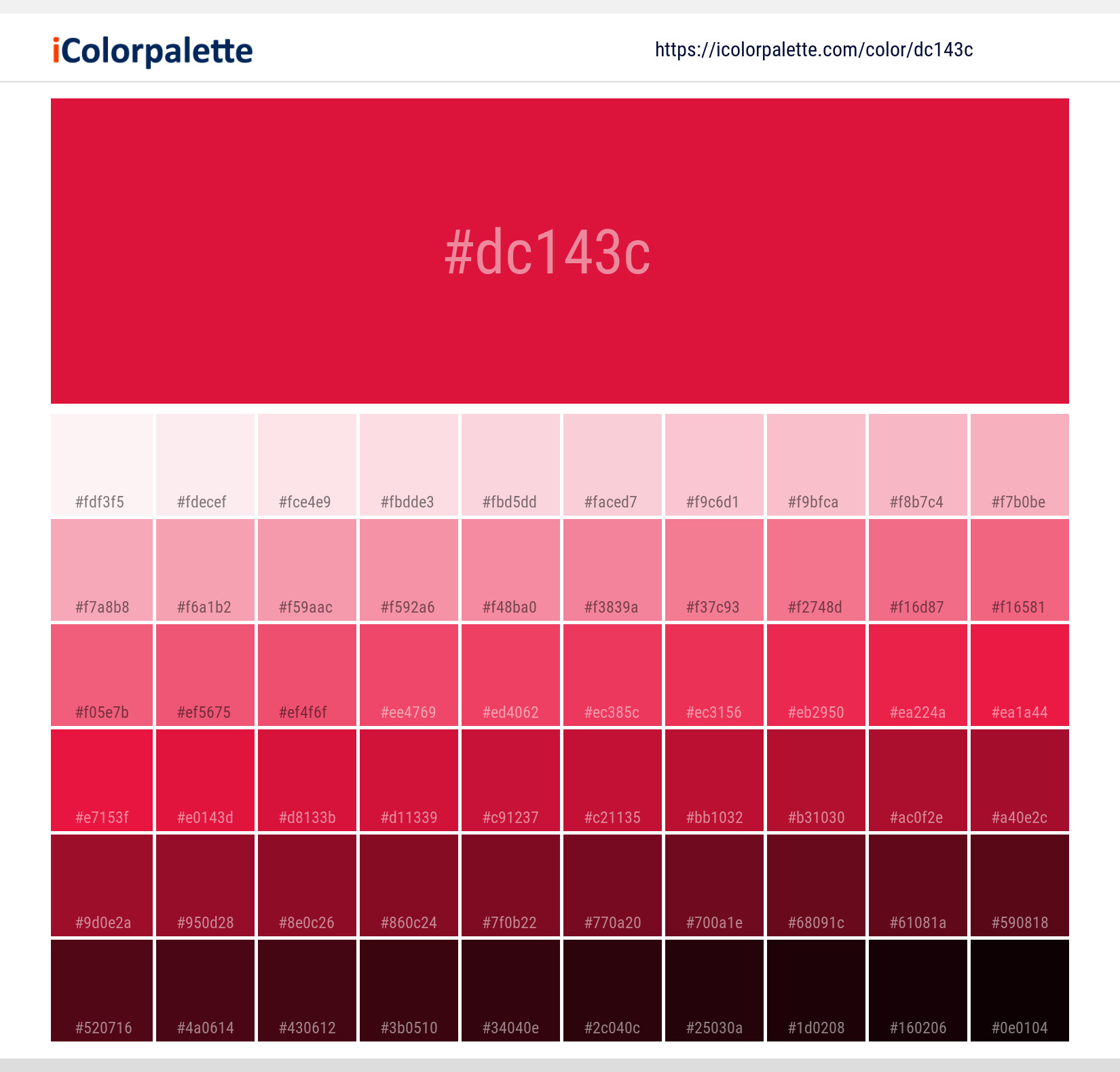
#dc143c Color Shades
Download Color Shades
Crimson Color | Hex dc143c Solid Color Background
Download Solid Color
Crimson - #dc143c Color Name
Download Color NameRelated Color Palettes
- Red Color Palettes • Green Color Palettes • Purple Color Palettes • Pink Color Palettes • Orange Color Palettes • Blue Color Palettes • Yellow Color Palettes • Brown Color Palettes • Gray Color Palettes • Beige Color Palettes • Turquoise Color Palettes
Color Palette Collection

50 Red color palettes
50 color palettes with 250 colors.

Orange Palette Collection
10 color palettes with 50 colors.

The Color of Calm: 18 Blue Palettes to Enhance Your Design
18 color palettes with 90 colors.
ADC Website Accents
1 color palettes with 5 colors.