#DA1884 Color
Your all-in-one color resource. Download hex background images, Adobe swatches (ASE), PDF color sheets, and SVG files. Explore palettes, harmonies, accessibility, conversions, and professional exports — designed for designers, developers, and color perfectionists.
This vibrant magenta, #DA1884, pulsates with a passionate energy. It evokes feelings of excitement, boldness, and a touch of mystery, like a hidden bloom in the twilight. It reminds one of ruby gemstones, the flush of a sunset, or the deep hues of a luxurious velvet. The color creates a mood of both sensuality and confidence, drawing the eye and demanding attention. In design, it could be used to add a dramatic flair to a space, perhaps as an accent wall or in luxurious upholstery. Culturally, it can symbolize romance, love, and feminine power, embodying a sense of daring individuality and unapologetic self-expression. It's a color that speaks of both strength and vulnerability, a compelling blend of fire and depth. Visually matched named color: Crimson Embrace.
PANTONE 219 C
Choose Color
Selected Color
Recent Colors
Color Details
Similar Ink Alternatives for #DA1884 color Alternative print inks for reproducing #DA1884 background image with a similar visual appearance.
Disclaimer: The visually matched ink reference is an independent approximation intended as a guide only. Please be advised that this pantone colors is only intended as a guide, Actual colours will depend on screen calibration variances. The print ink suggestions provided are independent visual approximations and are not affiliated with or endorsed by Pantone LLC. For official color specifications, conversion factors, and comprehensive color system information, please visit Pantone Connect. Official Pantone products can be purchased at pantone.com.
Color Previews for #000000 See how this color looks as a background or as text.
Complete Guide to Your Color Laboratory
Everything you need to know about this professional color toolkit.
Use the Color Picker at the top to select any color. All modules below update instantly.
Workflow: Pick a color → Explore palettes & data → Download what you need (PDF, Image, or Adobe ASE).
Color Details — Your color in all formats: HEX, RGB, RGBA, HSL, HSLA, HSV, CMYK, CIELab, Hunter-Lab, XYZ, Yxy, YUV. One-click copy.
Color Psychology — Emotional impact, cultural meanings, physiological effects, branding applications, and historical significance.
Named Colors — Find official color names (HTML/CSS, Pantone) that match your selection with similarity percentages.
Light & Dark Shades
80-step gradient from black to white. Perfect for button states and component systems.
Tints
Color mixed with white → lighter, pastel variations for backgrounds and disabled states.
Monochromatic — 11 curated tints/shades from one color. Production-ready for design systems.
- Complementary — Opposite on wheel (180°). High contrast.
- Analogous — Neighbors (±30°). Harmonious flow.
- Triadic — Three colors (120° apart). Vibrant, balanced.
- Split-Complementary — Base + two near-complements. Softer contrast.
- Tetradic/Square — Four colors. Complex, maximum variety.
- Neutral — Desaturated versions. Subtle, sophisticated.
15 Professional Variations — Monochromatic, Analogous, Complementary, Warm/Cool/Earth Tones, Pastel, Vibrant, High Contrast, and more.
Color Infusion — 10 palettes showing your color morphing into each major hue. Find bridge colors.
Similar Colors — 60+ colors generated via CIELAB Delta E matching. Unexpected harmonious combinations.
18 Ready-to-Use Gradients — Complementary, Analogous, Triadic, Tint/Shade progressions, and more.
Downloads: PNG (2560×1440), CSS (production-ready code), SVG (scalable vector).
WCAG Contrast Checker — Tests your color against white, black, and custom colors for AA (4.5:1) and AAA (7:1) compliance. Large text thresholds included.
Harmony & Accessibility Guide — Tests against 10 canonical hues. Shows which pairs are both beautiful AND WCAG-compliant for text.
PNG/JPG — High-res images for presentations and mood boards.
PDF — Print-ready reports for clients and teams.
Adobe ASE — Direct import to Photoshop, Illustrator, InDesign, XD.
CSS/SVG — Gradients only. Production-ready code and vectors.
Color Science: Industry-standard conversions (HSL, CIELAB, CMYK, XYZ). WCAG 2.1 luminance formula. Delta E (ΔE76) for perceptual matching.
Direct Links: Share colors via icolorpalette.com/color/ff5733 or icolorpalette.com/color/red
Issues? Refresh the page, wait for rendering, try another browser, or check console (F12) for errors.
Printing Guide for #da1884 Background Image
Use PANTONE 219 C as a visually matched ink reference when printing this background image.
To print the #da1884 background image from our site, consider using PANTONE 219 C as a visually matched ink reference.
Download the background image, then provide this reference code to your print vendor to help achieve accurate color reproduction.
The visually matched ink reference for the #da1884 background image is PANTONE 219 C.
This color is commonly described as Crimson Embrace.
This vibrant magenta, #DA1884, pulsates with a passionate energy. It evokes feelings of excitement, boldness, and a touch of mystery, like a hidden bloom in the twilight. It reminds one of ruby gemstones, the flush of a sunset, or the deep hues of a luxurious velvet. The color creates a mood of both sensuality and confidence, drawing the eye and demanding attention. In design, it could be used to add a dramatic flair to a space, perhaps as an accent wall or in luxurious upholstery. Culturally, it can symbolize romance, love, and feminine power, embodying a sense of daring individuality and unapologetic self-expression. It's a color that speaks of both strength and vulnerability, a compelling blend of fire and depth.
We provide PANTONE 219 C as a visually matched ink reference to help you reproduce the #da1884 background image accurately in professional printing.
This reference code helps print vendors achieve consistent color output across different printing equipment and materials.
After downloading the #da1884 background image from our site:
- Include the visually matched ink reference PANTONE 219 C in your print order notes
- Inform your print vendor that this is your target color reference
- Request a proof print to verify the Crimson Embrace color appearance before full production
The #da1884 background image with PANTONE 219 C as visually matched ink reference can be used for:
- Posters, banners, and backdrops
- Business cards, brochures, and flyers
- Packaging, labels, and stickers
- Signage and promotional materials
This is an independent visual approximation.
While PANTONE 219 C closely matches the #da1884 background image color, variations may exist between screen display and printed output.
We recommend requesting a proof print to verify the final appearance.
This vibrant magenta, #DA1884, pulsates with a passionate energy. It evokes feelings of excitement, boldness, and a touch of mystery, like a hidden bloom in the twilight. It reminds one of ruby gemstones, the flush of a sunset, or the deep hues of a luxurious velvet. The color creates a mood of both sensuality and confidence, drawing the eye and demanding attention. In design, it could be used to add a dramatic flair to a space, perhaps as an accent wall or in luxurious upholstery. Culturally, it can symbolize romance, love, and feminine power, embodying a sense of daring individuality and unapologetic self-expression. It's a color that speaks of both strength and vulnerability, a compelling blend of fire and depth.
Understanding these associations helps ensure the #da1884 background image aligns with your intended message and brand impact.
Important Information
The visually matched ink reference is an independent approximation intended as a guide only.
Actual printed colors may vary depending on screen calibration, substrate material, ink type, and printing equipment used.
For official color specifications and certified color standards, visit Pantone Connect.
Official color guides and swatch books can be purchased from pantone.com.
Pantone 219 C Color: Elegant Rose | #DA1884
Introduction:
Elegant Rose, also known as Pantone 219 C Color with the hex code #DA1884, is a vibrant and sophisticated shade of pink. It exudes elegance and grace, making it a popular choice in creative endeavors.
Historical Significance:
Key Moments in History: Elegant Rose has been prominently used throughout history in various artistic and cultural contexts. In the Renaissance period, it was often associated with femininity and romance, appearing in paintings and fashion of the time. In the 1980s, it experienced a resurgence in popularity and became synonymous with elegance and luxury.
Symbolism and Meaning:
Symbolism: Elegant Rose typically symbolizes love, beauty, and tenderness. It is often associated with romance and femininity. In some cultures, it represents compassion and nurturing qualities. The color also signifies elegance, sophistication, and grace.
Elegant Rose in Fashion:
Fashion Impact: Elegant Rose has had a significant impact on styles and trends in the fashion world. It is a versatile color that can be used to create both classic and contemporary looks. Designers often incorporate it in formal wear, evening gowns, and accessories to add a touch of elegance and femininity.
Elegant Rose in Graphic Design:
Design Significance: Elegant Rose plays a crucial role in design aesthetics and branding. Its vibrant and eye-catching nature makes it a popular choice for logos, packaging, and advertisements. The color is often associated with luxury and premium products, giving them a sophisticated and elegant appeal.
Color Combinations:
Potential Color Combinations: Elegant Rose can be paired with various colors to create striking and harmonious combinations. Some popular combinations include: - Elegant Rose with ivory and gold for a luxurious and regal look. - Elegant Rose with pale pink and white for a soft and romantic aesthetic. - Elegant Rose with deep navy blue and silver for a sophisticated and modern appeal.
Nature’s Palette:
Natural Occurrences: Elegant Rose can be found in nature in various forms. It is often seen in vibrant roses and other flowers, adding beauty and charm to gardens and landscapes. The color can also be found in stunning sunsets, creating a warm and romantic ambiance.
Artistic Representations:
Artistic Usage: Elegant Rose has been used extensively in various forms of art. It has been featured in paintings, sculptures, and textiles, capturing the attention of viewers with its vibrant and captivating presence. Many artists use Elegant Rose to evoke emotions of love, beauty, and elegance in their works.
Movies and Cinematic Landscapes:
Movies and scenes: Elegant Rose often sets the tone and mood in movies and cinematic landscapes. It is commonly used in romantic films to symbolize love and passion. Additionally, it can create a dreamy and enchanting atmosphere when featured in fantasy or period films.
Products and Commercial Appeal:
Popular Products: Elegant Rose has become a popular choice for various products and brands. It can be seen in cosmetics, jewelry, luxury fashion items, and home décor. The color's association with elegance and sophistication makes it appealing to consumers seeking high-quality and stylish products.
National Symbols and Significance:
National Symbols: Elegant Rose holds significance in various national and cultural contexts. For example, in some countries, it may represent love and beauty as symbols of national identity. In other cultures, it may have religious or spiritual connotations tied to ceremonies or festivals.
The Psychological and Emotional Impact:
Psychological and Emotional Influence: Elegant Rose has a psychological impact on emotions and perceptions. It is often associated with feelings of love, romance, and tenderness. The color can evoke a sense of calmness and relaxation, as well as create a warm and inviting atmosphere.
Conclusion:
Elegant Rose, Pantone 219 C Color, has a rich historical significance and timeless appeal. It has been used in various cultural and artistic contexts, symbolizing love, beauty, and elegance. Whether in fashion, graphic design, or nature, Elegant Rose continues to captivate and inspire with its vibrant and sophisticated presence.
Pantone 219 C Color | Hex color Code #da1884 Image & Artwork
Download high-quality assets for your projects.

#da1884 Color Schemes
Download Color Schemes
#da1884 Color Shades
Download Color Shades
Pantone 219 C Color | Hex color Code #da1884 Solid Color Background
Download Solid Color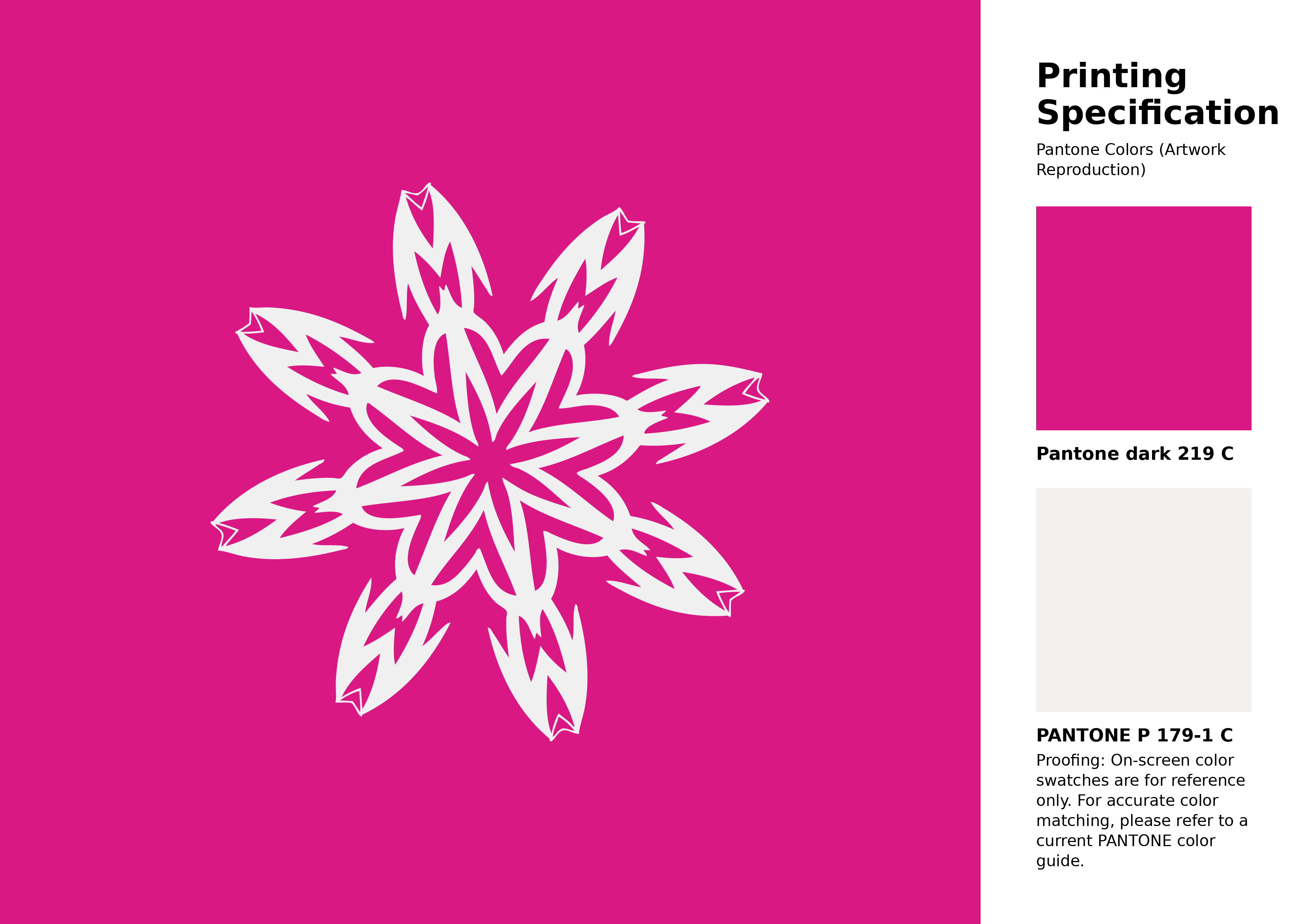
#da1884 Pantone 219 C Color | Hex color Code #da1884 Artwork Image (PNG)
Download Artwork (PNG)#da1884 Pantone 219 C Color | Hex color Code #da1884 Artwork Vector (PDF)
Download Artwork (PDF)#da1884 Pantone 219 C Color | Hex color Code #da1884 Artwork Vector (SVG)
Download Artwork (SVG)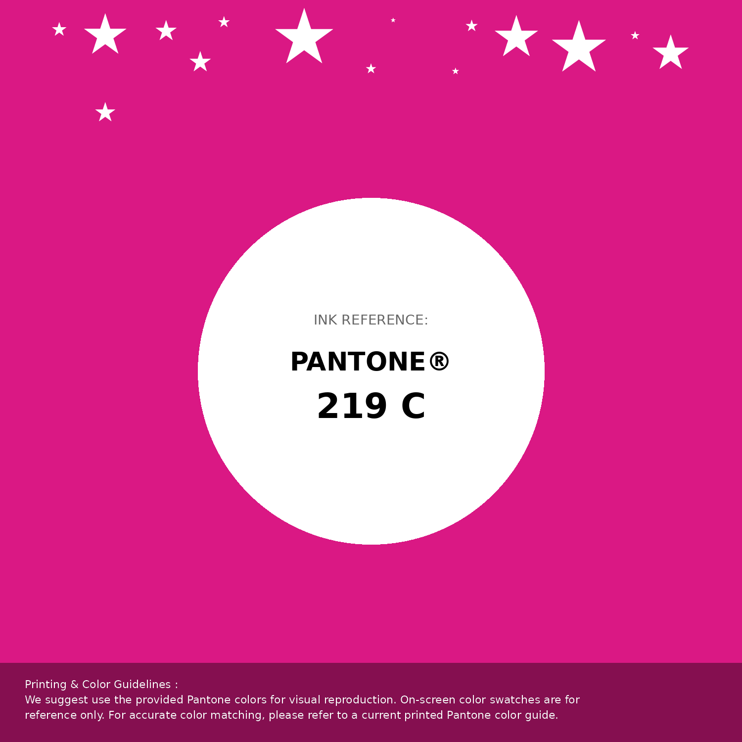
#da1884 Pantone 219 C Color | Hex color Code #da1884 Pantone Swatch Artwork
Download Artwork Swatch
#da1884 Pantone 219 C Color | Hex color Code #da1884 Gradient Artwork (PNG)
Download Gradient (PNG)#da1884 Pantone 219 C Color | Hex color Code #da1884 Gradient Artwork (SVG)
Download Gradient (SVG)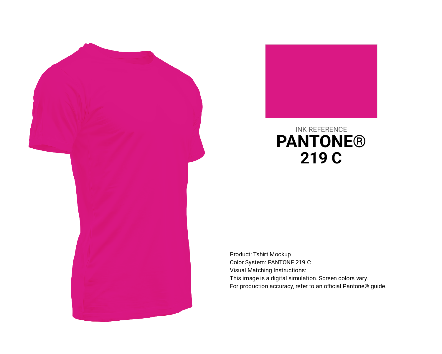
#da1884 Pantone 219 C Color | Hex color Code #da1884 T-Shirt Mockup
Download T-Shirt Mockup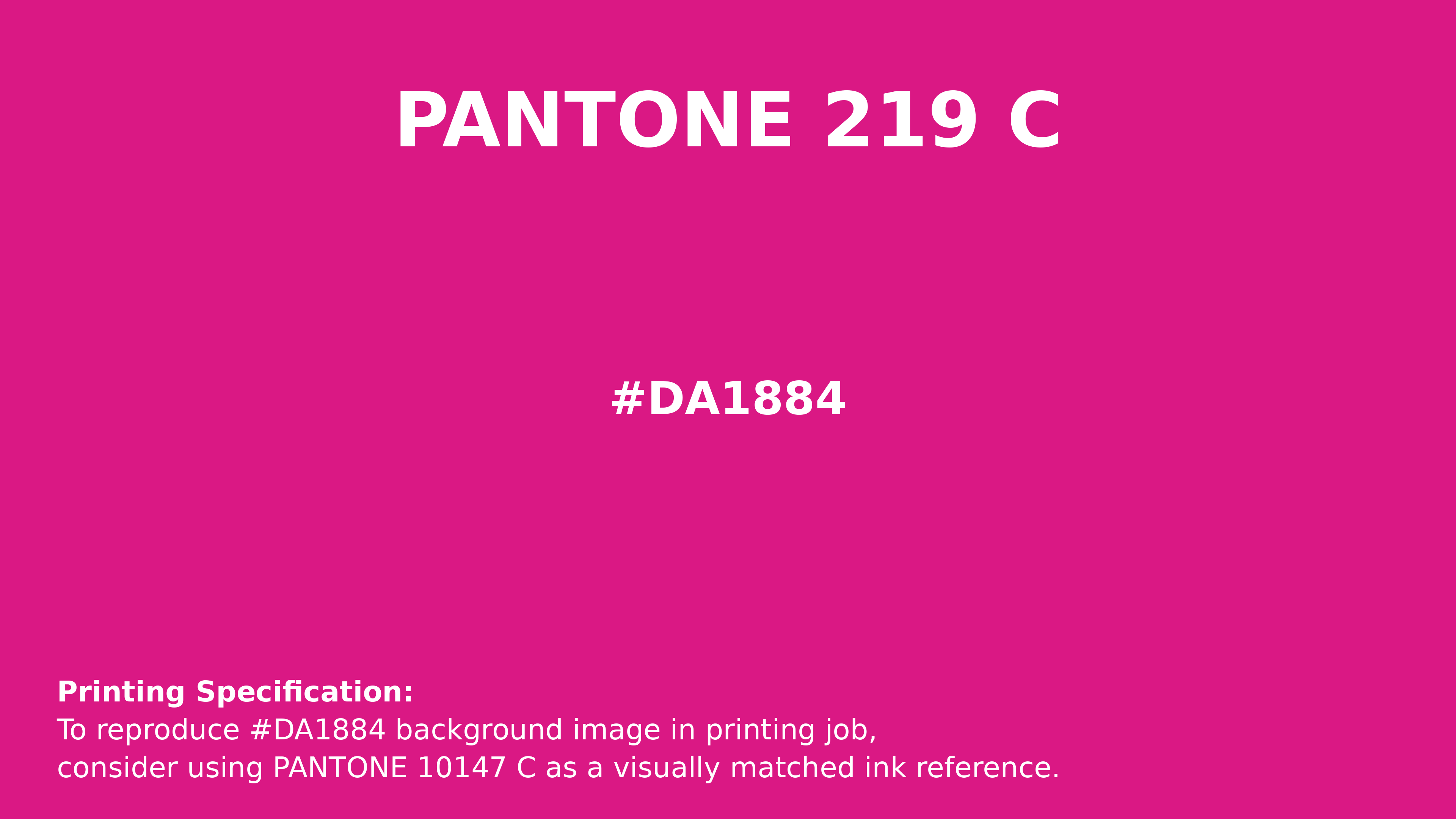
#da1884 Pantone 219 C Color | Hex color Code #da1884 Printing Artwork Pantone Reference
Download Pantone Printing ReferenceRelated Color Palettes
- Red Color Palettes • Green Color Palettes • Purple Color Palettes • Pink Color Palettes • Orange Color Palettes • Blue Color Palettes • Yellow Color Palettes • Brown Color Palettes • Gray Color Palettes • Beige Color Palettes • Turquoise Color Palettes
Color Palette Collection
Burnt orange
25 color palettes with 125 colors.
My color palette 1
863 color palettes with 4315 colors.

Astronomy Color Palettes
11 color palettes with 55 colors.
Chardon
1 color palettes with 5 colors.