#EB3300 Color
Your all-in-one color resource. Download hex background images, Adobe swatches (ASE), PDF color sheets, and SVG files. Explore palettes, harmonies, accessibility, conversions, and professional exports — designed for designers, developers, and color perfectionists.
#EB3300 is a vibrant, intense orange-red, reminiscent of a blazing sunset or a roaring bonfire. Its strong saturation evokes feelings of energy, excitement, and even aggression. The color's warmth suggests passion, enthusiasm, and a sense of urgency. Psychologically, it can be stimulating and attention-grabbing, but also potentially overwhelming if overused. It brings to mind desert landscapes, hot summers, and perhaps even warnings or danger signals. In design, it works well to highlight important elements or to create a feeling of excitement, possibly used sparingly as an accent color in logos, packaging, or websites to convey power and dynamism. Culturally, red and orange are often associated with fire, strength, and action, across various cultures. Visually matched named color: Fiery Sunset Blaze.
PANTONE 2028 C
Choose Color
Selected Color
Recent Colors
Color Details
Similar Ink Alternatives for #EB3300 color Alternative print inks for reproducing #EB3300 background image with a similar visual appearance.
Disclaimer: The visually matched ink reference is an independent approximation intended as a guide only. Please be advised that this pantone colors is only intended as a guide, Actual colours will depend on screen calibration variances. The print ink suggestions provided are independent visual approximations and are not affiliated with or endorsed by Pantone LLC. For official color specifications, conversion factors, and comprehensive color system information, please visit Pantone Connect. Official Pantone products can be purchased at pantone.com.
Color Previews for #000000 See how this color looks as a background or as text.
Complete Guide to Your Color Laboratory
Everything you need to know about this professional color toolkit.
Use the Color Picker at the top to select any color. All modules below update instantly.
Workflow: Pick a color → Explore palettes & data → Download what you need (PDF, Image, or Adobe ASE).
Color Details — Your color in all formats: HEX, RGB, RGBA, HSL, HSLA, HSV, CMYK, CIELab, Hunter-Lab, XYZ, Yxy, YUV. One-click copy.
Color Psychology — Emotional impact, cultural meanings, physiological effects, branding applications, and historical significance.
Named Colors — Find official color names (HTML/CSS, Pantone) that match your selection with similarity percentages.
Light & Dark Shades
80-step gradient from black to white. Perfect for button states and component systems.
Tints
Color mixed with white → lighter, pastel variations for backgrounds and disabled states.
Monochromatic — 11 curated tints/shades from one color. Production-ready for design systems.
- Complementary — Opposite on wheel (180°). High contrast.
- Analogous — Neighbors (±30°). Harmonious flow.
- Triadic — Three colors (120° apart). Vibrant, balanced.
- Split-Complementary — Base + two near-complements. Softer contrast.
- Tetradic/Square — Four colors. Complex, maximum variety.
- Neutral — Desaturated versions. Subtle, sophisticated.
15 Professional Variations — Monochromatic, Analogous, Complementary, Warm/Cool/Earth Tones, Pastel, Vibrant, High Contrast, and more.
Color Infusion — 10 palettes showing your color morphing into each major hue. Find bridge colors.
Similar Colors — 60+ colors generated via CIELAB Delta E matching. Unexpected harmonious combinations.
18 Ready-to-Use Gradients — Complementary, Analogous, Triadic, Tint/Shade progressions, and more.
Downloads: PNG (2560×1440), CSS (production-ready code), SVG (scalable vector).
WCAG Contrast Checker — Tests your color against white, black, and custom colors for AA (4.5:1) and AAA (7:1) compliance. Large text thresholds included.
Harmony & Accessibility Guide — Tests against 10 canonical hues. Shows which pairs are both beautiful AND WCAG-compliant for text.
PNG/JPG — High-res images for presentations and mood boards.
PDF — Print-ready reports for clients and teams.
Adobe ASE — Direct import to Photoshop, Illustrator, InDesign, XD.
CSS/SVG — Gradients only. Production-ready code and vectors.
Color Science: Industry-standard conversions (HSL, CIELAB, CMYK, XYZ). WCAG 2.1 luminance formula. Delta E (ΔE76) for perceptual matching.
Direct Links: Share colors via icolorpalette.com/color/ff5733 or icolorpalette.com/color/red
Issues? Refresh the page, wait for rendering, try another browser, or check console (F12) for errors.
Printing Guide for #eb3300 Background Image
Use PANTONE 2028 C as a visually matched ink reference when printing this background image.
To print the #eb3300 background image from our site, consider using PANTONE 2028 C as a visually matched ink reference.
Download the background image, then provide this reference code to your print vendor to help achieve accurate color reproduction.
The visually matched ink reference for the #eb3300 background image is PANTONE 2028 C.
This color is commonly described as Fiery Sunset Blaze.
#EB3300 is a vibrant, intense orange-red, reminiscent of a blazing sunset or a roaring bonfire. Its strong saturation evokes feelings of energy, excitement, and even aggression. The color's warmth suggests passion, enthusiasm, and a sense of urgency. Psychologically, it can be stimulating and attention-grabbing, but also potentially overwhelming if overused. It brings to mind desert landscapes, hot summers, and perhaps even warnings or danger signals. In design, it works well to highlight important elements or to create a feeling of excitement, possibly used sparingly as an accent color in logos, packaging, or websites to convey power and dynamism. Culturally, red and orange are often associated with fire, strength, and action, across various cultures.
We provide PANTONE 2028 C as a visually matched ink reference to help you reproduce the #eb3300 background image accurately in professional printing.
This reference code helps print vendors achieve consistent color output across different printing equipment and materials.
After downloading the #eb3300 background image from our site:
- Include the visually matched ink reference PANTONE 2028 C in your print order notes
- Inform your print vendor that this is your target color reference
- Request a proof print to verify the Fiery Sunset Blaze color appearance before full production
The #eb3300 background image with PANTONE 2028 C as visually matched ink reference can be used for:
- Posters, banners, and backdrops
- Business cards, brochures, and flyers
- Packaging, labels, and stickers
- Signage and promotional materials
This is an independent visual approximation.
While PANTONE 2028 C closely matches the #eb3300 background image color, variations may exist between screen display and printed output.
We recommend requesting a proof print to verify the final appearance.
#EB3300 is a vibrant, intense orange-red, reminiscent of a blazing sunset or a roaring bonfire. Its strong saturation evokes feelings of energy, excitement, and even aggression. The color's warmth suggests passion, enthusiasm, and a sense of urgency. Psychologically, it can be stimulating and attention-grabbing, but also potentially overwhelming if overused. It brings to mind desert landscapes, hot summers, and perhaps even warnings or danger signals. In design, it works well to highlight important elements or to create a feeling of excitement, possibly used sparingly as an accent color in logos, packaging, or websites to convey power and dynamism. Culturally, red and orange are often associated with fire, strength, and action, across various cultures.
Understanding these associations helps ensure the #eb3300 background image aligns with your intended message and brand impact.
Important Information
The visually matched ink reference is an independent approximation intended as a guide only.
Actual printed colors may vary depending on screen calibration, substrate material, ink type, and printing equipment used.
For official color specifications and certified color standards, visit Pantone Connect.
Official color guides and swatch books can be purchased from pantone.com.
Pantone 2028 C Color: Vibrant Red | #EB3300
Introduction:
Pantone 2028 C Color, also known as Vibrant Red, is a lively and eye-catching hue. Its essence lies in its intense and vibrant visual appeal, making it a popular choice for creative projects.
Historical Significance:
Key moments in history where the Pantone 2028 C Color was prominently used or played a significant role include its presence in iconic fashion trends of the 1980s and its use in revolutionary propaganda art during political movements.
Symbolism and Meaning:
Pantone 2028 C Color typically symbolizes passion, energy, and excitement. It is often associated with love and strength, evoking strong emotions and drawing attention.
Pantone 2028 C Color in Fashion:
Pantone 2028 C Color has a significant impact on styles and trends in the fashion world. It is frequently used in bold designs, statement pieces, and as an accent color to create a striking visual impact.
Pantone 2028 C Color in Graphic Design:
The significance of Pantone 2028 C Color in design aesthetics, branding, and visual impact cannot be overstated. Its vibrant and attention-grabbing nature makes it a popular choice for logos, packaging, and marketing materials.
Color Combinations:
Some potential color combinations that work well with Pantone 2028 C Color include complementary colors such as cyan (#00FFFF) and magenta (#FF00FF) or contrasting colors like black (#000000) and white (#FFFFFF).
Nature’s Palette:
Pantone 2028 C Color can be found in nature in vibrant flowers such as poppies and roses. It also resembles the fiery hues of a sunset, making it reminiscent of warm and inviting landscapes.
Artistic Representations:
Throughout history, Pantone 2028 C Color has been used in various forms of art to convey strong emotions, capture attention, and evoke a sense of passion. It has been prominently featured in paintings, sculptures, and contemporary installations.
Movies and Cinematic Landscapes:
In movies, Pantone 2028 C Color is often used to set a vibrant and energetic tone. It can be seen in scenes depicting passion, love, or intense emotions, adding visual impact to the storytelling.
Products and Commercial Appeal:
Many popular products and brands are associated with Pantone 2028 C Color or use it in their branding. It is often chosen to convey a sense of excitement and stand out among competitors.
National Symbols and Significance:
While Pantone 2028 C Color does not have specific national or cultural significance, it is often associated with patriotic themes, especially when combined with complementary colors such as blue and white.
The Psychological and Emotional Impact:
Pantone 2028 C Color has a powerful influence on emotions and perceptions. It can evoke feelings of passion, excitement, and intensity. It is also associated with courage and determination.
Conclusion:
In conclusion, Pantone 2028 C Color, or Vibrant Red, is a dynamic and attention-grabbing hue with a rich history and versatile appeal. Its symbolism, significance in various industries, and psychological impact make it a timeless choice for creative endeavors.
Pantone 2028 C Color | Hex color Code #eb3300 Image & Artwork
Download high-quality assets for your projects.

#eb3300 Color Schemes
Download Color Schemes
#eb3300 Color Shades
Download Color Shades
Pantone 2028 C Color | Hex color Code #eb3300 Solid Color Background
Download Solid Color
#eb3300 Pantone 2028 C Color | Hex color Code #eb3300 Artwork Image (PNG)
Download Artwork (PNG)#eb3300 Pantone 2028 C Color | Hex color Code #eb3300 Artwork Vector (PDF)
Download Artwork (PDF)#eb3300 Pantone 2028 C Color | Hex color Code #eb3300 Artwork Vector (SVG)
Download Artwork (SVG)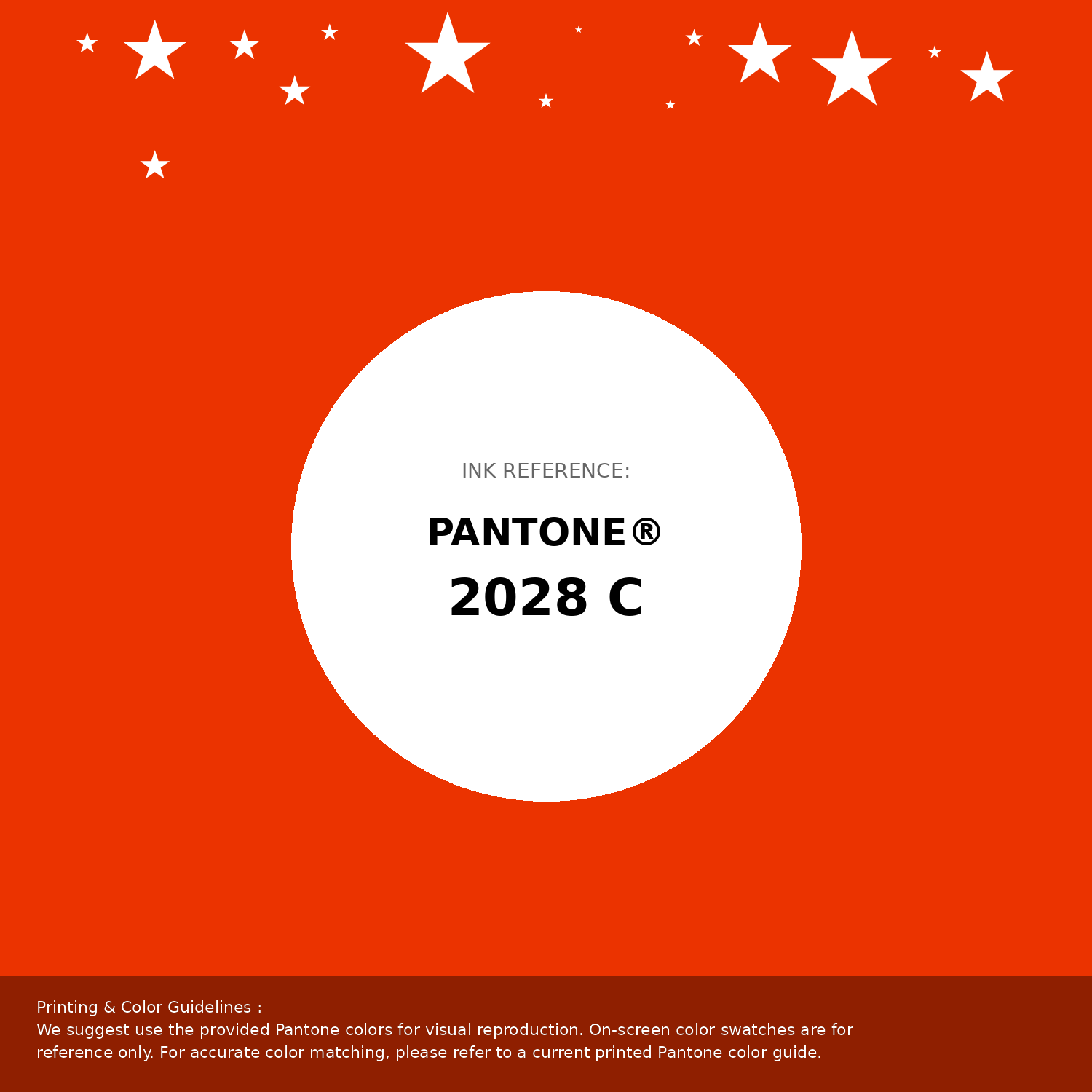
#eb3300 Pantone 2028 C Color | Hex color Code #eb3300 Pantone Swatch Artwork
Download Artwork Swatch
#eb3300 Pantone 2028 C Color | Hex color Code #eb3300 Gradient Artwork (PNG)
Download Gradient (PNG)#eb3300 Pantone 2028 C Color | Hex color Code #eb3300 Gradient Artwork (SVG)
Download Gradient (SVG)
#eb3300 Pantone 2028 C Color | Hex color Code #eb3300 T-Shirt Mockup
Download T-Shirt Mockup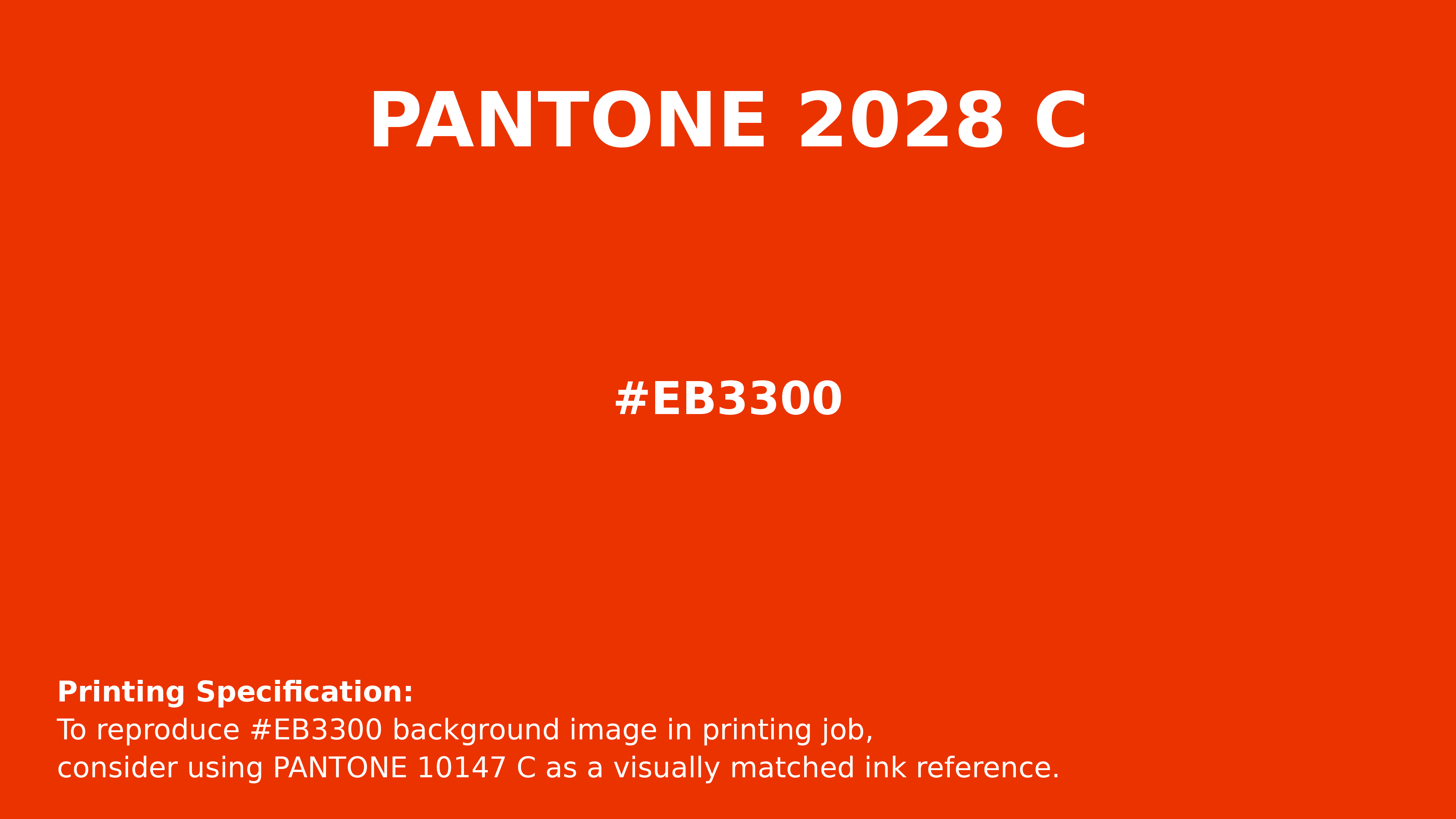
#eb3300 Pantone 2028 C Color | Hex color Code #eb3300 Printing Artwork Pantone Reference
Download Pantone Printing ReferenceRelated Color Palettes
- Red Oxide •
- Indian Red and Tomato •
- Dim Gray and Dark Red •
- OrangeRed and Black •
- Indian Red and Salmon •
- Goldenrod and Pale Violet Red •
- Dark Red •
- Thistle and Indian Red •
- OrangeRed and Dark Orange •
- Dark Red and Sandy Brown •
- Indian Red and Brown •
- Red and OrangeRed •
- Sandy Brown and Indian Red •
- Medium Violet Red and Hot Pink •
- Pale Violet Red and Dark Gray
Color Palette Collection

18 Light Color Palettes Collection
18 color palettes with 90 colors.
Forest Theme colors
15 color palettes with 75 colors.
Chardon
1 color palettes with 5 colors.
50 Autumn / Fall Color Palettes
50 color palettes with 250 colors.