#D9E1E2 Color
Your all-in-one color resource. Download hex background images, Adobe swatches (ASE), PDF color sheets, and SVG files. Explore palettes, harmonies, accessibility, conversions, and professional exports — designed for designers, developers, and color perfectionists.
#D9E1E2 is a soft, muted light gray-blue, reminiscent of a hazy dawn or a subtly overcast sky. The color evokes a sense of calm, quiet contemplation, and gentle melancholy. It's not overtly cheerful, but rather possesses a peaceful, introspective quality. It suggests a sense of spaciousness and openness, perhaps like a wide, misty landscape. The color reminds one of early mornings, quiet moments of reflection, and the subtle beauty of understated elegance. In design, it could be used to create a serene and sophisticated atmosphere, suitable for minimalist interiors, calming bedrooms, or spaces requiring a sense of tranquility and order. It lacks strong cultural or symbolic meanings, instead offering a neutral, adaptable backdrop that allows other elements to stand out. The muted tones suggest a sense of stability and reliability. Visually matched named color: Misty Dawn.
PANTONE 7541 C
Choose Color
Selected Color
Recent Colors
Color Details
Similar Ink Alternatives for #D9E1E2 color Alternative print inks for reproducing #D9E1E2 background image with a similar visual appearance.
Disclaimer: The visually matched ink reference is an independent approximation intended as a guide only. Please be advised that this pantone colors is only intended as a guide, Actual colours will depend on screen calibration variances. The print ink suggestions provided are independent visual approximations and are not affiliated with or endorsed by Pantone LLC. For official color specifications, conversion factors, and comprehensive color system information, please visit Pantone Connect. Official Pantone products can be purchased at pantone.com.
Color Previews for #000000 See how this color looks as a background or as text.
Complete Guide to Your Color Laboratory
Everything you need to know about this professional color toolkit.
Use the Color Picker at the top to select any color. All modules below update instantly.
Workflow: Pick a color → Explore palettes & data → Download what you need (PDF, Image, or Adobe ASE).
Color Details — Your color in all formats: HEX, RGB, RGBA, HSL, HSLA, HSV, CMYK, CIELab, Hunter-Lab, XYZ, Yxy, YUV. One-click copy.
Color Psychology — Emotional impact, cultural meanings, physiological effects, branding applications, and historical significance.
Named Colors — Find official color names (HTML/CSS, Pantone) that match your selection with similarity percentages.
Light & Dark Shades
80-step gradient from black to white. Perfect for button states and component systems.
Tints
Color mixed with white → lighter, pastel variations for backgrounds and disabled states.
Monochromatic — 11 curated tints/shades from one color. Production-ready for design systems.
- Complementary — Opposite on wheel (180°). High contrast.
- Analogous — Neighbors (±30°). Harmonious flow.
- Triadic — Three colors (120° apart). Vibrant, balanced.
- Split-Complementary — Base + two near-complements. Softer contrast.
- Tetradic/Square — Four colors. Complex, maximum variety.
- Neutral — Desaturated versions. Subtle, sophisticated.
15 Professional Variations — Monochromatic, Analogous, Complementary, Warm/Cool/Earth Tones, Pastel, Vibrant, High Contrast, and more.
Color Infusion — 10 palettes showing your color morphing into each major hue. Find bridge colors.
Similar Colors — 60+ colors generated via CIELAB Delta E matching. Unexpected harmonious combinations.
18 Ready-to-Use Gradients — Complementary, Analogous, Triadic, Tint/Shade progressions, and more.
Downloads: PNG (2560×1440), CSS (production-ready code), SVG (scalable vector).
WCAG Contrast Checker — Tests your color against white, black, and custom colors for AA (4.5:1) and AAA (7:1) compliance. Large text thresholds included.
Harmony & Accessibility Guide — Tests against 10 canonical hues. Shows which pairs are both beautiful AND WCAG-compliant for text.
PNG/JPG — High-res images for presentations and mood boards.
PDF — Print-ready reports for clients and teams.
Adobe ASE — Direct import to Photoshop, Illustrator, InDesign, XD.
CSS/SVG — Gradients only. Production-ready code and vectors.
Color Science: Industry-standard conversions (HSL, CIELAB, CMYK, XYZ). WCAG 2.1 luminance formula. Delta E (ΔE76) for perceptual matching.
Direct Links: Share colors via icolorpalette.com/color/ff5733 or icolorpalette.com/color/red
Issues? Refresh the page, wait for rendering, try another browser, or check console (F12) for errors.
Printing Guide for #d9e1e2 Background Image
Use PANTONE 7541 C as a visually matched ink reference when printing this background image.
To print the #d9e1e2 background image from our site, consider using PANTONE 7541 C as a visually matched ink reference.
Download the background image, then provide this reference code to your print vendor to help achieve accurate color reproduction.
The visually matched ink reference for the #d9e1e2 background image is PANTONE 7541 C.
This color is commonly described as Misty Dawn.
#D9E1E2 is a soft, muted light gray-blue, reminiscent of a hazy dawn or a subtly overcast sky. The color evokes a sense of calm, quiet contemplation, and gentle melancholy. It's not overtly cheerful, but rather possesses a peaceful, introspective quality. It suggests a sense of spaciousness and openness, perhaps like a wide, misty landscape. The color reminds one of early mornings, quiet moments of reflection, and the subtle beauty of understated elegance. In design, it could be used to create a serene and sophisticated atmosphere, suitable for minimalist interiors, calming bedrooms, or spaces requiring a sense of tranquility and order. It lacks strong cultural or symbolic meanings, instead offering a neutral, adaptable backdrop that allows other elements to stand out. The muted tones suggest a sense of stability and reliability.
We provide PANTONE 7541 C as a visually matched ink reference to help you reproduce the #d9e1e2 background image accurately in professional printing.
This reference code helps print vendors achieve consistent color output across different printing equipment and materials.
After downloading the #d9e1e2 background image from our site:
- Include the visually matched ink reference PANTONE 7541 C in your print order notes
- Inform your print vendor that this is your target color reference
- Request a proof print to verify the Misty Dawn color appearance before full production
The #d9e1e2 background image with PANTONE 7541 C as visually matched ink reference can be used for:
- Posters, banners, and backdrops
- Business cards, brochures, and flyers
- Packaging, labels, and stickers
- Signage and promotional materials
This is an independent visual approximation.
While PANTONE 7541 C closely matches the #d9e1e2 background image color, variations may exist between screen display and printed output.
We recommend requesting a proof print to verify the final appearance.
#D9E1E2 is a soft, muted light gray-blue, reminiscent of a hazy dawn or a subtly overcast sky. The color evokes a sense of calm, quiet contemplation, and gentle melancholy. It's not overtly cheerful, but rather possesses a peaceful, introspective quality. It suggests a sense of spaciousness and openness, perhaps like a wide, misty landscape. The color reminds one of early mornings, quiet moments of reflection, and the subtle beauty of understated elegance. In design, it could be used to create a serene and sophisticated atmosphere, suitable for minimalist interiors, calming bedrooms, or spaces requiring a sense of tranquility and order. It lacks strong cultural or symbolic meanings, instead offering a neutral, adaptable backdrop that allows other elements to stand out. The muted tones suggest a sense of stability and reliability.
Understanding these associations helps ensure the #d9e1e2 background image aligns with your intended message and brand impact.
Important Information
The visually matched ink reference is an independent approximation intended as a guide only.
Actual printed colors may vary depending on screen calibration, substrate material, ink type, and printing equipment used.
For official color specifications and certified color standards, visit Pantone Connect.
Official color guides and swatch books can be purchased from pantone.com.
Pantone 7541 C Color: Harmonious Aquamarine | #D9E1E2
Introduction:
Harmonious Aquamarine, represented by Pantone 7541 C, is a color that exudes tranquility and serenity. Its essence lies in its cool and calm visual appeal, reminiscent of clear waters and refreshing breezes.
Historical Significance:
Key Moments in History: Throughout history, Harmonious Aquamarine has been widely used in various artistic and cultural expressions. It can be found in ancient frescoes, where it was used to depict water bodies, symbolizing purity and tranquility. In Renaissance art, this color was often used to represent heavenly themes and celestial landscapes. Additionally, Harmonious Aquamarine gained popularity in the Art Nouveau movement, reflecting the era's fascination with natural forms and organic aesthetics.
Symbolism and Meaning:
Symbolism: Harmonious Aquamarine typically symbolizes calmness, purity, and balance. It is often associated with communication and harmonious relationships. In different cultures, this color is linked to healing, spirituality, and emotional well-being.
Harmonious Aquamarine in Fashion:
Influence on Fashion: Harmonious Aquamarine has a significant impact on fashion trends, particularly during the spring and summer seasons. It is commonly used in clothing, accessories, and swimwear designs. This color is favored for its refreshing and soothing vibes, making it a popular choice for resort and beachwear collections.
Harmonious Aquamarine in Graphic Design:
Significance in Graphic Design: Harmonious Aquamarine plays a significant role in design aesthetics and branding. Its calming nature makes it suitable for creating peaceful and tranquil visual experiences. This color is often used to evoke emotions of serenity and clarity, making it a popular choice for websites, logos, and corporate branding.
Color Combinations:
Potential Color Combinations: Harmonious Aquamarine pairs well with a variety of colors. Possible combinations include: - Harmonious Aquamarine and Ivory - Harmonious Aquamarine and Coral - Harmonious Aquamarine and Lavender - Harmonious Aquamarine and Silver - Harmonious Aquamarine and Navy Blue - Harmonious Aquamarine and Peach
Nature's Palette:
Natural Occurrences: Harmonious Aquamarine can be observed in various natural elements and phenomena. It reflects the color of the serene ocean, the delicate petals of certain flowers like forget-me-nots, and the enchanting landscapes of icy glaciers. This color is also reminiscent of the feathers of certain birds and the translucent qualities of gemstones like aquamarine.
Artistic Representations:
Artistic Use: Throughout art history, Harmonious Aquamarine has been utilized in various forms of artistic expression. It can be seen in serene landscape paintings, where it represents bodies of water and evokes a sense of tranquility. Additionally, many modern artists incorporate this color into abstract art pieces, exploring its emotional and symbolic dimensions.
Movies and Cinematic Landscapes:
Set the Tone in Movies: Harmonious Aquamarine is often used in movies to convey a calm and peaceful atmosphere. It can be found in scenes depicting tropical islands, underwater worlds, and tranquil natural landscapes. This color effectively creates a soothing ambiance, enhancing the cinematic experience.
Products and Commercial Appeal:
Commercial Associations: Many popular products and brands have incorporated Harmonious Aquamarine into their designs and branding strategies. From beauty and skincare products to interior decor and home accessories, this color is often chosen for its calming and aesthetically pleasing qualities.
National Symbols and Significance:
Cultural Significance: In some cultures, Harmonious Aquamarine holds national or cultural significance. For example, in certain countries, it may be associated with traditional celebrations or be featured in national emblems or flags. This color can symbolize harmony, purity, or represent significant bodies of water in a nation's landscape.
The Psychological and Emotional Impact:
Psychological Influence: Harmonious Aquamarine has a positive impact on emotions and perceptions. It promotes a sense of peace, tranquility, and relaxation. This color can help reduce stress and anxiety and create a calming environment. It is often used in spaces like spas, bedrooms, and meditation rooms to foster a sense of serenity and balance.
Conclusion:
Harmonious Aquamarine, represented by Pantone 7541 C, is a color that embodies tranquility, balance, and purity. Its historical significance, symbolism, and timeless appeal have led to its widespread use in various creative fields, including fashion, design, and art. This color's calming and soothing qualities make it a favorite choice for creating peaceful atmospheres and evoking emotions of serenity and clarity.
Pantone 7541 C Color | Hex color Code #d9e1e2 Image & Artwork
Download high-quality assets for your projects.

#d9e1e2 Color Schemes
Download Color Schemes
#d9e1e2 Color Shades
Download Color Shades
Pantone 7541 C Color | Hex color Code #d9e1e2 Solid Color Background
Download Solid Color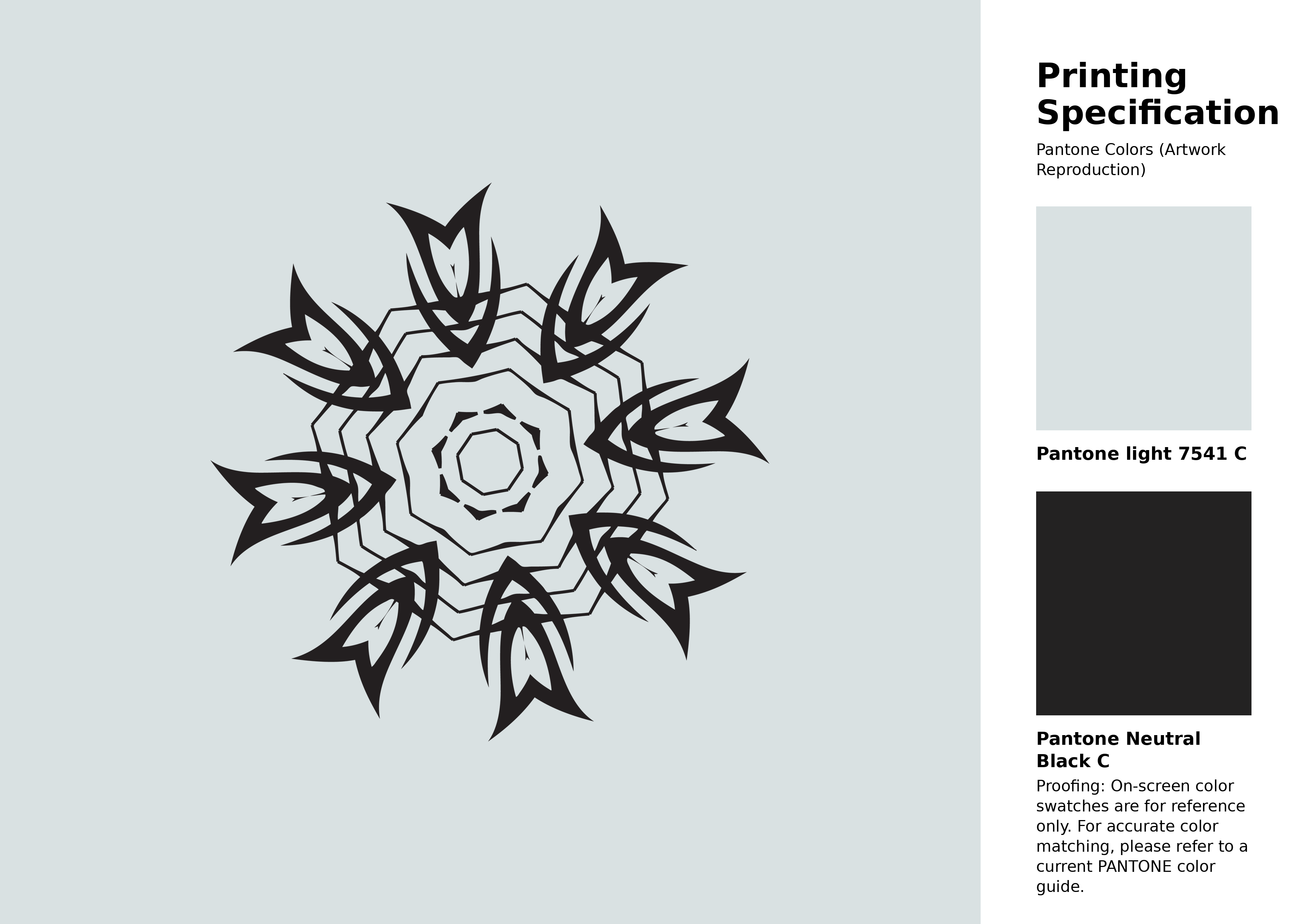
#d9e1e2 Pantone 7541 C Color | Hex color Code #d9e1e2 Artwork Image (PNG)
Download Artwork (PNG)#d9e1e2 Pantone 7541 C Color | Hex color Code #d9e1e2 Artwork Vector (PDF)
Download Artwork (PDF)#d9e1e2 Pantone 7541 C Color | Hex color Code #d9e1e2 Artwork Vector (SVG)
Download Artwork (SVG)
#d9e1e2 Pantone 7541 C Color | Hex color Code #d9e1e2 Pantone Swatch Artwork
Download Artwork Swatch
#d9e1e2 Pantone 7541 C Color | Hex color Code #d9e1e2 Gradient Artwork (PNG)
Download Gradient (PNG)#d9e1e2 Pantone 7541 C Color | Hex color Code #d9e1e2 Gradient Artwork (SVG)
Download Gradient (SVG)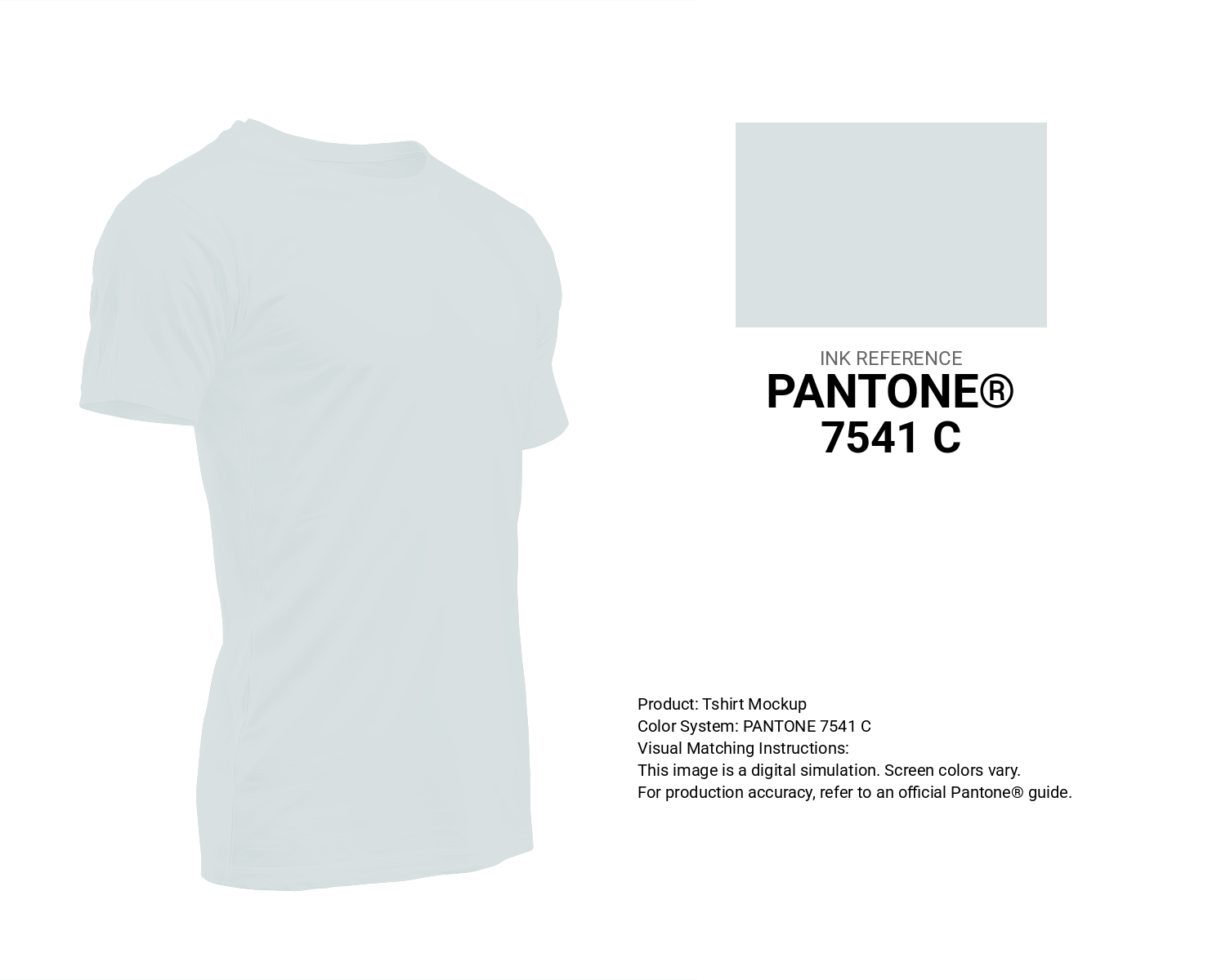
#d9e1e2 Pantone 7541 C Color | Hex color Code #d9e1e2 T-Shirt Mockup
Download T-Shirt Mockup
#d9e1e2 Pantone 7541 C Color | Hex color Code #d9e1e2 Printing Artwork Pantone Reference
Download Pantone Printing ReferenceRelated Color Palettes
- Beige and Linen •
- Beige and Dark Goldenrod •
- Beige and Gold •
- Beige and Indian Red •
- Beige and Dim Gray •
- Light Gray and Beige •
- Saddle Brown and Beige •
- Beige and Khaki •
- Powder Blue and Beige •
- Plum and Beige •
- Beige and Pale Violet Red •
- Silver and Beige •
- Beige and Pale Goldenrod •
- Beige and Saddle Brown •
- Beige and Brown
Color Palette Collection

30 Pastel Pink Color Palette
30 color palettes with 150 colors.

35 Light Blue Color Palette
35 color palettes with 175 colors.

50 Beige Color Palettes
50 color palettes with 250 colors.

29 Pink Color Palettes for your next design project
29 color palettes with 145 colors.