#75787B Color
Your all-in-one color resource. Download hex background images, Adobe swatches (ASE), PDF color sheets, and SVG files. Explore palettes, harmonies, accessibility, conversions, and professional exports — designed for designers, developers, and color perfectionists.
#75787B is a muted, cool-toned gray that evokes a feeling of quiet contemplation and subdued elegance. It lacks the starkness of a pure gray, possessing a subtle warmth that prevents it from feeling cold or sterile. The color reminds one of a twilight sky just after sunset, or the soft light filtering through a dense forest canopy. It creates a mood of peaceful serenity and understated sophistication, hinting at a sense of mystery and depth. In design, it works well as a neutral backdrop, allowing bolder colors to stand out or providing a sophisticated foundation for minimalist aesthetics. It suggests reliability, timelessness, and a certain quiet dignity, making it suitable for spaces where calmness and composure are desired. There's a hint of old-world charm, reminiscent of antique silver or weathered stone. Visually matched named color: Silvered Dusk.
PANTONE COOL GRAY 9 C
Choose Color
Selected Color
Recent Colors
Color Details
Similar Ink Alternatives for #75787B color Alternative print inks for reproducing #75787B background image with a similar visual appearance.
Disclaimer: The visually matched ink reference is an independent approximation intended as a guide only. Please be advised that this pantone colors is only intended as a guide, Actual colours will depend on screen calibration variances. The print ink suggestions provided are independent visual approximations and are not affiliated with or endorsed by Pantone LLC. For official color specifications, conversion factors, and comprehensive color system information, please visit Pantone Connect. Official Pantone products can be purchased at pantone.com.
Color Previews for #000000 See how this color looks as a background or as text.
Complete Guide to Your Color Laboratory
Everything you need to know about this professional color toolkit.
Use the Color Picker at the top to select any color. All modules below update instantly.
Workflow: Pick a color → Explore palettes & data → Download what you need (PDF, Image, or Adobe ASE).
Color Details — Your color in all formats: HEX, RGB, RGBA, HSL, HSLA, HSV, CMYK, CIELab, Hunter-Lab, XYZ, Yxy, YUV. One-click copy.
Color Psychology — Emotional impact, cultural meanings, physiological effects, branding applications, and historical significance.
Named Colors — Find official color names (HTML/CSS, Pantone) that match your selection with similarity percentages.
Light & Dark Shades
80-step gradient from black to white. Perfect for button states and component systems.
Tints
Color mixed with white → lighter, pastel variations for backgrounds and disabled states.
Monochromatic — 11 curated tints/shades from one color. Production-ready for design systems.
- Complementary — Opposite on wheel (180°). High contrast.
- Analogous — Neighbors (±30°). Harmonious flow.
- Triadic — Three colors (120° apart). Vibrant, balanced.
- Split-Complementary — Base + two near-complements. Softer contrast.
- Tetradic/Square — Four colors. Complex, maximum variety.
- Neutral — Desaturated versions. Subtle, sophisticated.
15 Professional Variations — Monochromatic, Analogous, Complementary, Warm/Cool/Earth Tones, Pastel, Vibrant, High Contrast, and more.
Color Infusion — 10 palettes showing your color morphing into each major hue. Find bridge colors.
Similar Colors — 60+ colors generated via CIELAB Delta E matching. Unexpected harmonious combinations.
18 Ready-to-Use Gradients — Complementary, Analogous, Triadic, Tint/Shade progressions, and more.
Downloads: PNG (2560×1440), CSS (production-ready code), SVG (scalable vector).
WCAG Contrast Checker — Tests your color against white, black, and custom colors for AA (4.5:1) and AAA (7:1) compliance. Large text thresholds included.
Harmony & Accessibility Guide — Tests against 10 canonical hues. Shows which pairs are both beautiful AND WCAG-compliant for text.
PNG/JPG — High-res images for presentations and mood boards.
PDF — Print-ready reports for clients and teams.
Adobe ASE — Direct import to Photoshop, Illustrator, InDesign, XD.
CSS/SVG — Gradients only. Production-ready code and vectors.
Color Science: Industry-standard conversions (HSL, CIELAB, CMYK, XYZ). WCAG 2.1 luminance formula. Delta E (ΔE76) for perceptual matching.
Direct Links: Share colors via icolorpalette.com/color/ff5733 or icolorpalette.com/color/red
Issues? Refresh the page, wait for rendering, try another browser, or check console (F12) for errors.
Printing Guide for #75787b Background Image
Use PANTONE COOL GRAY 9 C as a visually matched ink reference when printing this background image.
To print the #75787b background image from our site, consider using PANTONE COOL GRAY 9 C as a visually matched ink reference.
Download the background image, then provide this reference code to your print vendor to help achieve accurate color reproduction.
The visually matched ink reference for the #75787b background image is PANTONE COOL GRAY 9 C.
This color is commonly described as Silvered Dusk.
#75787B is a muted, cool-toned gray that evokes a feeling of quiet contemplation and subdued elegance. It lacks the starkness of a pure gray, possessing a subtle warmth that prevents it from feeling cold or sterile. The color reminds one of a twilight sky just after sunset, or the soft light filtering through a dense forest canopy. It creates a mood of peaceful serenity and understated sophistication, hinting at a sense of mystery and depth. In design, it works well as a neutral backdrop, allowing bolder colors to stand out or providing a sophisticated foundation for minimalist aesthetics. It suggests reliability, timelessness, and a certain quiet dignity, making it suitable for spaces where calmness and composure are desired. There's a hint of old-world charm, reminiscent of antique silver or weathered stone.
We provide PANTONE COOL GRAY 9 C as a visually matched ink reference to help you reproduce the #75787b background image accurately in professional printing.
This reference code helps print vendors achieve consistent color output across different printing equipment and materials.
After downloading the #75787b background image from our site:
- Include the visually matched ink reference PANTONE COOL GRAY 9 C in your print order notes
- Inform your print vendor that this is your target color reference
- Request a proof print to verify the Silvered Dusk color appearance before full production
The #75787b background image with PANTONE COOL GRAY 9 C as visually matched ink reference can be used for:
- Posters, banners, and backdrops
- Business cards, brochures, and flyers
- Packaging, labels, and stickers
- Signage and promotional materials
This is an independent visual approximation.
While PANTONE COOL GRAY 9 C closely matches the #75787b background image color, variations may exist between screen display and printed output.
We recommend requesting a proof print to verify the final appearance.
#75787B is a muted, cool-toned gray that evokes a feeling of quiet contemplation and subdued elegance. It lacks the starkness of a pure gray, possessing a subtle warmth that prevents it from feeling cold or sterile. The color reminds one of a twilight sky just after sunset, or the soft light filtering through a dense forest canopy. It creates a mood of peaceful serenity and understated sophistication, hinting at a sense of mystery and depth. In design, it works well as a neutral backdrop, allowing bolder colors to stand out or providing a sophisticated foundation for minimalist aesthetics. It suggests reliability, timelessness, and a certain quiet dignity, making it suitable for spaces where calmness and composure are desired. There's a hint of old-world charm, reminiscent of antique silver or weathered stone.
Understanding these associations helps ensure the #75787b background image aligns with your intended message and brand impact.
Important Information
The visually matched ink reference is an independent approximation intended as a guide only.
Actual printed colors may vary depending on screen calibration, substrate material, ink type, and printing equipment used.
For official color specifications and certified color standards, visit Pantone Connect.
Official color guides and swatch books can be purchased from pantone.com.
Pantone Cool Gray 9 C Color: The Cool and Sophisticated Shade | #75787B
Introduction:
Pantone Cool Gray 9 C is a color that exudes coolness and sophistication. It is a neutral shade of gray that is often described as timeless and elegant. This color has a calming effect and is associated with stability and balance. Its versatility allows it to be used in various creative applications.
Historical Significance:
Key moments in history: Pantone Cool Gray 9 C has been prominently used in the fashion industry, especially in the minimalist and monochromatic trends of the 20th century. It became popular for its ability to create a sleek and sophisticated look.
Other historical significance: Pantone Cool Gray 9 C has also played a significant role in modern graphic design, being a go-to color for creating clean and minimalist visual identities for brands.
Symbolism and Meaning:
Symbolism: Pantone Cool Gray 9 C typically symbolizes stability, sophistication, and professionalism. It is often associated with corporate environments and is used to convey a sense of trust and reliability.
Meaning in various cultures or contexts: In Western cultures, gray is often associated with intelligence, wisdom, and maturity. In Eastern cultures, it can symbolize balance, humility, and modesty.
Pantone Cool Gray 9 C in Fashion:
Pantone Cool Gray 9 C has a significant impact on styles and trends in the fashion world. It is often used as a base color for minimalist and monochromatic outfits. It adds a touch of sophistication and elegance to any ensemble.
Pantone Cool Gray 9 C in Graphic Design:
Pantone Cool Gray 9 C holds great significance in design aesthetics, branding, and visual impact. Its neutrality and versatility make it a popular choice for creating clean and minimalist designs. It is often used to evoke a sense of professionalism and reliability.
Color Combinations:
Potential color combinations: Pantone Cool Gray 9 C pairs well with other shades of gray, as well as with vibrant colors such as red, blue, and yellow. It can also be combined with pastel shades for a softer and more delicate look.
Nature’s Palette:
While Pantone Cool Gray 9 C is not commonly found in nature, it can be seen in the color of rocks, metal, and stormy skies. It is a color that represents the calmness and stability of the natural world.
Artistic Representations:
Pantone Cool Gray 9 C has been used in various forms of art over time. It has been a popular choice for creating minimalist and abstract artworks, as well as for adding depth and dimension to realistic paintings and sculptures.
Movies and Cinematic Landscapes:
In movies, Pantone Cool Gray 9 C is often used to set a tone or mood. It is commonly seen in film noir and suspenseful movies, where it helps create a dark and mysterious atmosphere.
Products and Commercial Appeal:
Pantone Cool Gray 9 C is associated with many popular products and brands. It is often used in the packaging and branding of high-end products, as it conveys a sense of sophistication and quality.
National Symbols and Significance:
There is no specific national or cultural significance tied to Pantone Cool Gray 9 C. However, its neutral and versatile nature makes it a color that can be easily incorporated into any national or cultural symbol.
The Psychological and Emotional Impact:
Pantone Cool Gray 9 C has a calming and soothing effect on the mind. It can evoke feelings of stability, reliability, and professionalism. It is often used in environments where a sense of trust and balance is desired.
Conclusion:
In summary, Pantone Cool Gray 9 C is a color that embodies coolness and sophistication. Its historical significance in fashion and graphic design, as well as its symbolism and psychological impact, make it a timeless color choice. Whether used in fashion, branding, or artistic representations, Pantone Cool Gray 9 C adds a touch of elegance and balance to any creative endeavor.
Pantone Cool Gray 9 C Color | Hex color Code #75787b Image & Artwork
Download high-quality assets for your projects.

#75787b Color Schemes
Download Color Schemes
#75787b Color Shades
Download Color Shades
Pantone Cool Gray 9 C Color | Hex color Code #75787b Solid Color Background
Download Solid Color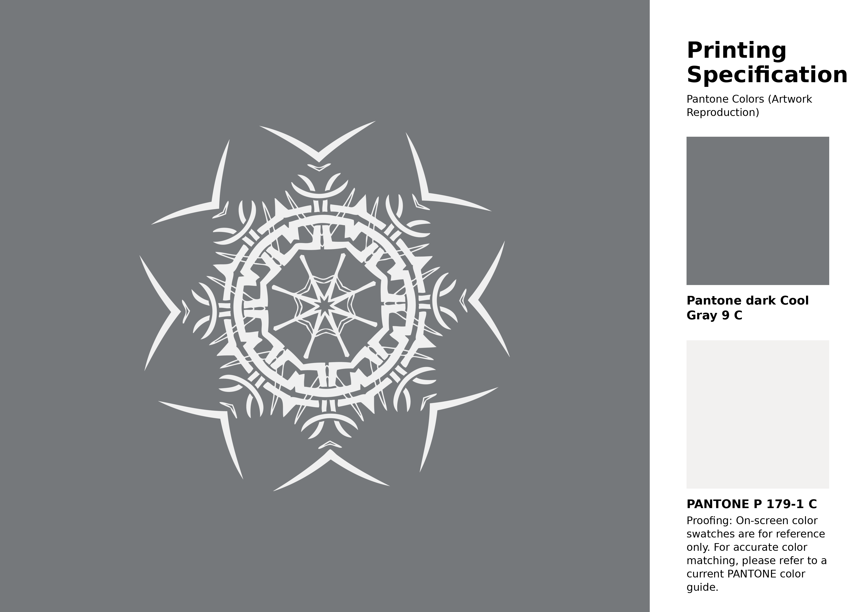
#75787b Pantone Cool Gray 9 C Color | Hex color Code #75787b Artwork Image (PNG)
Download Artwork (PNG)#75787b Pantone Cool Gray 9 C Color | Hex color Code #75787b Artwork Vector (PDF)
Download Artwork (PDF)#75787b Pantone Cool Gray 9 C Color | Hex color Code #75787b Artwork Vector (SVG)
Download Artwork (SVG)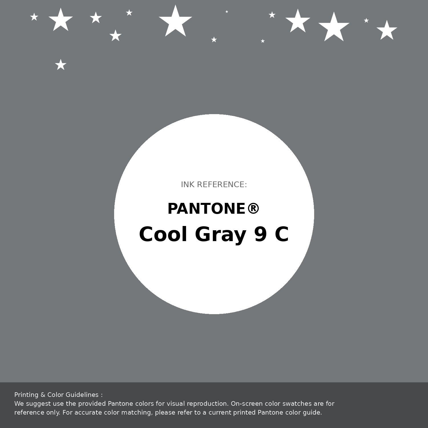
#75787b Pantone Cool Gray 9 C Color | Hex color Code #75787b Pantone Swatch Artwork
Download Artwork Swatch
#75787b Pantone Cool Gray 9 C Color | Hex color Code #75787b Gradient Artwork (PNG)
Download Gradient (PNG)#75787b Pantone Cool Gray 9 C Color | Hex color Code #75787b Gradient Artwork (SVG)
Download Gradient (SVG)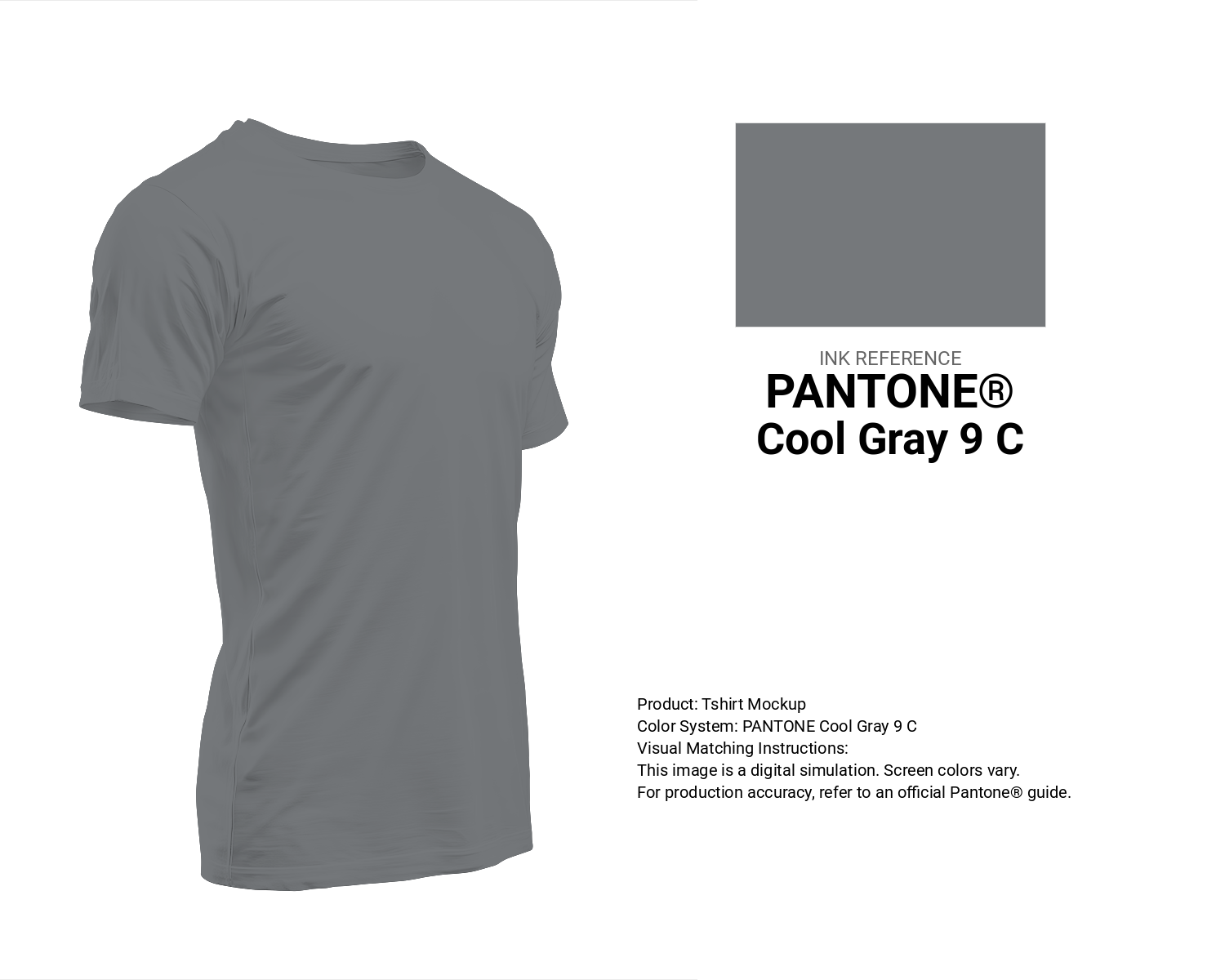
#75787b Pantone Cool Gray 9 C Color | Hex color Code #75787b T-Shirt Mockup
Download T-Shirt Mockup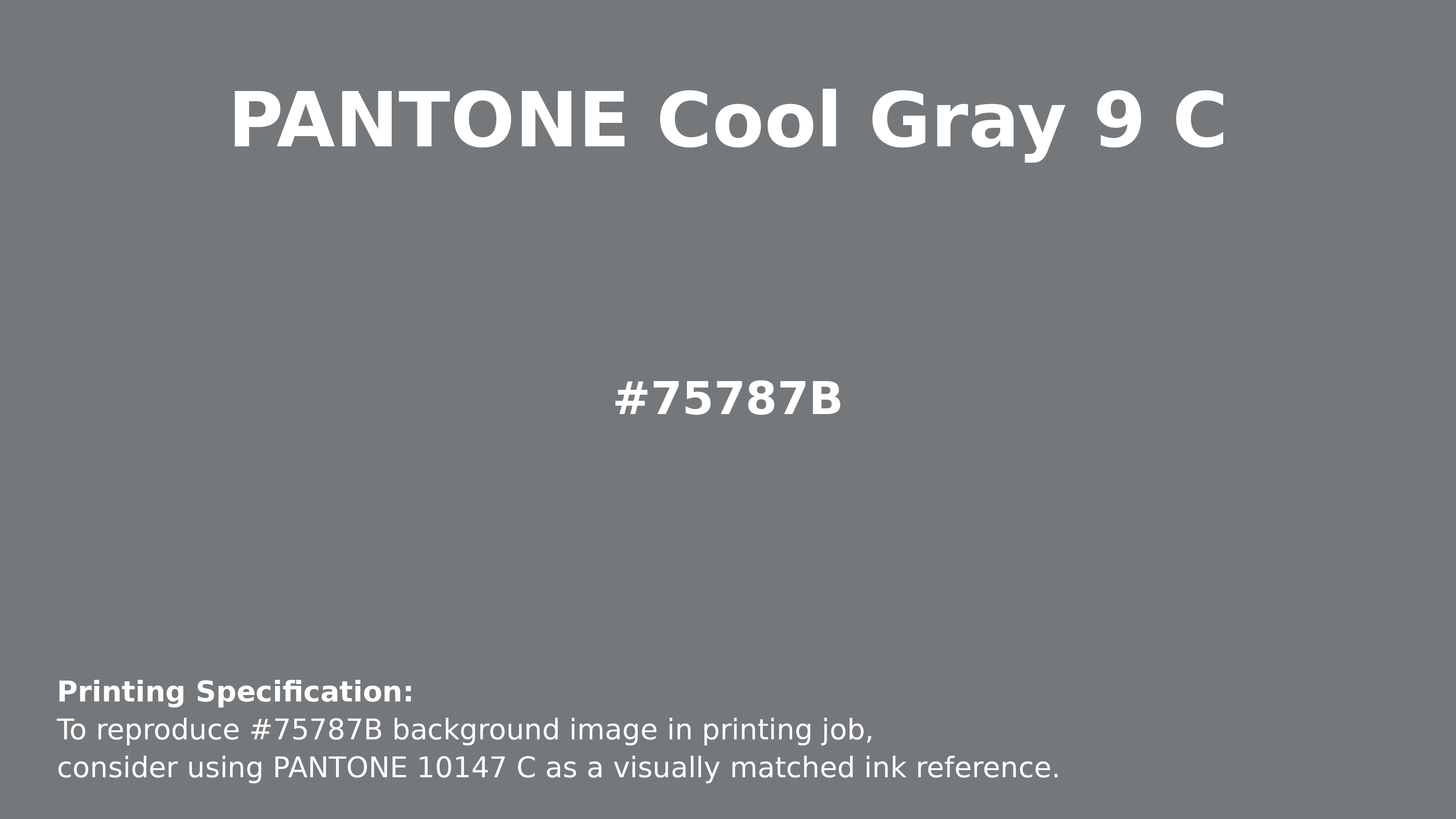
#75787b Pantone Cool Gray 9 C Color | Hex color Code #75787b Printing Artwork Pantone Reference
Download Pantone Printing ReferenceRelated Color Palettes
- Light Gray and Dark Green •
- Dark Orchid and Dim Gray •
- Light Sea Green and Light Slate Gray •
- Dim Gray •
- Gray and Light Sky Blue •
- Light Sky Blue and Light Slate Gray •
- Deep Pink and Dim Gray •
- Khaki and Dim Gray •
- Dark Gray and Dark Slate Gray •
- Slate Gray and Dark Goldenrod •
- Slate Gray and Maroon •
- Tan and Dark Gray •
- Linen and Slate Gray •
- Dim Gray and Light Slate Gray •
- Santas Gray
Color Palette Collection

70 Winter Color Palette
70 color palettes with 350 colors.

Child Theme Colors
5 color palettes with 25 colors.

Pink Colors
8 color palettes with 40 colors.
17 Christmas Color Palettes Ideas
17 color palettes with 85 colors.