Dim Gray Color | 696969
Your all-in-one color resource. Download hex background images, Adobe swatches (ASE), PDF color sheets, and SVG files. Explore palettes, harmonies, accessibility, conversions, and professional exports — designed for designers, developers, and color perfectionists.
Choose Color
Selected Color
Recent Colors
Color Details
Similar Ink Alternatives for #696969 color Alternative print inks for reproducing #696969 background image with a similar visual appearance.
Disclaimer: The visually matched ink reference is an independent approximation intended as a guide only. Please be advised that this pantone colors is only intended as a guide, Actual colours will depend on screen calibration variances. The print ink suggestions provided are independent visual approximations and are not affiliated with or endorsed by Pantone LLC. For official color specifications, conversion factors, and comprehensive color system information, please visit Pantone Connect. Official Pantone products can be purchased at pantone.com.
Color Previews for #000000 See how this color looks as a background or as text.
Complete Guide to Your Color Laboratory
Everything you need to know about this professional color toolkit.
Use the Color Picker at the top to select any color. All modules below update instantly.
Workflow: Pick a color → Explore palettes & data → Download what you need (PDF, Image, or Adobe ASE).
Color Details — Your color in all formats: HEX, RGB, RGBA, HSL, HSLA, HSV, CMYK, CIELab, Hunter-Lab, XYZ, Yxy, YUV. One-click copy.
Color Psychology — Emotional impact, cultural meanings, physiological effects, branding applications, and historical significance.
Named Colors — Find official color names (HTML/CSS, Pantone) that match your selection with similarity percentages.
Light & Dark Shades
80-step gradient from black to white. Perfect for button states and component systems.
Tints
Color mixed with white → lighter, pastel variations for backgrounds and disabled states.
Monochromatic — 11 curated tints/shades from one color. Production-ready for design systems.
- Complementary — Opposite on wheel (180°). High contrast.
- Analogous — Neighbors (±30°). Harmonious flow.
- Triadic — Three colors (120° apart). Vibrant, balanced.
- Split-Complementary — Base + two near-complements. Softer contrast.
- Tetradic/Square — Four colors. Complex, maximum variety.
- Neutral — Desaturated versions. Subtle, sophisticated.
15 Professional Variations — Monochromatic, Analogous, Complementary, Warm/Cool/Earth Tones, Pastel, Vibrant, High Contrast, and more.
Color Infusion — 10 palettes showing your color morphing into each major hue. Find bridge colors.
Similar Colors — 60+ colors generated via CIELAB Delta E matching. Unexpected harmonious combinations.
18 Ready-to-Use Gradients — Complementary, Analogous, Triadic, Tint/Shade progressions, and more.
Downloads: PNG (2560×1440), CSS (production-ready code), SVG (scalable vector).
WCAG Contrast Checker — Tests your color against white, black, and custom colors for AA (4.5:1) and AAA (7:1) compliance. Large text thresholds included.
Harmony & Accessibility Guide — Tests against 10 canonical hues. Shows which pairs are both beautiful AND WCAG-compliant for text.
PNG/JPG — High-res images for presentations and mood boards.
PDF — Print-ready reports for clients and teams.
Adobe ASE — Direct import to Photoshop, Illustrator, InDesign, XD.
CSS/SVG — Gradients only. Production-ready code and vectors.
Color Science: Industry-standard conversions (HSL, CIELAB, CMYK, XYZ). WCAG 2.1 luminance formula. Delta E (ΔE76) for perceptual matching.
Direct Links: Share colors via icolorpalette.com/color/ff5733 or icolorpalette.com/color/red
Issues? Refresh the page, wait for rendering, try another browser, or check console (F12) for errors.
DimGray: A Subdued and Soothing Shade | #696969
Introduction:
DimGray, also known as #696969, is a color that exudes elegance and understated sophistication. It is a cool shade of gray with a slightly brownish undertone, giving it a muted and subtle appearance. The dimness of the color adds a sense of calm and tranquility, making it a popular choice in various design fields.
Historical Significance:
Usage in Architecture: The color DimGray has a long history in architecture, particularly in Greek and Roman structures where it was frequently used for column bases and pedestals. Its neutral and timeless appeal made it a practical choice for showcasing the grandeur and solidity of these monumental structures.
Role in Early Photography: In the early days of black and white photography, DimGray was commonly used to create subtle tonal variations and add depth to the images. Its ability to capture finer details and texture made it a favorite among photographers of the time.
Symbolism and Meaning:
Sophistication and Elegance: DimGray is often associated with sophistication, elegance, and maturity. Its muted tone evokes a sense of refinement and understated luxury, making it a popular choice in high-end fashion and interior design.
Serenity and Calmness: The subdued nature of DimGray creates a calming effect, making it ideal for promoting relaxation and tranquility. This makes it a suitable color for meditation spaces, spa environments, and other places where a peaceful atmosphere is desired.
DimGray in Fashion:
Minimalistic Style: DimGray is a staple in minimalist fashion, where clean lines and neutral colors take center stage. Its understated appeal allows for versatile styling options and effortless sophistication.
Timeless Wardrobe Essentials: DimGray is often found in wardrobe essentials, such as tailored suits, trench coats, and classic accessories. Its versatility and ability to complement a wide range of colors make it a go-to choice for timeless and versatile fashion pieces.
DimGray in Graphic Design:
Aesthetic Appeal: DimGray is widely used in graphic design for its aesthetic appeal. Its neutrality allows it to serve as a strong background color that enhances the visibility and legibility of other design elements.
Branding and Corporate Identity: DimGray is often incorporated into branding and corporate identities to convey a sense of stability, reliability, and professionalism. Its subtle and unobtrusive nature allows it to support and complement brand messaging without overpowering it.
Color Combinations:
DimGray and White: The combination of DimGray and white creates a clean and sophisticated look. This classic duo is often used in minimalist designs and adds a sense of harmony and balance.
DimGray and Silver: Adding silver to DimGray creates a luxurious and glamorous color combination. This pairing is often seen in high-end fashion and jewelry designs, adding a touch of opulence and elegance.
Nature's Palette:
Stone and Rocks: DimGray is reminiscent of natural stone and rocks, blending seamlessly into landscapes and rocky terrain. Its earthy undertones make it a popular choice for creating a sense of authenticity and grounding in design.
Artistic Representations:
Monochrome Photography: DimGray is often used in monochrome or black and white photography to create a sense of drama and contrast. Its ability to convey depth and texture without distraction makes it a favorite among photographers in capturing intricate details.
Movies and Cinematic Landscapes:
Noir Films: DimGray, with its dark and mysterious undertones, is commonly used in film noir genre to create a moody and atmospheric setting. It helps to establish a sense of suspense and intrigue, adding depth and intensity to the storytelling.
Products and Commercial Appeal:
Luxury Goods: DimGray is often associated with luxury and is used in the branding of high-end products and services. Its subtle sophistication and timeless appeal make it an ideal choice for premium brands looking to convey exclusivity and refinement.
National Symbols and Significance:
Union Jack Flag: DimGray is one of the colors present in the Union Jack, the national flag of the United Kingdom. It represents the union of England, Scotland, and Wales, and serves as a symbol of British identity and heritage.
The Psychological and Emotional Impact:
Tranquility and Relaxation: DimGray has a calming effect on the mind and body, promoting a sense of tranquility and relaxation. It can help alleviate stress and anxiety, creating a soothing atmosphere.
Conclusion:
DimGray, with its subdued and understated charm, has proven its timeless appeal throughout history. From ancient architecture to modern fashion and design, it continues to be a color of choice for conveying elegance, sophistication, and tranquility. Its versatility and ability to create harmony with other colors make it a valuable asset in various creative fields.
Dim Gray Color | Hex 696969 Image & Artwork
Download high-quality assets for your projects.

#696969 Color Schemes
Download Color Schemes
#696969 Color Shades
Download Color Shades
Dim Gray Color | Hex 696969 Solid Color Background
Download Solid Color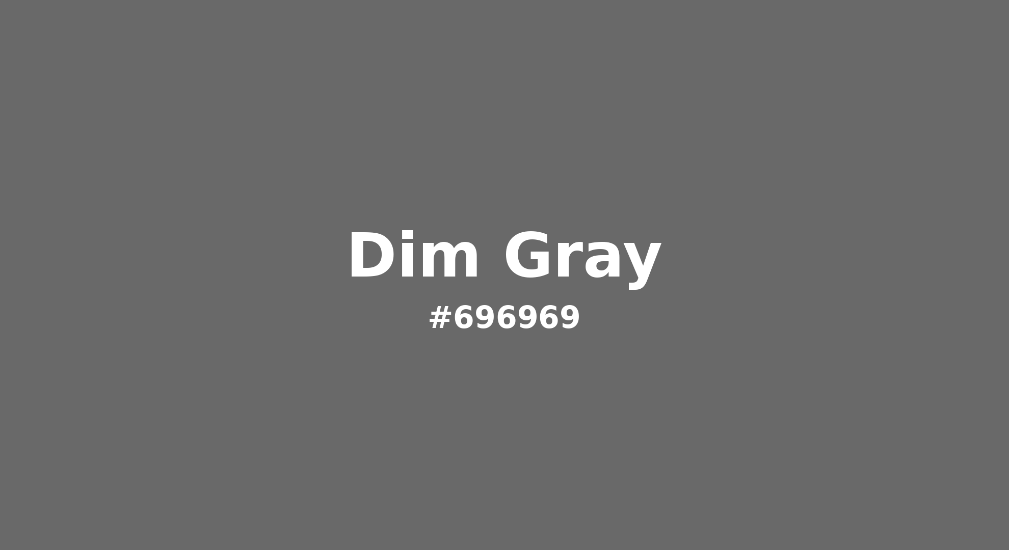
Dim Gray - #696969 Color Name
Download Color NameRelated Color Palettes
- Light Blue and Light Slate Gray •
- Slate Gray and Linen •
- Rosy Brown and Light Slate Gray •
- Antique White and Dim Gray •
- Dark Slate Gray and Medium Sea Green •
- Light Sky Blue and Light Slate Gray •
- Dark Salmon and Dark Gray •
- Forest Green and Dim Gray •
- Dim Gray and Linen •
- Olive Drab and Dark Gray •
- Light Slate Gray and Dark Red •
- Dark Gray and Burly Wood •
- Dark Slate Gray and Maroon •
- Dark Khaki and Dark Gray •
- Dark Goldenrod and Dark Gray
Color Palette Collection

Purple ideas
10 color palettes with 50 colors.
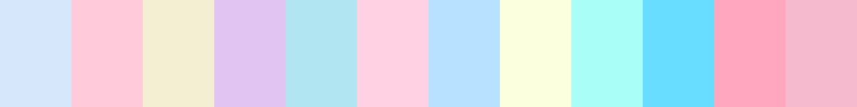
80 Pastel Light color Palettes
80 color palettes with 400 colors.
65 Red Color Palettes
65 color palettes with 325 colors.

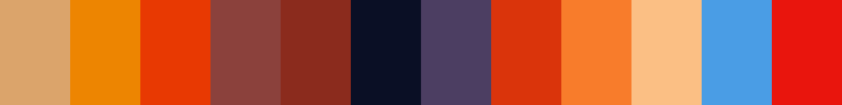
52 Orange Color Palettes
52 color palettes with 260 colors.