#64313E Color
Your all-in-one color resource. Download hex background images, Adobe swatches (ASE), PDF color sheets, and SVG files. Explore palettes, harmonies, accessibility, conversions, and professional exports — designed for designers, developers, and color perfectionists.
This rich, burgundy-toned brown speaks of passion, sensuality, and understated drama. It's reminiscent of aged wine, expensive leathers, and the warmth of a crackling fireplace. Its a color of deep feeling, suggesting both the intensity of love and the melancholy of loss. It creates a mood of sophistication and confidence, perfect for a space where one wants to feel grounded and empowered. It can be used in design for accentuating a sense of luxury and refinement, or in branding to create a feeling of trust and expertise. Visually matched named color: Wine Stain.
PANTONE 19-1617 TCX
Choose Color
Selected Color
Recent Colors
Color Details
Similar Ink Alternatives for #64313E color Alternative print inks for reproducing #64313E background image with a similar visual appearance.
Disclaimer: The visually matched ink reference is an independent approximation intended as a guide only. Please be advised that this pantone colors is only intended as a guide, Actual colours will depend on screen calibration variances. The print ink suggestions provided are independent visual approximations and are not affiliated with or endorsed by Pantone LLC. For official color specifications, conversion factors, and comprehensive color system information, please visit Pantone Connect. Official Pantone products can be purchased at pantone.com.
Color Previews for #000000 See how this color looks as a background or as text.
Complete Guide to Your Color Laboratory
Everything you need to know about this professional color toolkit.
Use the Color Picker at the top to select any color. All modules below update instantly.
Workflow: Pick a color → Explore palettes & data → Download what you need (PDF, Image, or Adobe ASE).
Color Details — Your color in all formats: HEX, RGB, RGBA, HSL, HSLA, HSV, CMYK, CIELab, Hunter-Lab, XYZ, Yxy, YUV. One-click copy.
Color Psychology — Emotional impact, cultural meanings, physiological effects, branding applications, and historical significance.
Named Colors — Find official color names (HTML/CSS, Pantone) that match your selection with similarity percentages.
Light & Dark Shades
80-step gradient from black to white. Perfect for button states and component systems.
Tints
Color mixed with white → lighter, pastel variations for backgrounds and disabled states.
Monochromatic — 11 curated tints/shades from one color. Production-ready for design systems.
- Complementary — Opposite on wheel (180°). High contrast.
- Analogous — Neighbors (±30°). Harmonious flow.
- Triadic — Three colors (120° apart). Vibrant, balanced.
- Split-Complementary — Base + two near-complements. Softer contrast.
- Tetradic/Square — Four colors. Complex, maximum variety.
- Neutral — Desaturated versions. Subtle, sophisticated.
15 Professional Variations — Monochromatic, Analogous, Complementary, Warm/Cool/Earth Tones, Pastel, Vibrant, High Contrast, and more.
Color Infusion — 10 palettes showing your color morphing into each major hue. Find bridge colors.
Similar Colors — 60+ colors generated via CIELAB Delta E matching. Unexpected harmonious combinations.
18 Ready-to-Use Gradients — Complementary, Analogous, Triadic, Tint/Shade progressions, and more.
Downloads: PNG (2560×1440), CSS (production-ready code), SVG (scalable vector).
WCAG Contrast Checker — Tests your color against white, black, and custom colors for AA (4.5:1) and AAA (7:1) compliance. Large text thresholds included.
Harmony & Accessibility Guide — Tests against 10 canonical hues. Shows which pairs are both beautiful AND WCAG-compliant for text.
PNG/JPG — High-res images for presentations and mood boards.
PDF — Print-ready reports for clients and teams.
Adobe ASE — Direct import to Photoshop, Illustrator, InDesign, XD.
CSS/SVG — Gradients only. Production-ready code and vectors.
Color Science: Industry-standard conversions (HSL, CIELAB, CMYK, XYZ). WCAG 2.1 luminance formula. Delta E (ΔE76) for perceptual matching.
Direct Links: Share colors via icolorpalette.com/color/ff5733 or icolorpalette.com/color/red
Issues? Refresh the page, wait for rendering, try another browser, or check console (F12) for errors.
Printing Guide for #64313e Background Image
Use PANTONE 19-1617 TCX as a visually matched ink reference when printing this background image.
To print the #64313e background image from our site, consider using PANTONE 19-1617 TCX as a visually matched ink reference.
Download the background image, then provide this reference code to your print vendor to help achieve accurate color reproduction.
The visually matched ink reference for the #64313e background image is PANTONE 19-1617 TCX.
This color is commonly described as Wine Stain.
This rich, burgundy-toned brown speaks of passion, sensuality, and understated drama. It's reminiscent of aged wine, expensive leathers, and the warmth of a crackling fireplace. Its a color of deep feeling, suggesting both the intensity of love and the melancholy of loss. It creates a mood of sophistication and confidence, perfect for a space where one wants to feel grounded and empowered. It can be used in design for accentuating a sense of luxury and refinement, or in branding to create a feeling of trust and expertise.
We provide PANTONE 19-1617 TCX as a visually matched ink reference to help you reproduce the #64313e background image accurately in professional printing.
This reference code helps print vendors achieve consistent color output across different printing equipment and materials.
After downloading the #64313e background image from our site:
- Include the visually matched ink reference PANTONE 19-1617 TCX in your print order notes
- Inform your print vendor that this is your target color reference
- Request a proof print to verify the Wine Stain color appearance before full production
The #64313e background image with PANTONE 19-1617 TCX as visually matched ink reference can be used for:
- Posters, banners, and backdrops
- Business cards, brochures, and flyers
- Packaging, labels, and stickers
- Signage and promotional materials
This is an independent visual approximation.
While PANTONE 19-1617 TCX closely matches the #64313e background image color, variations may exist between screen display and printed output.
We recommend requesting a proof print to verify the final appearance.
This rich, burgundy-toned brown speaks of passion, sensuality, and understated drama. It's reminiscent of aged wine, expensive leathers, and the warmth of a crackling fireplace. Its a color of deep feeling, suggesting both the intensity of love and the melancholy of loss. It creates a mood of sophistication and confidence, perfect for a space where one wants to feel grounded and empowered. It can be used in design for accentuating a sense of luxury and refinement, or in branding to create a feeling of trust and expertise.
Understanding these associations helps ensure the #64313e background image aligns with your intended message and brand impact.
Important Information
The visually matched ink reference is an independent approximation intended as a guide only.
Actual printed colors may vary depending on screen calibration, substrate material, ink type, and printing equipment used.
For official color specifications and certified color standards, visit Pantone Connect.
Official color guides and swatch books can be purchased from pantone.com.
Burgundy Color: A Rich and Elegant Hue | #64313E
Introduction:
Burgundy is a deep, dark red color that exudes sophistication and elegance. It is often associated with luxury and richness.
Historical Significance:
Key moments in history: Burgundy gained prominence in the 18th century during the Victorian era, where it was commonly used in fashion and interior design. It was also favored by royalty, symbolizing power and opulence.
Role in history: Burgundy played a significant role in the Renaissance period, particularly in religious art and tapestries. It was often used to depict nobility and wealth.
Symbolism and Meaning:
Symbolism in various cultures: Burgundy is commonly associated with passion, power, and sensuality. In some cultures, it represents love, while in others, it symbolizes abundance and prosperity.
Contextual symbolism: In fashion, burgundy is often associated with elegance and sophistication. It can also convey a sense of mystery and allure.
Burgundy in Fashion:
Impact on styles and trends: Burgundy is a timeless color in the fashion world. It is often used in formalwear and evening gowns, adding a touch of luxury and glamour.
Popular combinations: Burgundy pairs well with gold, ivory, navy, and black. It can also be complemented by warm tones like mustard or brown.
Burgundy in Graphic Design:
Design aesthetics and branding: Burgundy is often used in graphic design to convey sophistication and elegance. It is commonly seen in luxury brand logos and packaging.
Visual impact: The rich and deep hue of burgundy can create a sense of depth and warmth in design compositions. It can be used to add a touch of luxury to any visual project.
Color Combinations:
Potential color combinations:
- Burgundy and gold
- Burgundy and ivory
- Burgundy and navy
- Burgundy and black
- Burgundy and mustard
These color combinations can create a luxurious and sophisticated look.
Nature’s Palette:
Natural occurrences: Burgundy can be found in nature, particularly in flowers like roses and dahlias. It also resembles the rich tones of autumn leaves and the deep hues of certain berries.
Artistic Representations:
Use in art: Burgundy has been used in various forms of art, including paintings, sculptures, and textiles. It has been favored by artists for its ability to evoke emotions and create a sense of depth.
Movies and Cinematic Landscapes:
Cinematic use: Burgundy is often used in movies to set a dramatic and intense tone. It can be seen in scenes depicting passion, romance, or mystery.
Products and Commercial Appeal:
Popular products and brands: Burgundy is often used in the branding of luxury and high-end products. It is commonly associated with prestige and quality.
National Symbols and Significance:
Cultural importance: There are no specific national symbols tied to the color burgundy. However, in some cultures, it may be associated with royalty and power.
The Psychological and Emotional Impact:
Psychological influence: Burgundy can evoke emotions such as passion, desire, and sophistication. It can create a sense of warmth and intimacy.
Conclusion:
Burgundy is a color that has stood the test of time, representing luxury, elegance, and sophistication. Its deep and rich hue has been used throughout history in fashion, art, and design, leaving a lasting impact on our visual culture.
Pantone 19-1617 Tcx Burgundy Color | Hex color Code #64313e Image & Artwork
Download high-quality assets for your projects.

#64313e Color Schemes
Download Color Schemes
#64313e Color Shades
Download Color Shades
Pantone 19-1617 Tcx Burgundy Color | Hex color Code #64313e Solid Color Background
Download Solid Color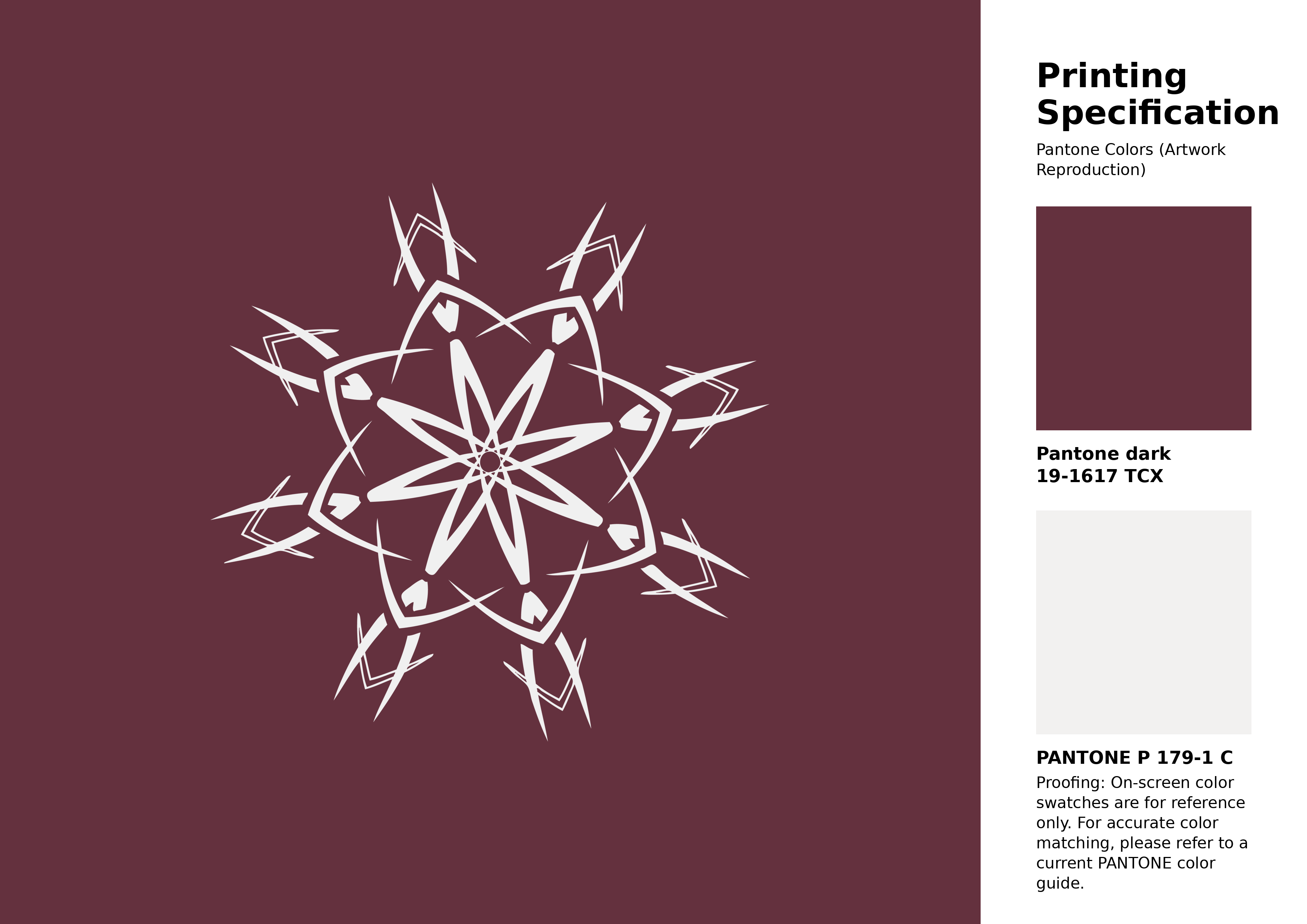
#64313e Pantone 19-1617 Tcx Burgundy Color | Hex color Code #64313e Artwork Image (PNG)
Download Artwork (PNG)#64313e Pantone 19-1617 Tcx Burgundy Color | Hex color Code #64313e Artwork Vector (PDF)
Download Artwork (PDF)#64313e Pantone 19-1617 Tcx Burgundy Color | Hex color Code #64313e Artwork Vector (SVG)
Download Artwork (SVG)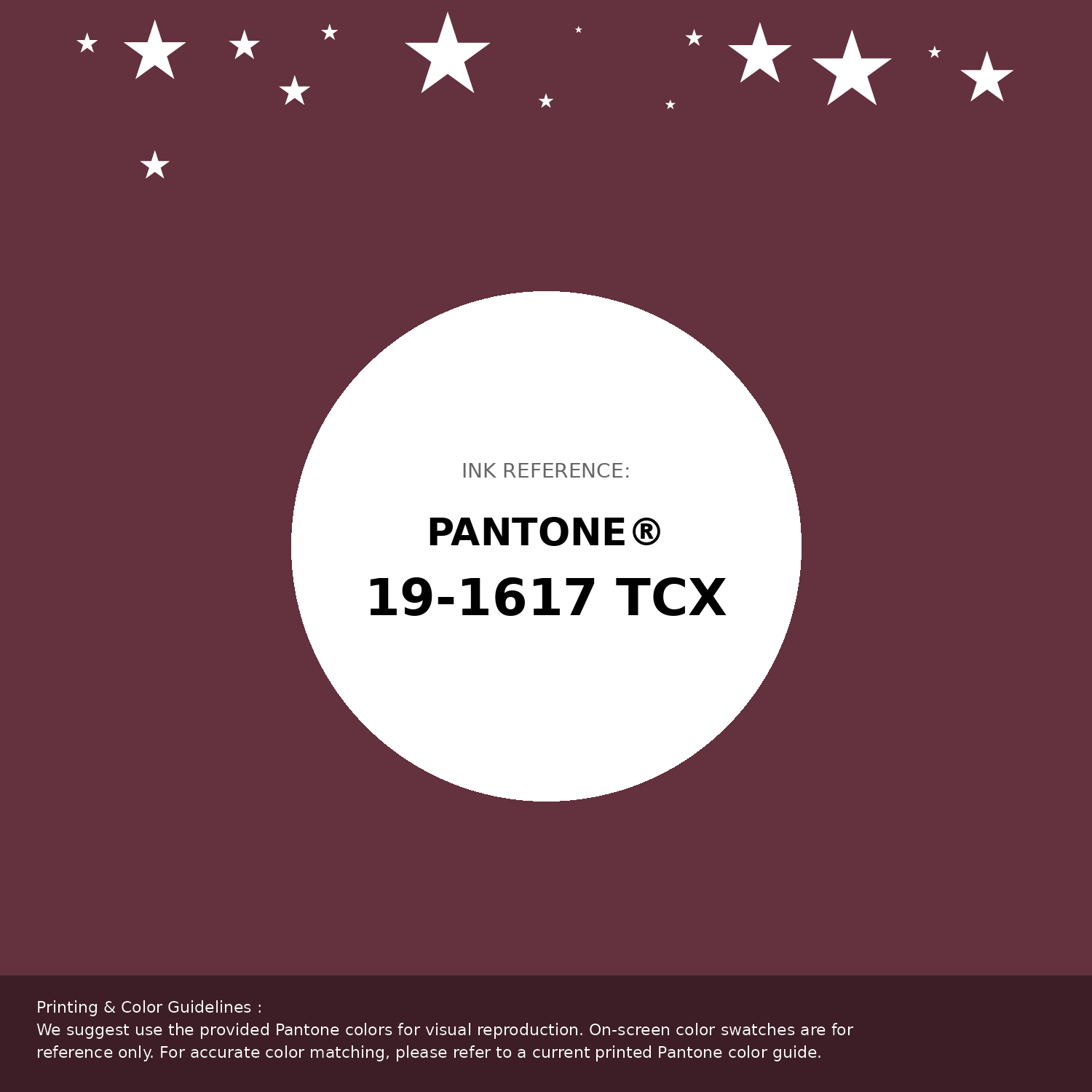
#64313e Pantone 19-1617 Tcx Burgundy Color | Hex color Code #64313e Pantone Swatch Artwork
Download Artwork Swatch
#64313e Pantone 19-1617 Tcx Burgundy Color | Hex color Code #64313e Gradient Artwork (PNG)
Download Gradient (PNG)#64313e Pantone 19-1617 Tcx Burgundy Color | Hex color Code #64313e Gradient Artwork (SVG)
Download Gradient (SVG)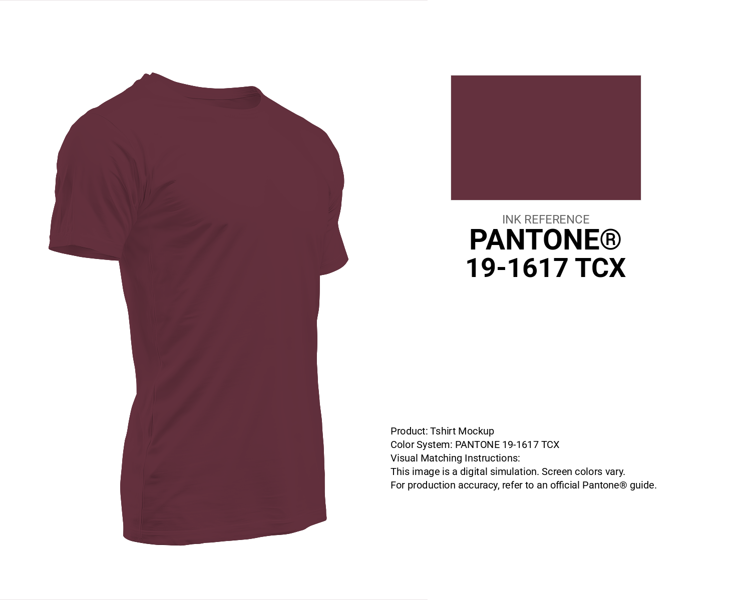
#64313e Pantone 19-1617 Tcx Burgundy Color | Hex color Code #64313e T-Shirt Mockup
Download T-Shirt Mockup
#64313e Pantone 19-1617 Tcx Burgundy Color | Hex color Code #64313e Printing Artwork Pantone Reference
Download Pantone Printing ReferenceRelated Color Palettes
- Dark Gray and Gray •
- Dark Gray and Indian Red •
- Powder Blue and Dark Gray •
- Dark Gray and Dim Gray •
- Chocolate and Dark Gray •
- Sienna and Dark Gray •
- Dark Olive Green and Dark Gray •
- Slate Gray and Dark Gray •
- Plum and Dark Gray •
- Dark Goldenrod and Dark Gray •
- White Smoke and Dark Gray •
- Pale Goldenrod and Dark Gray •
- Beige and Dark Gray •
- Wheat and Dark Gray •
- Light Blue and Dark Gray
Color Palette Collection

500+ Popular Color Palette Collection
501 color palettes with 2505 colors.

81 Pink color palettes
81 color palettes with 405 colors.

45 Gold Color Palettes
45 color palettes with 225 colors.
Burnt orange
25 color palettes with 125 colors.