#614B79 Color
Your all-in-one color resource. Download hex background images, Adobe swatches (ASE), PDF color sheets, and SVG files. Explore palettes, harmonies, accessibility, conversions, and professional exports — designed for designers, developers, and color perfectionists.
This muted, deep purple-blue hue evokes a sense of mystery and introspection. It hints at the transition between day and night, a time of quiet reflection and contemplation. The color might remind one of a starlit night sky or the deep, still waters of a moonlit lake. Its rich tone creates a sophisticated and sophisticated atmosphere, suitable for rooms meant for quiet contemplation or creative pursuits. In design, it could be used for a sophisticated bedroom, a library, or a study to encourage focus and introspection. The subtle depth could also evoke feelings of nostalgia and emotional depth. Visually matched named color: Twilight Enigma.
PANTONE 668 C
Choose Color
Selected Color
Recent Colors
Color Details
Similar Ink Alternatives for #614B79 color Alternative print inks for reproducing #614B79 background image with a similar visual appearance.
Disclaimer: The visually matched ink reference is an independent approximation intended as a guide only. Please be advised that this pantone colors is only intended as a guide, Actual colours will depend on screen calibration variances. The print ink suggestions provided are independent visual approximations and are not affiliated with or endorsed by Pantone LLC. For official color specifications, conversion factors, and comprehensive color system information, please visit Pantone Connect. Official Pantone products can be purchased at pantone.com.
Color Previews for #000000 See how this color looks as a background or as text.
Complete Guide to Your Color Laboratory
Everything you need to know about this professional color toolkit.
Use the Color Picker at the top to select any color. All modules below update instantly.
Workflow: Pick a color → Explore palettes & data → Download what you need (PDF, Image, or Adobe ASE).
Color Details — Your color in all formats: HEX, RGB, RGBA, HSL, HSLA, HSV, CMYK, CIELab, Hunter-Lab, XYZ, Yxy, YUV. One-click copy.
Color Psychology — Emotional impact, cultural meanings, physiological effects, branding applications, and historical significance.
Named Colors — Find official color names (HTML/CSS, Pantone) that match your selection with similarity percentages.
Light & Dark Shades
80-step gradient from black to white. Perfect for button states and component systems.
Tints
Color mixed with white → lighter, pastel variations for backgrounds and disabled states.
Monochromatic — 11 curated tints/shades from one color. Production-ready for design systems.
- Complementary — Opposite on wheel (180°). High contrast.
- Analogous — Neighbors (±30°). Harmonious flow.
- Triadic — Three colors (120° apart). Vibrant, balanced.
- Split-Complementary — Base + two near-complements. Softer contrast.
- Tetradic/Square — Four colors. Complex, maximum variety.
- Neutral — Desaturated versions. Subtle, sophisticated.
15 Professional Variations — Monochromatic, Analogous, Complementary, Warm/Cool/Earth Tones, Pastel, Vibrant, High Contrast, and more.
Color Infusion — 10 palettes showing your color morphing into each major hue. Find bridge colors.
Similar Colors — 60+ colors generated via CIELAB Delta E matching. Unexpected harmonious combinations.
18 Ready-to-Use Gradients — Complementary, Analogous, Triadic, Tint/Shade progressions, and more.
Downloads: PNG (2560×1440), CSS (production-ready code), SVG (scalable vector).
WCAG Contrast Checker — Tests your color against white, black, and custom colors for AA (4.5:1) and AAA (7:1) compliance. Large text thresholds included.
Harmony & Accessibility Guide — Tests against 10 canonical hues. Shows which pairs are both beautiful AND WCAG-compliant for text.
PNG/JPG — High-res images for presentations and mood boards.
PDF — Print-ready reports for clients and teams.
Adobe ASE — Direct import to Photoshop, Illustrator, InDesign, XD.
CSS/SVG — Gradients only. Production-ready code and vectors.
Color Science: Industry-standard conversions (HSL, CIELAB, CMYK, XYZ). WCAG 2.1 luminance formula. Delta E (ΔE76) for perceptual matching.
Direct Links: Share colors via icolorpalette.com/color/ff5733 or icolorpalette.com/color/red
Issues? Refresh the page, wait for rendering, try another browser, or check console (F12) for errors.
Printing Guide for #614b79 Background Image
Use PANTONE 668 C as a visually matched ink reference when printing this background image.
To print the #614b79 background image from our site, consider using PANTONE 668 C as a visually matched ink reference.
Download the background image, then provide this reference code to your print vendor to help achieve accurate color reproduction.
The visually matched ink reference for the #614b79 background image is PANTONE 668 C.
This color is commonly described as Twilight Enigma.
This muted, deep purple-blue hue evokes a sense of mystery and introspection. It hints at the transition between day and night, a time of quiet reflection and contemplation. The color might remind one of a starlit night sky or the deep, still waters of a moonlit lake. Its rich tone creates a sophisticated and sophisticated atmosphere, suitable for rooms meant for quiet contemplation or creative pursuits. In design, it could be used for a sophisticated bedroom, a library, or a study to encourage focus and introspection. The subtle depth could also evoke feelings of nostalgia and emotional depth.
We provide PANTONE 668 C as a visually matched ink reference to help you reproduce the #614b79 background image accurately in professional printing.
This reference code helps print vendors achieve consistent color output across different printing equipment and materials.
After downloading the #614b79 background image from our site:
- Include the visually matched ink reference PANTONE 668 C in your print order notes
- Inform your print vendor that this is your target color reference
- Request a proof print to verify the Twilight Enigma color appearance before full production
The #614b79 background image with PANTONE 668 C as visually matched ink reference can be used for:
- Posters, banners, and backdrops
- Business cards, brochures, and flyers
- Packaging, labels, and stickers
- Signage and promotional materials
This is an independent visual approximation.
While PANTONE 668 C closely matches the #614b79 background image color, variations may exist between screen display and printed output.
We recommend requesting a proof print to verify the final appearance.
This muted, deep purple-blue hue evokes a sense of mystery and introspection. It hints at the transition between day and night, a time of quiet reflection and contemplation. The color might remind one of a starlit night sky or the deep, still waters of a moonlit lake. Its rich tone creates a sophisticated and sophisticated atmosphere, suitable for rooms meant for quiet contemplation or creative pursuits. In design, it could be used for a sophisticated bedroom, a library, or a study to encourage focus and introspection. The subtle depth could also evoke feelings of nostalgia and emotional depth.
Understanding these associations helps ensure the #614b79 background image aligns with your intended message and brand impact.
Important Information
The visually matched ink reference is an independent approximation intended as a guide only.
Actual printed colors may vary depending on screen calibration, substrate material, ink type, and printing equipment used.
For official color specifications and certified color standards, visit Pantone Connect.
Official color guides and swatch books can be purchased from pantone.com.
Pantone 668 C Color: Mysterious Violet | #614B79
Introduction:
Mysterious Violet, also known as Pantone 668 C, is a deep and captivating hue. It evokes a sense of intrigue and enchantment, with its rich and dark purple tones.
Historical Significance:
Key moments in history: Mysterious Violet has been prominently used in various historical periods, such as during the Renaissance era in European art and in the clothing of royalty. It has also been associated with spirituality and mysticism in many ancient civilizations.
Symbolism and Meaning:
Symbolism: Mysterious Violet typically symbolizes creativity, spirituality, and transformation. It is often associated with luxury, power, and extravagance. In some cultures, it represents mystery, intuition, and the unseen.
Mysterious Violet in Fashion:
Impact on fashion: Mysterious Violet has a strong presence in the fashion world, particularly in formal wear and luxury brands. It is often used to create elegant and dramatic looks, making it a popular choice for evening gowns and accessories.
Mysterious Violet in Graphic Design:
Significance in design aesthetics: Mysterious Violet plays a significant role in graphic design. Its deep and alluring shade adds a sense of mystery and sophistication to visual compositions. It is often used to create a luxurious and elegant brand identity.
Color Combinations:
Potential color combinations: Mysterious Violet pairs well with lighter shades such as silver, lavender, and blush for an ethereal and romantic look. It can also create a striking contrast when combined with gold, emerald green, or deep burgundy.
Nature’s Palette:
Natural occurrences: Mysterious Violet can be found in nature in flowers like the orchid and morning glory. It also appears in some stunning sunsets, creating a captivating and mysterious atmosphere in the sky.
Artistic Representations:
Use in art forms: Mysterious Violet has been used by various artists throughout history to convey emotions such as passion, spirituality, and introspection. It has been featured in paintings, sculptures, and other forms of artistic expression.
Movies and Cinematic Landscapes:
Instances in movies: Mysterious Violet sets the tone in movies that emphasize mystery, magic, and otherworldly elements. It adds a touch of enchantment to cinematic landscapes, creating visually stunning and captivating scenes.
Products and Commercial Appeal:
Popular products and brands: Mysterious Violet is often associated with high-end products and brands that aim to convey sophistication and luxury. It is frequently used in cosmetics, fragrance packaging, and premium fashion labels.
National Symbols and Significance:
Cultural significance: Mysterious Violet holds cultural significance in some countries and societies. It may be associated with national symbols, ceremonies, or traditional attire, representing pride, heritage, or spirituality.
The Psychological and Emotional Impact:
Psychological impact: Mysterious Violet can evoke a range of emotions including creativity, mystery, sensuality, and spirituality. It has a calming effect and can promote introspection and meditation.
Conclusion:
Mysterious Violet, also known as Pantone 668 C, is a color that exudes a sense of mystique and allure. Its historical significance, symbolism, and impact in various industries make it a timeless and captivating color choice. Whether used in fashion, design, or art, Mysterious Violet adds a touch of elegance and intrigue to any composition.
Pantone 668 C Color | Hex color Code #614b79 Image & Artwork
Download high-quality assets for your projects.

#614b79 Color Schemes
Download Color Schemes
#614b79 Color Shades
Download Color Shades
Pantone 668 C Color | Hex color Code #614b79 Solid Color Background
Download Solid Color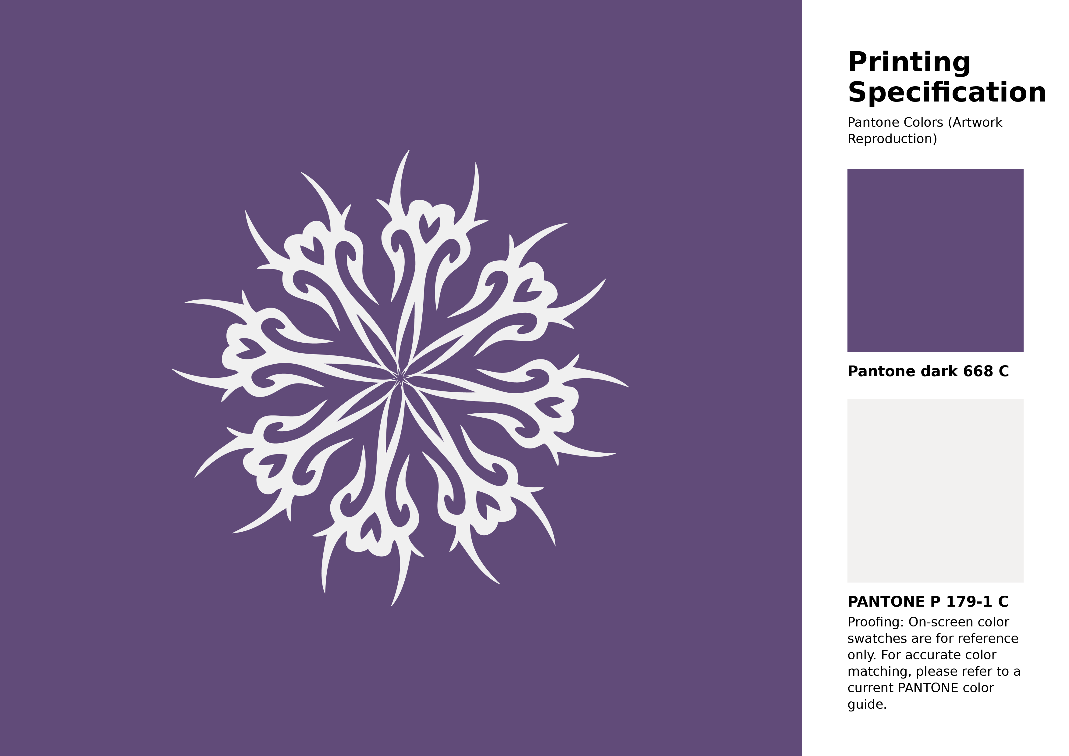
#614b79 Pantone 668 C Color | Hex color Code #614b79 Artwork Image (PNG)
Download Artwork (PNG)#614b79 Pantone 668 C Color | Hex color Code #614b79 Artwork Vector (PDF)
Download Artwork (PDF)#614b79 Pantone 668 C Color | Hex color Code #614b79 Artwork Vector (SVG)
Download Artwork (SVG)
#614b79 Pantone 668 C Color | Hex color Code #614b79 Pantone Swatch Artwork
Download Artwork Swatch
#614b79 Pantone 668 C Color | Hex color Code #614b79 Gradient Artwork (PNG)
Download Gradient (PNG)#614b79 Pantone 668 C Color | Hex color Code #614b79 Gradient Artwork (SVG)
Download Gradient (SVG)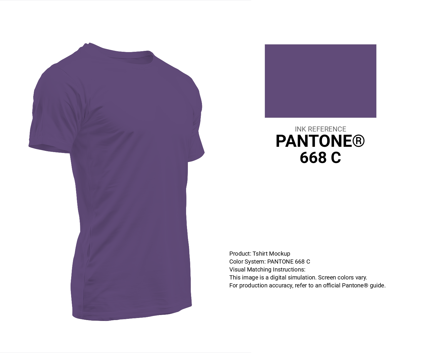
#614b79 Pantone 668 C Color | Hex color Code #614b79 T-Shirt Mockup
Download T-Shirt Mockup
#614b79 Pantone 668 C Color | Hex color Code #614b79 Printing Artwork Pantone Reference
Download Pantone Printing ReferenceRelated Color Palettes
- Dark Olive Green and Gray •
- Dark Slate Gray and Salmon •
- Dark Gray and Dark Slate Blue •
- Gray and Burly Wood •
- Cadet Blue and Dark Slate Gray •
- Dark Gray and Gray •
- Dim Gray and Gray •
- Sienna and Light Slate Gray •
- Gray and Sandy Brown •
- Bermuda Gray •
- Light GoldenrodYellow and Dark Slate Gray •
- Dark Gray and Dark Slate Gray •
- Dark Slate Gray and Saddle Brown •
- Tan and Light Gray •
- Chocolate and Dark Gray
Color Palette Collection

29 Pink Color Palettes for your next design project
29 color palettes with 145 colors.
Burnt orange
25 color palettes with 125 colors.

25 Blue Color Palettes
25 color palettes with 125 colors.

45 Gold Color Palettes
45 color palettes with 225 colors.