#506886 Color
Your all-in-one color resource. Download hex background images, Adobe swatches (ASE), PDF color sheets, and SVG files. Explore palettes, harmonies, accessibility, conversions, and professional exports — designed for designers, developers, and color perfectionists.
This deep blue-gray evokes the mysteries of the ocean, suggesting depth, wisdom, and a sense of exploration. It creates a mood of quiet power and introspection. It reminds one of the uncharted territories and the calming qualities of the sea. It is well suited for designs that want to convey a sense of trust, innovation, and a touch of the unknown. Visually matched named color: Oceanic Depths.
PANTONE 18-4027 TCX
Choose Color
Selected Color
Recent Colors
Color Details
Similar Ink Alternatives for #506886 color Alternative print inks for reproducing #506886 background image with a similar visual appearance.
Disclaimer: The visually matched ink reference is an independent approximation intended as a guide only. Please be advised that this pantone colors is only intended as a guide, Actual colours will depend on screen calibration variances. The print ink suggestions provided are independent visual approximations and are not affiliated with or endorsed by Pantone LLC. For official color specifications, conversion factors, and comprehensive color system information, please visit Pantone Connect. Official Pantone products can be purchased at pantone.com.
Color Previews for #000000 See how this color looks as a background or as text.
Complete Guide to Your Color Laboratory
Everything you need to know about this professional color toolkit.
Use the Color Picker at the top to select any color. All modules below update instantly.
Workflow: Pick a color → Explore palettes & data → Download what you need (PDF, Image, or Adobe ASE).
Color Details — Your color in all formats: HEX, RGB, RGBA, HSL, HSLA, HSV, CMYK, CIELab, Hunter-Lab, XYZ, Yxy, YUV. One-click copy.
Color Psychology — Emotional impact, cultural meanings, physiological effects, branding applications, and historical significance.
Named Colors — Find official color names (HTML/CSS, Pantone) that match your selection with similarity percentages.
Light & Dark Shades
80-step gradient from black to white. Perfect for button states and component systems.
Tints
Color mixed with white → lighter, pastel variations for backgrounds and disabled states.
Monochromatic — 11 curated tints/shades from one color. Production-ready for design systems.
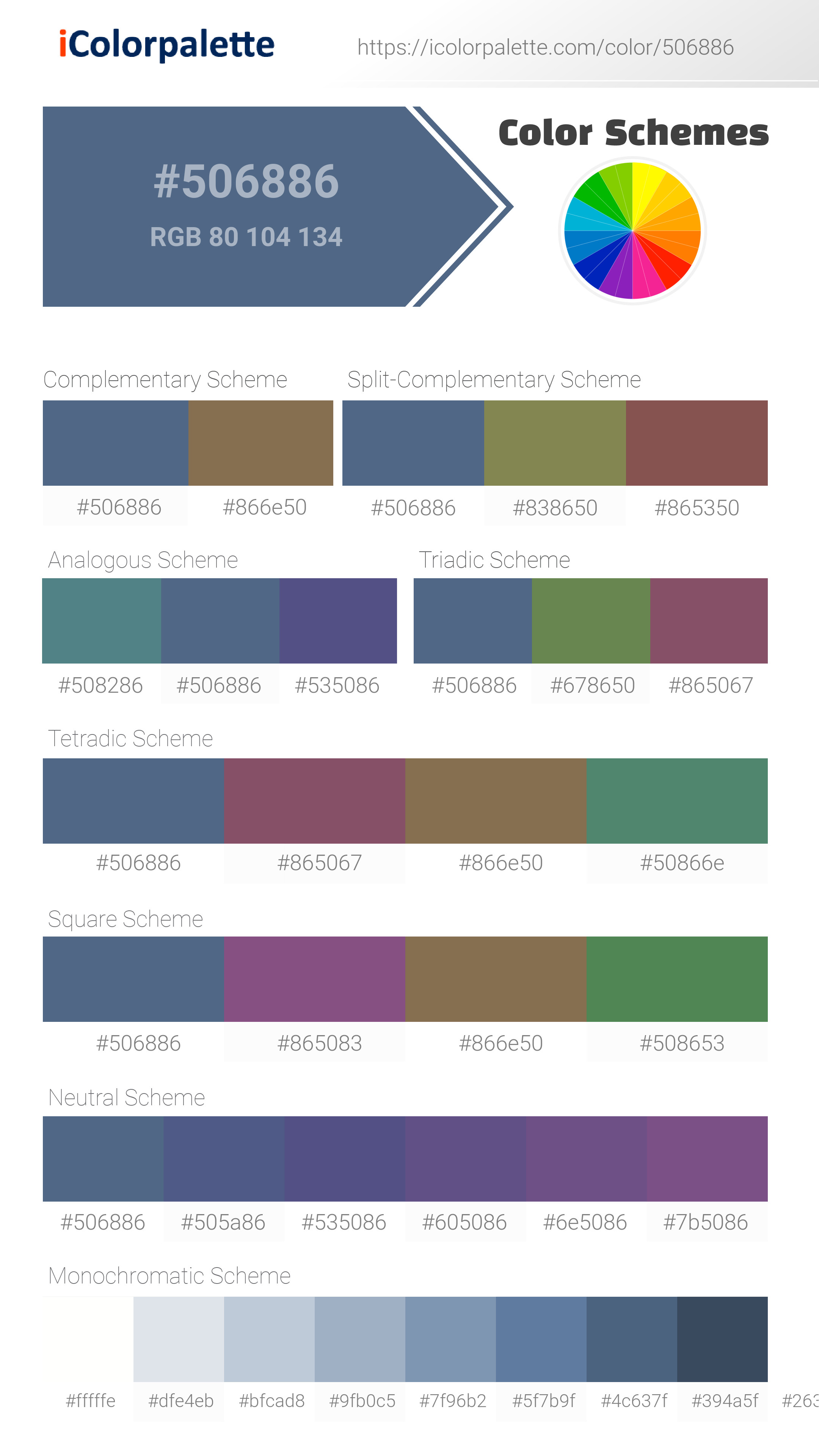
- Complementary — Opposite on wheel (180°). High contrast.
- Analogous — Neighbors (±30°). Harmonious flow.
- Triadic — Three colors (120° apart). Vibrant, balanced.
- Split-Complementary — Base + two near-complements. Softer contrast.
- Tetradic/Square — Four colors. Complex, maximum variety.
- Neutral — Desaturated versions. Subtle, sophisticated.
15 Professional Variations — Monochromatic, Analogous, Complementary, Warm/Cool/Earth Tones, Pastel, Vibrant, High Contrast, and more.
Color Infusion — 10 palettes showing your color morphing into each major hue. Find bridge colors.
Similar Colors — 60+ colors generated via CIELAB Delta E matching. Unexpected harmonious combinations.
18 Ready-to-Use Gradients — Complementary, Analogous, Triadic, Tint/Shade progressions, and more.
Downloads: PNG (2560×1440), CSS (production-ready code), SVG (scalable vector).
WCAG Contrast Checker — Tests your color against white, black, and custom colors for AA (4.5:1) and AAA (7:1) compliance. Large text thresholds included.
Harmony & Accessibility Guide — Tests against 10 canonical hues. Shows which pairs are both beautiful AND WCAG-compliant for text.
PNG/JPG — High-res images for presentations and mood boards.
PDF — Print-ready reports for clients and teams.
Adobe ASE — Direct import to Photoshop, Illustrator, InDesign, XD.
CSS/SVG — Gradients only. Production-ready code and vectors.
Color Science: Industry-standard conversions (HSL, CIELAB, CMYK, XYZ). WCAG 2.1 luminance formula. Delta E (ΔE76) for perceptual matching.
Direct Links: Share colors via icolorpalette.com/color/ff5733 or icolorpalette.com/color/red
Issues? Refresh the page, wait for rendering, try another browser, or check console (F12) for errors.
Printing Guide for #506886 Background Image
Use PANTONE 18-4027 TCX as a visually matched ink reference when printing this background image.
To print the #506886 background image from our site, consider using PANTONE 18-4027 TCX as a visually matched ink reference.
Download the background image, then provide this reference code to your print vendor to help achieve accurate color reproduction.
The visually matched ink reference for the #506886 background image is PANTONE 18-4027 TCX.
This color is commonly described as Oceanic Depths.
This deep blue-gray evokes the mysteries of the ocean, suggesting depth, wisdom, and a sense of exploration. It creates a mood of quiet power and introspection. It reminds one of the uncharted territories and the calming qualities of the sea. It is well suited for designs that want to convey a sense of trust, innovation, and a touch of the unknown.
We provide PANTONE 18-4027 TCX as a visually matched ink reference to help you reproduce the #506886 background image accurately in professional printing.
This reference code helps print vendors achieve consistent color output across different printing equipment and materials.
After downloading the #506886 background image from our site:
- Include the visually matched ink reference PANTONE 18-4027 TCX in your print order notes
- Inform your print vendor that this is your target color reference
- Request a proof print to verify the Oceanic Depths color appearance before full production
The #506886 background image with PANTONE 18-4027 TCX as visually matched ink reference can be used for:
- Posters, banners, and backdrops
- Business cards, brochures, and flyers
- Packaging, labels, and stickers
- Signage and promotional materials
This is an independent visual approximation.
While PANTONE 18-4027 TCX closely matches the #506886 background image color, variations may exist between screen display and printed output.
We recommend requesting a proof print to verify the final appearance.
This deep blue-gray evokes the mysteries of the ocean, suggesting depth, wisdom, and a sense of exploration. It creates a mood of quiet power and introspection. It reminds one of the uncharted territories and the calming qualities of the sea. It is well suited for designs that want to convey a sense of trust, innovation, and a touch of the unknown.
Understanding these associations helps ensure the #506886 background image aligns with your intended message and brand impact.
Important Information
The visually matched ink reference is an independent approximation intended as a guide only.
Actual printed colors may vary depending on screen calibration, substrate material, ink type, and printing equipment used.
For official color specifications and certified color standards, visit Pantone Connect.
Official color guides and swatch books can be purchased from pantone.com.
Moonlight Blue Color: A Tranquil Shade for Creativity | #506886
Introduction:
Moonlight Blue is a captivating color that exudes tranquility and sophistication. With its deep yet soft hue, it captivates the eyes and creates a sense of calmness and serenity.
Historical Significance:
First Appearance in History: Moonlight Blue made its mark in history during the Renaissance period as artists began incorporating this color in their palettes. Its deep and mysterious tone added depth and a touch of elegance to many Renaissance masterpieces.
Symbolism in Religious Art: Moonlight Blue is often associated with spirituality and divinity. In religious art, this color is commonly used to depict the night sky or heavenly realms, symbolizing a connection with the divine.
Symbolism and Meaning:
Tranquility and Serenity: Moonlight Blue symbolizes tranquility, serenity, and peacefulness. It evokes a sense of calmness and encourages relaxation.
Spiritual Significance: In various cultures, Moonlight Blue is associated with spirituality, meditation, and deep introspection. It represents a connection with the higher realms and inner peace.
Moonlight Blue in Fashion:
A Versatile Fashion Choice: Moonlight Blue has been embraced in the world of fashion for its versatility. It can be effortlessly incorporated into various styles and lends an air of sophistication to any outfit.
A Timeless Hue: Moonlight Blue has stood the test of time and remains a classic choice in fashion. Whether used in formal evening gowns or casual denim, this color effortlessly adds elegance and refinement.
Moonlight Blue in Graphic Design:
Aesthetic Appeal: In graphic design, Moonlight Blue is often used to evoke a sense of calmness and elegance. Its deep hue creates a visually appealing contrast when combined with lighter shades, making it a popular choice for branding and visual impact.
Branding: Moonlight Blue is frequently utilized by businesses looking to convey a sense of trust, reliability, and sophistication. It adds a touch of luxury to brand identities and helps establish a strong and memorable visual presence.
Color Combinations:
Complementary Colors: Moonlight Blue pairs beautifully with warm tones like golden yellow and rich oranges. It also creates a stunning contrast with shades of silver and off-white, adding depth and visual interest to any color scheme.
Nature-Inspired Combinations: Combine Moonlight Blue with shades of forest green or soft lavender to evoke a peaceful and serene natural environment. These color combinations are often seen in botanical designs and outdoor-themed graphics.
Nature’s Palette:
Echoes of the Night Sky: Moonlight Blue can be found naturally in the midnight sky, giving a sense of tranquility to moonlit nights. It is also present in certain flowers, such as the majestic delphinium and the delicate morning glory.
Water Reflections: The serene color of Moonlight Blue can be observed in calm bodies of water, where it reflects the deep blue of the sky. From tranquil lakes to vast oceans, this color brings a sense of peace and wonder to natural landscapes.
Artistic Representations:
Impressionist Inspiration: Moonlight Blue has been a favorite color in the palette of many Impressionist artists. It represents the beauty and tranquility of the night, capturing the essence of moonlit scenes in their art.
Abstract Interpretations: Artists have used Moonlight Blue to explore emotions, dreams, and the subconscious mind. Its deep and mysterious tone adds layers of complexity to abstract art.
Movies and Cinematic Landscapes:
Epic Nightscapes: Moonlight Blue often sets the tone for poetic and introspective scenes in movies. It creates a sense of mystery and enchantment, symbolizing nighttime adventures and hidden depths.
Romantic Atmospheres: Moonlight Blue is frequently used in romantic films to create an atmosphere of passion and longing. It adds a touch of elegance and sophistication to cinematic love stories.
Products and Commercial Appeal:
Luxury Brands: Moonlight Blue is often associated with premium and upscale products. It is frequently used in the branding and packaging of high-end cosmetics, fashion accessories, and luxury automobiles.
Mood and Sleep Products: Due to its calming nature, Moonlight Blue is utilized in products and advertisements related to relaxation, sleep aid, and mental well-being. It creates a soothing ambiance that promotes restful sleep and a peaceful atmosphere.
National Symbols and Significance:
Cultural Associations: In some cultures, Moonlight Blue holds symbolic significance as a color associated with meditation, spirituality, and the pursuit of higher knowledge. It represents inner peace and wisdom.
National Pride: Moonlight Blue is recognized as a patriotic color in certain countries, representing unity, stability, and national pride. It is often showcased in flags, emblems, and other national symbols.
The Psychological and Emotional Impact:
Calming Influence: Moonlight Blue has a soothing effect on emotions and can help reduce stress and anxiety. It promotes a sense of tranquility and encourages a peaceful state of mind.
Reflection and Introspection: This color inspires deep introspection and encourages contemplation. It can aid in meditation practices and provide mental clarity.
Conclusion:
Moonlight Blue, with its rich history, timeless appeal, and serene qualities, is a color that continues to captivate and inspire. From its usage in art to its representation in fashion and design, this shade transcends boundaries, bringing a touch of elegance and tranquility to various aspects of life.
Pantone 18-4027 Tcx Moonlight Blue Color | Hex color Code #506886 Image & Artwork
Download high-quality assets for your projects.
#506886 Color Schemes
Download Color Schemes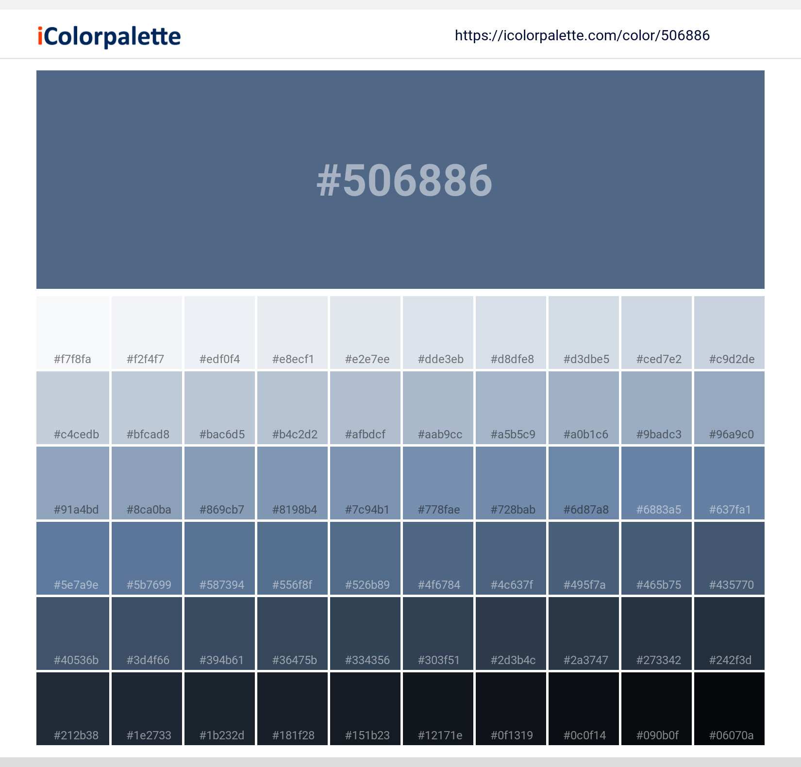
#506886 Color Shades
Download Color Shades
Pantone 18-4027 Tcx Moonlight Blue Color | Hex color Code #506886 Solid Color Background
Download Solid Color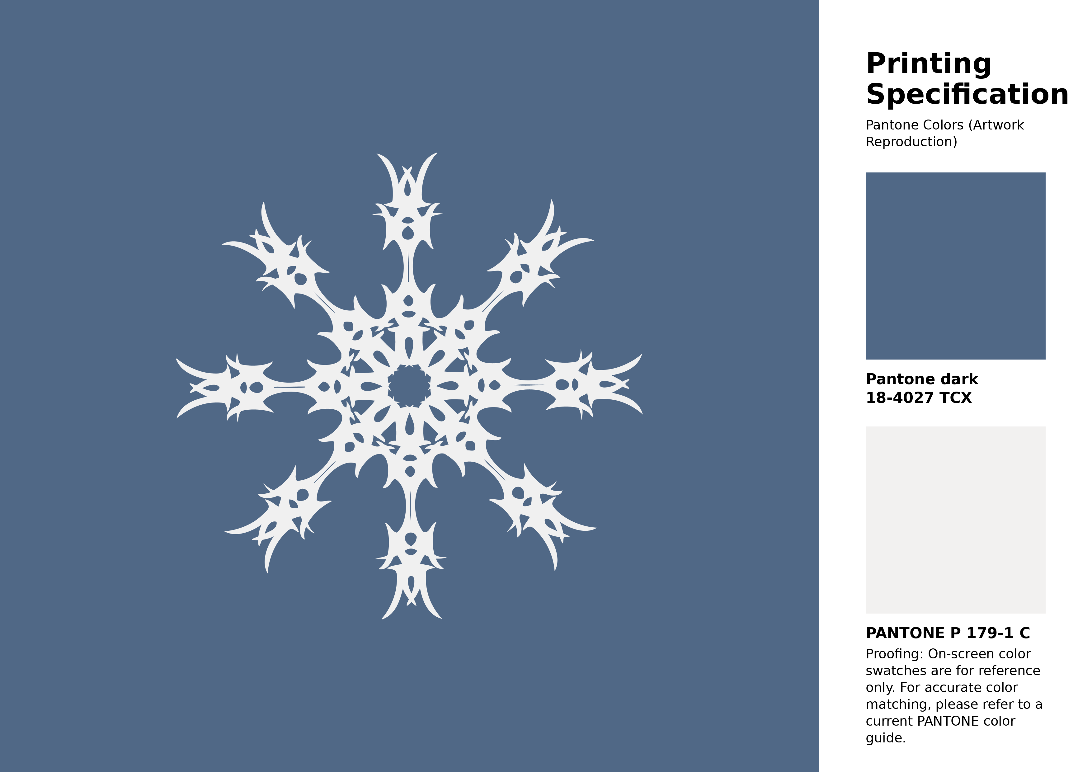
#506886 Pantone 18-4027 Tcx Moonlight Blue Color | Hex color Code #506886 Artwork Image (PNG)
Download Artwork (PNG)#506886 Pantone 18-4027 Tcx Moonlight Blue Color | Hex color Code #506886 Artwork Vector (PDF)
Download Artwork (PDF)#506886 Pantone 18-4027 Tcx Moonlight Blue Color | Hex color Code #506886 Artwork Vector (SVG)
Download Artwork (SVG)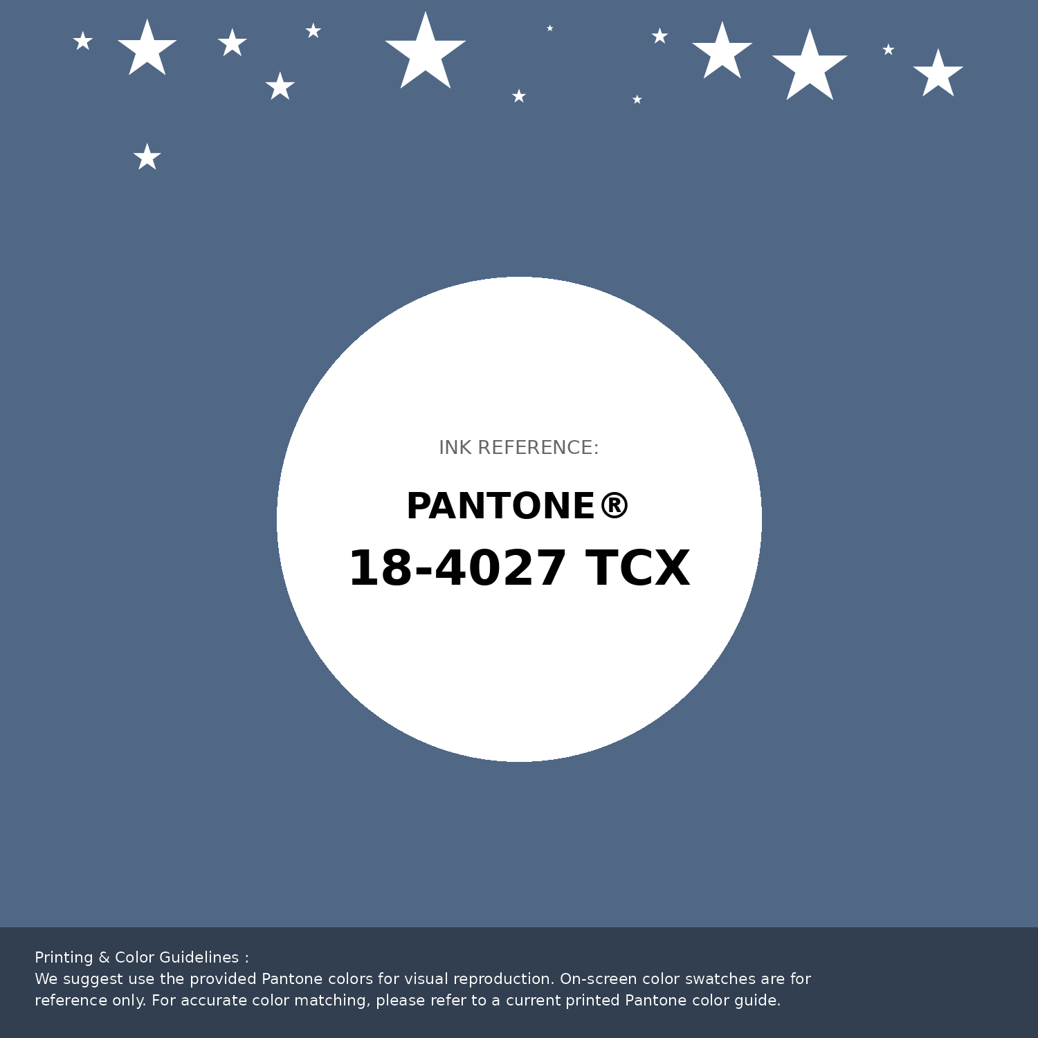
#506886 Pantone 18-4027 Tcx Moonlight Blue Color | Hex color Code #506886 Pantone Swatch Artwork
Download Artwork Swatch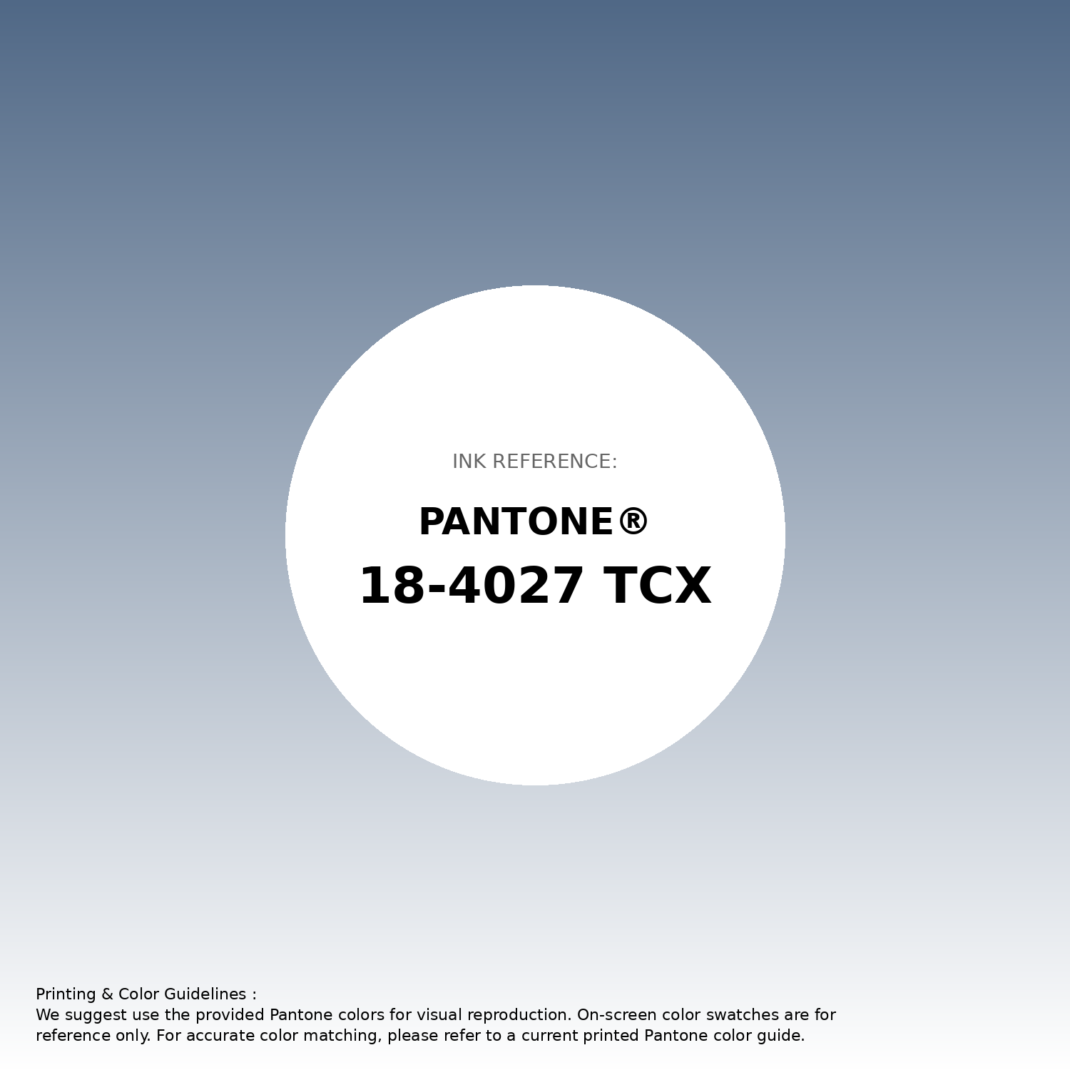
#506886 Pantone 18-4027 Tcx Moonlight Blue Color | Hex color Code #506886 Gradient Artwork (PNG)
Download Gradient (PNG)#506886 Pantone 18-4027 Tcx Moonlight Blue Color | Hex color Code #506886 Gradient Artwork (SVG)
Download Gradient (SVG)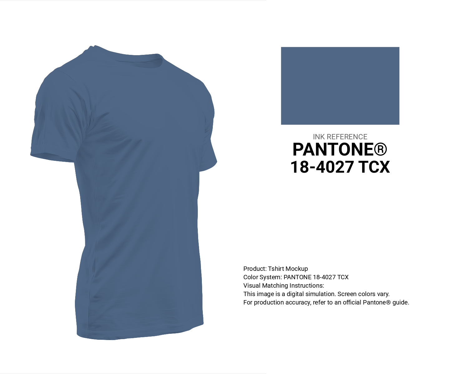
#506886 Pantone 18-4027 Tcx Moonlight Blue Color | Hex color Code #506886 T-Shirt Mockup
Download T-Shirt Mockup
#506886 Pantone 18-4027 Tcx Moonlight Blue Color | Hex color Code #506886 Printing Artwork Pantone Reference
Download Pantone Printing Reference
Moonlight Blue - #506886 Color Name
Download Color NameRelated Color Palettes
- Light GoldenrodYellow and Slate Gray •
- Goldenrod and Dark Slate Gray •
- Light GoldenrodYellow and Dim Gray •
- Dark Slate Gray and Peru •
- Rosy Brown and Light Slate Gray •
- Red and Dim Gray •
- Sienna and Light Gray •
- Deep Pink and Dark Slate Gray •
- Dark Gray and Yellow Green •
- Steel Blue and Dark Slate Gray •
- Dark Slate Gray and Light Sea Green •
- Slate Gray and Medium Purple •
- Gray and Cadet Blue •
- Black and Slate Gray •
- Gray and Light Sea Green
Color Palette Collection

18 Light Color Palettes Collection
18 color palettes with 90 colors.

38 Beautiful Color Palettes
38 color palettes with 190 colors.
Summer Beach Vibes
1 color palettes with 5 colors.
Purple ideas
12 color palettes with 60 colors.