#418FDE Color
Your all-in-one color resource. Download hex background images, Adobe swatches (ASE), PDF color sheets, and SVG files. Explore palettes, harmonies, accessibility, conversions, and professional exports — designed for designers, developers, and color perfectionists.
The hex code #418FDE presents a vibrant yet calming blue, leaning towards a lighter, airy turquoise. Its emotional impact is one of serenity and openness, evoking feelings of peace, tranquility, and boundless possibility. It reminds me of a clear, sunny day at the seaside, the vast expanse of the ocean, or perhaps a bright, cloudless sky. The mood it creates is optimistic and refreshing, yet still soothing and contemplative. In design, this color works well in spaces intended for relaxation or creativity, such as bedrooms, offices, or even children's rooms. It could be used to create a sense of spaciousness in smaller rooms. The color lacks strong cultural or symbolic meanings beyond its inherent associations with water, sky, and the emotions they inspire. Visually matched named color: Azure Serenity.
PANTONE 279 C
Choose Color
Selected Color
Recent Colors
Color Details
Similar Ink Alternatives for #418FDE color Alternative print inks for reproducing #418FDE background image with a similar visual appearance.
Disclaimer: The visually matched ink reference is an independent approximation intended as a guide only. Please be advised that this pantone colors is only intended as a guide, Actual colours will depend on screen calibration variances. The print ink suggestions provided are independent visual approximations and are not affiliated with or endorsed by Pantone LLC. For official color specifications, conversion factors, and comprehensive color system information, please visit Pantone Connect. Official Pantone products can be purchased at pantone.com.
Color Previews for #000000 See how this color looks as a background or as text.
Complete Guide to Your Color Laboratory
Everything you need to know about this professional color toolkit.
Use the Color Picker at the top to select any color. All modules below update instantly.
Workflow: Pick a color → Explore palettes & data → Download what you need (PDF, Image, or Adobe ASE).
Color Details — Your color in all formats: HEX, RGB, RGBA, HSL, HSLA, HSV, CMYK, CIELab, Hunter-Lab, XYZ, Yxy, YUV. One-click copy.
Color Psychology — Emotional impact, cultural meanings, physiological effects, branding applications, and historical significance.
Named Colors — Find official color names (HTML/CSS, Pantone) that match your selection with similarity percentages.
Light & Dark Shades
80-step gradient from black to white. Perfect for button states and component systems.
Tints
Color mixed with white → lighter, pastel variations for backgrounds and disabled states.
Monochromatic — 11 curated tints/shades from one color. Production-ready for design systems.
- Complementary — Opposite on wheel (180°). High contrast.
- Analogous — Neighbors (±30°). Harmonious flow.
- Triadic — Three colors (120° apart). Vibrant, balanced.
- Split-Complementary — Base + two near-complements. Softer contrast.
- Tetradic/Square — Four colors. Complex, maximum variety.
- Neutral — Desaturated versions. Subtle, sophisticated.
15 Professional Variations — Monochromatic, Analogous, Complementary, Warm/Cool/Earth Tones, Pastel, Vibrant, High Contrast, and more.
Color Infusion — 10 palettes showing your color morphing into each major hue. Find bridge colors.
Similar Colors — 60+ colors generated via CIELAB Delta E matching. Unexpected harmonious combinations.
18 Ready-to-Use Gradients — Complementary, Analogous, Triadic, Tint/Shade progressions, and more.
Downloads: PNG (2560×1440), CSS (production-ready code), SVG (scalable vector).
WCAG Contrast Checker — Tests your color against white, black, and custom colors for AA (4.5:1) and AAA (7:1) compliance. Large text thresholds included.
Harmony & Accessibility Guide — Tests against 10 canonical hues. Shows which pairs are both beautiful AND WCAG-compliant for text.
PNG/JPG — High-res images for presentations and mood boards.
PDF — Print-ready reports for clients and teams.
Adobe ASE — Direct import to Photoshop, Illustrator, InDesign, XD.
CSS/SVG — Gradients only. Production-ready code and vectors.
Color Science: Industry-standard conversions (HSL, CIELAB, CMYK, XYZ). WCAG 2.1 luminance formula. Delta E (ΔE76) for perceptual matching.
Direct Links: Share colors via icolorpalette.com/color/ff5733 or icolorpalette.com/color/red
Issues? Refresh the page, wait for rendering, try another browser, or check console (F12) for errors.
Printing Guide for #418fde Background Image
Use PANTONE 279 C as a visually matched ink reference when printing this background image.
To print the #418fde background image from our site, consider using PANTONE 279 C as a visually matched ink reference.
Download the background image, then provide this reference code to your print vendor to help achieve accurate color reproduction.
The visually matched ink reference for the #418fde background image is PANTONE 279 C.
This color is commonly described as Azure Serenity.
The hex code #418FDE presents a vibrant yet calming blue, leaning towards a lighter, airy turquoise. Its emotional impact is one of serenity and openness, evoking feelings of peace, tranquility, and boundless possibility. It reminds me of a clear, sunny day at the seaside, the vast expanse of the ocean, or perhaps a bright, cloudless sky. The mood it creates is optimistic and refreshing, yet still soothing and contemplative. In design, this color works well in spaces intended for relaxation or creativity, such as bedrooms, offices, or even children's rooms. It could be used to create a sense of spaciousness in smaller rooms. The color lacks strong cultural or symbolic meanings beyond its inherent associations with water, sky, and the emotions they inspire.
We provide PANTONE 279 C as a visually matched ink reference to help you reproduce the #418fde background image accurately in professional printing.
This reference code helps print vendors achieve consistent color output across different printing equipment and materials.
After downloading the #418fde background image from our site:
- Include the visually matched ink reference PANTONE 279 C in your print order notes
- Inform your print vendor that this is your target color reference
- Request a proof print to verify the Azure Serenity color appearance before full production
The #418fde background image with PANTONE 279 C as visually matched ink reference can be used for:
- Posters, banners, and backdrops
- Business cards, brochures, and flyers
- Packaging, labels, and stickers
- Signage and promotional materials
This is an independent visual approximation.
While PANTONE 279 C closely matches the #418fde background image color, variations may exist between screen display and printed output.
We recommend requesting a proof print to verify the final appearance.
The hex code #418FDE presents a vibrant yet calming blue, leaning towards a lighter, airy turquoise. Its emotional impact is one of serenity and openness, evoking feelings of peace, tranquility, and boundless possibility. It reminds me of a clear, sunny day at the seaside, the vast expanse of the ocean, or perhaps a bright, cloudless sky. The mood it creates is optimistic and refreshing, yet still soothing and contemplative. In design, this color works well in spaces intended for relaxation or creativity, such as bedrooms, offices, or even children's rooms. It could be used to create a sense of spaciousness in smaller rooms. The color lacks strong cultural or symbolic meanings beyond its inherent associations with water, sky, and the emotions they inspire.
Understanding these associations helps ensure the #418fde background image aligns with your intended message and brand impact.
Important Information
The visually matched ink reference is an independent approximation intended as a guide only.
Actual printed colors may vary depending on screen calibration, substrate material, ink type, and printing equipment used.
For official color specifications and certified color standards, visit Pantone Connect.
Official color guides and swatch books can be purchased from pantone.com.
Pantone 279 C Color: Captivating Blue | #418FDE
Introduction:
Captivating Blue, represented by Pantone 279 C Color (#418FDE), is a striking hue that exudes a sense of depth and tranquility. Its vibrant yet soothing visual appeal makes it a popular choice in various applications.
Historical Significance:
Key moments in history: Captivating Blue has been prominently used in ancient civilizations, such as the Egyptian and Mesopotamian cultures, where it was associated with royalty and power. It also played a significant role in Renaissance art, symbolizing depth and tranquility.
Symbolism and Meaning:
Symbolism in various cultures: Captivating Blue typically symbolizes loyalty, trust, and intelligence. In many cultures, it represents wisdom and stability. Additionally, it is associated with communication and self-expression.
Captivating Blue in Fashion:
Impact on fashion trends: Captivating Blue has made its mark in the world of fashion, often seen in elegant evening wear and formal attire. It adds a touch of sophistication and elegance to any outfit, making it a popular choice for red carpets and special events.
Captivating Blue in Graphic Design:
Significance in design aesthetics: In graphic design, Captivating Blue is often used to convey trust, dependability, and professionalism. It is commonly utilized in corporate branding and logos to create a sense of reliability and credibility.
Color Combinations:
Potential color combinations: Captivating Blue pairs well with complementary colors such as crisp white (#FFFFFF) and soft gray (#CCCCCC). It also harmonizes with shades of navy blue (#003366) and light turquoise (#00CED1), creating a balanced and refreshing palette.
Nature’s Palette:
Natural occurrences: Captivating Blue can be found in nature in the vibrant blue petals of flowers like forget-me-nots and cornflowers. Additionally, it mirrors the hues of clear skies and pristine waters, creating a sense of calm and serenity in natural landscapes.
Artistic Representations:
Use in art: Captivating Blue has been used by artists throughout history to evoke emotions and create depth in their works. It appears in famous masterpieces, such as Vincent van Gogh's "Starry Night," where it symbolizes the infinite and mysterious nature of the universe.
Movies and Cinematic Landscapes:
Setting the tone in films: Captivating Blue is often used in movies to create a calm and serene ambiance. It sets the mood in scenes depicting peaceful landscapes, dream sequences, or introspective moments.
Products and Commercial Appeal:
Popular brands and products: Captivating Blue is frequently utilized by various brands to convey trustworthiness and reliability. It is commonly seen in technology companies' logos and luxury brands' packaging, enhancing their perceived value and appeal.
National Symbols and Significance:
Cultural significance: In some cultures, Captivating Blue is associated with patriotism and national identity. It can be found in national flags or used in traditional costumes for ceremonial purposes, representing a nation's values and heritage.
The Psychological and Emotional Impact:
Influencing emotions and perceptions: Captivating Blue has a calming effect on the mind and is often associated with feelings of trust, peace, and serenity. It is believed to promote clear communication and enhance focus and productivity.
Conclusion:
Captivating Blue, represented by Pantone 279 C Color (#418FDE), holds a significant historical and cultural relevance. Its timeless appeal and associations with trust and stability make it a versatile hue in various fields, including fashion, graphic design, and visual arts.
Pantone 279 C Color | Hex color Code #418fde Image & Artwork
Download high-quality assets for your projects.

#418fde Color Schemes
Download Color Schemes
#418fde Color Shades
Download Color Shades
Pantone 279 C Color | Hex color Code #418fde Solid Color Background
Download Solid Color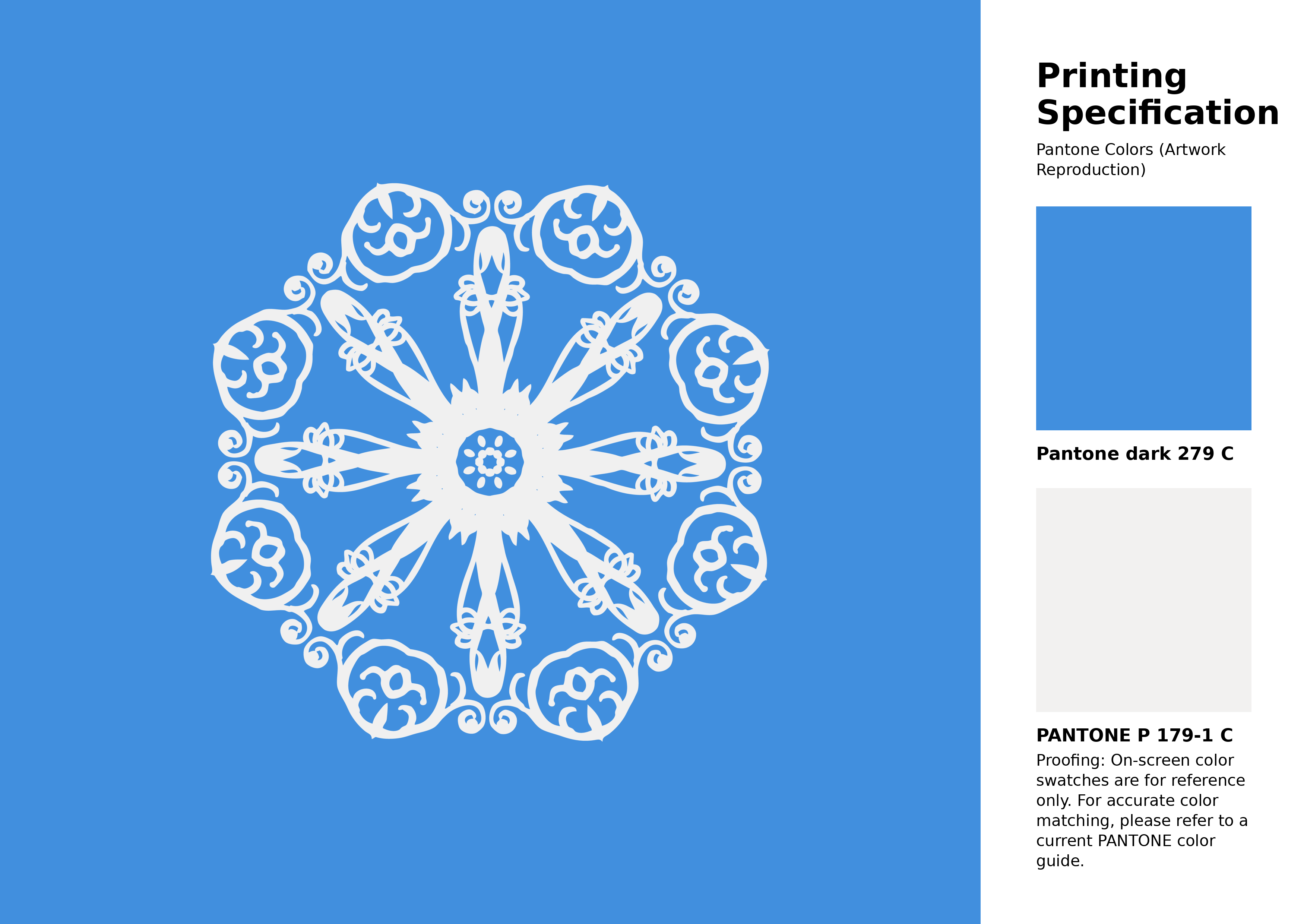
#418fde Pantone 279 C Color | Hex color Code #418fde Artwork Image (PNG)
Download Artwork (PNG)#418fde Pantone 279 C Color | Hex color Code #418fde Artwork Vector (PDF)
Download Artwork (PDF)#418fde Pantone 279 C Color | Hex color Code #418fde Artwork Vector (SVG)
Download Artwork (SVG)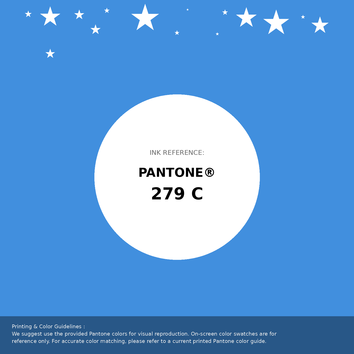
#418fde Pantone 279 C Color | Hex color Code #418fde Pantone Swatch Artwork
Download Artwork Swatch
#418fde Pantone 279 C Color | Hex color Code #418fde Gradient Artwork (PNG)
Download Gradient (PNG)#418fde Pantone 279 C Color | Hex color Code #418fde Gradient Artwork (SVG)
Download Gradient (SVG)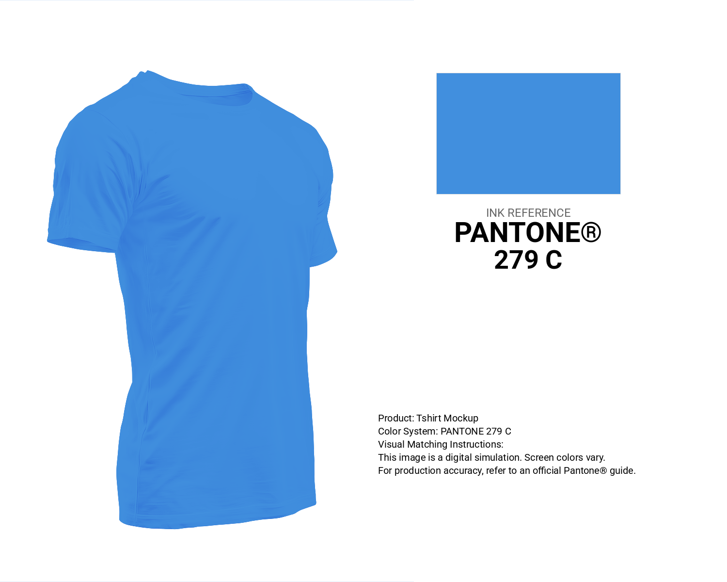
#418fde Pantone 279 C Color | Hex color Code #418fde T-Shirt Mockup
Download T-Shirt Mockup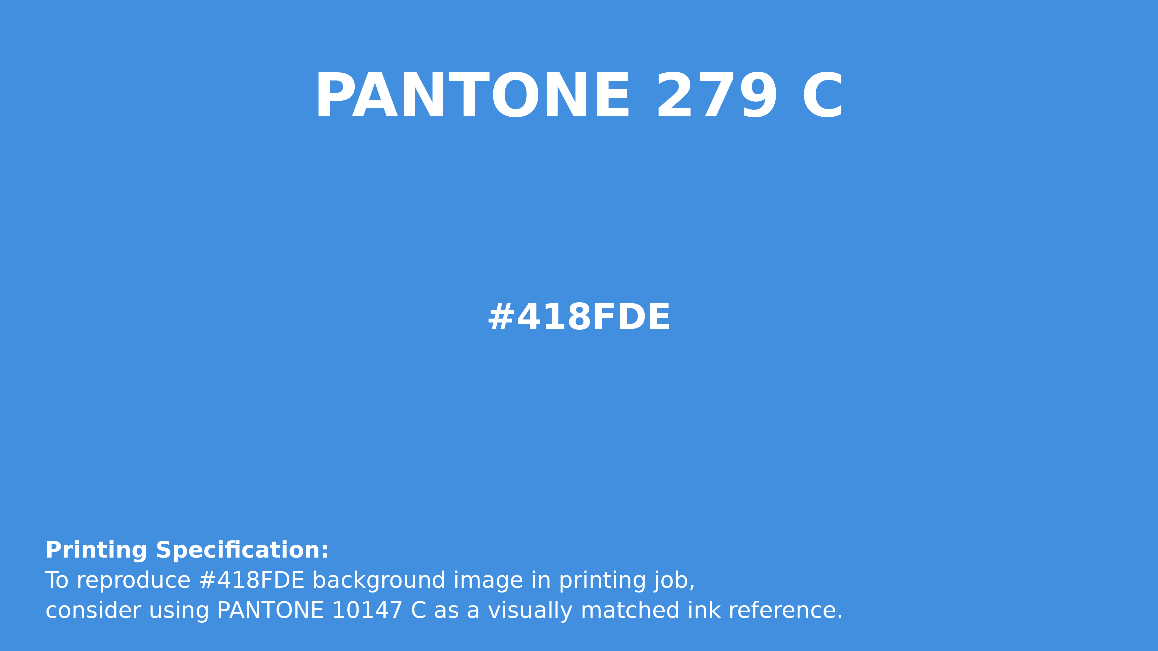
#418fde Pantone 279 C Color | Hex color Code #418fde Printing Artwork Pantone Reference
Download Pantone Printing ReferenceRelated Color Palettes
- SkyBlue and Pale Turquoise •
- Pale Turquoise and Light Slate Gray •
- Dark Cyan and Dark Turquoise •
- Dark Sea Green and Medium Turquoise •
- Turquoise •
- Medium Aquamarine and Medium Turquoise •
- Light Sea Green and Turquoise •
- Bright Turquoise •
- Medium Turquoise and Slate Gray •
- Slate Gray and Medium Turquoise •
- Light Slate Gray and Medium Turquoise •
- Dark Slate Gray and Turquoise •
- Dark Turquoise and Teal •
- Medium Turquoise and Tan •
- Pale Turquoise and Rosy Brown
Color Palette Collection
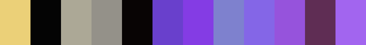
Purple ideas
12 color palettes with 60 colors.
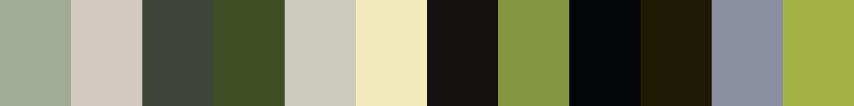
Forest Theme colors
15 color palettes with 75 colors.

20 Turquoise Color Palettes
20 color palettes with 100 colors.
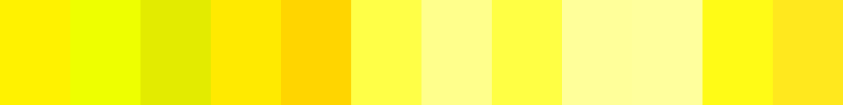
125 Yellow Color Palettes
125 color palettes with 625 colors.