#008578 Color
Your all-in-one color resource. Download hex background images, Adobe swatches (ASE), PDF color sheets, and SVG files. Explore palettes, harmonies, accessibility, conversions, and professional exports — designed for designers, developers, and color perfectionists.
This deep teal, reminiscent of hidden lagoons and the ocean's unexplored depths, evokes a sense of calm mystery and quiet confidence. The color leans towards a cool, grounded feeling, subtly suggesting growth and stability like the depths of a forest. It hints at both tranquility and vitality, much like the vibrant life found beneath the water's surface. It reminds one of lush vegetation, cool shadows, and the hushed stillness of a secluded place. This color creates a mood that is both sophisticated and approachable, suggesting a sense of trustworthiness and understated elegance. In design, it can be used to promote a feeling of health and wellness, making it a fitting choice for spaces dedicated to relaxation, introspection, or a connection to nature. It speaks to a deeper awareness and a connection to the natural world. Visually matched named color: Emerald Depths.
PANTONE 3282 C
Choose Color
Selected Color
Recent Colors
Color Details
Similar Ink Alternatives for #008578 color Alternative print inks for reproducing #008578 background image with a similar visual appearance.
Disclaimer: The visually matched ink reference is an independent approximation intended as a guide only. Please be advised that this pantone colors is only intended as a guide, Actual colours will depend on screen calibration variances. The print ink suggestions provided are independent visual approximations and are not affiliated with or endorsed by Pantone LLC. For official color specifications, conversion factors, and comprehensive color system information, please visit Pantone Connect. Official Pantone products can be purchased at pantone.com.
Color Previews for #000000 See how this color looks as a background or as text.
Complete Guide to Your Color Laboratory
Everything you need to know about this professional color toolkit.
Use the Color Picker at the top to select any color. All modules below update instantly.
Workflow: Pick a color → Explore palettes & data → Download what you need (PDF, Image, or Adobe ASE).
Color Details — Your color in all formats: HEX, RGB, RGBA, HSL, HSLA, HSV, CMYK, CIELab, Hunter-Lab, XYZ, Yxy, YUV. One-click copy.
Color Psychology — Emotional impact, cultural meanings, physiological effects, branding applications, and historical significance.
Named Colors — Find official color names (HTML/CSS, Pantone) that match your selection with similarity percentages.
Light & Dark Shades
80-step gradient from black to white. Perfect for button states and component systems.
Tints
Color mixed with white → lighter, pastel variations for backgrounds and disabled states.
Monochromatic — 11 curated tints/shades from one color. Production-ready for design systems.
- Complementary — Opposite on wheel (180°). High contrast.
- Analogous — Neighbors (±30°). Harmonious flow.
- Triadic — Three colors (120° apart). Vibrant, balanced.
- Split-Complementary — Base + two near-complements. Softer contrast.
- Tetradic/Square — Four colors. Complex, maximum variety.
- Neutral — Desaturated versions. Subtle, sophisticated.
15 Professional Variations — Monochromatic, Analogous, Complementary, Warm/Cool/Earth Tones, Pastel, Vibrant, High Contrast, and more.
Color Infusion — 10 palettes showing your color morphing into each major hue. Find bridge colors.
Similar Colors — 60+ colors generated via CIELAB Delta E matching. Unexpected harmonious combinations.
18 Ready-to-Use Gradients — Complementary, Analogous, Triadic, Tint/Shade progressions, and more.
Downloads: PNG (2560×1440), CSS (production-ready code), SVG (scalable vector).
WCAG Contrast Checker — Tests your color against white, black, and custom colors for AA (4.5:1) and AAA (7:1) compliance. Large text thresholds included.
Harmony & Accessibility Guide — Tests against 10 canonical hues. Shows which pairs are both beautiful AND WCAG-compliant for text.
PNG/JPG — High-res images for presentations and mood boards.
PDF — Print-ready reports for clients and teams.
Adobe ASE — Direct import to Photoshop, Illustrator, InDesign, XD.
CSS/SVG — Gradients only. Production-ready code and vectors.
Color Science: Industry-standard conversions (HSL, CIELAB, CMYK, XYZ). WCAG 2.1 luminance formula. Delta E (ΔE76) for perceptual matching.
Direct Links: Share colors via icolorpalette.com/color/ff5733 or icolorpalette.com/color/red
Issues? Refresh the page, wait for rendering, try another browser, or check console (F12) for errors.
Printing Guide for #008578 Background Image
Use PANTONE 3282 C as a visually matched ink reference when printing this background image.
To print the #008578 background image from our site, consider using PANTONE 3282 C as a visually matched ink reference.
Download the background image, then provide this reference code to your print vendor to help achieve accurate color reproduction.
The visually matched ink reference for the #008578 background image is PANTONE 3282 C.
This color is commonly described as Emerald Depths.
This deep teal, reminiscent of hidden lagoons and the ocean's unexplored depths, evokes a sense of calm mystery and quiet confidence. The color leans towards a cool, grounded feeling, subtly suggesting growth and stability like the depths of a forest. It hints at both tranquility and vitality, much like the vibrant life found beneath the water's surface. It reminds one of lush vegetation, cool shadows, and the hushed stillness of a secluded place. This color creates a mood that is both sophisticated and approachable, suggesting a sense of trustworthiness and understated elegance. In design, it can be used to promote a feeling of health and wellness, making it a fitting choice for spaces dedicated to relaxation, introspection, or a connection to nature. It speaks to a deeper awareness and a connection to the natural world.
We provide PANTONE 3282 C as a visually matched ink reference to help you reproduce the #008578 background image accurately in professional printing.
This reference code helps print vendors achieve consistent color output across different printing equipment and materials.
After downloading the #008578 background image from our site:
- Include the visually matched ink reference PANTONE 3282 C in your print order notes
- Inform your print vendor that this is your target color reference
- Request a proof print to verify the Emerald Depths color appearance before full production
The #008578 background image with PANTONE 3282 C as visually matched ink reference can be used for:
- Posters, banners, and backdrops
- Business cards, brochures, and flyers
- Packaging, labels, and stickers
- Signage and promotional materials
This is an independent visual approximation.
While PANTONE 3282 C closely matches the #008578 background image color, variations may exist between screen display and printed output.
We recommend requesting a proof print to verify the final appearance.
This deep teal, reminiscent of hidden lagoons and the ocean's unexplored depths, evokes a sense of calm mystery and quiet confidence. The color leans towards a cool, grounded feeling, subtly suggesting growth and stability like the depths of a forest. It hints at both tranquility and vitality, much like the vibrant life found beneath the water's surface. It reminds one of lush vegetation, cool shadows, and the hushed stillness of a secluded place. This color creates a mood that is both sophisticated and approachable, suggesting a sense of trustworthiness and understated elegance. In design, it can be used to promote a feeling of health and wellness, making it a fitting choice for spaces dedicated to relaxation, introspection, or a connection to nature. It speaks to a deeper awareness and a connection to the natural world.
Understanding these associations helps ensure the #008578 background image aligns with your intended message and brand impact.
Important Information
The visually matched ink reference is an independent approximation intended as a guide only.
Actual printed colors may vary depending on screen calibration, substrate material, ink type, and printing equipment used.
For official color specifications and certified color standards, visit Pantone Connect.
Official color guides and swatch books can be purchased from pantone.com.
Pantone 3282 C Color: Refreshing Green | #008578
Introduction:
Refreshing Green, also known as Pantone 3282 C, is a vibrant and lively shade of green. It exudes a sense of freshness and vitality, making it a captivating color choice.
Historical Significance:
Key moments in history: Refreshing Green has been prominently used in various historical events, such as environmental movements and campaigns for sustainable development.
Symbolism and Meaning:
Symbolism and Meaning: Refreshing Green is often associated with growth, harmony, and renewal. It represents balance and the abundance found in nature.
Refreshing Green in Fashion:
Influence in fashion: Refreshing Green has made a significant impact on fashion trends, especially in spring and summer collections. It adds a pop of color and a refreshing touch to outfits.
Refreshing Green in Graphic Design:
Significance in graphic design: Refreshing Green is widely used in design aesthetics and branding. It conveys a sense of rejuvenation and is often associated with eco-friendly and sustainable brands.
Color Combinations:
Potential color combinations: Refreshing Green pairs well with complementary colors such as white, coral, and navy blue. Its versatility allows for a wide range of creative combinations.
Nature’s Palette:
Natural occurrences: Refreshing Green can be found in various natural elements, including lush green forests, vibrant tropical plants, and calming oceanic scenes.
Artistic Representations:
Usage in art: Refreshing Green has been utilized by artists to depict the beauty of nature and evoke a sense of tranquility. It has been featured in paintings, sculptures, and other art forms.
Movies and Cinematic Landscapes:
Role in movies: Refreshing Green sets the tone in movies, particularly in scenes depicting lush landscapes, serene environments, or fantasy realms.
Products and Commercial Appeal:
Popular products and brands: Many popular brands have embraced Refreshing Green in their products or branding to convey a sense of freshness, health, and eco-consciousness.
National Symbols and Significance:
National symbols: Refreshing Green is often used in national flags, representing the importance of nature and the environment in a country's identity.
The Psychological and Emotional Impact:
Influence on emotions: Refreshing Green can have a calming and soothing effect on individuals. It promotes feelings of relaxation and rejuvenation.
Conclusion:
Refreshing Green, with its historical significance, symbolism, and versatile appeal, continues to be a timeless color choice. Its association with nature and vitality makes it a refreshing and captivating color in various contexts.
Pantone 3282 C Color | Hex color Code #008578 Image & Artwork
Download high-quality assets for your projects.

#008578 Color Schemes
Download Color Schemes
#008578 Color Shades
Download Color Shades
Pantone 3282 C Color | Hex color Code #008578 Solid Color Background
Download Solid Color
#008578 Pantone 3282 C Color | Hex color Code #008578 Artwork Image (PNG)
Download Artwork (PNG)#008578 Pantone 3282 C Color | Hex color Code #008578 Artwork Vector (PDF)
Download Artwork (PDF)#008578 Pantone 3282 C Color | Hex color Code #008578 Artwork Vector (SVG)
Download Artwork (SVG)
#008578 Pantone 3282 C Color | Hex color Code #008578 Pantone Swatch Artwork
Download Artwork Swatch
#008578 Pantone 3282 C Color | Hex color Code #008578 Gradient Artwork (PNG)
Download Gradient (PNG)#008578 Pantone 3282 C Color | Hex color Code #008578 Gradient Artwork (SVG)
Download Gradient (SVG)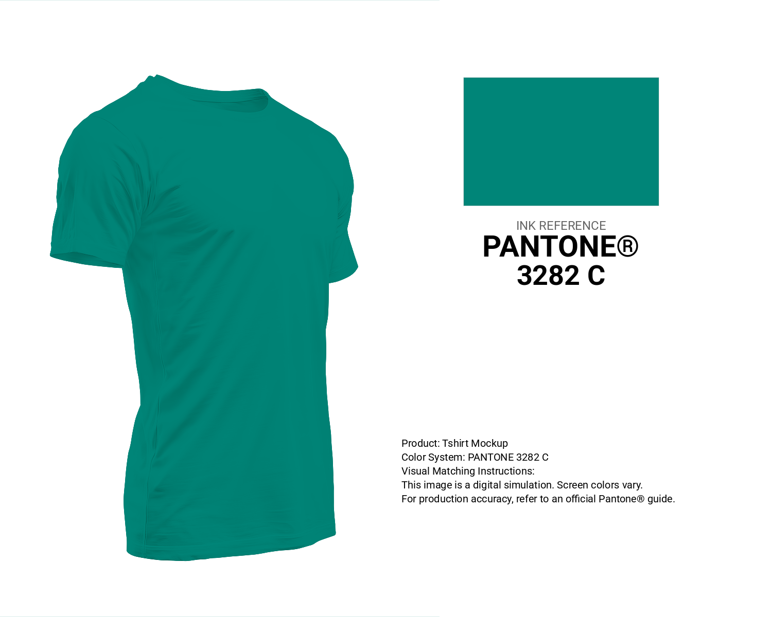
#008578 Pantone 3282 C Color | Hex color Code #008578 T-Shirt Mockup
Download T-Shirt Mockup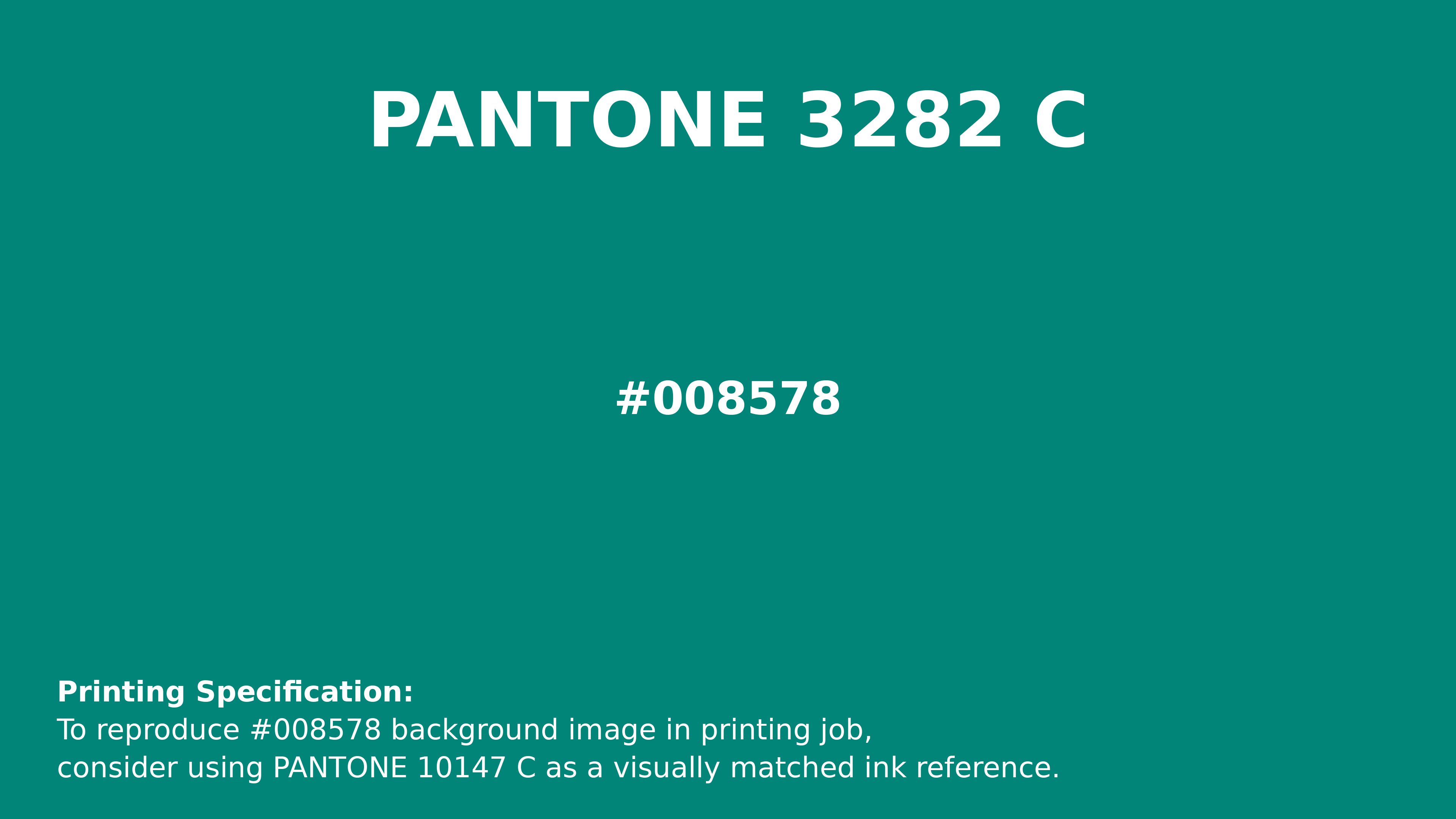
#008578 Pantone 3282 C Color | Hex color Code #008578 Printing Artwork Pantone Reference
Download Pantone Printing ReferenceRelated Color Palettes
- Plum and Dark Gray •
- Dark Gray and Beige •
- Beige and Dark Gray •
- Tan and Dark Gray •
- SkyBlue and Dark Gray •
- Dark Gray and Wheat •
- Dark Gray and Black •
- Brown and Dark Gray •
- Dark Gray and Light Blue •
- Dim Gray and Dark Gray •
- Dark Gray and Pale Goldenrod •
- Dark Gray and Linen •
- Sienna and Dark Gray •
- Yellow Green and Dark Gray •
- Gainsboro and Dark Gray
Color Palette Collection

38 Purple Color Schemes
38 color palettes with 190 colors.

26 Pastel Color Schemes
26 color palettes with 130 colors.
Burnt orange
25 color palettes with 125 colors.

81 Pink color palettes
81 color palettes with 405 colors.