#007041 Color
Your all-in-one color resource. Download hex background images, Adobe swatches (ASE), PDF color sheets, and SVG files. Explore palettes, harmonies, accessibility, conversions, and professional exports — designed for designers, developers, and color perfectionists.
This deep green, #007041, speaks of life, growth, and the quiet strength of the earth. It evokes the feeling of being nestled amongst lush, verdant foliage, a hidden glade bathed in dappled sunlight. The color whispers of vitality, balance, and a sense of groundedness. Its reminiscent of dense forests, the fertile earth after a spring rain, and the vibrant energy of new beginnings. The mood it creates is one of calm confidence and enduring resilience. In design, it lends itself well to spaces that promote well-being and connection to nature, such as spas, meditation rooms, or living areas where a sense of sanctuary is desired. Culturally, it often symbolizes prosperity, harmony, and the enduring power of nature. Visually matched named color: Emerald Embrace.
PANTONE 7733 C
Choose Color
Selected Color
Recent Colors
Color Details
Similar Ink Alternatives for #007041 color Alternative print inks for reproducing #007041 background image with a similar visual appearance.
Disclaimer: The visually matched ink reference is an independent approximation intended as a guide only. Please be advised that this pantone colors is only intended as a guide, Actual colours will depend on screen calibration variances. The print ink suggestions provided are independent visual approximations and are not affiliated with or endorsed by Pantone LLC. For official color specifications, conversion factors, and comprehensive color system information, please visit Pantone Connect. Official Pantone products can be purchased at pantone.com.
Color Previews for #000000 See how this color looks as a background or as text.
Complete Guide to Your Color Laboratory
Everything you need to know about this professional color toolkit.
Use the Color Picker at the top to select any color. All modules below update instantly.
Workflow: Pick a color → Explore palettes & data → Download what you need (PDF, Image, or Adobe ASE).
Color Details — Your color in all formats: HEX, RGB, RGBA, HSL, HSLA, HSV, CMYK, CIELab, Hunter-Lab, XYZ, Yxy, YUV. One-click copy.
Color Psychology — Emotional impact, cultural meanings, physiological effects, branding applications, and historical significance.
Named Colors — Find official color names (HTML/CSS, Pantone) that match your selection with similarity percentages.
Light & Dark Shades
80-step gradient from black to white. Perfect for button states and component systems.
Tints
Color mixed with white → lighter, pastel variations for backgrounds and disabled states.
Monochromatic — 11 curated tints/shades from one color. Production-ready for design systems.
- Complementary — Opposite on wheel (180°). High contrast.
- Analogous — Neighbors (±30°). Harmonious flow.
- Triadic — Three colors (120° apart). Vibrant, balanced.
- Split-Complementary — Base + two near-complements. Softer contrast.
- Tetradic/Square — Four colors. Complex, maximum variety.
- Neutral — Desaturated versions. Subtle, sophisticated.
15 Professional Variations — Monochromatic, Analogous, Complementary, Warm/Cool/Earth Tones, Pastel, Vibrant, High Contrast, and more.
Color Infusion — 10 palettes showing your color morphing into each major hue. Find bridge colors.
Similar Colors — 60+ colors generated via CIELAB Delta E matching. Unexpected harmonious combinations.
18 Ready-to-Use Gradients — Complementary, Analogous, Triadic, Tint/Shade progressions, and more.
Downloads: PNG (2560×1440), CSS (production-ready code), SVG (scalable vector).
WCAG Contrast Checker — Tests your color against white, black, and custom colors for AA (4.5:1) and AAA (7:1) compliance. Large text thresholds included.
Harmony & Accessibility Guide — Tests against 10 canonical hues. Shows which pairs are both beautiful AND WCAG-compliant for text.
PNG/JPG — High-res images for presentations and mood boards.
PDF — Print-ready reports for clients and teams.
Adobe ASE — Direct import to Photoshop, Illustrator, InDesign, XD.
CSS/SVG — Gradients only. Production-ready code and vectors.
Color Science: Industry-standard conversions (HSL, CIELAB, CMYK, XYZ). WCAG 2.1 luminance formula. Delta E (ΔE76) for perceptual matching.
Direct Links: Share colors via icolorpalette.com/color/ff5733 or icolorpalette.com/color/red
Issues? Refresh the page, wait for rendering, try another browser, or check console (F12) for errors.
Printing Guide for #007041 Background Image
Use PANTONE 7733 C as a visually matched ink reference when printing this background image.
To print the #007041 background image from our site, consider using PANTONE 7733 C as a visually matched ink reference.
Download the background image, then provide this reference code to your print vendor to help achieve accurate color reproduction.
The visually matched ink reference for the #007041 background image is PANTONE 7733 C.
This color is commonly described as Emerald Embrace.
This deep green, #007041, speaks of life, growth, and the quiet strength of the earth. It evokes the feeling of being nestled amongst lush, verdant foliage, a hidden glade bathed in dappled sunlight. The color whispers of vitality, balance, and a sense of groundedness. Its reminiscent of dense forests, the fertile earth after a spring rain, and the vibrant energy of new beginnings. The mood it creates is one of calm confidence and enduring resilience. In design, it lends itself well to spaces that promote well-being and connection to nature, such as spas, meditation rooms, or living areas where a sense of sanctuary is desired. Culturally, it often symbolizes prosperity, harmony, and the enduring power of nature.
We provide PANTONE 7733 C as a visually matched ink reference to help you reproduce the #007041 background image accurately in professional printing.
This reference code helps print vendors achieve consistent color output across different printing equipment and materials.
After downloading the #007041 background image from our site:
- Include the visually matched ink reference PANTONE 7733 C in your print order notes
- Inform your print vendor that this is your target color reference
- Request a proof print to verify the Emerald Embrace color appearance before full production
The #007041 background image with PANTONE 7733 C as visually matched ink reference can be used for:
- Posters, banners, and backdrops
- Business cards, brochures, and flyers
- Packaging, labels, and stickers
- Signage and promotional materials
This is an independent visual approximation.
While PANTONE 7733 C closely matches the #007041 background image color, variations may exist between screen display and printed output.
We recommend requesting a proof print to verify the final appearance.
This deep green, #007041, speaks of life, growth, and the quiet strength of the earth. It evokes the feeling of being nestled amongst lush, verdant foliage, a hidden glade bathed in dappled sunlight. The color whispers of vitality, balance, and a sense of groundedness. Its reminiscent of dense forests, the fertile earth after a spring rain, and the vibrant energy of new beginnings. The mood it creates is one of calm confidence and enduring resilience. In design, it lends itself well to spaces that promote well-being and connection to nature, such as spas, meditation rooms, or living areas where a sense of sanctuary is desired. Culturally, it often symbolizes prosperity, harmony, and the enduring power of nature.
Understanding these associations helps ensure the #007041 background image aligns with your intended message and brand impact.
Important Information
The visually matched ink reference is an independent approximation intended as a guide only.
Actual printed colors may vary depending on screen calibration, substrate material, ink type, and printing equipment used.
For official color specifications and certified color standards, visit Pantone Connect.
Official color guides and swatch books can be purchased from pantone.com.
Pantone 7733 C Color: Serene Seawater | #007041
Introduction:
Serene Seawater is a beautiful shade of green that evokes a sense of calmness and tranquility. Its visual appeal lies in its soothing and refreshing nature.
Historical Significance:
Exploration of Ocean Depths: Serene Seawater played a significant role in the history of ocean exploration, as it represented the vastness and beauty of the sea.
Maritime Traditions: Serene Seawater has been a prominent color in maritime traditions, symbolizing the connection between human beings and the ocean.
Symbolism and Meaning:
Harmony and Balance: Serene Seawater symbolizes harmony and balance, reflecting the peaceful and tranquil qualities of nature.
Growth and Renewal: This color is often associated with growth and renewal, representing the rejuvenating powers of water and the natural world.
Serene Seawater in Fashion:
Eco-friendly Fashion: Serene Seawater has influenced eco-friendly fashion trends, inspiring designers to incorporate sustainable and nature-inspired elements into their collections.
Relaxed and Casual Styles: This color is often used in casual and relaxed fashion styles, adding a touch of freshness and serenity to outfits.
Serene Seawater in Graphic Design:
Nature-themed Design Aesthetics: Serene Seawater is frequently used in design aesthetics that focus on nature, such as environmental campaigns, outdoor brands, and eco-conscious organizations.
Calm and Serene Visual Impact: The color creates a calming and serene visual impact, making it popular for creating tranquil and peaceful design compositions.
Color Combinations:
Elegant Combination: Serene Seawater pairs well with a sophisticated shade of pearl white, creating an elegant and refined color combination.
Vibrant Contrast: Combining Serene Seawater with a vibrant shade of coral creates a striking and eye-catching color combination.
Nature’s Palette:
Underwater World: Serene Seawater can be found in beautiful underwater scenes, coral reefs, and in the feathers of exotic sea creatures.
Artistic Representations:
Impressionist Paintings: Serene Seawater has been a popular color choice for impressionist painters, who use it to convey the peacefulness and tranquility of nature.
Movies and Cinematic Landscapes:
The Blue Lagoon: Serene Seawater sets the tone and mood for movies like "The Blue Lagoon," capturing the beauty and serenity of unspoiled natural landscapes.
Products and Commercial Appeal:
Skin Care and Relaxation Products: Serene Seawater is often used in packaging and branding for skincare and relaxation products, as it conveys a sense of calmness and purity.
National Symbols and Significance:
The Great Barrier Reef: Serene Seawater represents the natural wonder of the Great Barrier Reef in Australia, symbolizing the importance of marine conservation.
The Psychological and Emotional Impact:
Relaxation and Tranquility: Serene Seawater has a psychologically calming effect, promoting relaxation and a sense of tranquility.
Conclusion:
Serene Seawater, with its historical significance, symbolism, and timeless appeal, captures the essence of calmness and tranquility in both the natural world and various creative domains.
Pantone 7733 C Color | Hex color Code #007041 Image & Artwork
Download high-quality assets for your projects.

#007041 Color Schemes
Download Color Schemes
#007041 Color Shades
Download Color Shades
Pantone 7733 C Color | Hex color Code #007041 Solid Color Background
Download Solid Color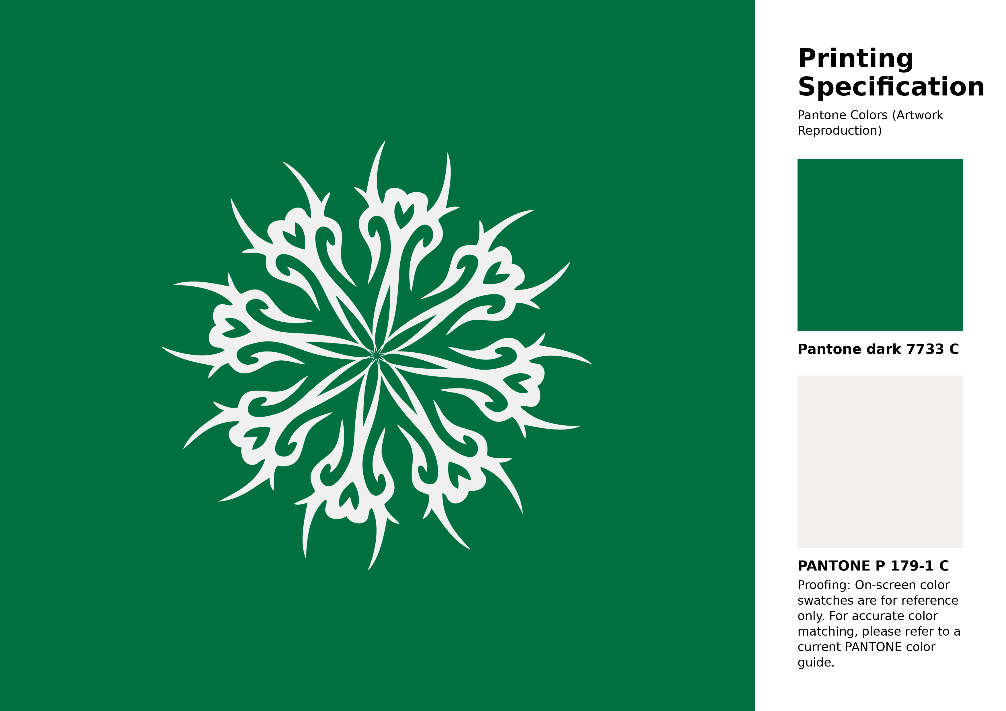
#007041 Pantone 7733 C Color | Hex color Code #007041 Artwork Image (PNG)
Download Artwork (PNG)#007041 Pantone 7733 C Color | Hex color Code #007041 Artwork Vector (PDF)
Download Artwork (PDF)#007041 Pantone 7733 C Color | Hex color Code #007041 Artwork Vector (SVG)
Download Artwork (SVG)
#007041 Pantone 7733 C Color | Hex color Code #007041 Pantone Swatch Artwork
Download Artwork Swatch
#007041 Pantone 7733 C Color | Hex color Code #007041 Gradient Artwork (PNG)
Download Gradient (PNG)#007041 Pantone 7733 C Color | Hex color Code #007041 Gradient Artwork (SVG)
Download Gradient (SVG)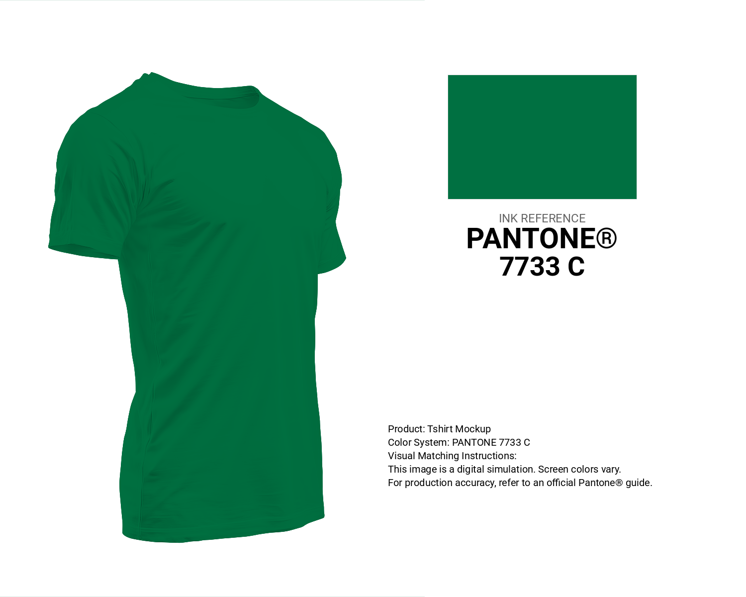
#007041 Pantone 7733 C Color | Hex color Code #007041 T-Shirt Mockup
Download T-Shirt Mockup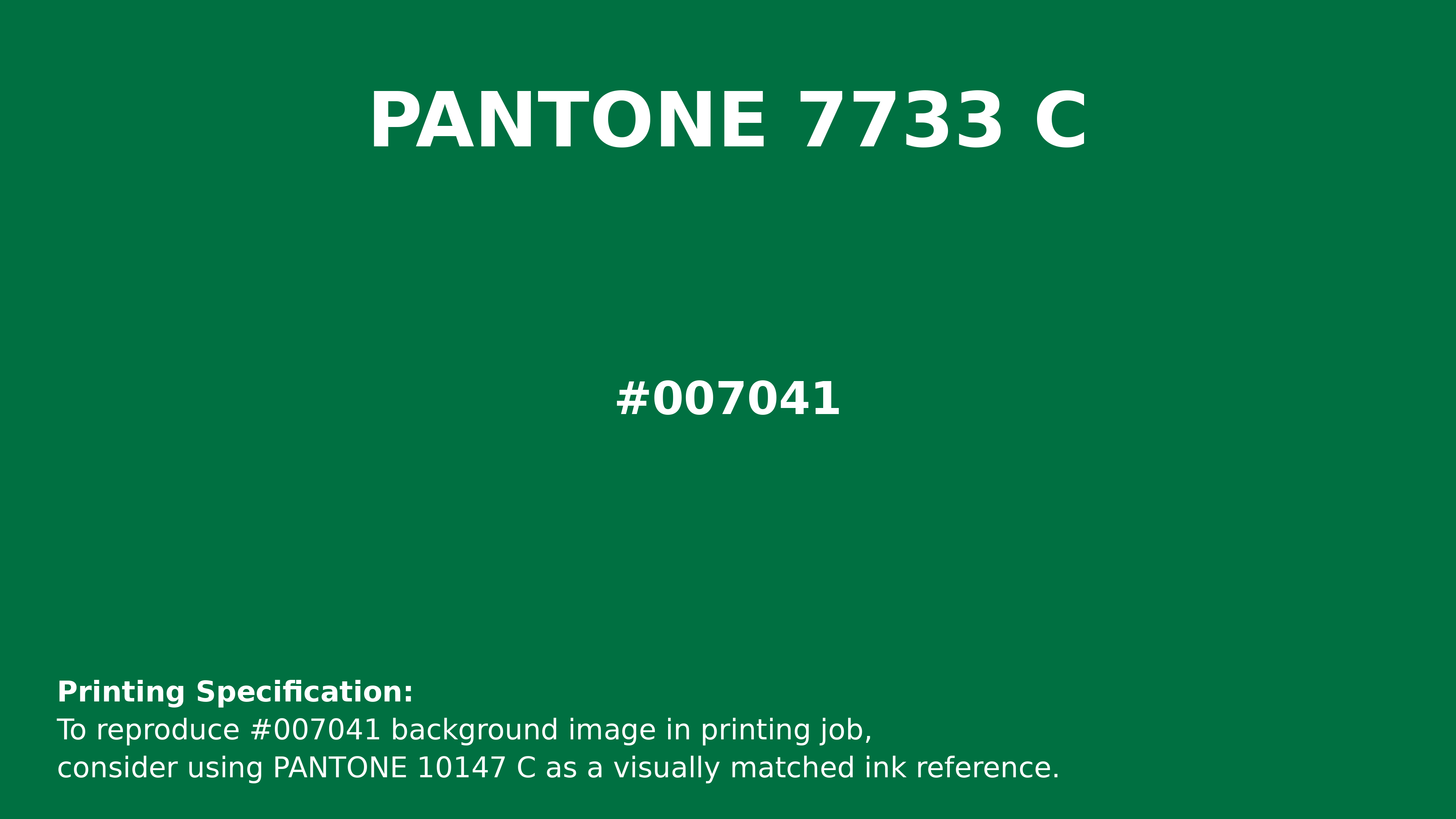
#007041 Pantone 7733 C Color | Hex color Code #007041 Printing Artwork Pantone Reference
Download Pantone Printing ReferenceRelated Color Palettes
- Indian Red and Dark Gray •
- Pale Goldenrod and Dark Gray •
- Dark Gray and Sienna •
- Dark Gray / smoked •
- White Smoke and Dark Gray •
- Dark Salmon and Dark Gray •
- Dim Gray and Dark Gray •
- Black and Dark Gray •
- Rosy Brown and Dark Gray •
- Dark Gray and Thistle •
- Dark Gray and Cadet Blue •
- Steel Blue and Dark Gray •
- Slate Gray and Dark Gray •
- Peru and Dark Gray •
- Dark Gray and Forest Green
Color Palette Collection
65 Red Color Palettes
65 color palettes with 325 colors.

18 Light Color Palettes Collection
18 color palettes with 90 colors.

49 Beautiful curated Color Schemes For Your Next Design Project
49 color palettes with 245 colors.
My Red Color Palettes
20 color palettes with 100 colors.