#0067B9 Color
Your all-in-one color resource. Download hex background images, Adobe swatches (ASE), PDF color sheets, and SVG files. Explore palettes, harmonies, accessibility, conversions, and professional exports — designed for designers, developers, and color perfectionists.
This deep, vibrant blue, #0067B9, evokes a sense of vastness and authority, much like the twilight sky just after the sun dips below the horizon. It speaks of quiet strength, dependability, and a touch of mystery. The color reminds one of the ocean's depths, the endless reach of space, and the hushed reverence of a moonlit night. It creates a mood of seriousness and professionalism, balanced by an underlying sense of hope and optimism. In design, #0067B9 could be used to suggest trust, stability, and intelligence, making it suitable for corporate branding, educational settings, or spaces intended to promote thoughtful contemplation. Culturally, this shade often symbolizes loyalty, wisdom, and the pursuit of knowledge. Visually matched named color: Celestial Depths.
PANTONE 2144 C
Choose Color
Selected Color
Recent Colors
Color Details
Similar Ink Alternatives for #0067B9 color Alternative print inks for reproducing #0067B9 background image with a similar visual appearance.
Disclaimer: The visually matched ink reference is an independent approximation intended as a guide only. Please be advised that this pantone colors is only intended as a guide, Actual colours will depend on screen calibration variances. The print ink suggestions provided are independent visual approximations and are not affiliated with or endorsed by Pantone LLC. For official color specifications, conversion factors, and comprehensive color system information, please visit Pantone Connect. Official Pantone products can be purchased at pantone.com.
Color Previews for #000000 See how this color looks as a background or as text.
Complete Guide to Your Color Laboratory
Everything you need to know about this professional color toolkit.
Use the Color Picker at the top to select any color. All modules below update instantly.
Workflow: Pick a color → Explore palettes & data → Download what you need (PDF, Image, or Adobe ASE).
Color Details — Your color in all formats: HEX, RGB, RGBA, HSL, HSLA, HSV, CMYK, CIELab, Hunter-Lab, XYZ, Yxy, YUV. One-click copy.
Color Psychology — Emotional impact, cultural meanings, physiological effects, branding applications, and historical significance.
Named Colors — Find official color names (HTML/CSS, Pantone) that match your selection with similarity percentages.
Light & Dark Shades
80-step gradient from black to white. Perfect for button states and component systems.
Tints
Color mixed with white → lighter, pastel variations for backgrounds and disabled states.
Monochromatic — 11 curated tints/shades from one color. Production-ready for design systems.
- Complementary — Opposite on wheel (180°). High contrast.
- Analogous — Neighbors (±30°). Harmonious flow.
- Triadic — Three colors (120° apart). Vibrant, balanced.
- Split-Complementary — Base + two near-complements. Softer contrast.
- Tetradic/Square — Four colors. Complex, maximum variety.
- Neutral — Desaturated versions. Subtle, sophisticated.
15 Professional Variations — Monochromatic, Analogous, Complementary, Warm/Cool/Earth Tones, Pastel, Vibrant, High Contrast, and more.
Color Infusion — 10 palettes showing your color morphing into each major hue. Find bridge colors.
Similar Colors — 60+ colors generated via CIELAB Delta E matching. Unexpected harmonious combinations.
18 Ready-to-Use Gradients — Complementary, Analogous, Triadic, Tint/Shade progressions, and more.
Downloads: PNG (2560×1440), CSS (production-ready code), SVG (scalable vector).
WCAG Contrast Checker — Tests your color against white, black, and custom colors for AA (4.5:1) and AAA (7:1) compliance. Large text thresholds included.
Harmony & Accessibility Guide — Tests against 10 canonical hues. Shows which pairs are both beautiful AND WCAG-compliant for text.
PNG/JPG — High-res images for presentations and mood boards.
PDF — Print-ready reports for clients and teams.
Adobe ASE — Direct import to Photoshop, Illustrator, InDesign, XD.
CSS/SVG — Gradients only. Production-ready code and vectors.
Color Science: Industry-standard conversions (HSL, CIELAB, CMYK, XYZ). WCAG 2.1 luminance formula. Delta E (ΔE76) for perceptual matching.
Direct Links: Share colors via icolorpalette.com/color/ff5733 or icolorpalette.com/color/red
Issues? Refresh the page, wait for rendering, try another browser, or check console (F12) for errors.
Printing Guide for #0067b9 Background Image
Use PANTONE 2144 C as a visually matched ink reference when printing this background image.
To print the #0067b9 background image from our site, consider using PANTONE 2144 C as a visually matched ink reference.
Download the background image, then provide this reference code to your print vendor to help achieve accurate color reproduction.
The visually matched ink reference for the #0067b9 background image is PANTONE 2144 C.
This color is commonly described as Celestial Depths.
This deep, vibrant blue, #0067B9, evokes a sense of vastness and authority, much like the twilight sky just after the sun dips below the horizon. It speaks of quiet strength, dependability, and a touch of mystery. The color reminds one of the ocean's depths, the endless reach of space, and the hushed reverence of a moonlit night. It creates a mood of seriousness and professionalism, balanced by an underlying sense of hope and optimism. In design, #0067B9 could be used to suggest trust, stability, and intelligence, making it suitable for corporate branding, educational settings, or spaces intended to promote thoughtful contemplation. Culturally, this shade often symbolizes loyalty, wisdom, and the pursuit of knowledge.
We provide PANTONE 2144 C as a visually matched ink reference to help you reproduce the #0067b9 background image accurately in professional printing.
This reference code helps print vendors achieve consistent color output across different printing equipment and materials.
After downloading the #0067b9 background image from our site:
- Include the visually matched ink reference PANTONE 2144 C in your print order notes
- Inform your print vendor that this is your target color reference
- Request a proof print to verify the Celestial Depths color appearance before full production
The #0067b9 background image with PANTONE 2144 C as visually matched ink reference can be used for:
- Posters, banners, and backdrops
- Business cards, brochures, and flyers
- Packaging, labels, and stickers
- Signage and promotional materials
This is an independent visual approximation.
While PANTONE 2144 C closely matches the #0067b9 background image color, variations may exist between screen display and printed output.
We recommend requesting a proof print to verify the final appearance.
This deep, vibrant blue, #0067B9, evokes a sense of vastness and authority, much like the twilight sky just after the sun dips below the horizon. It speaks of quiet strength, dependability, and a touch of mystery. The color reminds one of the ocean's depths, the endless reach of space, and the hushed reverence of a moonlit night. It creates a mood of seriousness and professionalism, balanced by an underlying sense of hope and optimism. In design, #0067B9 could be used to suggest trust, stability, and intelligence, making it suitable for corporate branding, educational settings, or spaces intended to promote thoughtful contemplation. Culturally, this shade often symbolizes loyalty, wisdom, and the pursuit of knowledge.
Understanding these associations helps ensure the #0067b9 background image aligns with your intended message and brand impact.
Important Information
The visually matched ink reference is an independent approximation intended as a guide only.
Actual printed colors may vary depending on screen calibration, substrate material, ink type, and printing equipment used.
For official color specifications and certified color standards, visit Pantone Connect.
Official color guides and swatch books can be purchased from pantone.com.
Pantone 2144 C Color: Deep Blue | #0067B9
Introduction:
Deep Blue is a rich and intense color that captivates the eye. Its deepness gives it a sense of mystery and tranquility, making it highly appealing in various design applications.
Historical Significance:
Antiquity: Deep Blue was commonly used in ancient Egyptian art and depicted the divine significance of the Nile River as well as the sky. In the Renaissance period, it became a symbol of power and wealth, often reserved for the clothing of royalty and nobility.
Blue Revolution: The industrial revolution led to the development of synthetic dyes, including Prussian Blue, which revolutionized the use of blue in art and design. This deep blue shade became popular in paintings and textiles during the 18th and 19th centuries.
Symbolism and Meaning:
Serenity and Tranquility: Deep Blue is often associated with calmness, serenity, and tranquility. It creates a sense of stability and peace, making it suitable for spaces seeking a soothing atmosphere.
Trust and Integrity: Deep Blue has long been associated with trustworthiness and integrity. It is often chosen by businesses and organizations to convey reliability and professionalism.
Deep Blue in Fashion:
Timeless Elegance: Deep Blue is a popular choice in the fashion industry, particularly for formal wear. It exudes elegance, sophistication, and a classic charm that never goes out of style.
Deep Blue in Graphic Design:
A Striking Impact: Deep Blue is frequently used in graphic design to create a bold and impactful visual presence. It adds depth and intensity to designs, making them visually compelling and memorable.
Color Combinations:
Complementary Colors: Deep Blue pairs well with shades of gold, silver, and white. The combination of deep blue and gold creates a regal and luxurious ambiance, while deep blue and silver evoke a modern and sophisticated feel.
Analogous Colors: Deep Blue harmonizes beautifully with shades of purple and teal. These combinations create a serene and harmonious color palette that is pleasing to the eye.
Nature's Palette:
Ocean and Sky: Deep Blue is often found in nature, particularly in the vast expanse of the ocean and the clear skies. It represents the depth, vastness, and freedom of these natural elements.
Artistic Representations:
Expression and Emotion: Deep Blue has been a popular choice among artists to convey emotions such as peace, melancholy, and introspection. It has been used in various art forms, including paintings, sculptures, and installations.
Movies and Cinematic Landscapes:
Scenic Backdrops: Deep Blue is often used in movies and cinematic landscapes to set a serene and contemplative mood. It creates a visually captivating backdrop, especially in scenes depicting vast oceans or starry skies.
Products and Commercial Appeal:
Luxury Brands: Deep Blue is frequently associated with luxury products and brands. It conveys a sense of exclusivity and high quality, making it a popular choice for luxury fashion, accessories, and high-end consumer goods.
National Symbols and Significance:
Majestic Connections: Deep Blue holds significance in various national symbols. For example, it is found in the flags of countries like Greece and Israel, symbolizing their strong connection to the sea and their cultural heritage.
The Psychological and Emotional Impact:
Calmness and Stability: Deep Blue has a calming effect on the mind and can evoke feelings of stability and security. It can also enhance focus and promote concentration, making it a suitable choice for work environments.
Conclusion:
Deep Blue, with its rich history, symbolism, and wide range of applications, continues to captivate and inspire. Its timeless appeal makes it a versatile color choice, whether in fashion, graphic design, or artistic representations. The deepness and intensity of Deep Blue create a visual impact that resonates with emotions and leaves a lasting impression.
Pantone 2144 C Color | Hex color Code #0067b9 Image & Artwork
Download high-quality assets for your projects.

#0067b9 Color Schemes
Download Color Schemes
#0067b9 Color Shades
Download Color Shades
Pantone 2144 C Color | Hex color Code #0067b9 Solid Color Background
Download Solid Color
#0067b9 Pantone 2144 C Color | Hex color Code #0067b9 Artwork Image (PNG)
Download Artwork (PNG)#0067b9 Pantone 2144 C Color | Hex color Code #0067b9 Artwork Vector (PDF)
Download Artwork (PDF)#0067b9 Pantone 2144 C Color | Hex color Code #0067b9 Artwork Vector (SVG)
Download Artwork (SVG)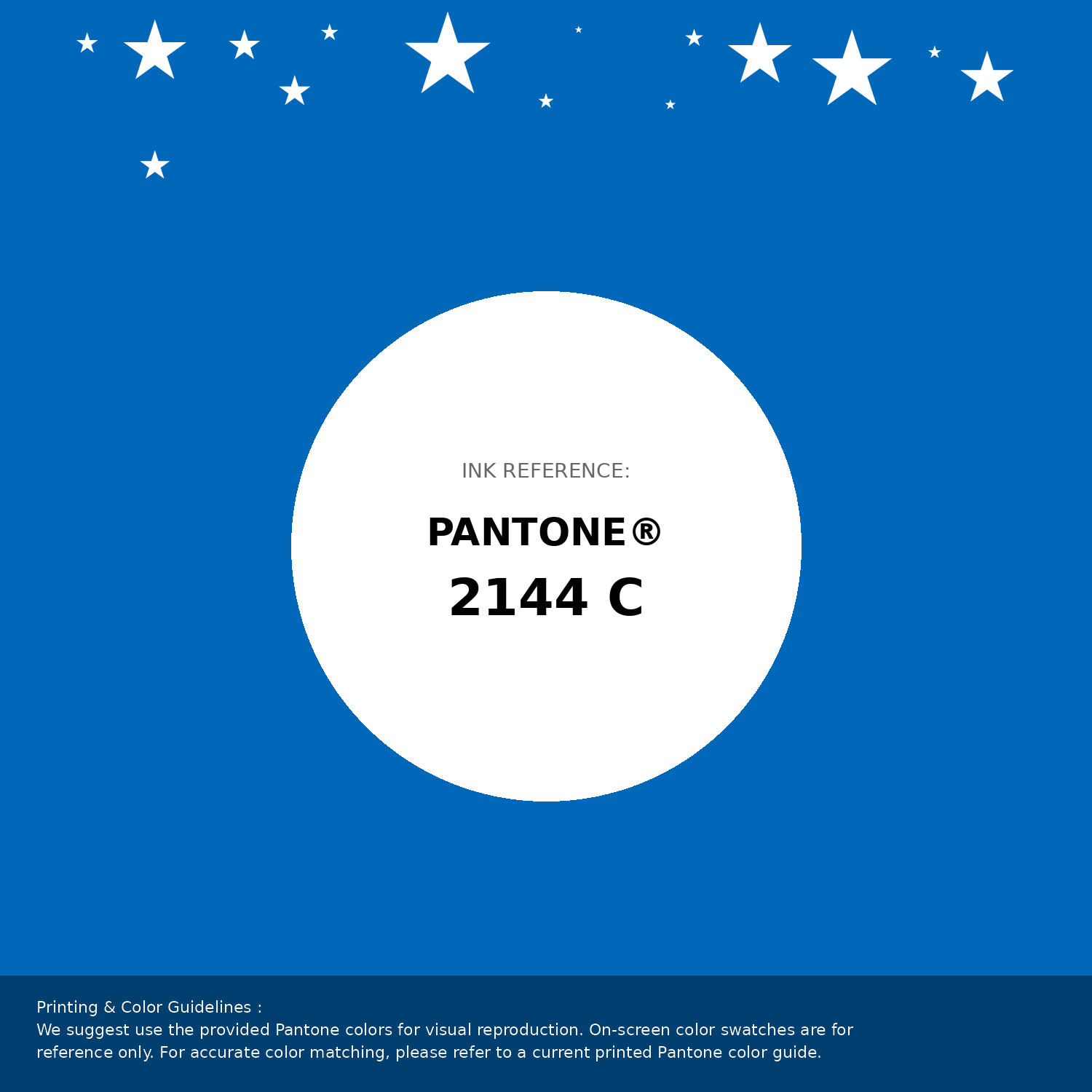
#0067b9 Pantone 2144 C Color | Hex color Code #0067b9 Pantone Swatch Artwork
Download Artwork Swatch
#0067b9 Pantone 2144 C Color | Hex color Code #0067b9 Gradient Artwork (PNG)
Download Gradient (PNG)#0067b9 Pantone 2144 C Color | Hex color Code #0067b9 Gradient Artwork (SVG)
Download Gradient (SVG)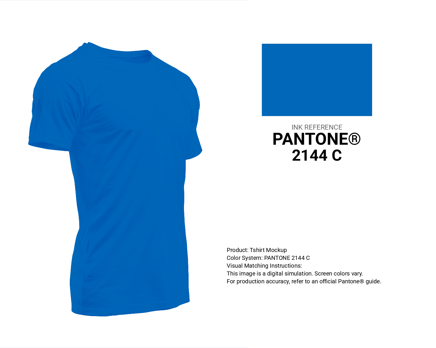
#0067b9 Pantone 2144 C Color | Hex color Code #0067b9 T-Shirt Mockup
Download T-Shirt Mockup
#0067b9 Pantone 2144 C Color | Hex color Code #0067b9 Printing Artwork Pantone Reference
Download Pantone Printing ReferenceRelated Color Palettes
- Light Blue and Light Steel Blue •
- Dark Slate Gray and SkyBlue •
- Powder Blue and Slate Gray •
- Dark Green and Dark Slate Blue •
- Steel Blue and Dark Green •
- Dark Slate Blue and Burly Wood •
- Powder Blue and Dark Sea Green •
- Gray and Cadet Blue •
- Steel Blue and Medium Purple •
- Rosy Brown and Cornflower Blue •
- Light Steel Blue and Dark Slate Gray •
- Beige and Midnight Blue •
- Blue Zodiac •
- Smalt Blue •
- Steel Blue and Dark Gray
Color Palette Collection

20 Beige Color Combinations
20 color palettes with 100 colors.

81 Pink color palettes
81 color palettes with 405 colors.

42 Green Color Schemes
42 color palettes with 210 colors.

30 Pink Color Combinations
30 color palettes with 150 colors.