#41B6E6 Color
Your all-in-one color resource. Download hex background images, Adobe swatches (ASE), PDF color sheets, and SVG files. Explore palettes, harmonies, accessibility, conversions, and professional exports — designed for designers, developers, and color perfectionists.
This vibrant turquoise, #41B6E6, evokes a feeling of boundless possibility and optimistic energy. It's reminiscent of a clear, sun-drenched tropical lagoon, sparkling with light and movement. The color speaks of open skies, freedom, and the refreshing coolness of water. Psychologically, it inspires communication, creativity, and a sense of youthful exuberance. It balances the calming properties of blue with a touch of invigorating energy, creating a mood of both serenity and excitement. In design, Azure Awakening would be perfect for promoting trust and innovation, lending itself well to tech companies, creative studios, or spaces designed to stimulate collaboration. It also suggests trustworthiness and reliability, making it appropriate for branding related to healthcare or financial services. Visually matched named color: Azure Awakening.
PANTONE 298 C
Choose Color
Selected Color
Recent Colors
Color Details
Similar Ink Alternatives for #41B6E6 color Alternative print inks for reproducing #41B6E6 background image with a similar visual appearance.
Disclaimer: The visually matched ink reference is an independent approximation intended as a guide only. Please be advised that this pantone colors is only intended as a guide, Actual colours will depend on screen calibration variances. The print ink suggestions provided are independent visual approximations and are not affiliated with or endorsed by Pantone LLC. For official color specifications, conversion factors, and comprehensive color system information, please visit Pantone Connect. Official Pantone products can be purchased at pantone.com.
Color Previews for #000000 See how this color looks as a background or as text.
Complete Guide to Your Color Laboratory
Everything you need to know about this professional color toolkit.
Use the Color Picker at the top to select any color. All modules below update instantly.
Workflow: Pick a color → Explore palettes & data → Download what you need (PDF, Image, or Adobe ASE).
Color Details — Your color in all formats: HEX, RGB, RGBA, HSL, HSLA, HSV, CMYK, CIELab, Hunter-Lab, XYZ, Yxy, YUV. One-click copy.
Color Psychology — Emotional impact, cultural meanings, physiological effects, branding applications, and historical significance.
Named Colors — Find official color names (HTML/CSS, Pantone) that match your selection with similarity percentages.
Light & Dark Shades
80-step gradient from black to white. Perfect for button states and component systems.
Tints
Color mixed with white → lighter, pastel variations for backgrounds and disabled states.
Monochromatic — 11 curated tints/shades from one color. Production-ready for design systems.
- Complementary — Opposite on wheel (180°). High contrast.
- Analogous — Neighbors (±30°). Harmonious flow.
- Triadic — Three colors (120° apart). Vibrant, balanced.
- Split-Complementary — Base + two near-complements. Softer contrast.
- Tetradic/Square — Four colors. Complex, maximum variety.
- Neutral — Desaturated versions. Subtle, sophisticated.
15 Professional Variations — Monochromatic, Analogous, Complementary, Warm/Cool/Earth Tones, Pastel, Vibrant, High Contrast, and more.
Color Infusion — 10 palettes showing your color morphing into each major hue. Find bridge colors.
Similar Colors — 60+ colors generated via CIELAB Delta E matching. Unexpected harmonious combinations.
18 Ready-to-Use Gradients — Complementary, Analogous, Triadic, Tint/Shade progressions, and more.
Downloads: PNG (2560×1440), CSS (production-ready code), SVG (scalable vector).
WCAG Contrast Checker — Tests your color against white, black, and custom colors for AA (4.5:1) and AAA (7:1) compliance. Large text thresholds included.
Harmony & Accessibility Guide — Tests against 10 canonical hues. Shows which pairs are both beautiful AND WCAG-compliant for text.
PNG/JPG — High-res images for presentations and mood boards.
PDF — Print-ready reports for clients and teams.
Adobe ASE — Direct import to Photoshop, Illustrator, InDesign, XD.
CSS/SVG — Gradients only. Production-ready code and vectors.
Color Science: Industry-standard conversions (HSL, CIELAB, CMYK, XYZ). WCAG 2.1 luminance formula. Delta E (ΔE76) for perceptual matching.
Direct Links: Share colors via icolorpalette.com/color/ff5733 or icolorpalette.com/color/red
Issues? Refresh the page, wait for rendering, try another browser, or check console (F12) for errors.
Printing Guide for #41b6e6 Background Image
Use PANTONE 298 C as a visually matched ink reference when printing this background image.
To print the #41b6e6 background image from our site, consider using PANTONE 298 C as a visually matched ink reference.
Download the background image, then provide this reference code to your print vendor to help achieve accurate color reproduction.
The visually matched ink reference for the #41b6e6 background image is PANTONE 298 C.
This color is commonly described as Azure Awakening.
This vibrant turquoise, #41B6E6, evokes a feeling of boundless possibility and optimistic energy. It's reminiscent of a clear, sun-drenched tropical lagoon, sparkling with light and movement. The color speaks of open skies, freedom, and the refreshing coolness of water. Psychologically, it inspires communication, creativity, and a sense of youthful exuberance. It balances the calming properties of blue with a touch of invigorating energy, creating a mood of both serenity and excitement. In design, Azure Awakening would be perfect for promoting trust and innovation, lending itself well to tech companies, creative studios, or spaces designed to stimulate collaboration. It also suggests trustworthiness and reliability, making it appropriate for branding related to healthcare or financial services.
We provide PANTONE 298 C as a visually matched ink reference to help you reproduce the #41b6e6 background image accurately in professional printing.
This reference code helps print vendors achieve consistent color output across different printing equipment and materials.
After downloading the #41b6e6 background image from our site:
- Include the visually matched ink reference PANTONE 298 C in your print order notes
- Inform your print vendor that this is your target color reference
- Request a proof print to verify the Azure Awakening color appearance before full production
The #41b6e6 background image with PANTONE 298 C as visually matched ink reference can be used for:
- Posters, banners, and backdrops
- Business cards, brochures, and flyers
- Packaging, labels, and stickers
- Signage and promotional materials
This is an independent visual approximation.
While PANTONE 298 C closely matches the #41b6e6 background image color, variations may exist between screen display and printed output.
We recommend requesting a proof print to verify the final appearance.
This vibrant turquoise, #41B6E6, evokes a feeling of boundless possibility and optimistic energy. It's reminiscent of a clear, sun-drenched tropical lagoon, sparkling with light and movement. The color speaks of open skies, freedom, and the refreshing coolness of water. Psychologically, it inspires communication, creativity, and a sense of youthful exuberance. It balances the calming properties of blue with a touch of invigorating energy, creating a mood of both serenity and excitement. In design, Azure Awakening would be perfect for promoting trust and innovation, lending itself well to tech companies, creative studios, or spaces designed to stimulate collaboration. It also suggests trustworthiness and reliability, making it appropriate for branding related to healthcare or financial services.
Understanding these associations helps ensure the #41b6e6 background image aligns with your intended message and brand impact.
Important Information
The visually matched ink reference is an independent approximation intended as a guide only.
Actual printed colors may vary depending on screen calibration, substrate material, ink type, and printing equipment used.
For official color specifications and certified color standards, visit Pantone Connect.
Official color guides and swatch books can be purchased from pantone.com.
Pantone 298 C Color: Refreshing Blue | #41B6E6
Introduction:
Pantone 298 C is a refreshing blue color that captures the essence of tranquility and serenity. Its vibrant and energetic hue makes it visually appealing and eye-catching.
Historical Significance:
Key moments in history: Throughout history, Pantone 298 C has been prominently used in ocean-themed artworks and nautical designs. It has also been associated with water-centric industries and activities.
Symbolism and Meaning:
Symbolism and Meaning: Pantone 298 C typically symbolizes calmness, harmony, and reliability. It is often associated with the sea, representing a sense of trust and stability.
Pantone 298 C in Fashion:
Pantone 298 C in Fashion: This vibrant blue color is commonly used in fashion to create fresh and invigorating looks. It can be seen in various clothing items, accessories, and footwear.
Pantone 298 C in Graphic Design:
Pantone 298 C in Graphic Design: The significance of Pantone 298 C in design aesthetics and branding is undeniable. Its vibrant and refreshing nature makes it a popular choice for creating visually impactful designs.
Color Combinations:
Color Combinations: Pantone 298 C pairs well with other vibrant colors such as white, yellow, and green. These combinations create a visually pleasing and harmonious palette.
Nature’s Palette:
Nature’s Palette: Pantone 298 C is often found in natural occurrences such as clear summer skies, tropical seas, and vibrant flowers. It is a color that reflects the beauty of nature.
Artistic Representations:
Artistic Representations: Artists have used Pantone 298 C in various forms of art to depict the serenity and calmness associated with the color. It has been featured in paintings, sculptures, and digital artworks.
Movies and Cinematic Landscapes:
Movies and Cinematic Landscapes: Pantone 298 C is often used in movies and cinematic landscapes to create a sense of tranquility and peacefulness. It is commonly seen in beach or ocean-themed scenes.
Products and Commercial Appeal:
Products and Commercial Appeal: Many popular products and brands use Pantone 298 C in their branding, particularly those associated with water-related activities, as it conveys a sense of trust and reliability.
National Symbols and Significance:
National Symbols and Significance: Pantone 298 C is not directly tied to any specific national or cultural symbolism. However, its association with the sea resonates with coastal nations and maritime traditions.
The Psychological and Emotional Impact:
The Psychological and Emotional Impact: Pantone 298 C has a calming effect on the mind and tends to evoke feelings of relaxation and peace. It is often used to create a soothing atmosphere.
Conclusion:
Pantone 298 C, also known as Refreshing Blue, holds historical significance in ocean-themed artworks and nautical designs. Its symbolism of calmness and reliability makes it an appealing color in various industries such as fashion, graphic design, and branding. Additionally, its natural occurrence in clear summer skies and vibrant flowers adds to its timeless appeal. Overall, Pantone 298 C's psychological impact of evoking relaxation and peace makes it a popular choice in creating visually impactful and soothing environments.
Pantone 298 C Color | Hex color Code #41b6e6 Image & Artwork
Download high-quality assets for your projects.

#41b6e6 Color Schemes
Download Color Schemes
#41b6e6 Color Shades
Download Color Shades
Pantone 298 C Color | Hex color Code #41b6e6 Solid Color Background
Download Solid Color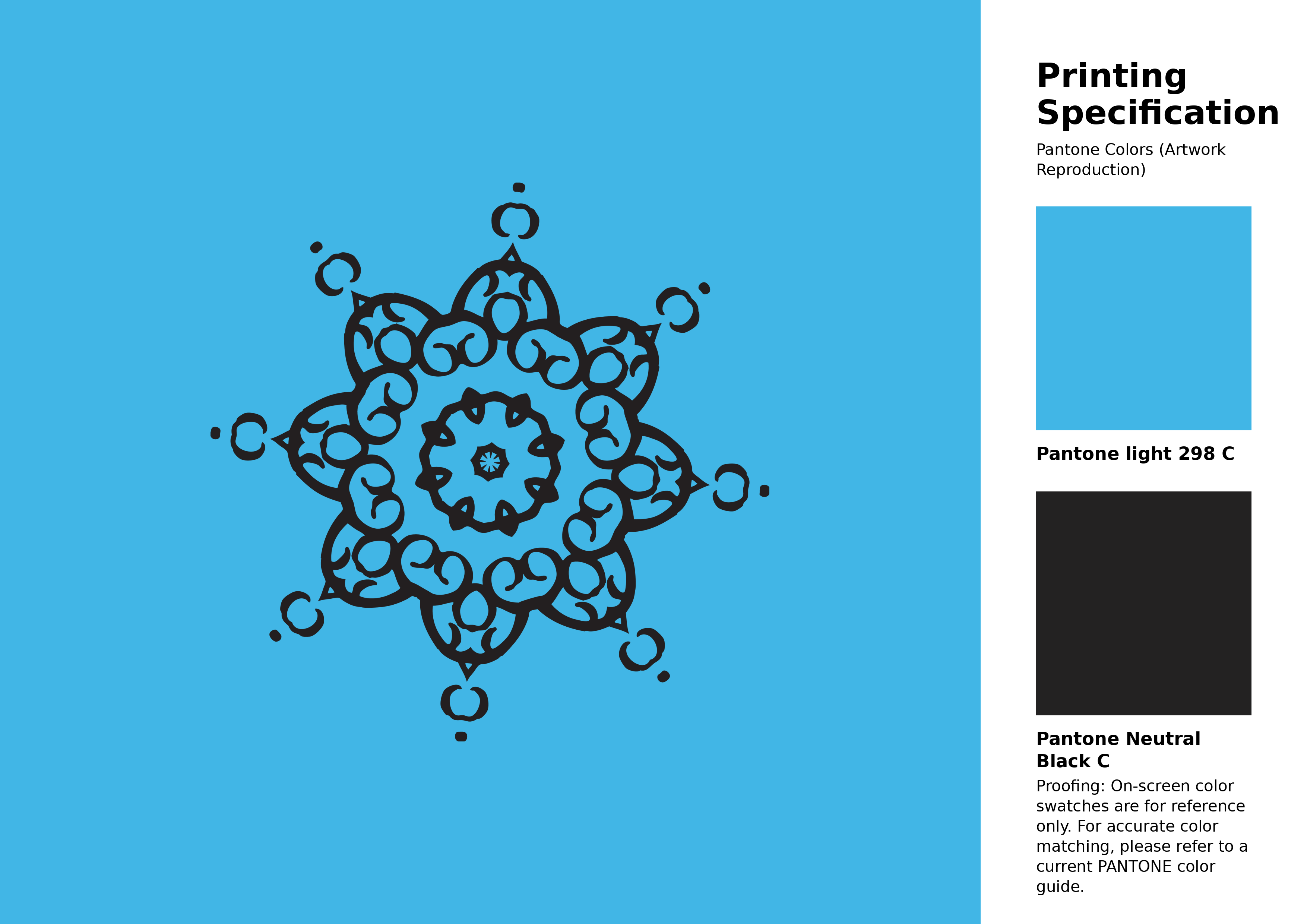
#41b6e6 Pantone 298 C Color | Hex color Code #41b6e6 Artwork Image (PNG)
Download Artwork (PNG)#41b6e6 Pantone 298 C Color | Hex color Code #41b6e6 Artwork Vector (PDF)
Download Artwork (PDF)#41b6e6 Pantone 298 C Color | Hex color Code #41b6e6 Artwork Vector (SVG)
Download Artwork (SVG)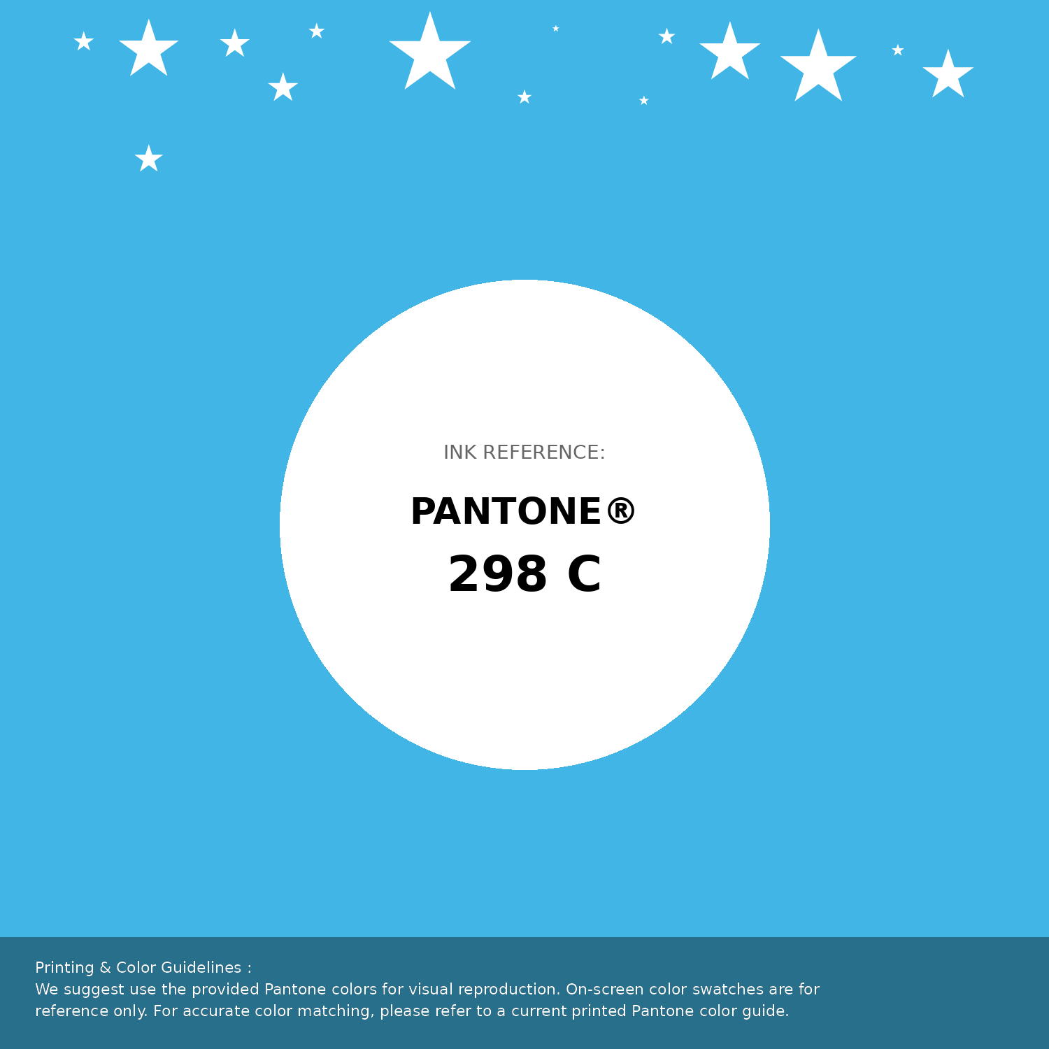
#41b6e6 Pantone 298 C Color | Hex color Code #41b6e6 Pantone Swatch Artwork
Download Artwork Swatch
#41b6e6 Pantone 298 C Color | Hex color Code #41b6e6 Gradient Artwork (PNG)
Download Gradient (PNG)#41b6e6 Pantone 298 C Color | Hex color Code #41b6e6 Gradient Artwork (SVG)
Download Gradient (SVG)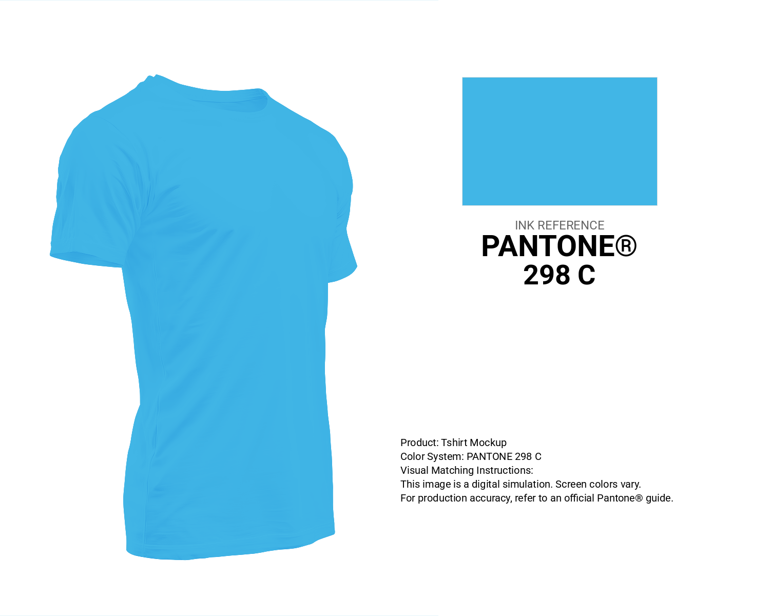
#41b6e6 Pantone 298 C Color | Hex color Code #41b6e6 T-Shirt Mockup
Download T-Shirt Mockup
#41b6e6 Pantone 298 C Color | Hex color Code #41b6e6 Printing Artwork Pantone Reference
Download Pantone Printing ReferenceRelated Color Palettes
- SkyBlue and Pale Turquoise •
- Dark Slate Gray and Medium Turquoise •
- Medium Turquoise and Light Steel Blue •
- Dim Gray and Medium Turquoise •
- Medium Turquoise and Dark Slate Blue •
- Pale Turquoise and Dark Olive Green •
- Light Steel Blue and Pale Turquoise •
- Medium Turquoise and Steel Blue •
- Turquoise and Dark Slate Gray •
- Medium Turquoise and Dark Sea Green •
- Dark Slate Gray and Turquoise •
- Dark Olive Green and Medium Turquoise •
- Pale Turquoise and Dark Khaki •
- Light Slate Gray and Medium Turquoise •
- Light Steel Blue and Medium Turquoise
Color Palette Collection
31 Autumn Color Palettes
31 color palettes with 155 colors.

20 Turquoise Color Palettes
20 color palettes with 100 colors.

46 Indigo Color Palettes
46 color palettes with 230 colors.

16 Brown Color Palettes
16 color palettes with 80 colors.